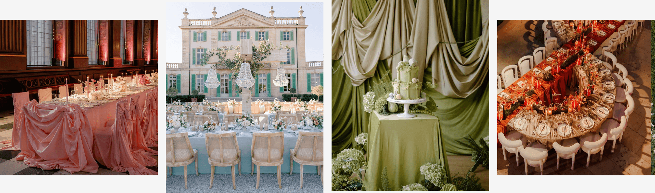
Spring Wedding Color Palette


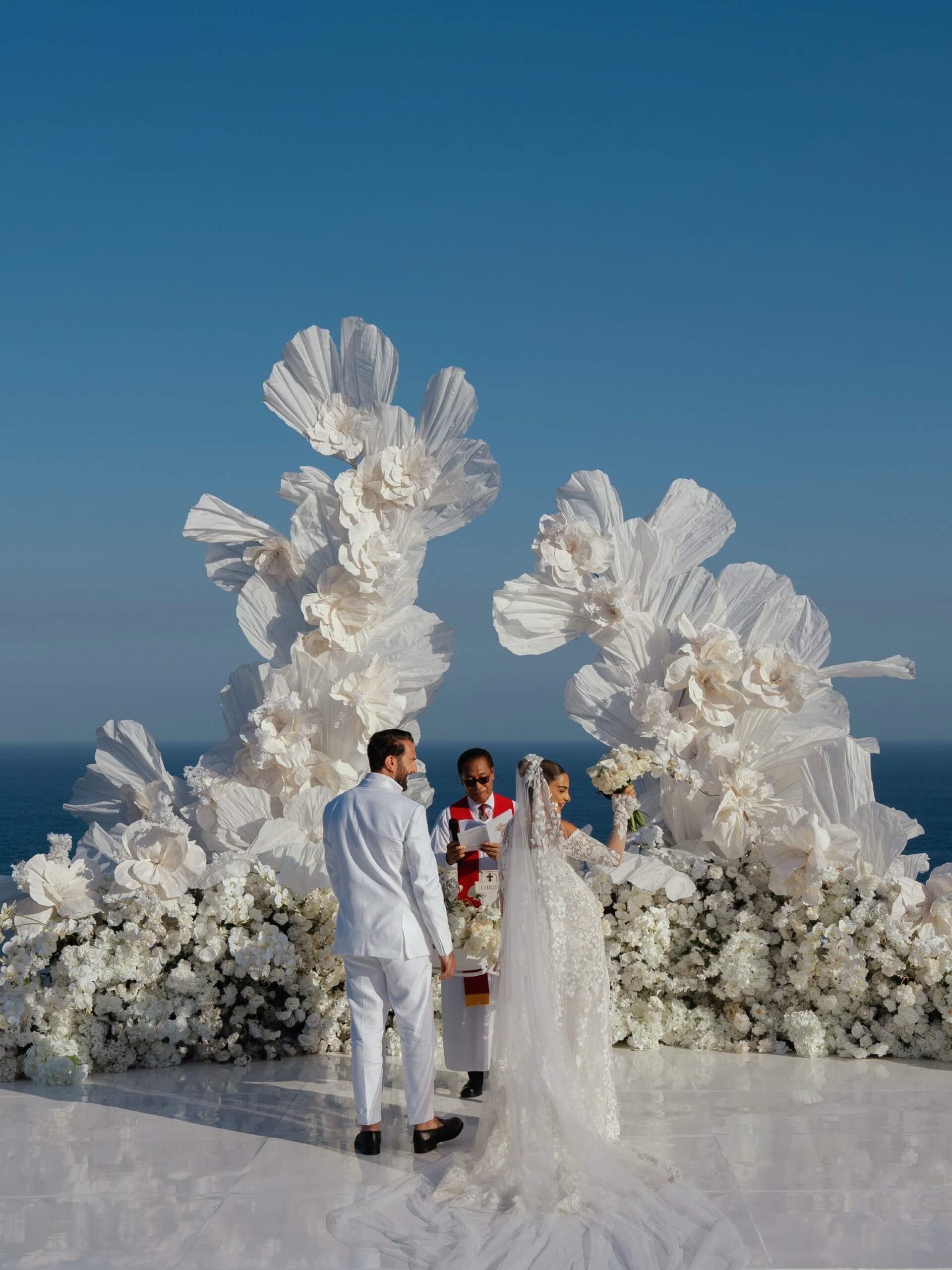
There is a certain type of light that occurs for only a few months every year, the sort that passes through the new leaves and just manages to catch the edge of a peony petal. It’s precisely why so many couples base their whole wedding around this season rather than opposing it. Choosing an appropriate spring wedding color paletteis not really a matter of picking a favorite shade from a swatch card. Instead, one should interpret what the season is already doing - that is, the gentle warmth of early morning light and the specific green of the grass that has not yet turned brown under the summer sun - and let the ideas develop from that rather than forcing something entirely foreign upon it. This guide looks at two approaches worth considering: individual pastel shades that look great on their own, and color combinations that turn a single hue into a complete atmosphere.
Find Your Perfect Wedding Vendors

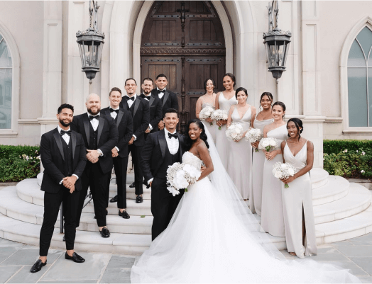
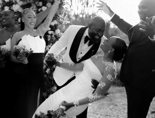
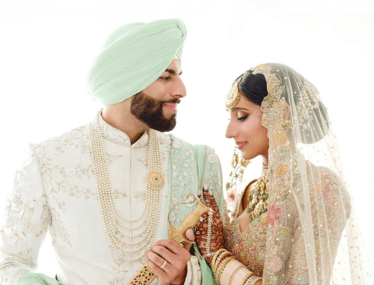
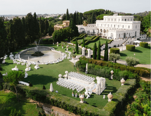
Individual Pastel Shades
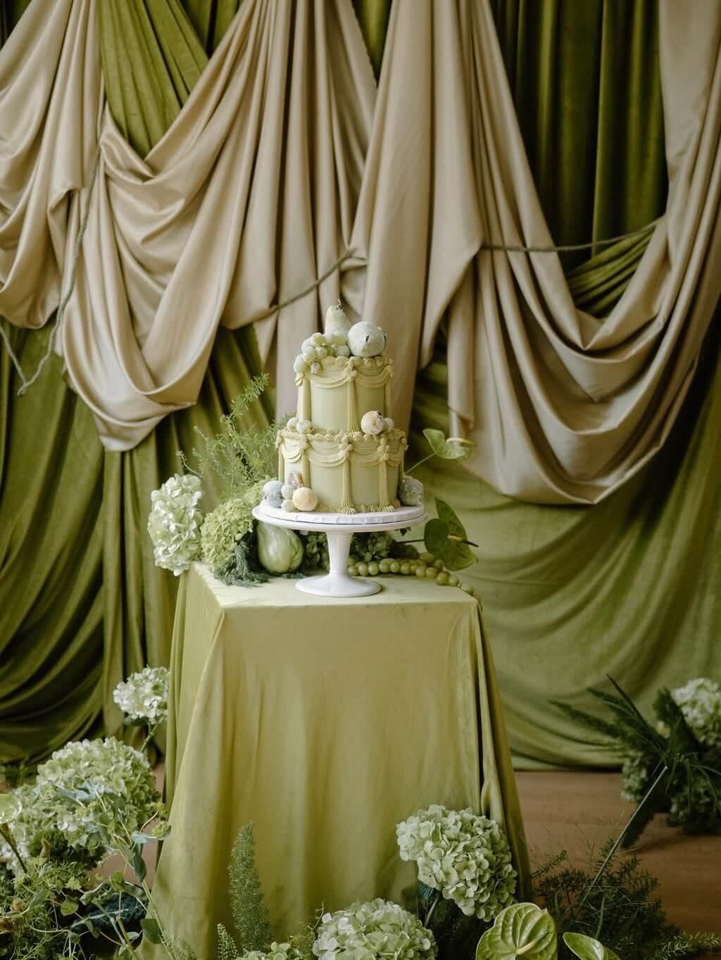
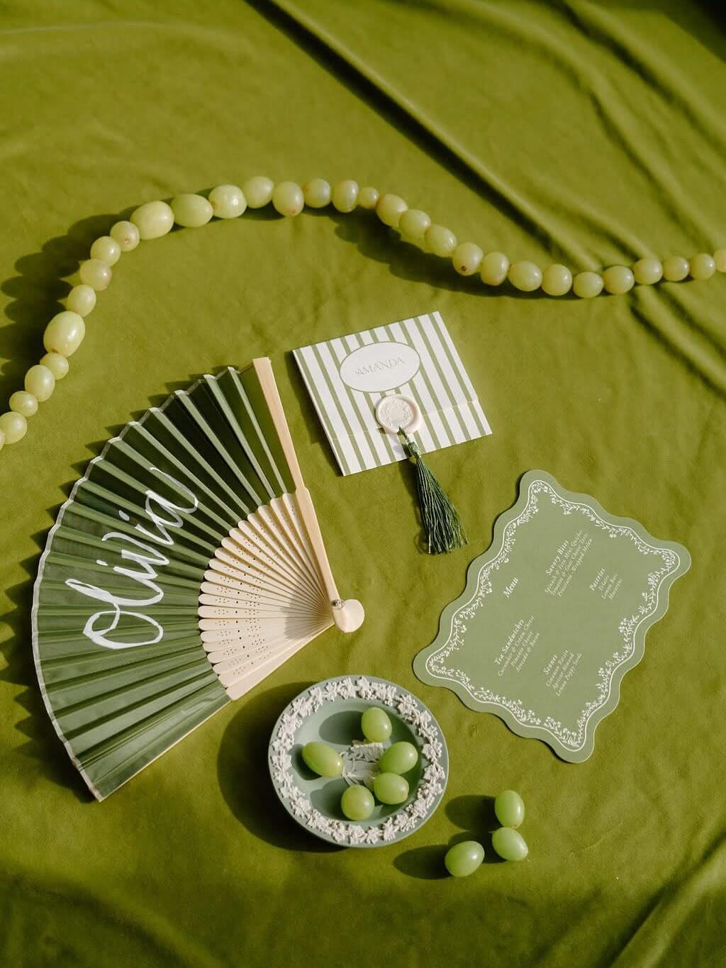
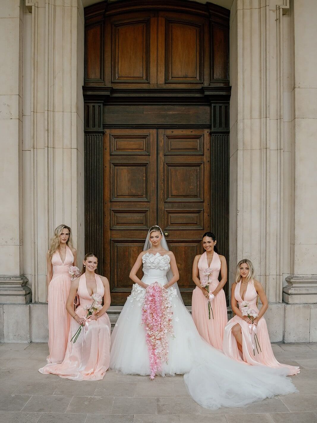
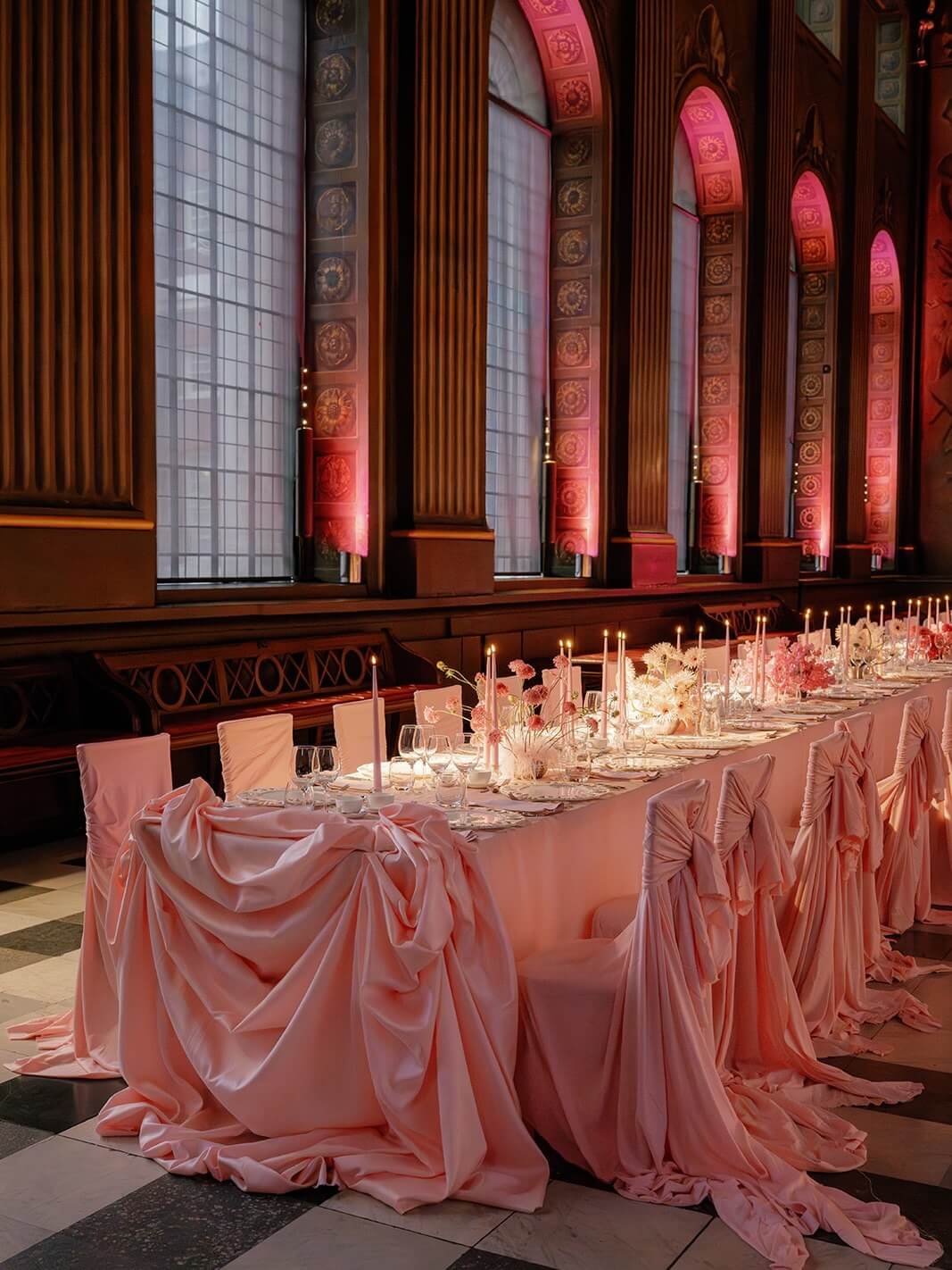
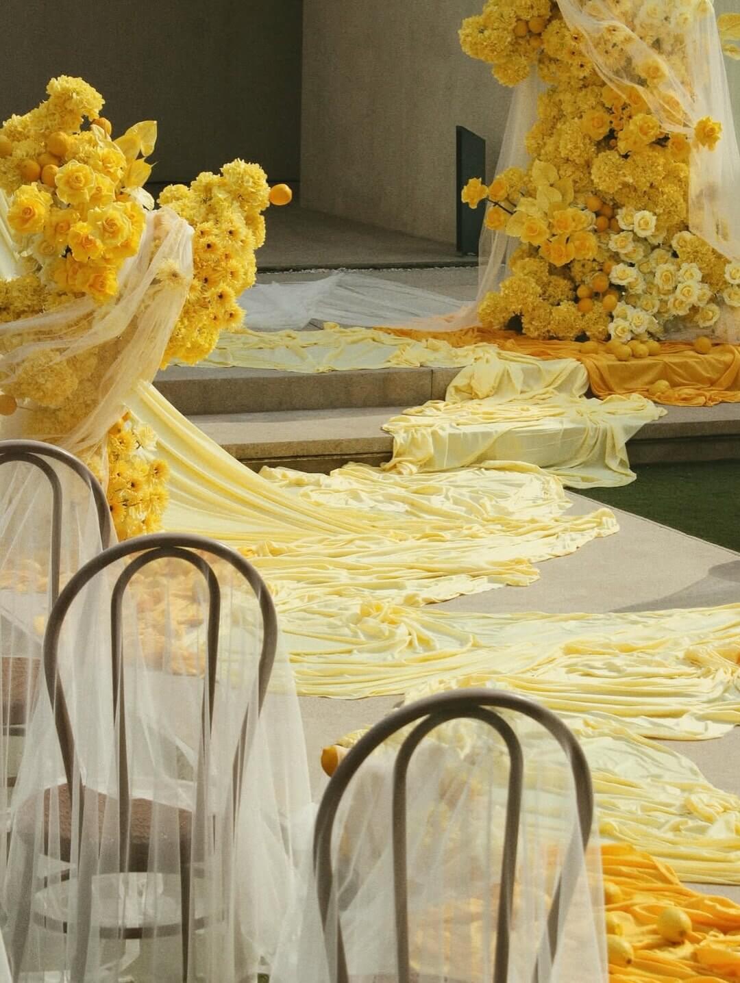
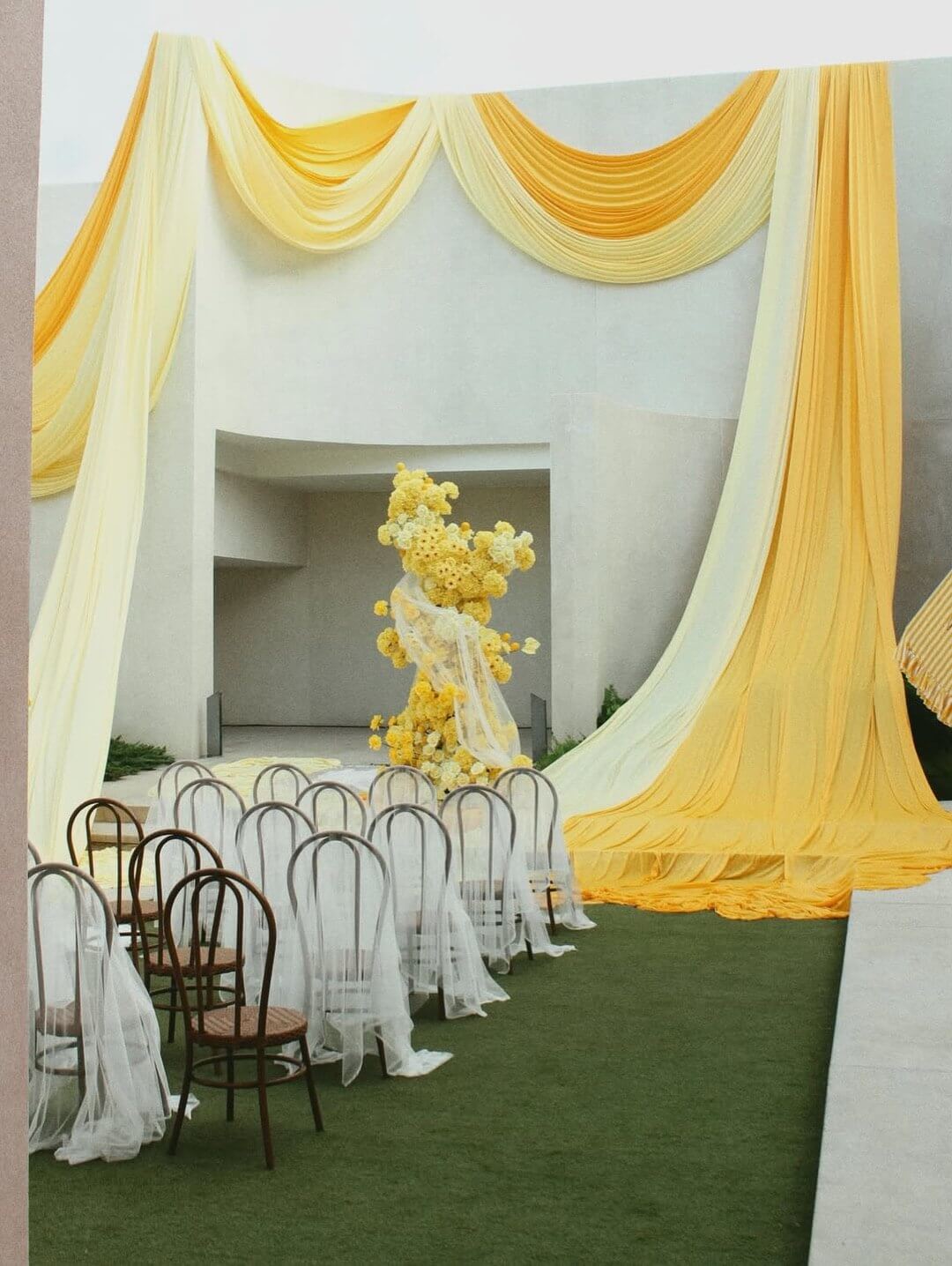
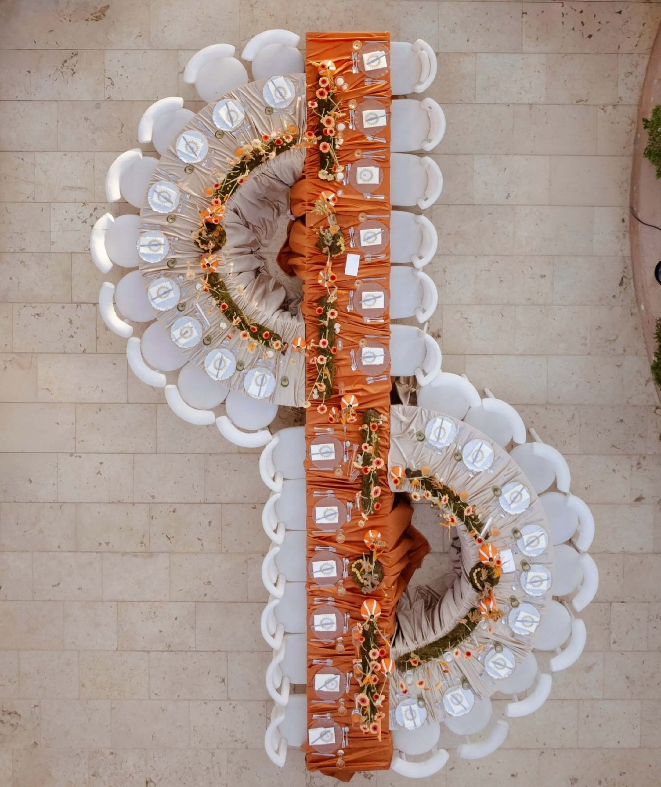
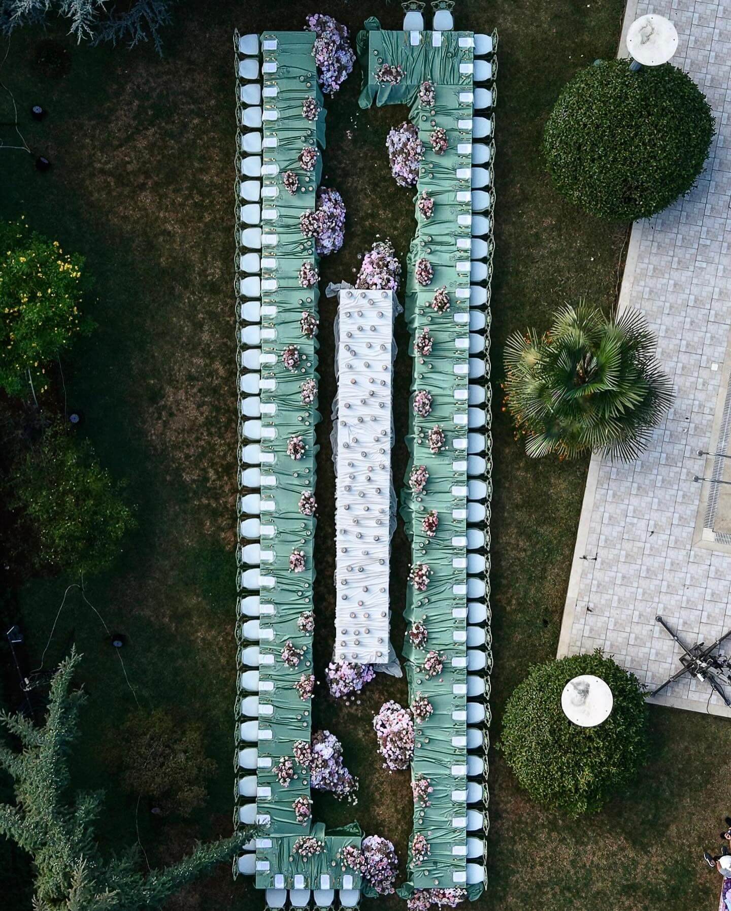
Some couples prefer not to use a combination of colors. They prefer to base all their wedding decisions on one spring color they choose with genuine intention, which then forms the entire visual theme of the day without competing with others. A single, thoughtfully selected pastel achieves something that a more complicated color scheme cannot: it enables all the other design choices, such as the architecture of the venue, the particular texture of the linens, and the exact shade of the bridesmaids’ lipstick, to exist in a quiet harmony with one dominant tone, rather than having to vie for attention among several colors. Each of the seven shades listed below has gained a place in the spring color vocabulary for its own particular reason, and by understanding what makes each one effective, you will learn more about your own preferences than any trend report ever could.
Peach
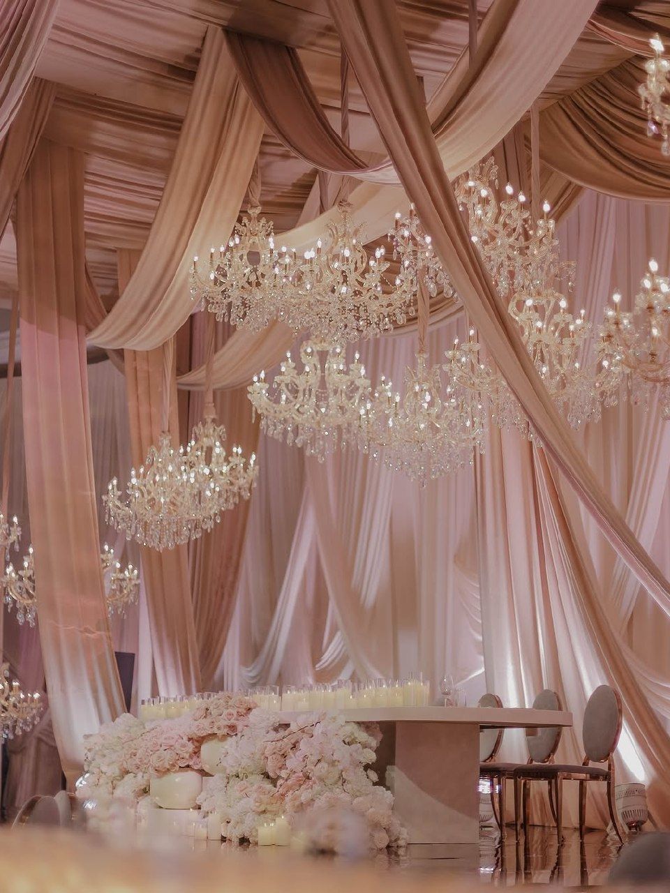
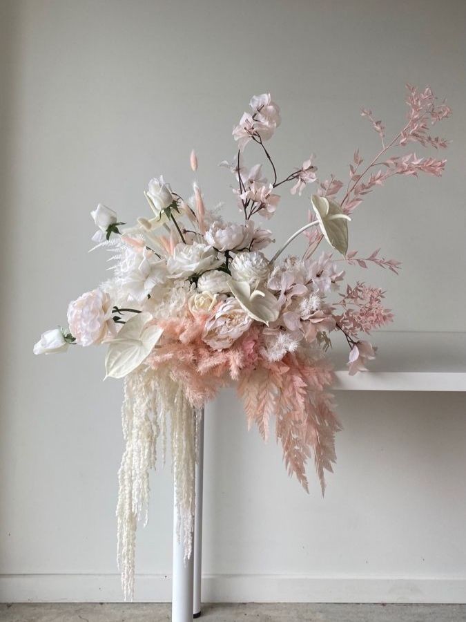
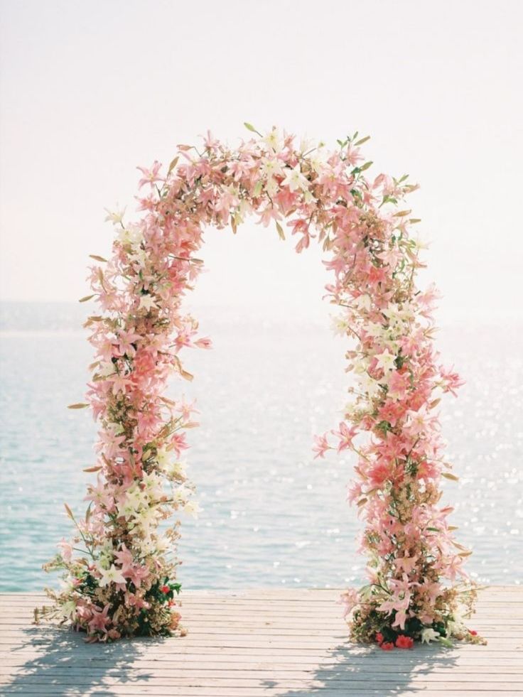
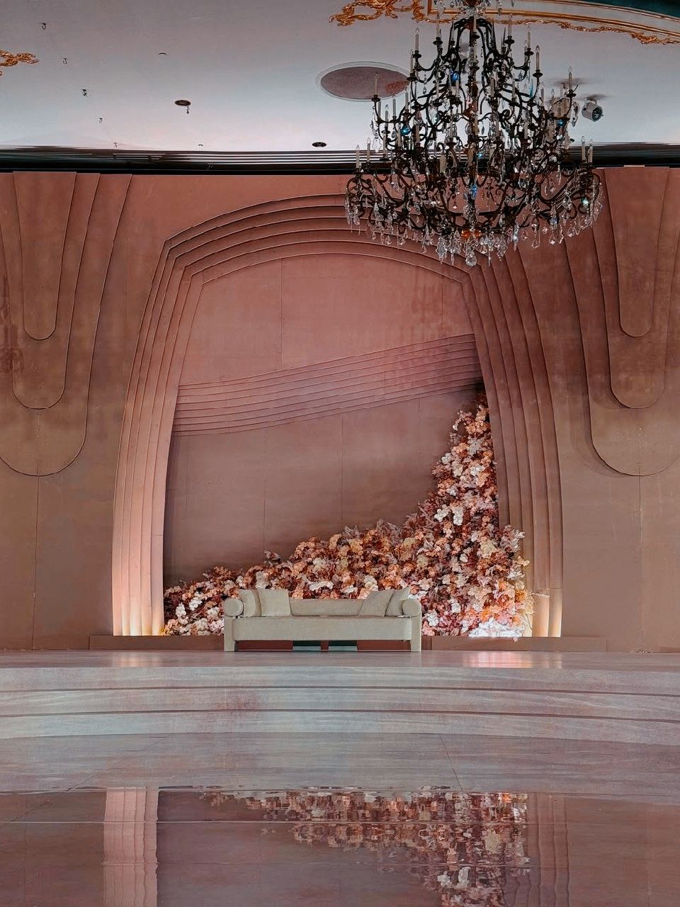
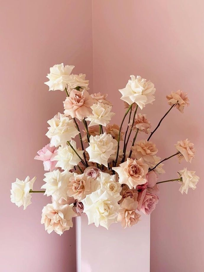
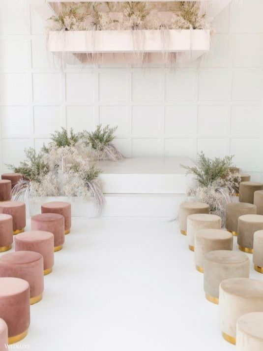
Peach has a warm quality that is kind and not flashy, matching the light of golden hour permanently trapped in fabric and petals. It photographs beautifully because it looks good with almost every skin tone in natural light; that is why so many photographers quietly prefer weddings with a strong peach tone, even though the couples themselves never notice. The shade blends very naturally into floral arrangements, particularly with garden roses and ranunculus. Yet its true strength shows in how gracefully it pairs with non-floral items: aged brass candlesticks, hand-torn kraft paper place cards, and a wedding cake finished with a soft, simple buttercream rather than something shiny. When peach is combined with ivory, the result appears classic and slightly old-fashioned; when paired with a deeper blush pink, it imparts the same warmth in a more clearly romantic way. The overall effect is inviting rather than dramatic, presenting a celebration that welcomes people in rather than one that performs for them.
Blush Pink
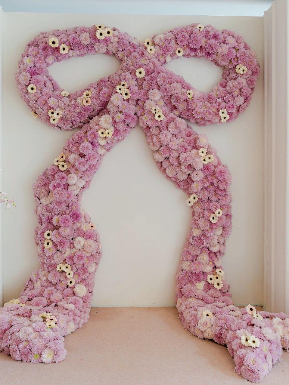
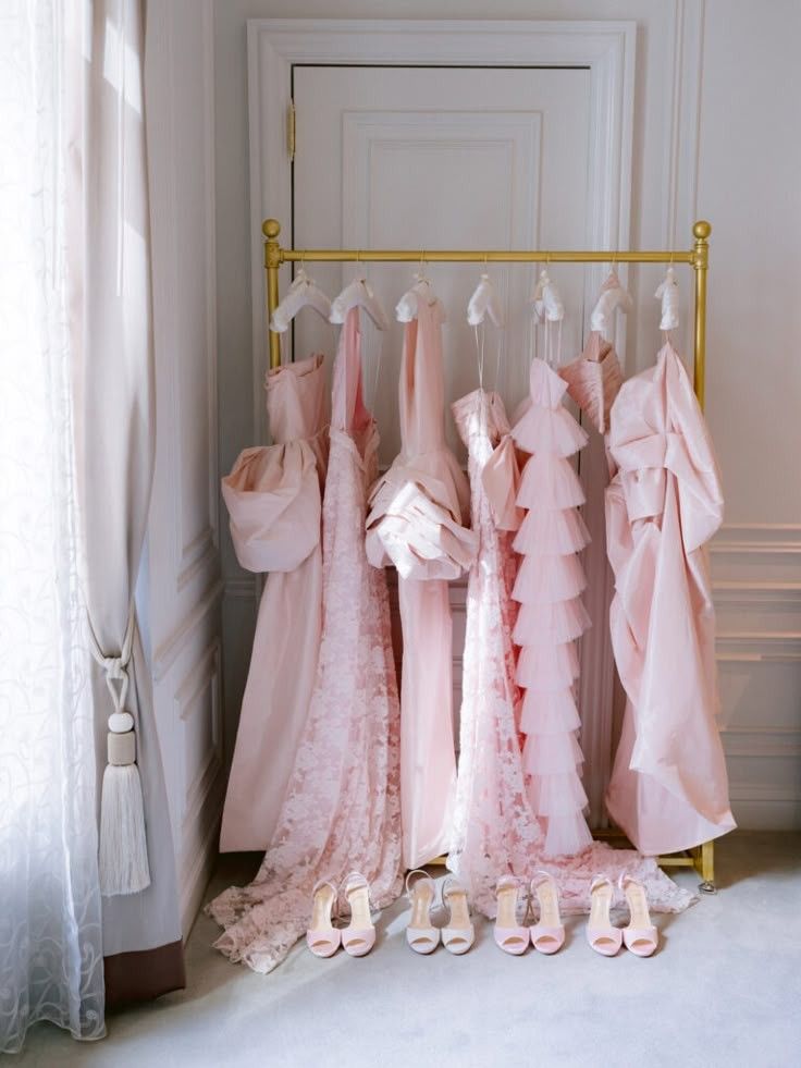
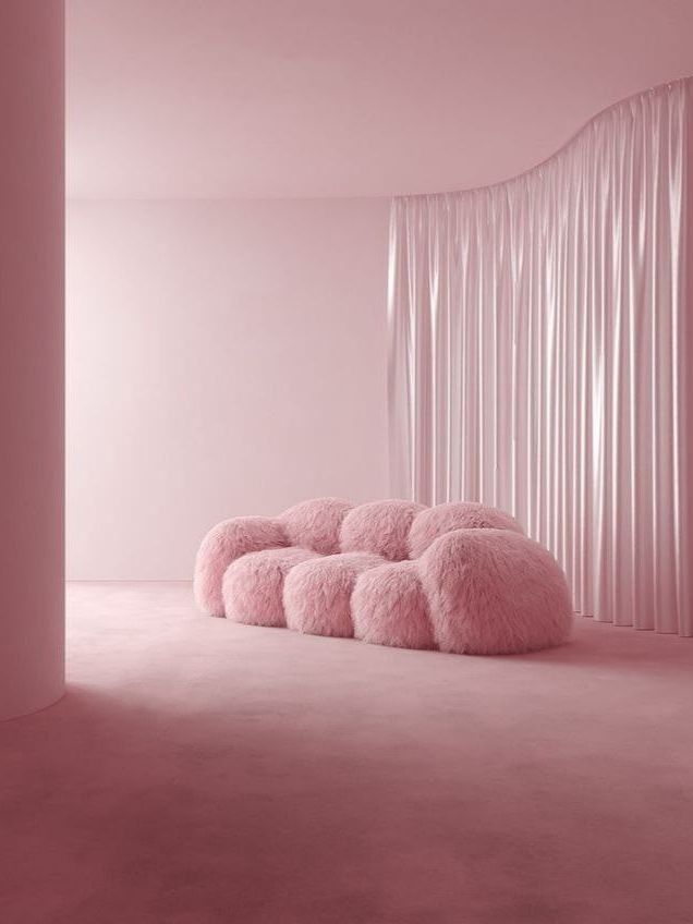
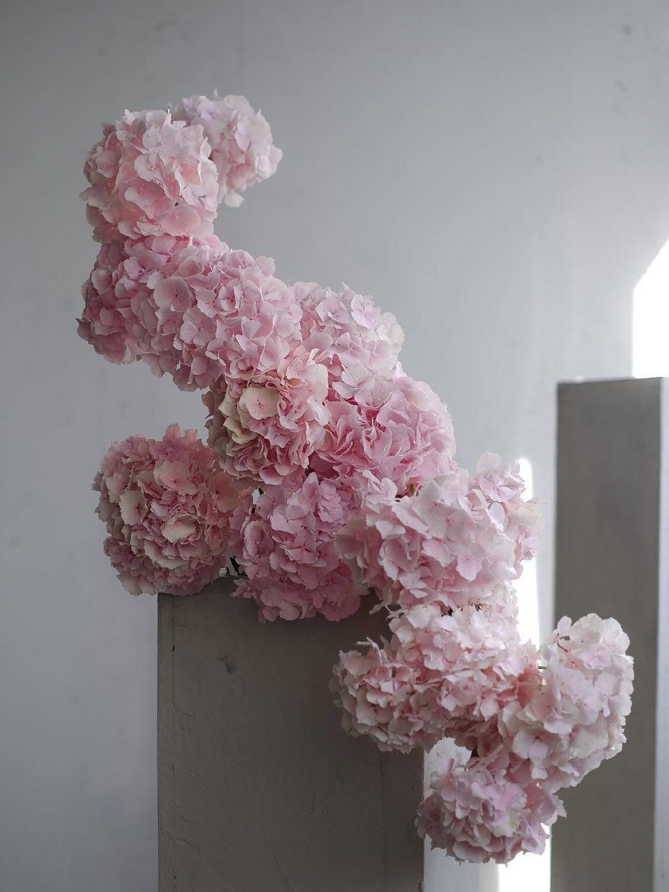
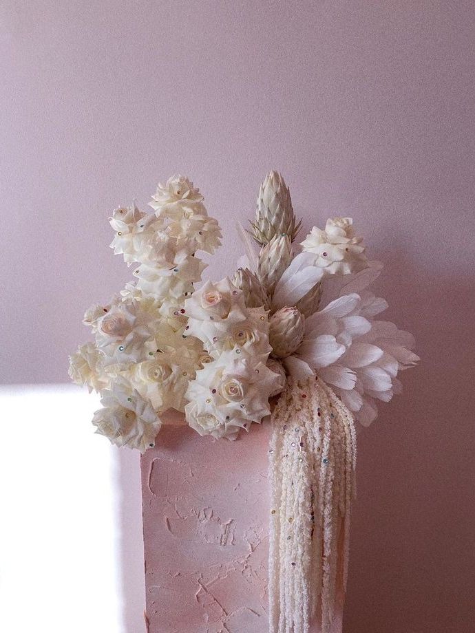
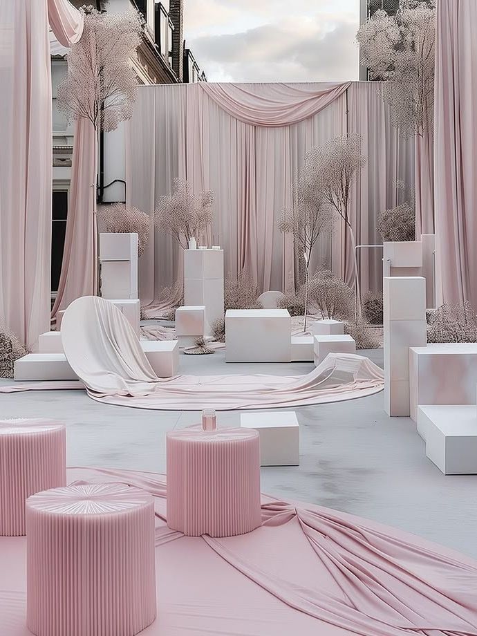
Blush holds a rare and admirable place among spring wedding color schemes, as it has been a favorite with so many couples and has rightly become a classic rather than a fashion trend, even though it has never become as predictable as an overused color scheme. One reason for its enduring popularity is the shade's versatility. If you combine it with lavender and seafoam, the entire scheme has a dreamy, almost watercolor effect; but if you pair it instead with a deep burgundy or a warm gold, blush at once takes on a much more mature and evening-appropriate air, moving away from being the color of a nursery and becoming more like the color of a truly elegant reception. It also photographs softly against most skin tones, which is why blush bouquets and blush bridesmaid dresses have remained a dependable choice for at least ten years amid all the changes in bridal fashion. Metallic touches, particularly rose gold, enhance blush's qualities rather than contradicting them, adding luxury without making the overall scheme look excessive.
Soft Yellow
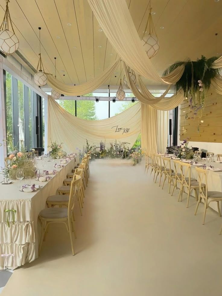
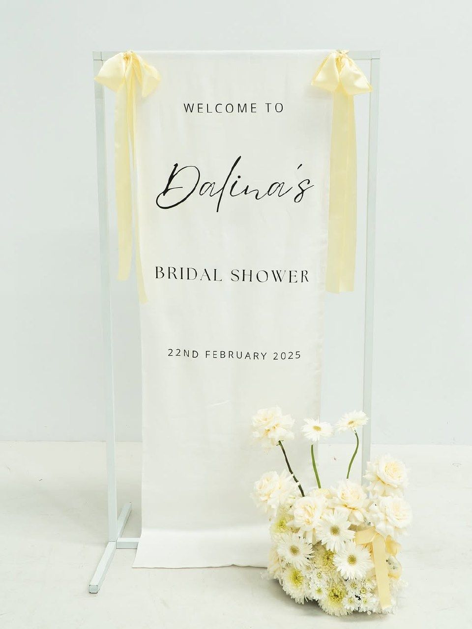
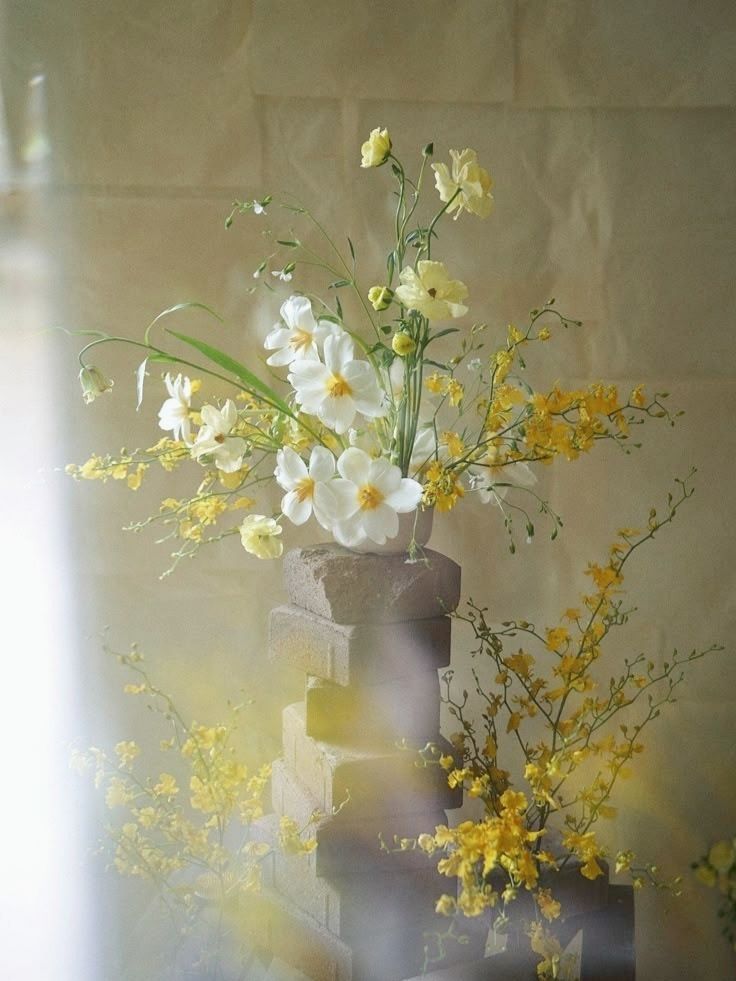
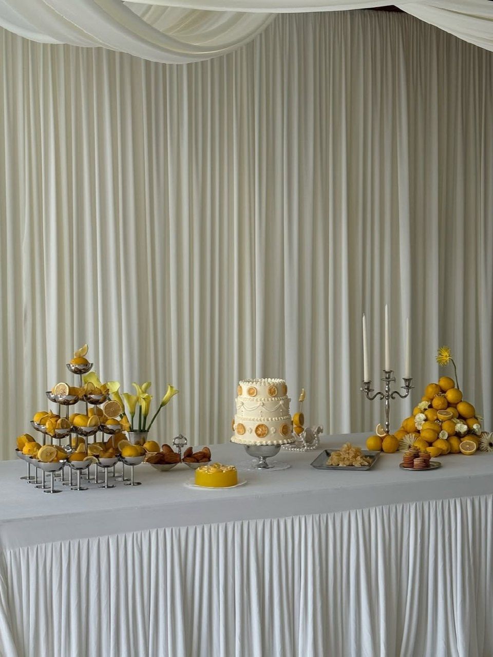
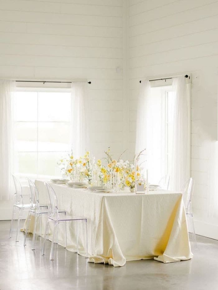
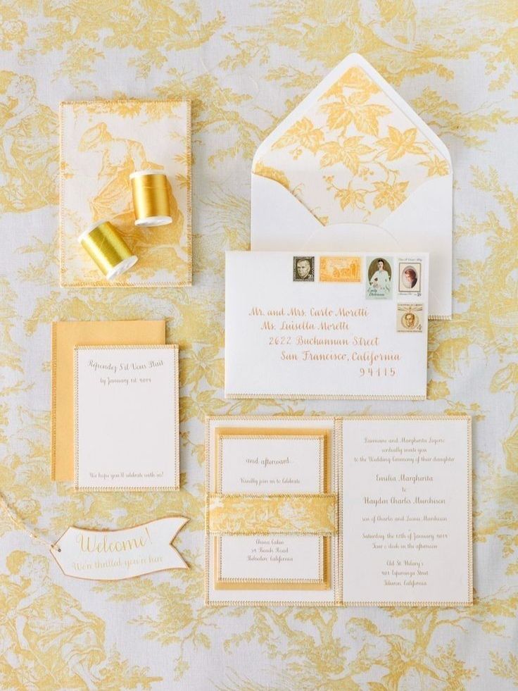
Soft yellow imparts a real, clear sense of warmth to a color scheme without needing other colors to do it. While peach and blush subtly suggest a romantic atmosphere, soft yellow suggests joy in a straightforward way, much like the first truly sunny afternoon of the season after a long winter. It works well outdoors because natural daylight enhances its brightness in a way artificial indoor lighting can sometimes diminish, making it an excellent choice for a garden ceremony or a reception partly held outside as the sun begins to set. When paired with blush or lavender, soft yellow becomes softer and gives up some of its intensity for a more gently balanced look. Matched with a true, saturated green instead, it becomes strikingly vivid, creating a combination that feels confident rather than hesitant. It is the color preferred by couples determined to keep their wedding day from feeling too serious and who want something that looks as if it was actually fun to attend.
Seafoam Green
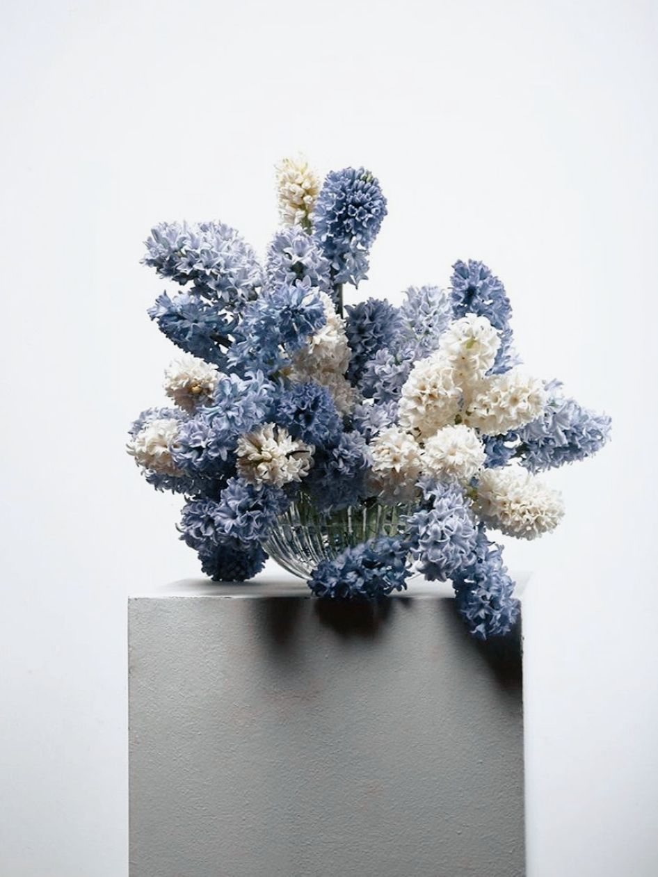
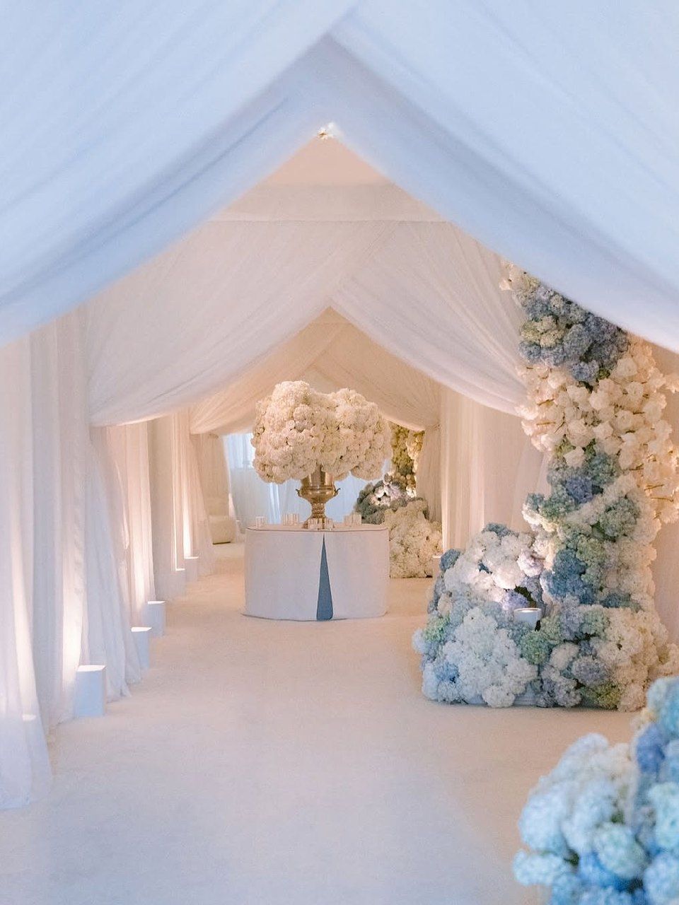
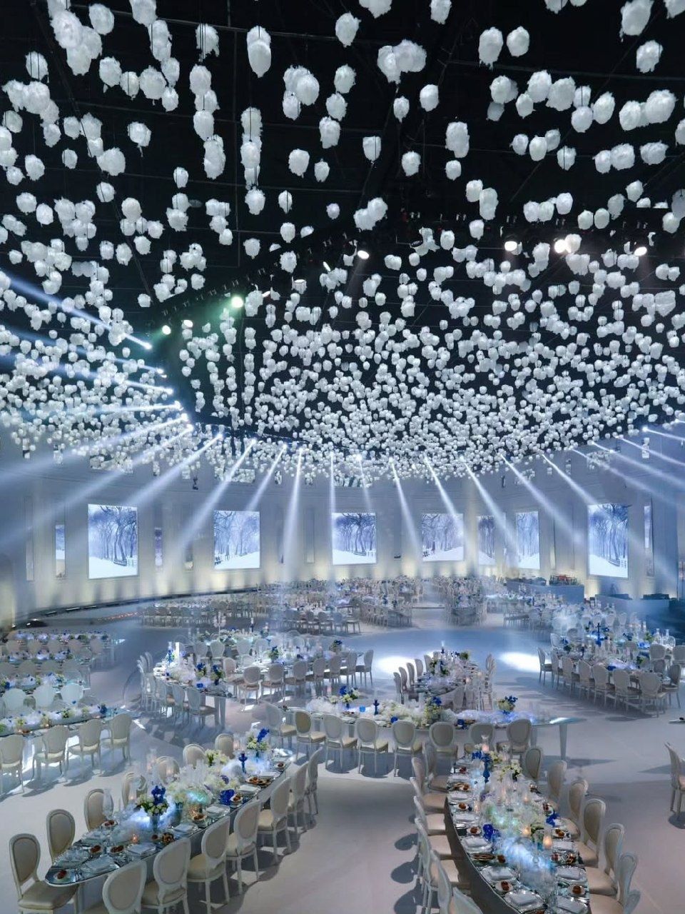
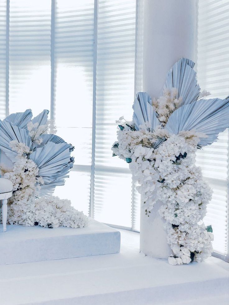
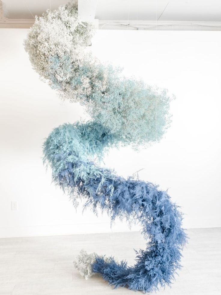
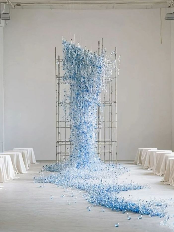
Seafoam green has a natural calmness that very few other spring shades achieve so easily, bringing to mind a mix of ocean mist and the underside of new leaves without fully leaning into either a coastal or a garden atmosphere. This middle-ground character makes the color so versatile. It pairs well with blush pink to create a soft, traditionally romantic effect, but it also works naturally with peach or pale turquoise to produce a scheme that feels more coastal without fully adopting a beach wedding style. Since it is a subtle color, seafoam green rewards restraint in its use, for it can vanish if surrounded by bolder tones; the most seafoam-green oriented weddings make use of it as a grounding element, incorporating it into the linens or the bridesmaid dresses, while having a warmer accent color take on the main visual role. Whenever there is a garden, a vineyard, or any place where real greenery is already part of the setting, seafoam green can match the location rather than clash with it.
Lavender
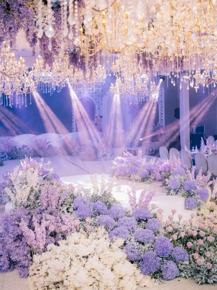
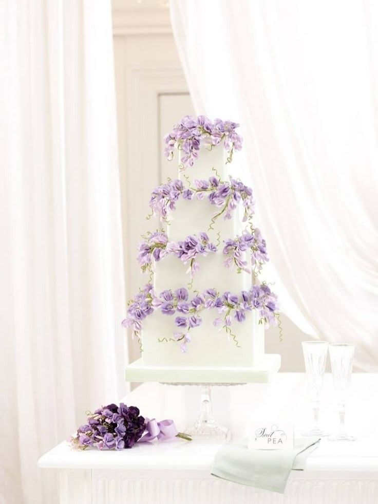
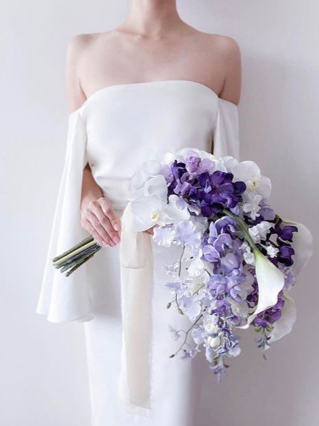
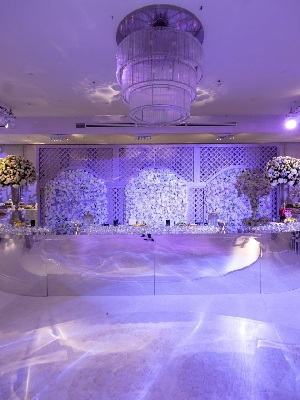
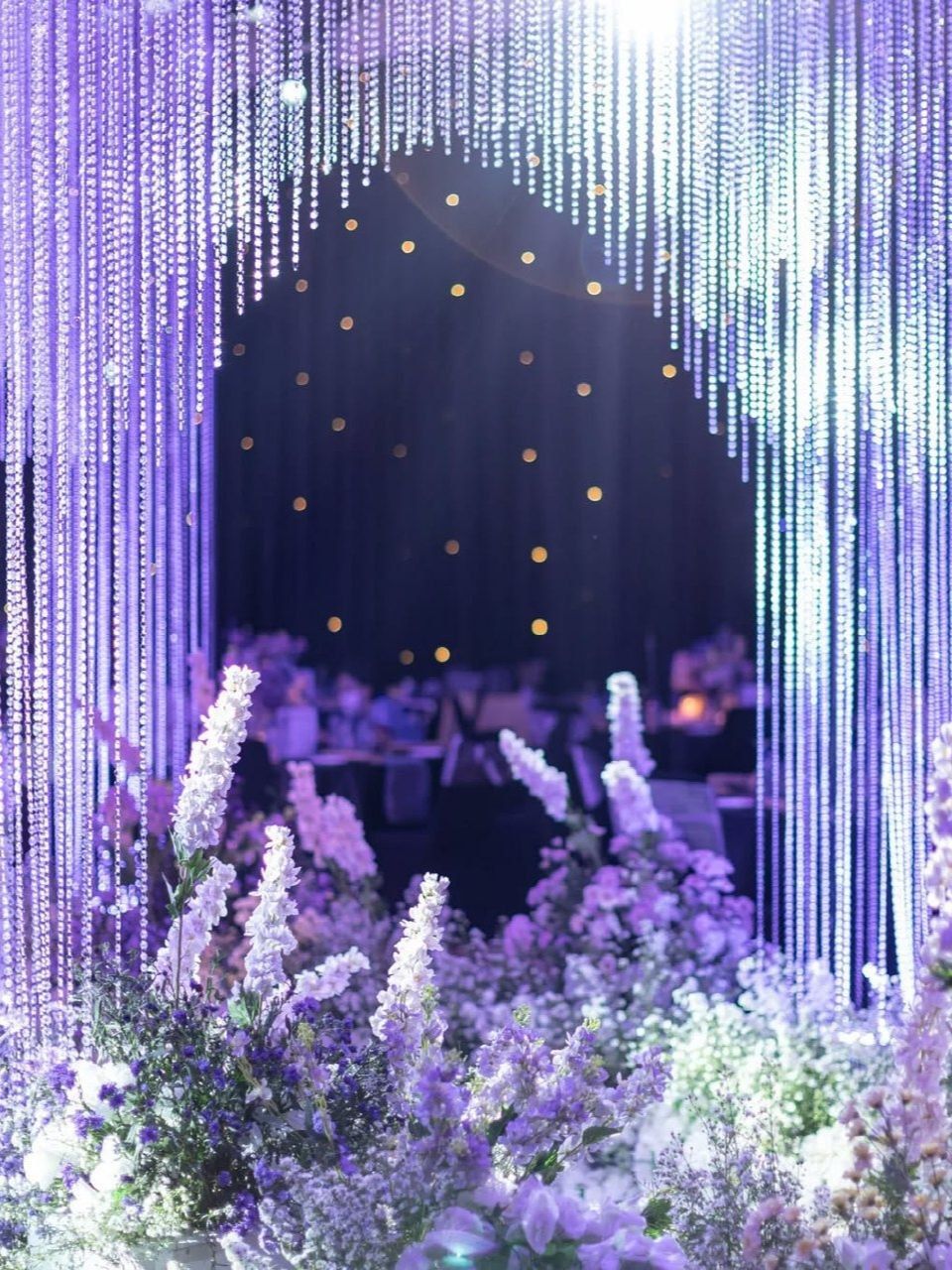
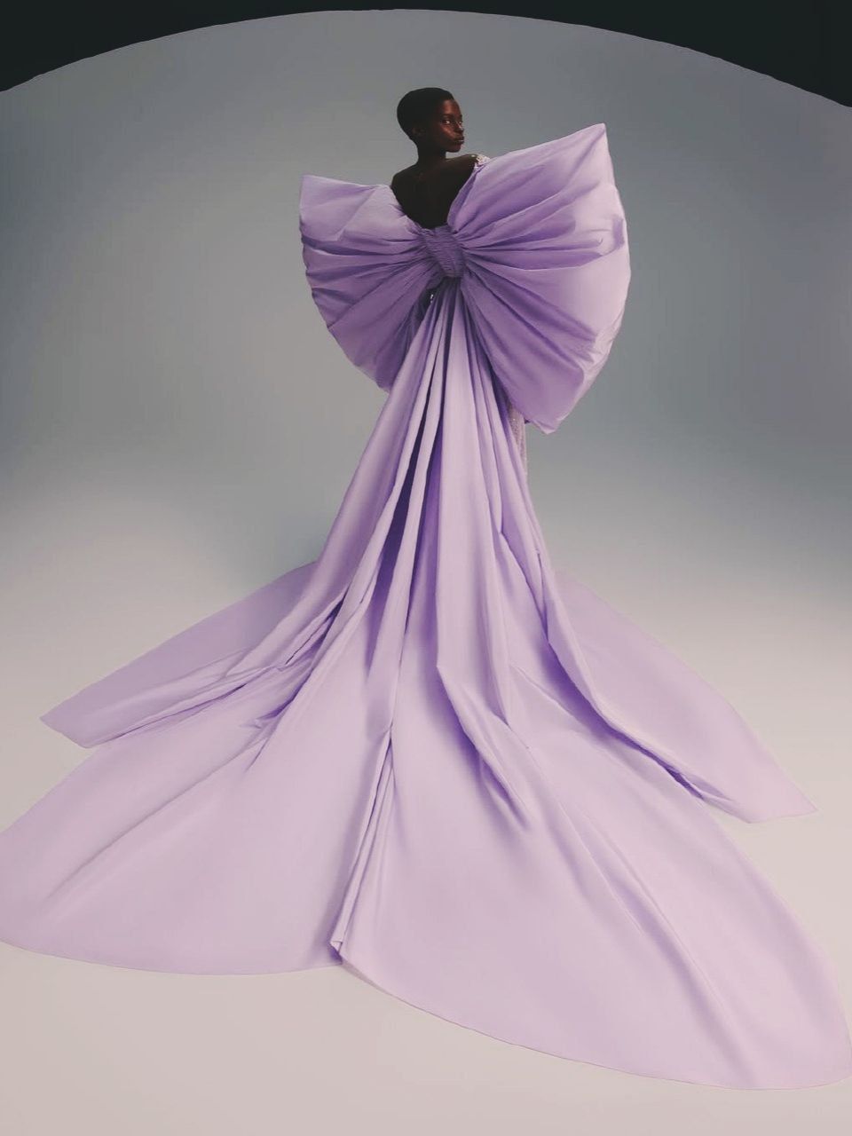
Lavender has carried romantic, slightly wistful associations for long enough that the color barely needs an introduction. However, the specific way it’s being used in current spring weddings deserves real attention. It’s a shade that photographs with genuine depth, especially in the softer light of early morning or early evening, catching just enough shadow to avoid looking flat the way some pastels can under harsh midday sun. Lavender pairs naturally with soft yellow and sage green for a combination that leans distinctly toward the pastoral, the kind of palette that feels lifted directly from an actual lavender field, not a color wheel. It also suits garden and rustic settings with real specificity, since the scent association alone- actual lavender sprigs woven through centerpieces or tucked into a boutonniere- adds a sensory layer most colors can’t offer. Couples drawn to lavender tend to want their wedding to feel gently nostalgic, romantic in a slightly old-fashioned way that doesn’t read as costume-y or overly themed.
Light Green
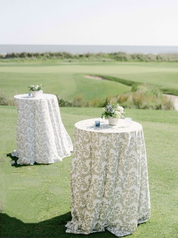
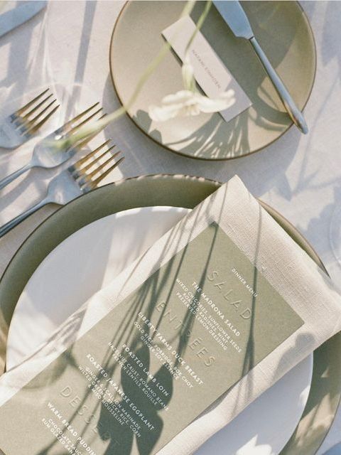
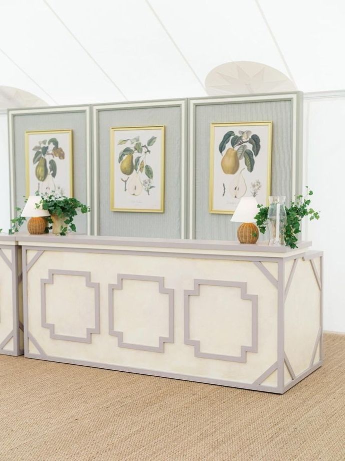
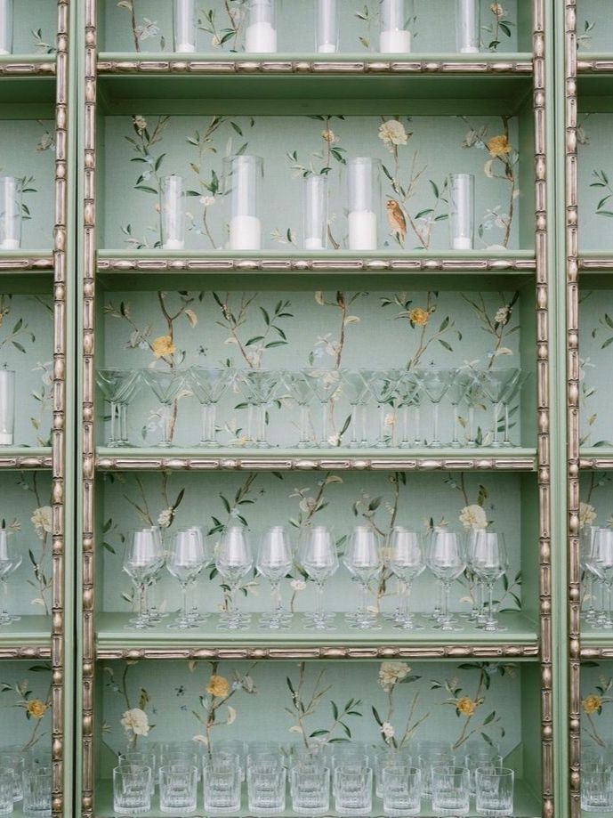
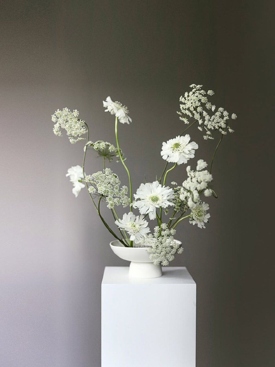
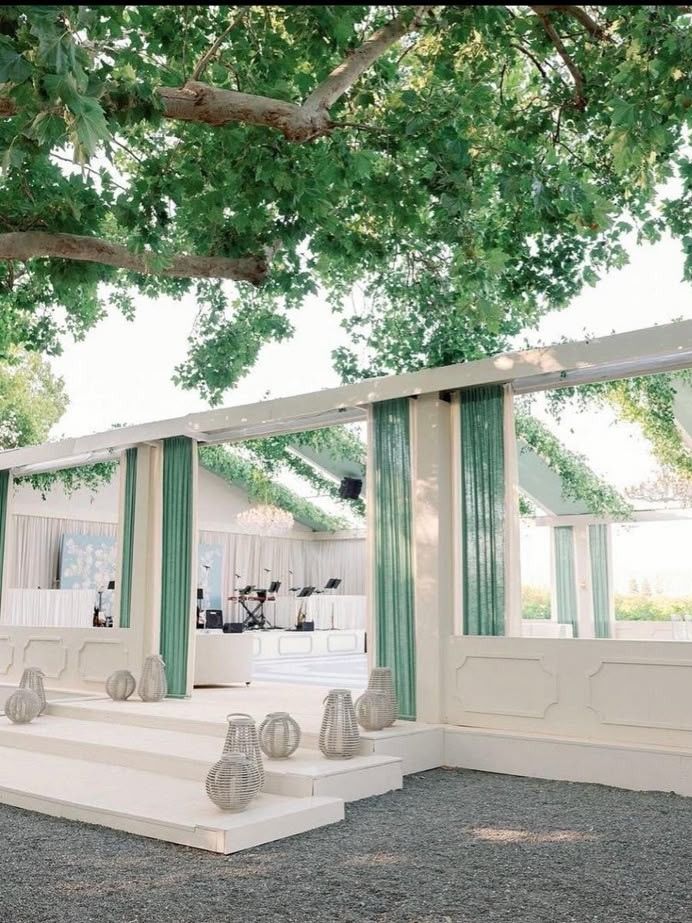
Light green has unexpectedly fresh potential and is easily underestimated, since green is usually seen as a neutral background rather than something worth basing a whole color scheme on. When used on purpose, however, light green has a youthful and revitalizing effect which clearly conveys the spirit of spring and not one that is taken from any other season. It pairs well with blush and soft yellow to create something traditionally attractive. Yet its true strength shines in eco-friendly or botanic-themed weddings, where the color doesn't just decorate the venue but mirrors the existing greenery. In a wedding that is based on real, living plants rather than just cut flowers, with potted arrangements and living centerpieces that guests can take home afterward, light green becomes less of a color choice and more an extension of the materials that are already being used.
Soft Turquoise
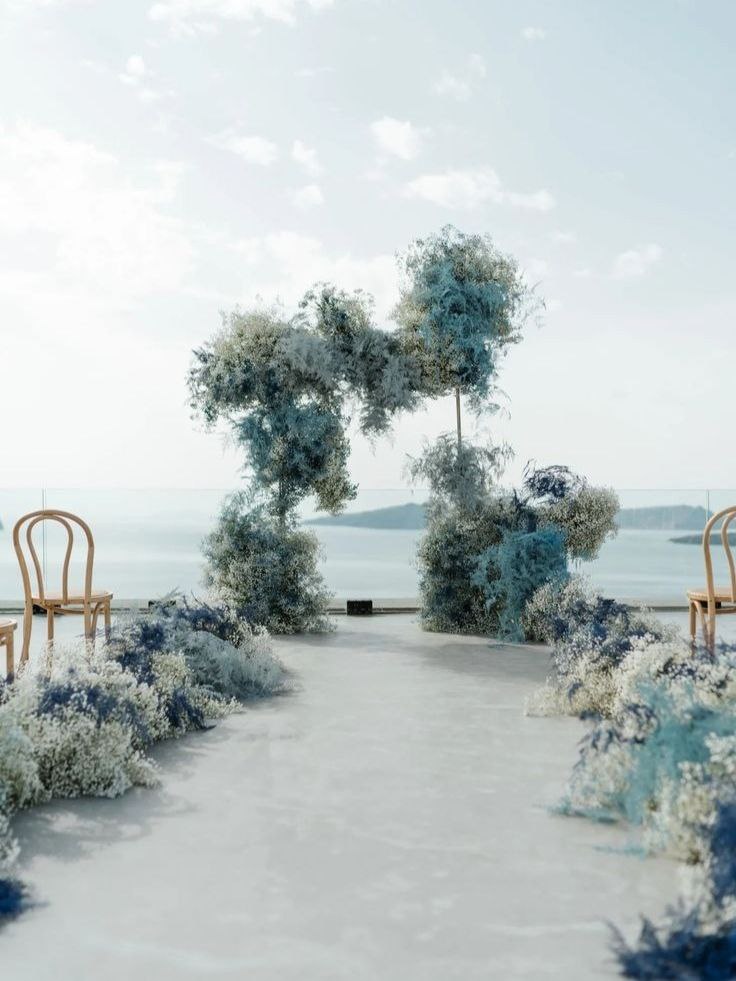
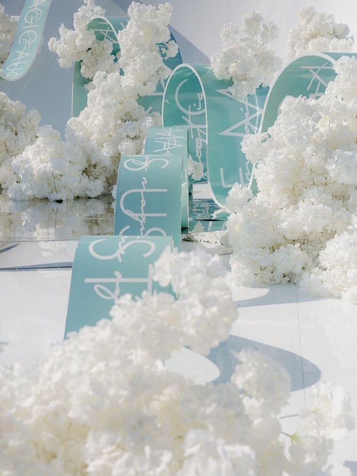
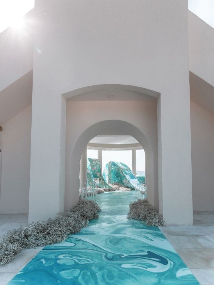
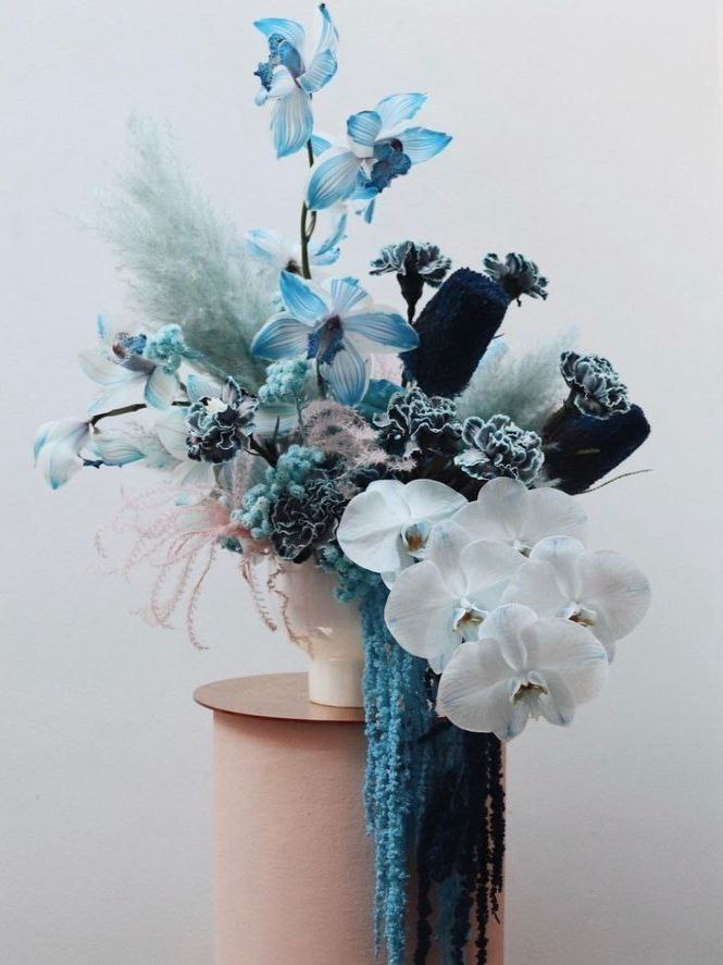
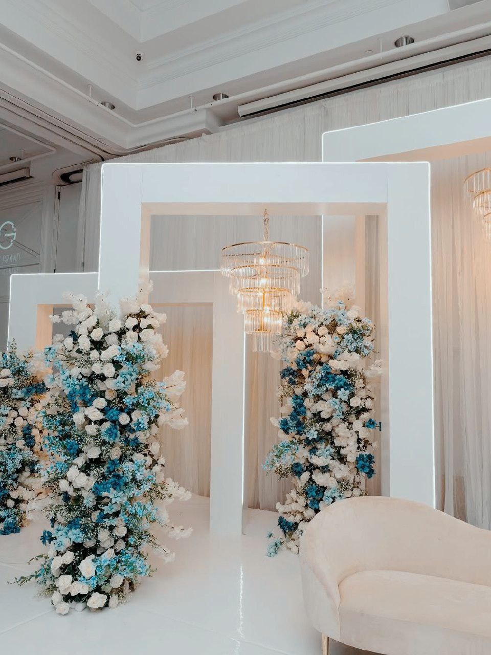
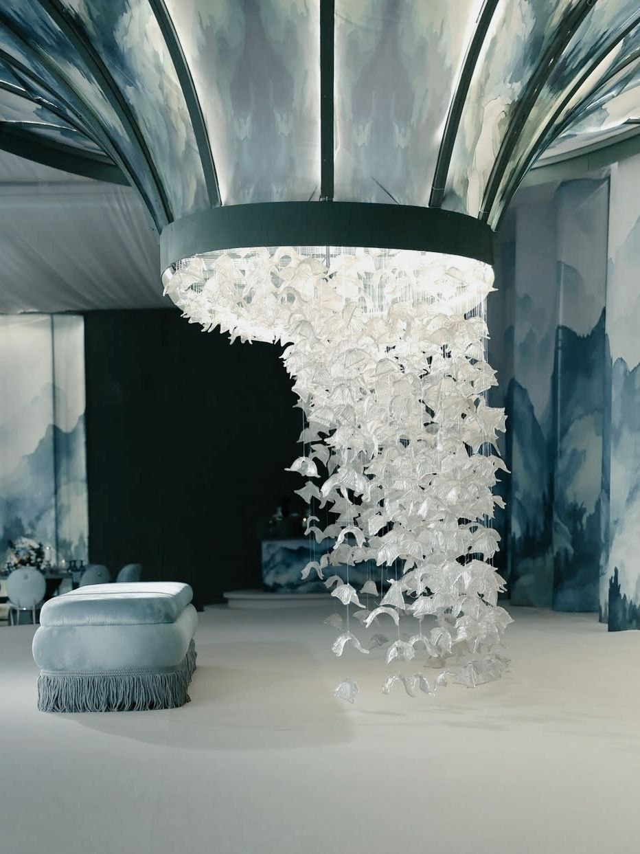
The soft turquoise introduces a certain kind of whimsy to a spring color scheme that very few other shades manage to achieve, lying somewhere between the clarity of an open sky and the particular blue-green tint of shallow water on a bright day. Because of its brightness, the color should be used lightly, since it can quickly become overwhelming if it takes too large a presence in the visual area; but when used as an accent - for example, in ribbons, in glassware, or as a single bold floral feature - it brings a real sense of personality without requiring the rest of the color scheme to compete with it. It pairs well with blush and peach to create a combination that is playful yet still elegant, and with silver touches to add sophistication that goes beyond what the color alone might suggest. It is particularly suitable for a wedding that aims to have a touch of the unexpected, since it's the kind of color scheme guests remember specifically because it wasn't another of the usual blush-and-sage weddings they saw that year.

Color Pair Combinations
Some couples never take a single color scheme seriously, and that is to be expected, since the true appeal of a spring wedding color palette at a wedding usually comes from the contrast and interaction between two colors at the same time. A good choice of two colors does more than just decorate a room; it gives guests an indication of the couple's real taste, whether that lies in soft romance, bold energy, or the kind of quiet elegance which requires a great deal of confidence to achieve. The six combinations listed below cover the full range of this spectrum, and most couples will have a clear preference for one end or the other long before they have finished reading all six.
Peach and Green
.jpg)
.jpg)
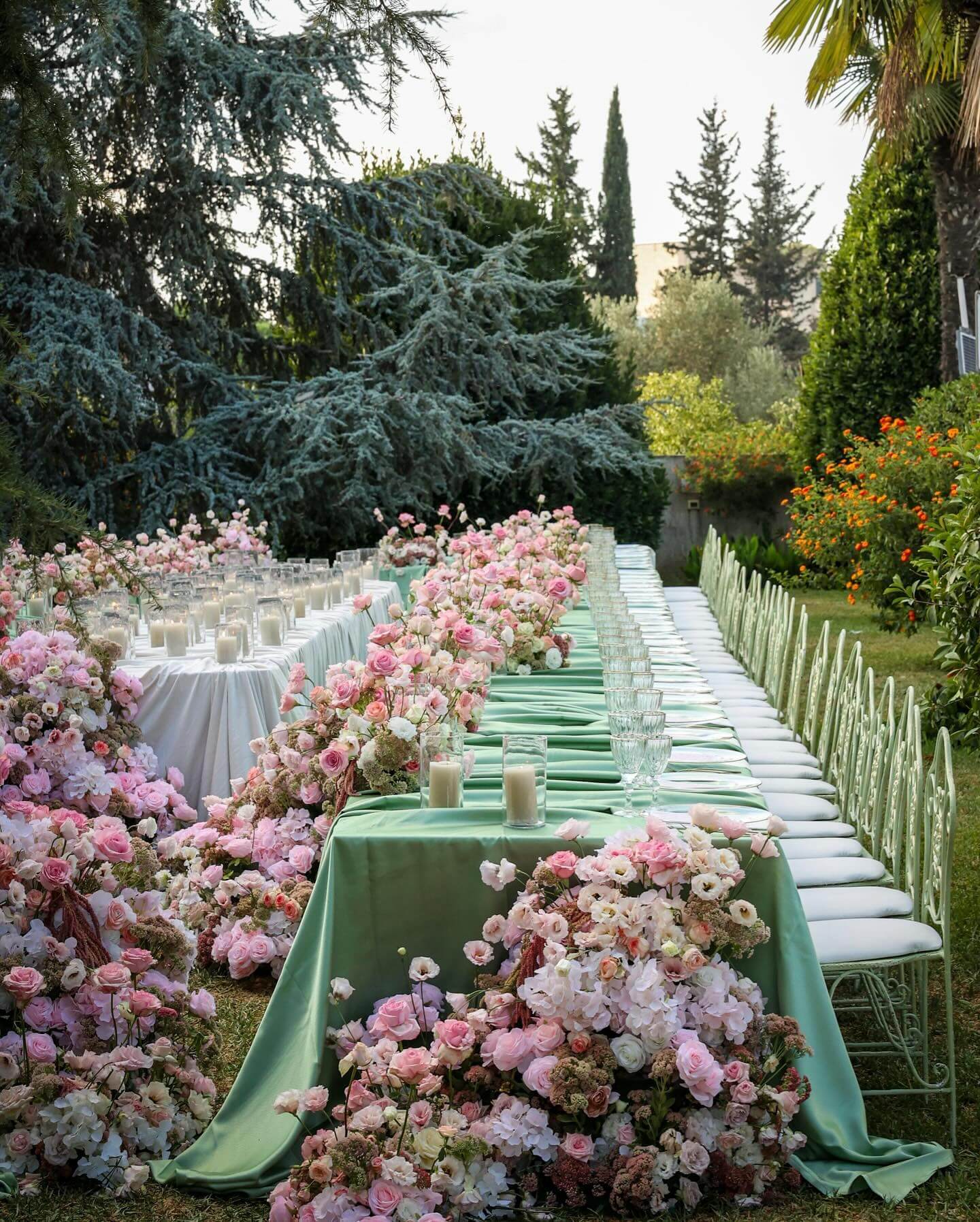
The combination of peach and green captures a particular aspect of the kind of spring wedding color palette that couples frequently aim for without being able to put their finger on it: the precise instance when warm sunlight interacts with new growth, namely the golden light that passes through fresh leaves as opposed to the more intense, bleached green of high summer. Peach adds warmth and tenderness, while green gives the color scheme a feeling of being alive rather than merely decorative, with the two colors engaging in a real conversation rather than simply contrasting. This combination works well with layered greenery, garden roses and ranunculus in a peachy tone, soft peach linens beside green table runners, and wedding stationery that includes both shades from the save-the-date to the day-of programs. When the wedding takes place at a location that already has real natural greenery present, this pairing comes across as less like a forced color scheme and more like an intensified expression of what is already growing there.
Lavender and Lilac
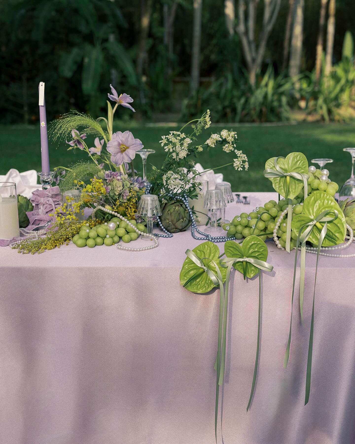
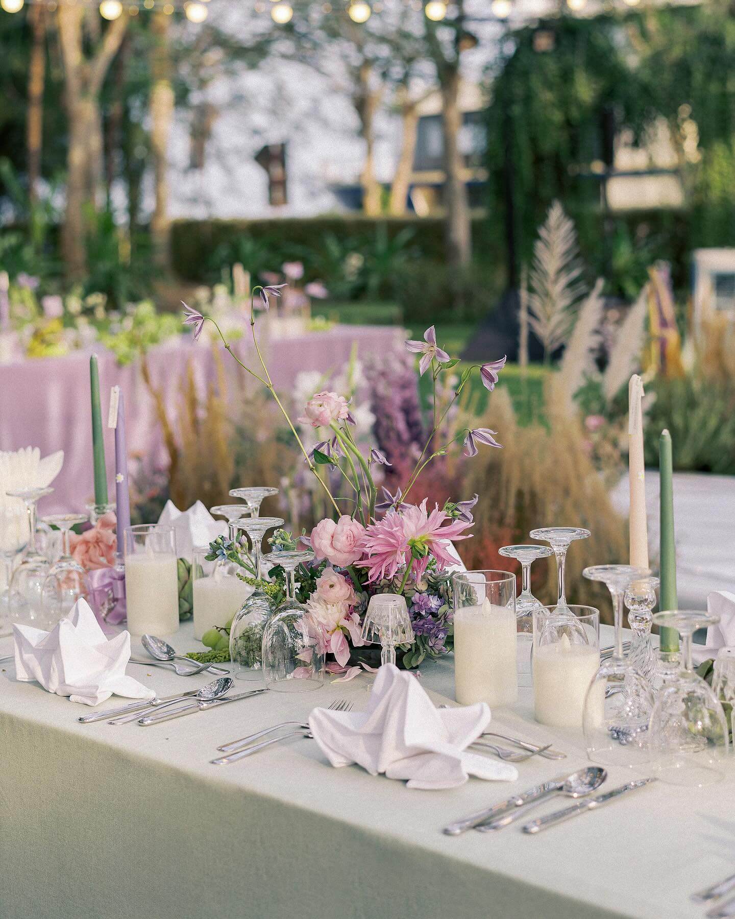
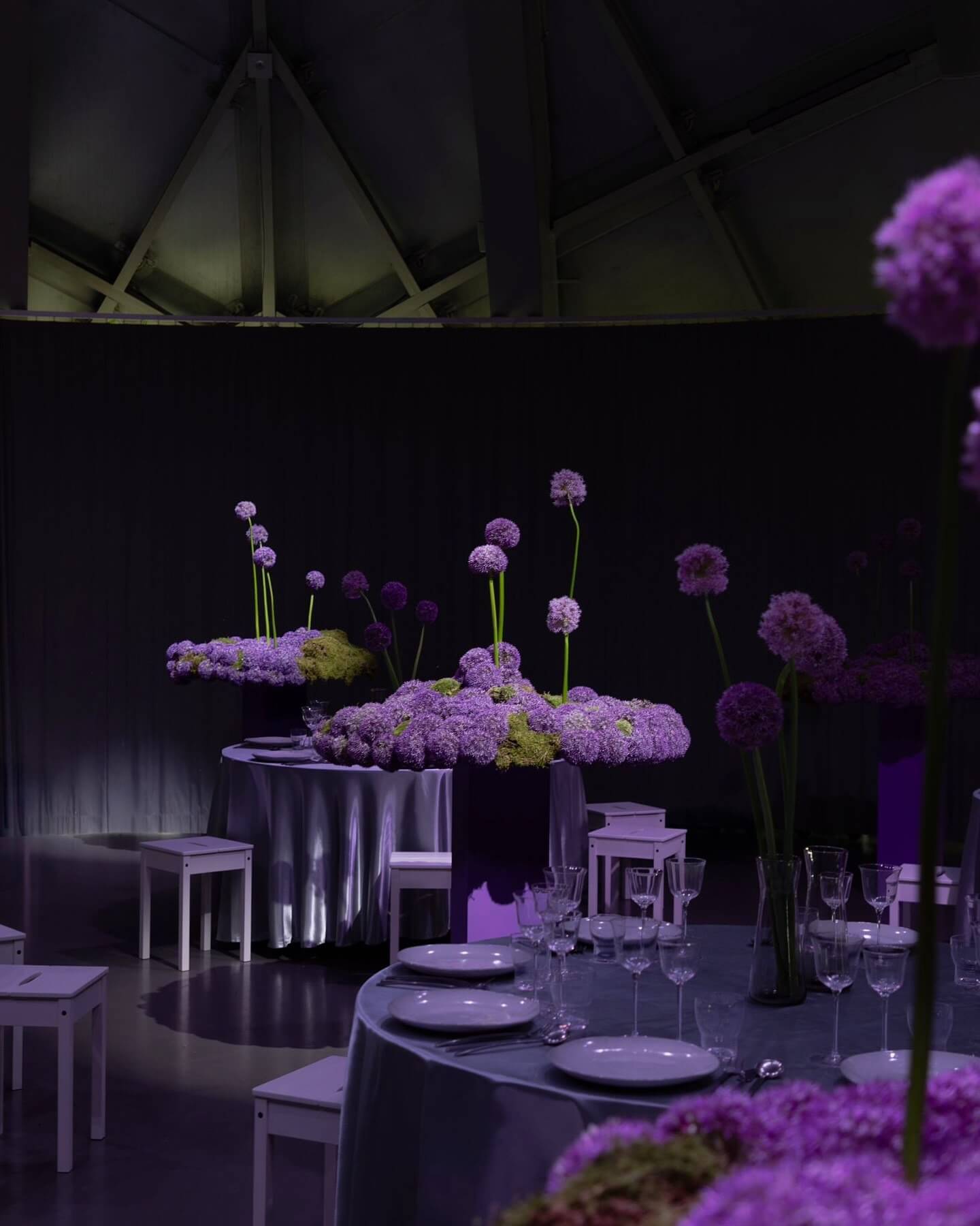
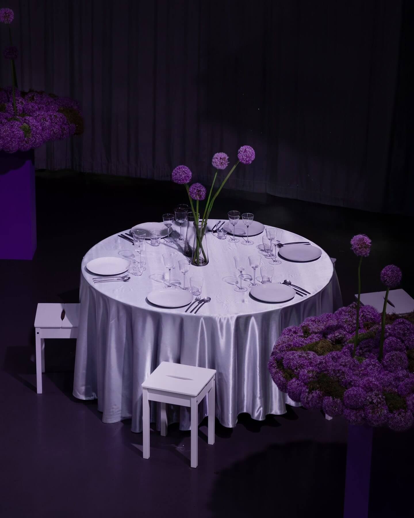
Lavender and lilac occupy such similar territory on the color wheel that pairing them together creates something closer to a tonal gradient than a true combination, and that subtlety is exactly the point. The effect lands as dreamy rather than deliberately styled, evoking an actual field in full bloom rather than a curated color palette pulled together after the fact. Actual lavender sprigs, tucked into centerpieces, boutonnieres, even a signature cocktail, add scent and texture that pure color alone can’t provide, which is where this palette rewards couples willing to lean into sensory detail rather than color alone. Balanced against ivory or soft silver, the whole look gains just enough contrast to avoid feeling flat, while staying firmly in territory that reads as elegant, romantic, and specifically suited to garden or rustic settings where the palette can echo actual growing lavender nearby.
Green and Ivory
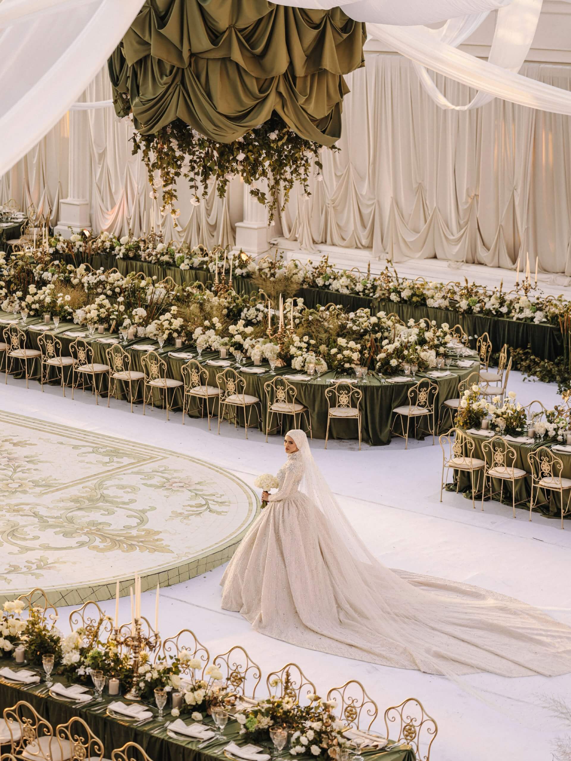
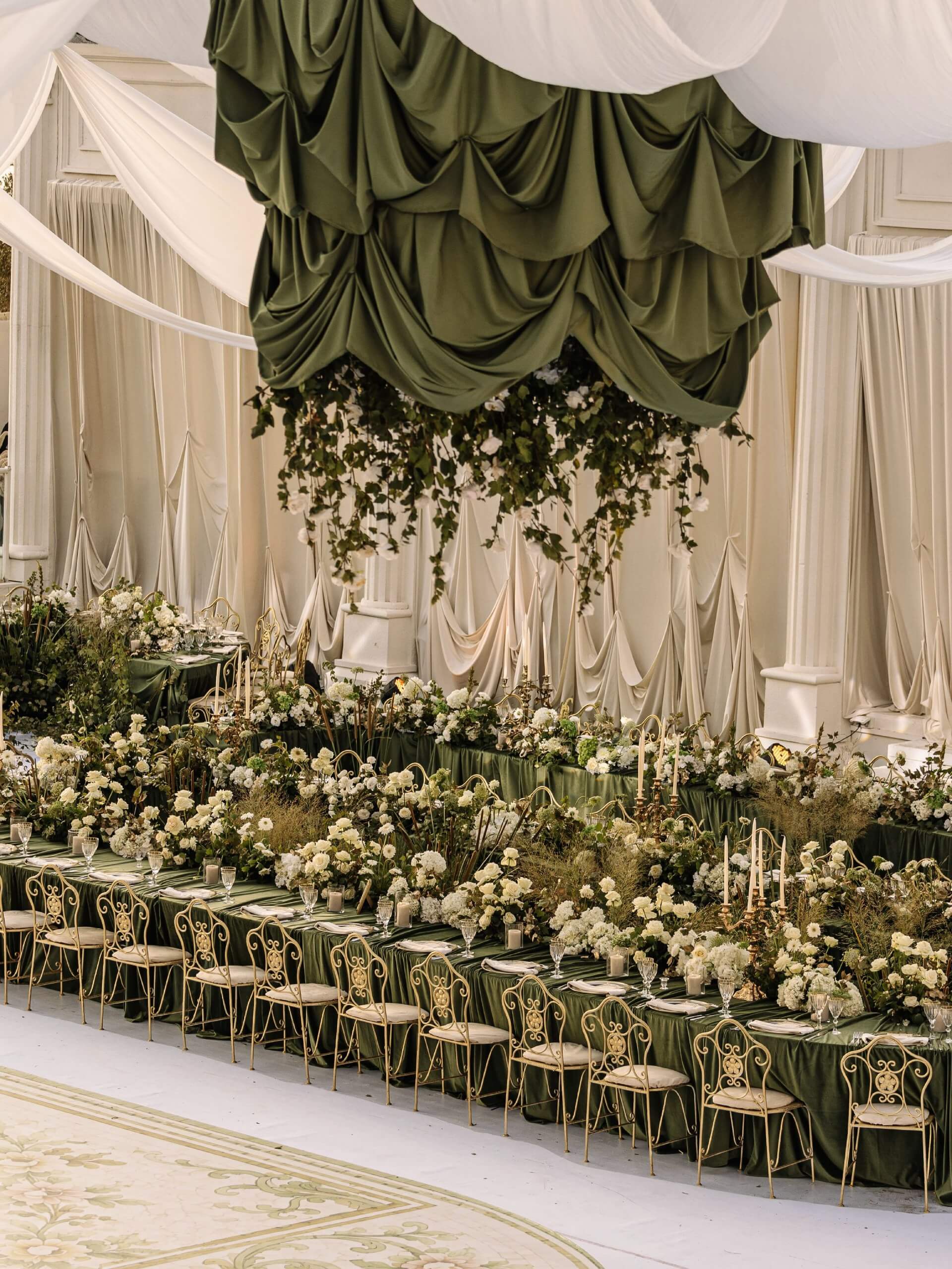
Green and ivory are an excellent example of restraint, ideal for couples who want their wedding to feel timeless rather than follow current fashions, with a focus on elegance rather than decoration. Ivory can do something very few other neutral colors can: it recedes slightly so the natural vitality of green can be the main feature, without appearing too stark or cold like pure white can in some lighting conditions. Lush greenery, flowing garlands, and potted arrangements look excellent against ivory tablecloths and soft-toned dinnerware, creating a setting that is sophisticated yet contains no single striking element throughout the room. This combination is particularly appropriate for formal spring weddings, especially those held in a truly elegant venue where the building's architecture contributes to the overall appearance and lets the color scheme complement rather than compete.
Green and Yellow
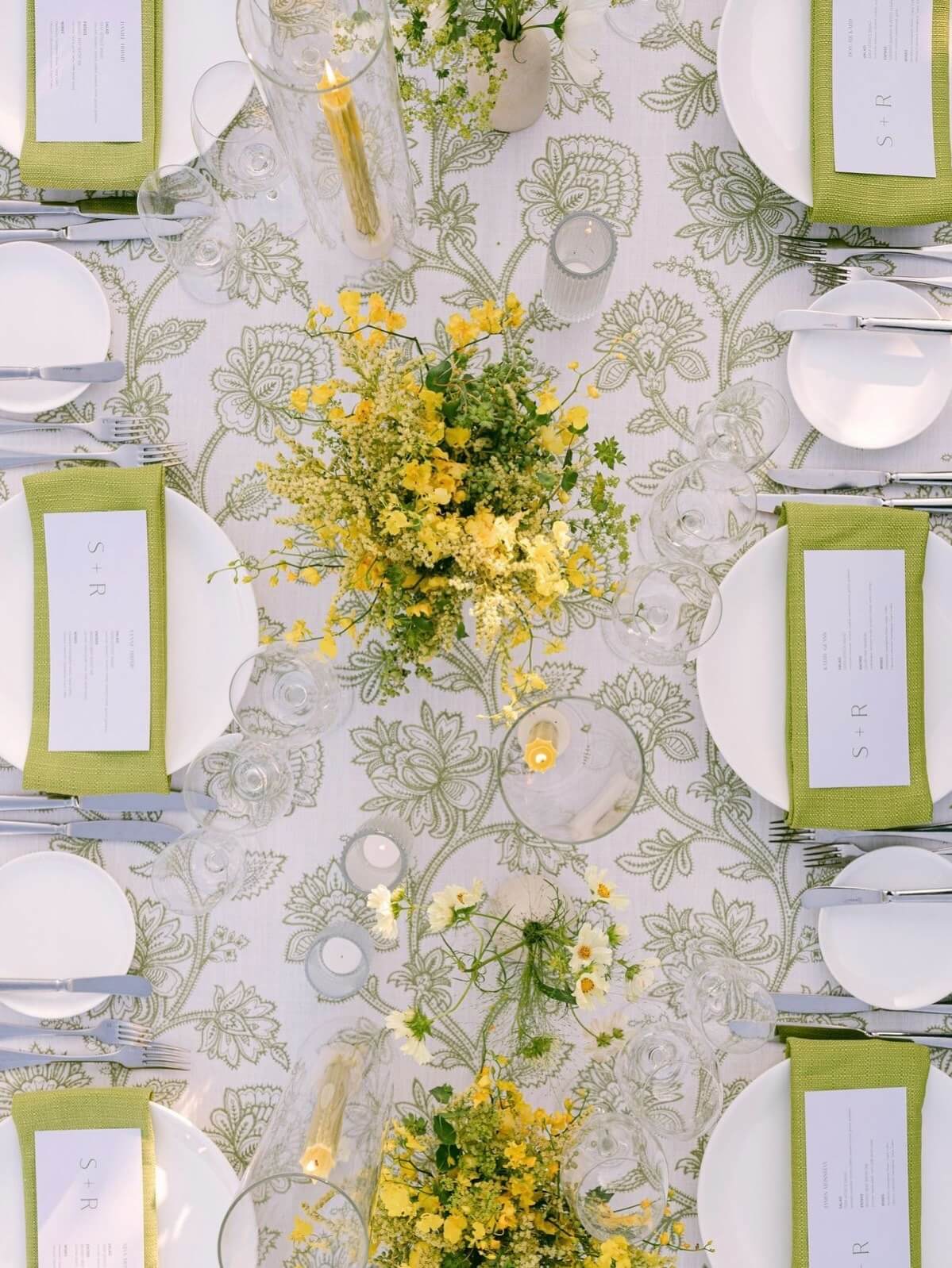
.jpg)
The combination of green and yellow produces a pure and simple kind of brightness, one that appears optimistic in a manner that very few other color pairings achieve without becoming overly sweet. The energy in this combination comes from contrast rather than harmony, since the warmth of yellow is directly opposed to the coolness of green, which keeps the entire color scheme vibrant rather than dull. Sunflowers, daffodils, and tulips work especially well with this combination in floral arrangements, and table setups featuring crisp green linen with yellow touches create a look that turns out genuinely cheerful in daylight photos. People attracted to this color pairing are generally putting together a wedding celebration focused on joy and energy rather than quiet elegance, resulting in a wedding where guests end up talking about how much fun the entire day was rather than how tasteful it was.
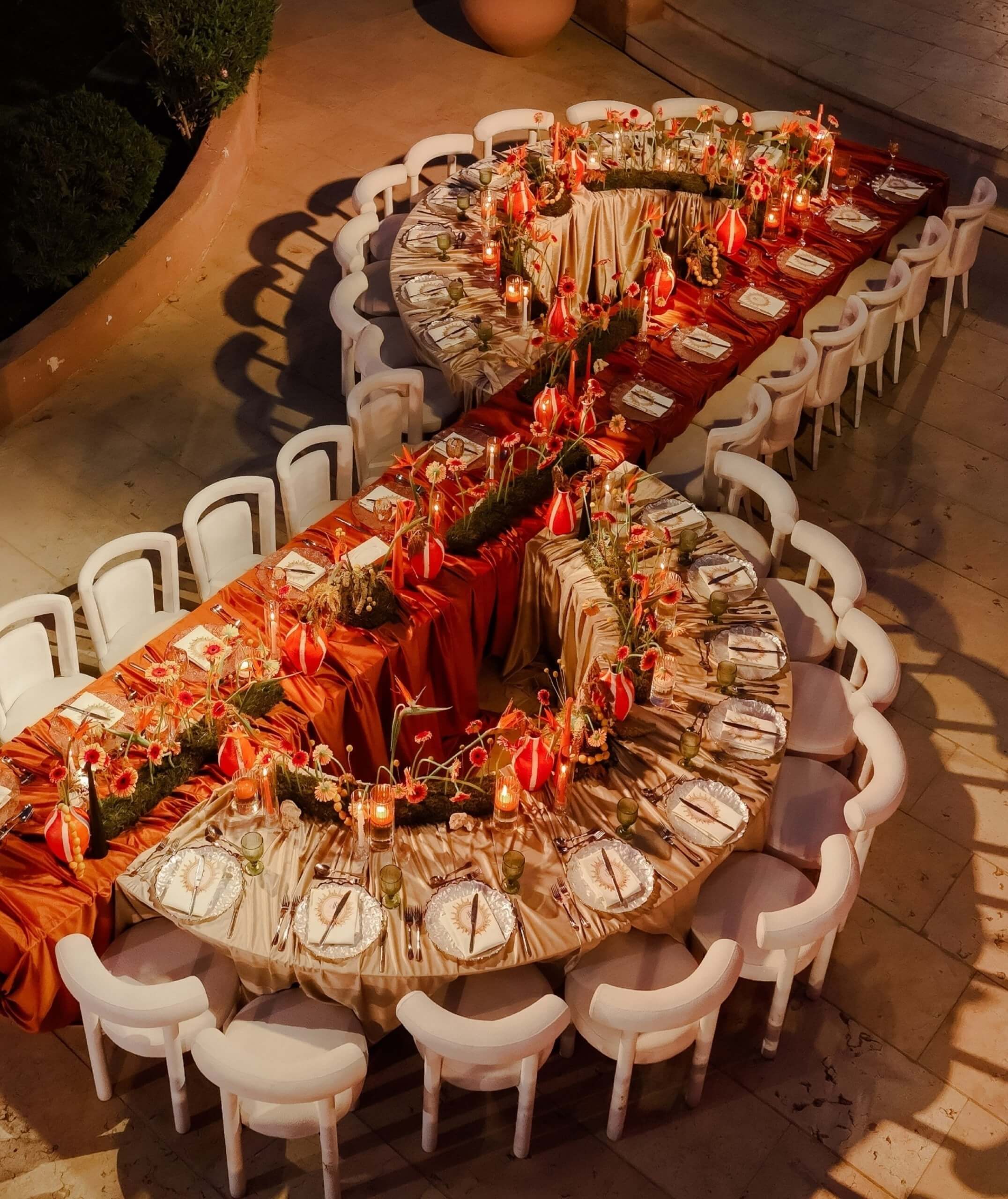
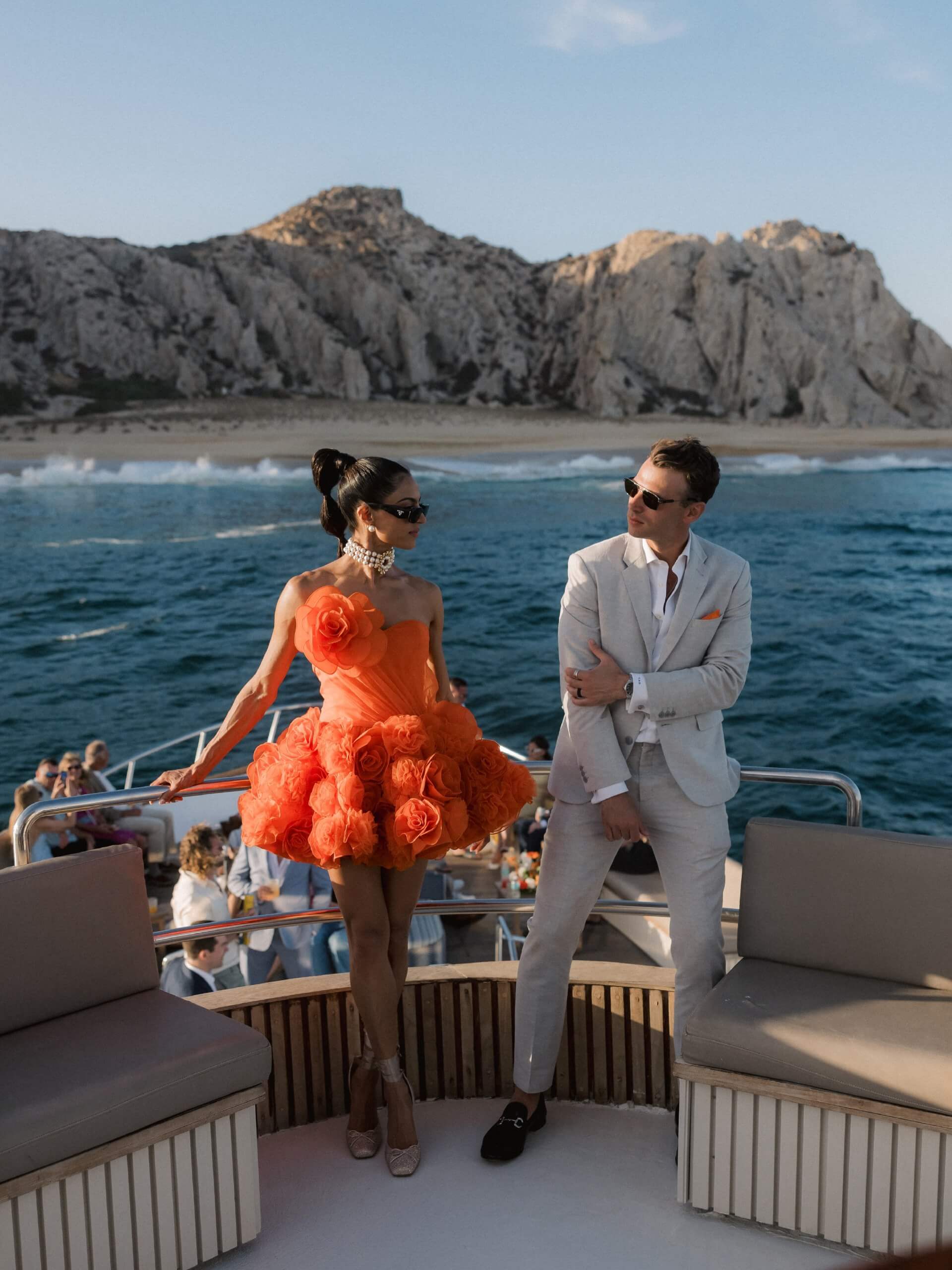
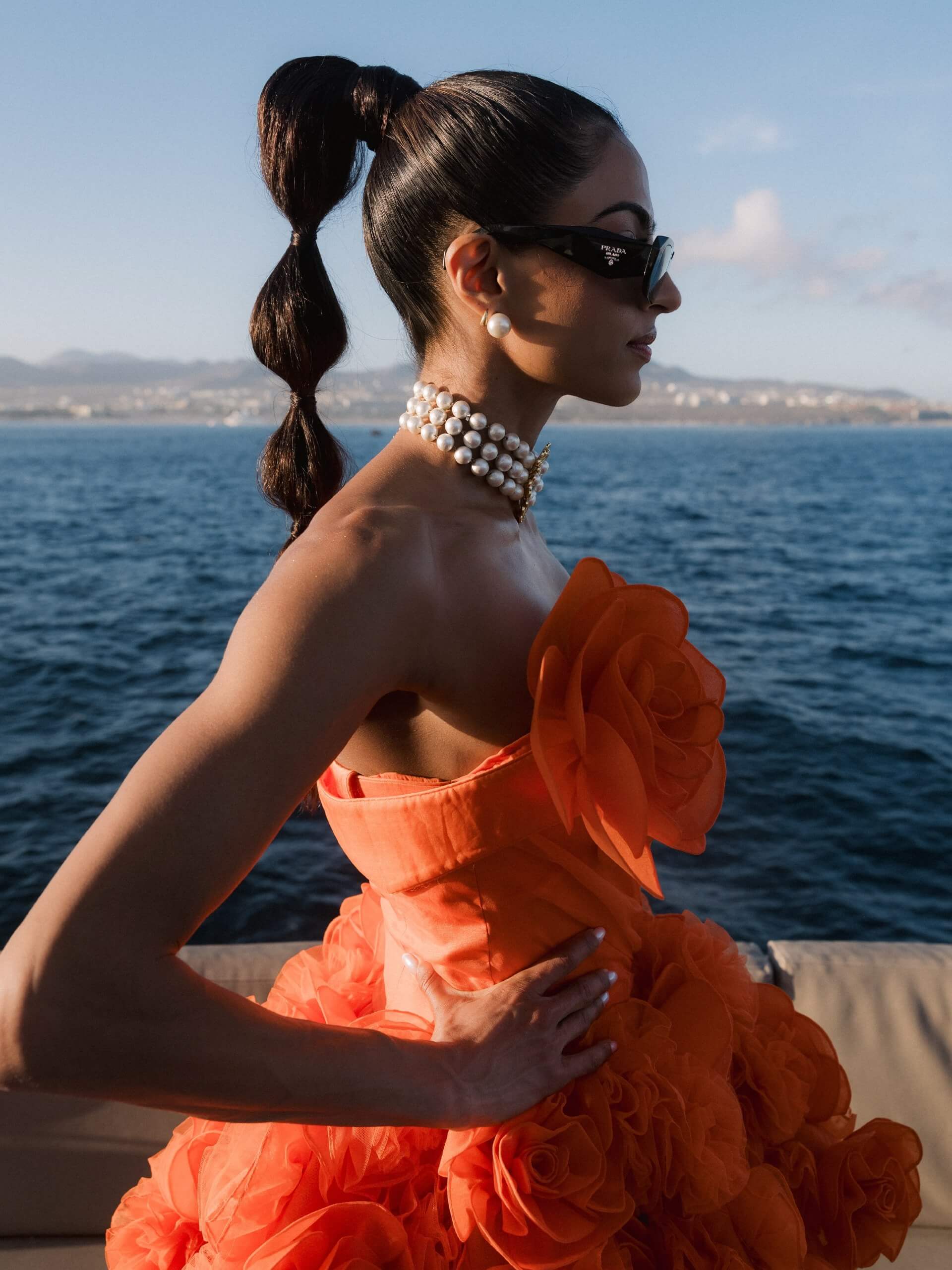
Pink and Orange
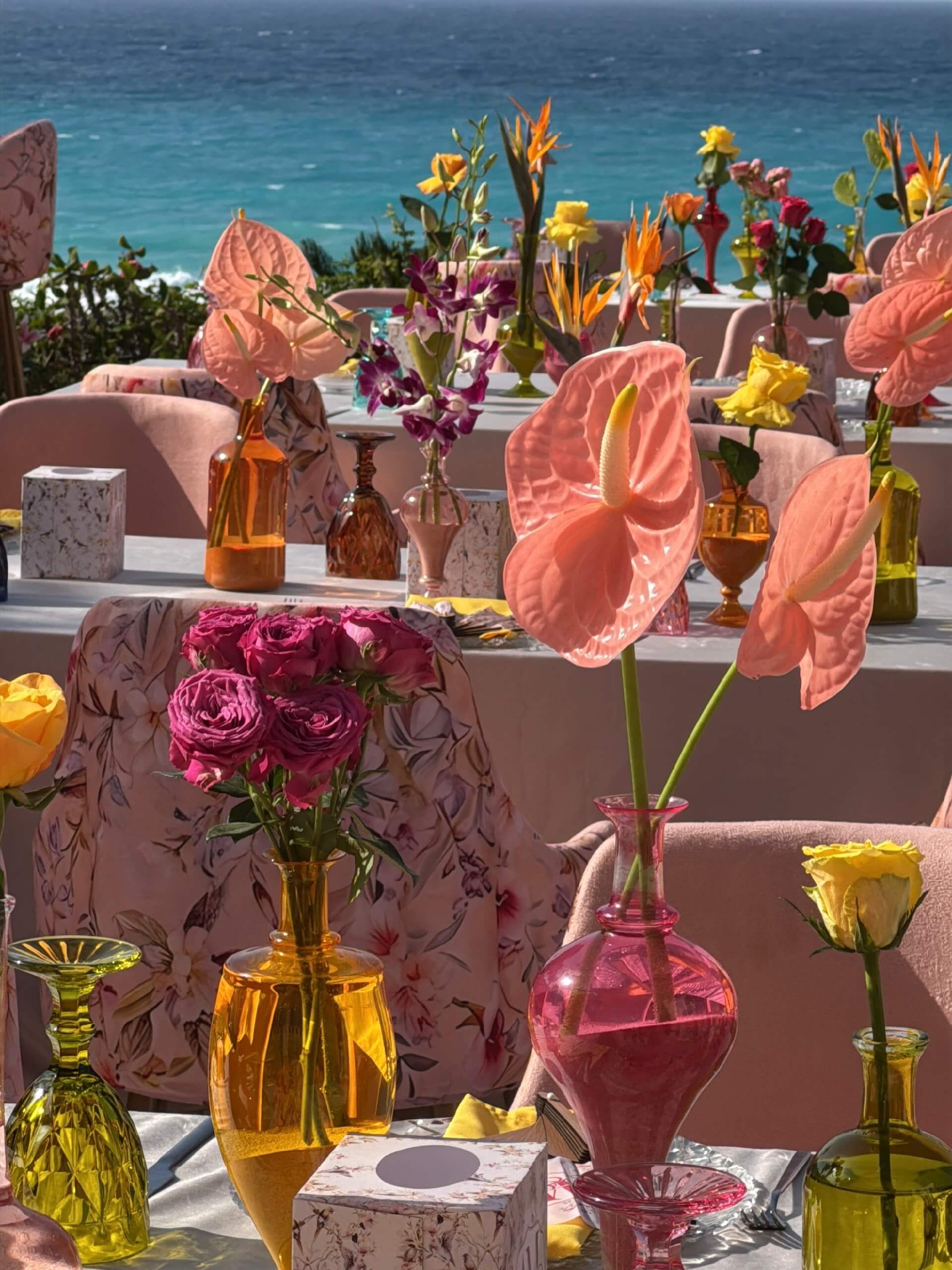
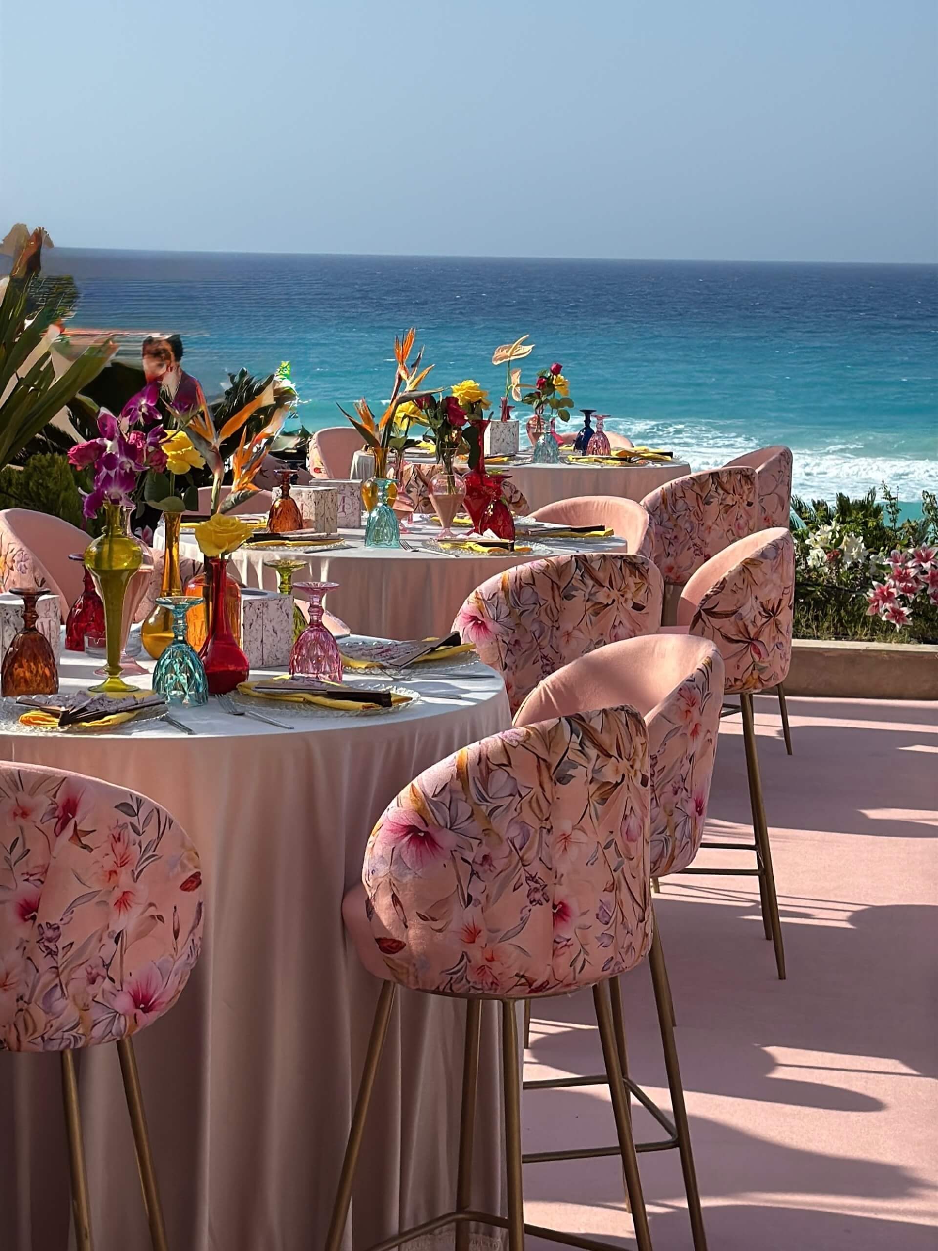
Pink and orange together are probably the most daring option on the whole list. This boldness attracts couples who want their wedding remembered above all because it looked unlike any other during that season. True warmth and confidence come when both colors are used at full strength, rather than softened into pastels like poppies and marigolds or anything subdued. Only by committing fully, rather than opting for something safer, does this color scheme work, ensuring the same vibrant, glowing energy is reflected in the flowers, the tablecloths, and the lighting design, rather than a cool, neutral tone. This is not a subtle palette, and it doesn't feign to be one; it is appropriate for couples who are confident enough to want their wedding photographs to feel clearly and specifically their own.
How to Choose Your Spring Wedding Color Palette
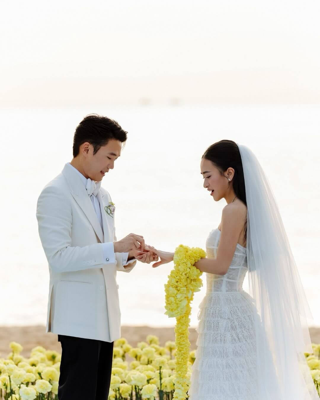
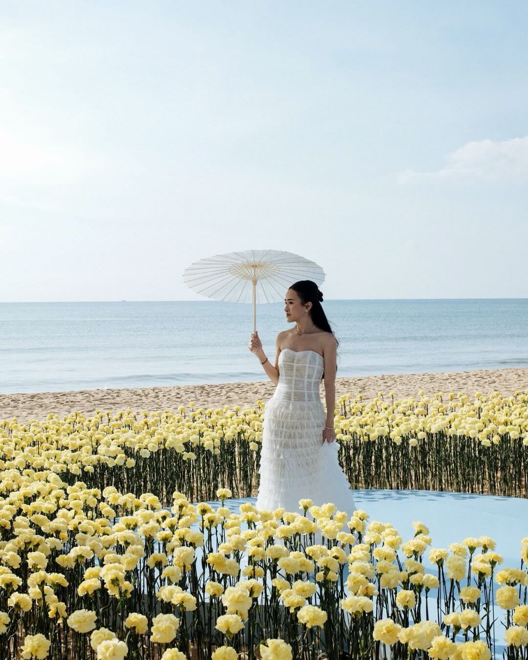
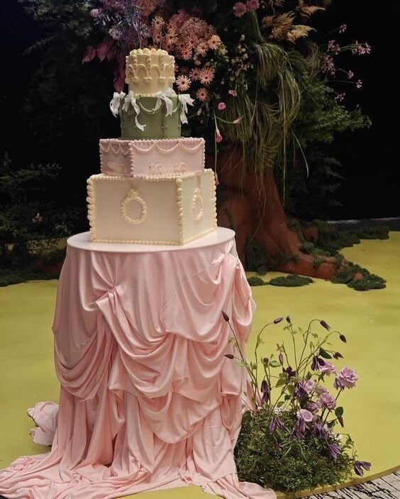
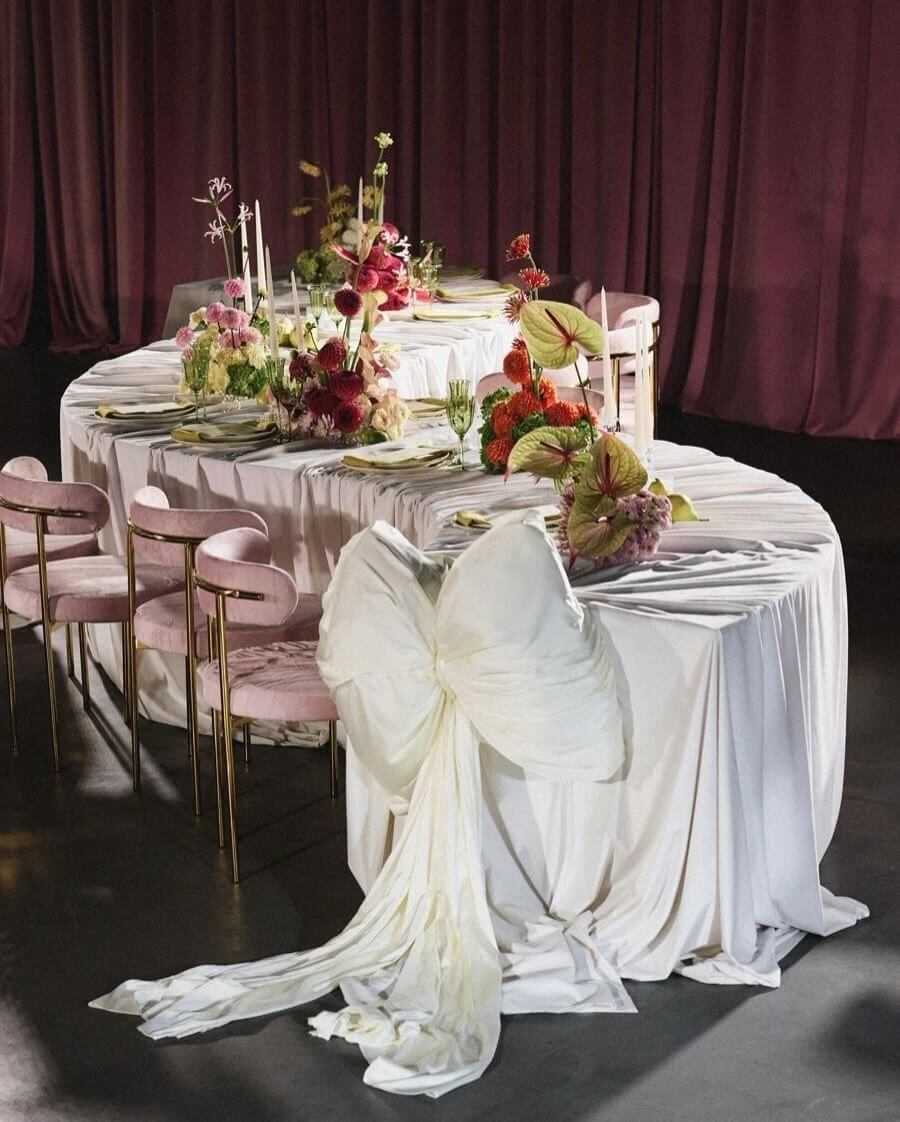
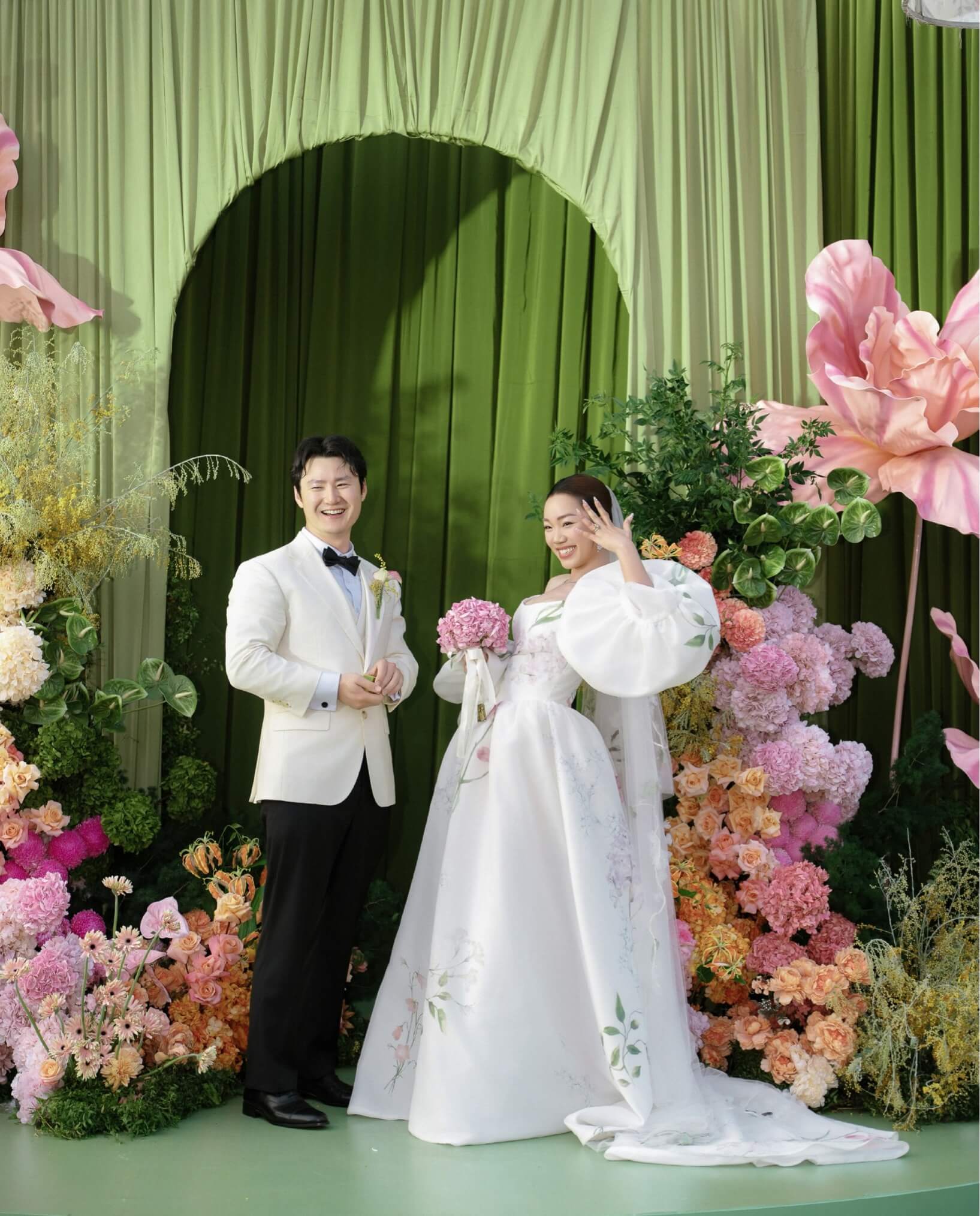
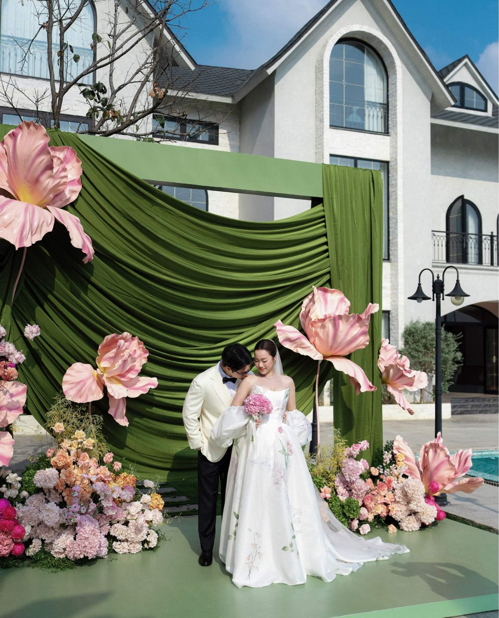
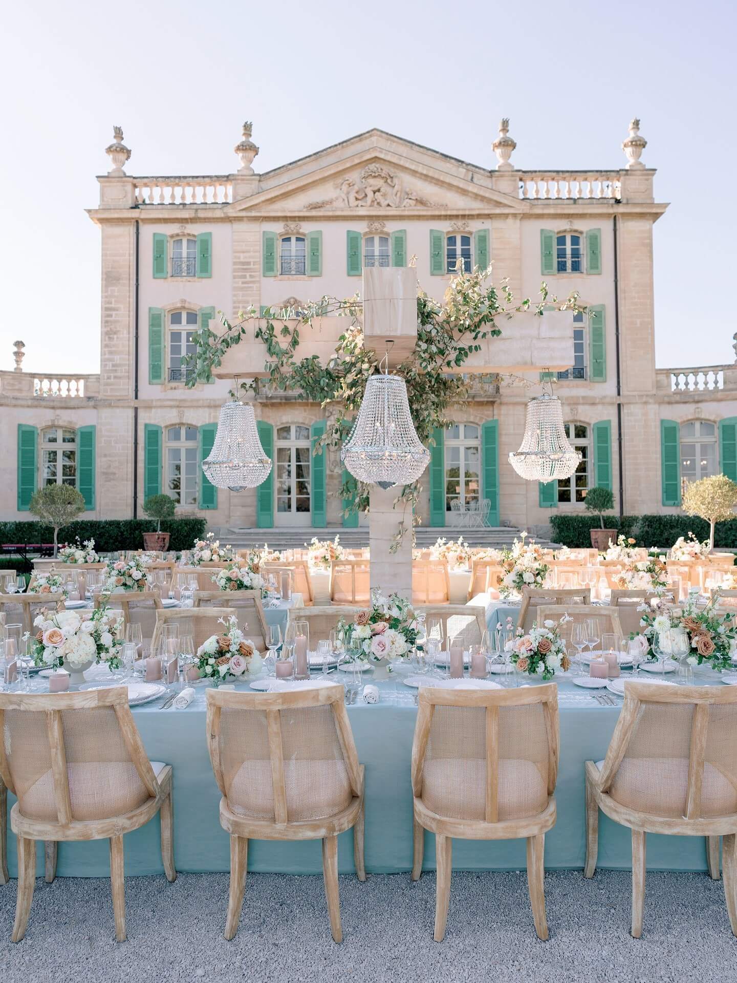
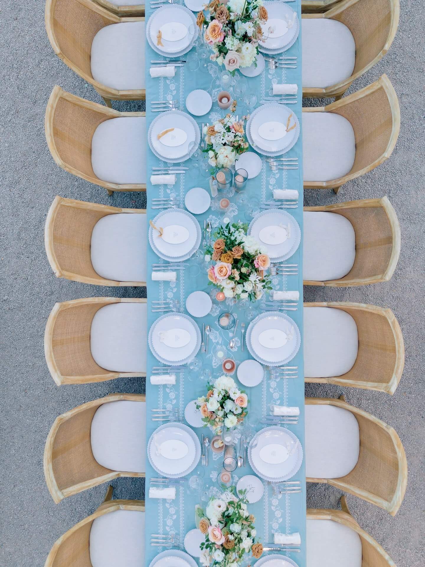
With thirteen strong directions on the table, the real work isn't merely about selecting a pastel spring wedding color palette that you personally like on your own; it's about deciding which one really suits the wedding that is taking shape. Although personal preference must still be the main factor, a few considerations matter more than preference alone. The time of year within the season has a greater influence than most couples at first realize: in early spring the cooler light left over from winter still prevails, that is suitable for deeper, richer pastels such as lavender or seafoam, whereas in late spring the warmer, more golden light means that brighter combinations like pink and orange or green and yellow appear as vibrant as they are intended to. Just as much as the architecture of the venue does when it comes to any spring theme wedding color palette, a scheme based on soft neutrals and greenery blends in beautifully with a naturally attractive setting, such as a garden or a vineyard, in any place where the location is already carrying out visual work, while a bolder combination can truly turn a plain, more neutral venue into one with its own real character.
Early signals already point to what the spring wedding color palette 2027 will likely look like, and the direction splits fairly cleanly along these same lines: quieter, more tonal pairings for outdoor and destination settings where the natural surroundings deserve to lead, bolder contrasts for indoor receptions and formal venues that benefit from a palette doing more of the visual heavy lifting itself.
| Best Wedding Style | Best Timing | |
|---|---|---|
| Peach, Blush Pink | Classic, garden, romantic | Early to mid spring |
| Lavender, Lavender & Lilac | Rustic, garden, vintage-inspired | Early spring |
| Soft Yellow, Green & Yellow | Outdoor, casual, joyful | Mid to late spring |
| Seafoam Green, Soft Turquoise | Coastal, whimsical | Mid spring |
| Green & Ivory | Formal, elegant, timeless | Any point in the season |
| Peach & Coral, Pink & Orange | Bold, celebratory, evening-leaning | Late spring |
These pairings are not strict rules but a starting point that helps reduce a long list of possibilities to something more manageable. A couple getting married in early May and planning a garden ceremony could find themselves settling on two or three entries in this table at the same time. It is precisely in this area of overlap that the most personal color combinations tend to appear, somewhere between what the guide recommends and what actually seems right when the swatches are placed next to one another in real light.
Where to Use Your Palette Throughout the Day
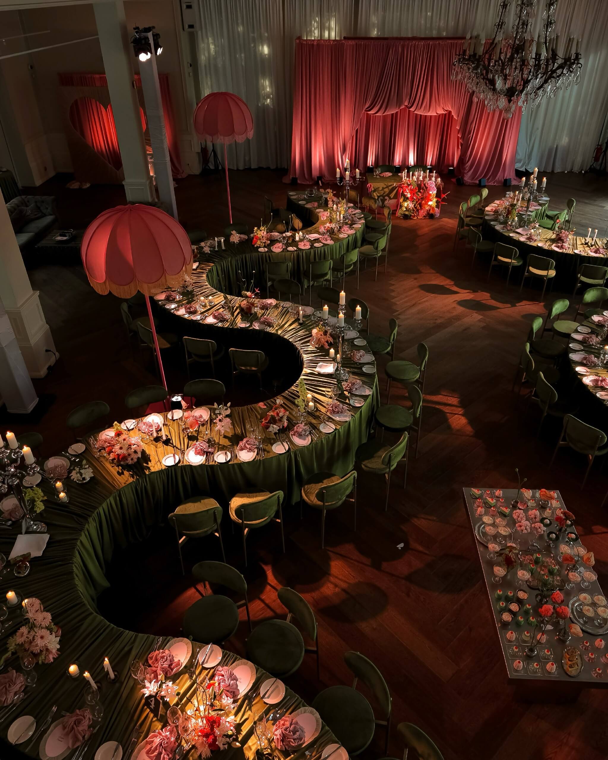
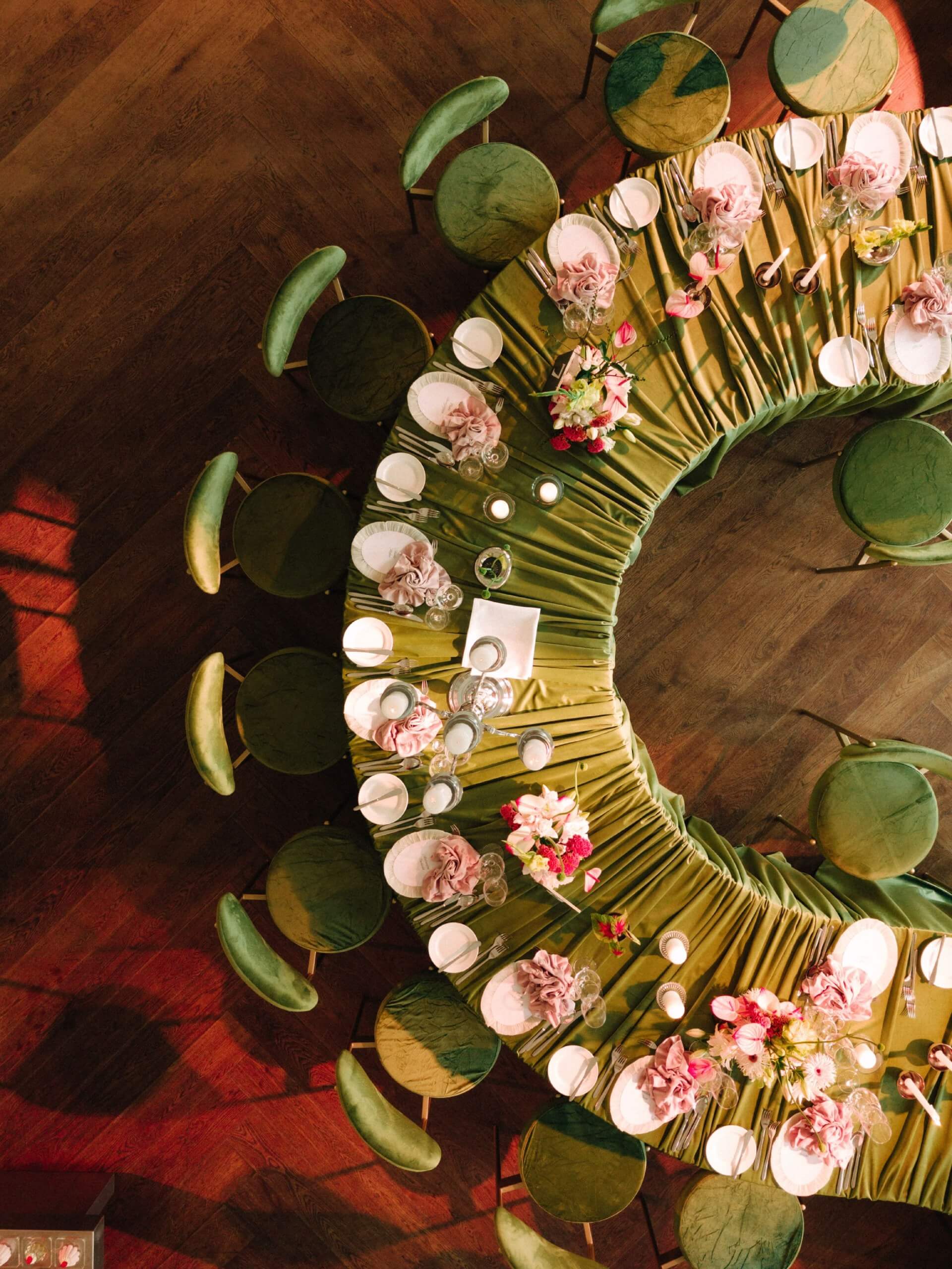
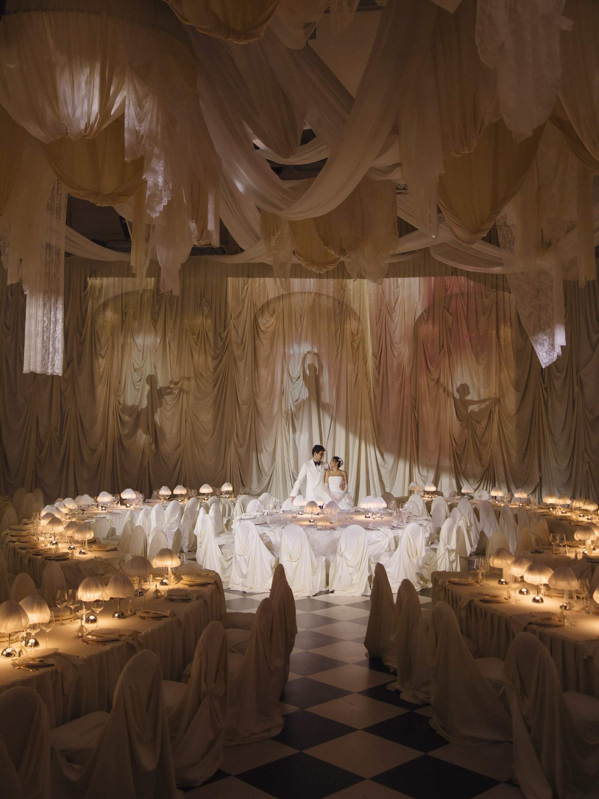
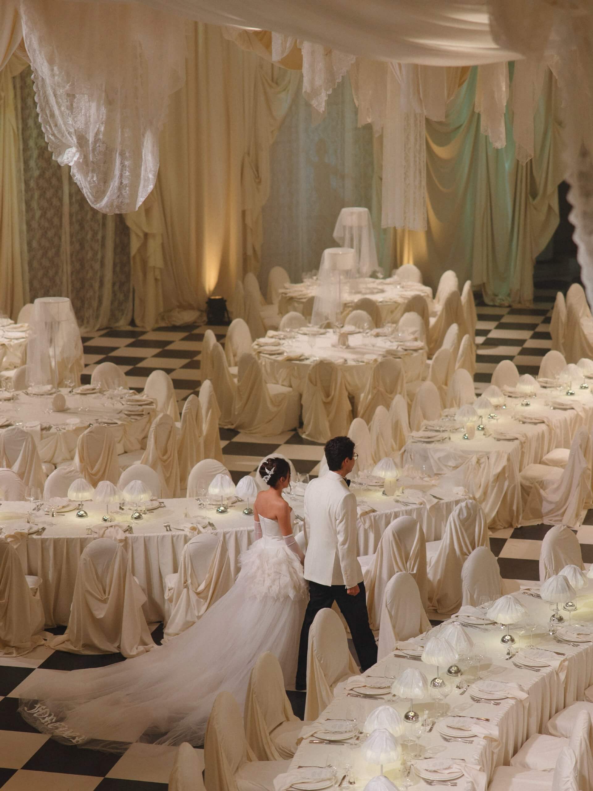
A color palette only earns its keep when it shows up consistently throughout the day, rather than living exclusively in the florals while everything else defaults to generic white and gold. The strongest spring weddings weave their chosen colors through nearly every visible decision, creating a sense of cohesion that guests register even when they couldn’t necessarily name why the day felt so put-together.
- Floral arrangements - the most obvious application, but worth choosing seasonal blooms specifically; peonies, ranunculus, tulips, and garden roses all carry spring pastels particularly well
- Table linens and dinnerware - soft-colored tablecloths, tinted glassware, and coordinating napkins do more to set the room’s tone than most couples initially budget for
- Wedding stationery - save-the-dates, invitations, and day-of programs carry the palette into guests’ hands before the wedding even begins, setting expectations early
- Bridal party attire - bridesmaid dresses and groomsmen accents, ties, pocket squares, boutonnieres, extend the palette into the people themselves, not just the decor around them
- Cake and desserts - a cake finished in a tone from the palette, or a dessert table styled around it, turns even the sweets into part of the visual story
- Lighting design - candlelight, uplighting, and string lights in warm or cool tones depending on the palette can shift the entire mood of a reception once the sun goes down
Getting the palette into even three or four of these categories, rather than obsessing over all six perfectly, creates a more natural, less overproduced feeling than couples expect going in. The goal was never to color-match every single object in the room; it’s to build enough visual repetition that guests register the palette without ever consciously noticing the effort behind it.
There’s no single correct spring color wedding palette waiting to be discovered, only the one that actually feels like the wedding you’re building rather than a trend borrowed wholesale from someone else’s. Whether that means committing fully to one soft, confident shade or building an entire mood around two colors in genuine conversation with each other, the season itself has already done most of the hard work, offering more usable light and more naturally beautiful color than almost any other time of year. Wezoree’s inspiration section offers considerably more seasonal styling guidance beyond this guide, plus florals, décor trends, and real wedding features for anyone still shaping what the rest of the day should look like.

FAQ
What are the best colors for a spring wedding?
Soft pastel colors such as peach, blush pink, and lavender are still the most frequently requested spring wedding color scheme ideas, mainly because they look excellent in the season's naturally warm, mild light. Bolder combinations - for example, pink and orange or green and yellow - have also become popular among couples who want something more vibrant and celebratory.
Can I mix pastel colors with bolder tones for a spring wedding?
Many of the most memorable spring wedding color combos do exactly that, pairing a soft pastel as a base and adding one or two more saturated accent colors for depth. The key is to choose one main color scheme as the primary tone, then add bolder shades as accents rather than giving all colors the same visual importance.
What’s the difference between early spring and late spring wedding colors?
In early spring, cooler and deeper pastels such as lavender and seafoam green are favored since the light of that season still has some of the softness of winter; by late spring, the light has become warmer and more golden, and it is then that bolder, more saturated combinations such as peach and coral or pink and orange really shine.
Are pastel colors only appropriate for garden or outdoor spring weddings?
Not at all. Pastels also work well in formal indoor venues, especially when paired with refined neutrals such as ivory or soft gold rather than used on their own. Rustic spring wedding color schemes, which are based on sage, lavender, and warm neutrals, translate just as easily to a barn setting as they do to a garden wedding.
How do I choose between a single color and a color pairing for my wedding?
A single, well-chosen pastel usually suits a quieter, more cohesive look where the venue and details carry equal visual weight. A pairing works better for couples who want more visual contrast and energy, or who are decorating a venue that needs a bit more personality built in through spring wedding color palettes.
What flowers work best with spring wedding color palettes?
Peonies, ranunculus, tulips, and garden roses all carry spring pastels particularly well, offering the soft, layered petal texture that photographs beautifully against most of the palettes covered here. For bolder combinations like pink and orange, poppies, dahlias, and marigolds hold up better, since they carry the saturation those pairings actually call for.