2027 Wedding Color Trends


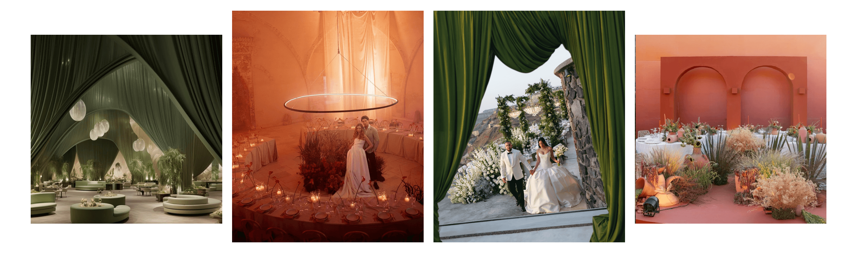
The need for palettes to "match" has quietly faded, and this shift is shaping 2027 wedding color trends more than anything else. Instead of perfectly coordinated schemes, couples are now combining somber tones with a lighter one, pairing rich earthy neutrals with surprising accents, and creating personal color narratives. Once again this year, seven different styles are appearing repeatedly at actual weddings - here is exactly what lies behind each of them and how you can put them together.
Find Your Perfect Wedding Vendors

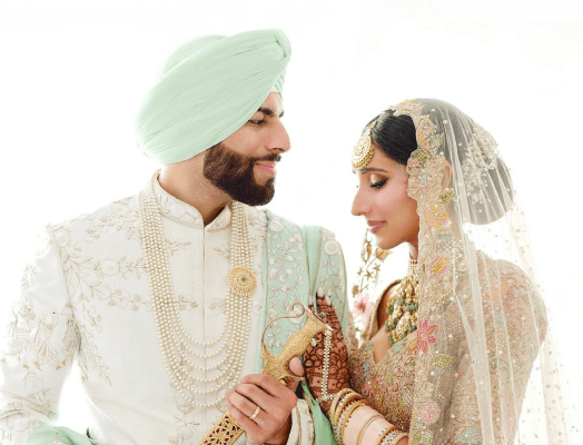
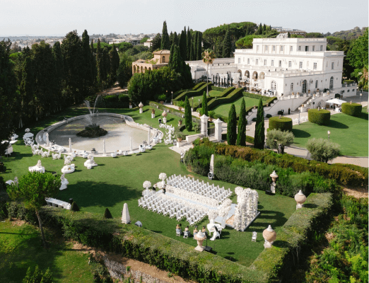
Plum and Lavender
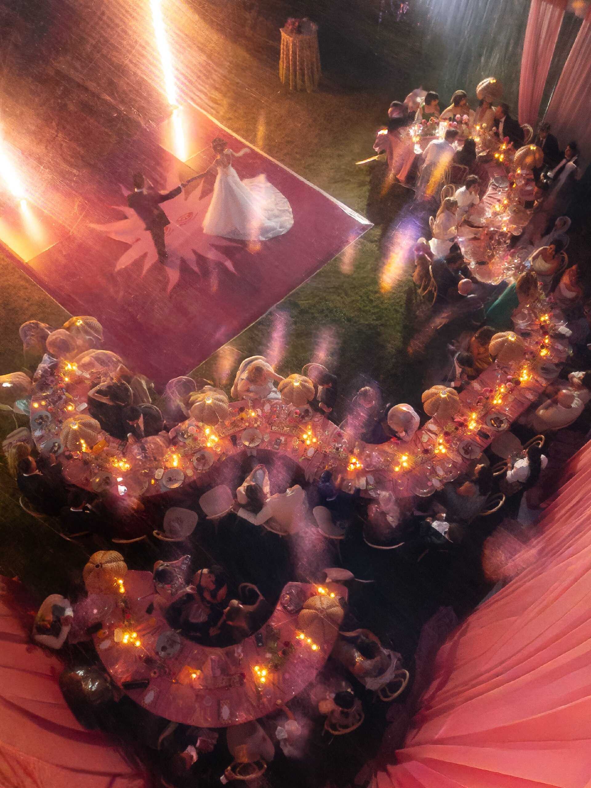
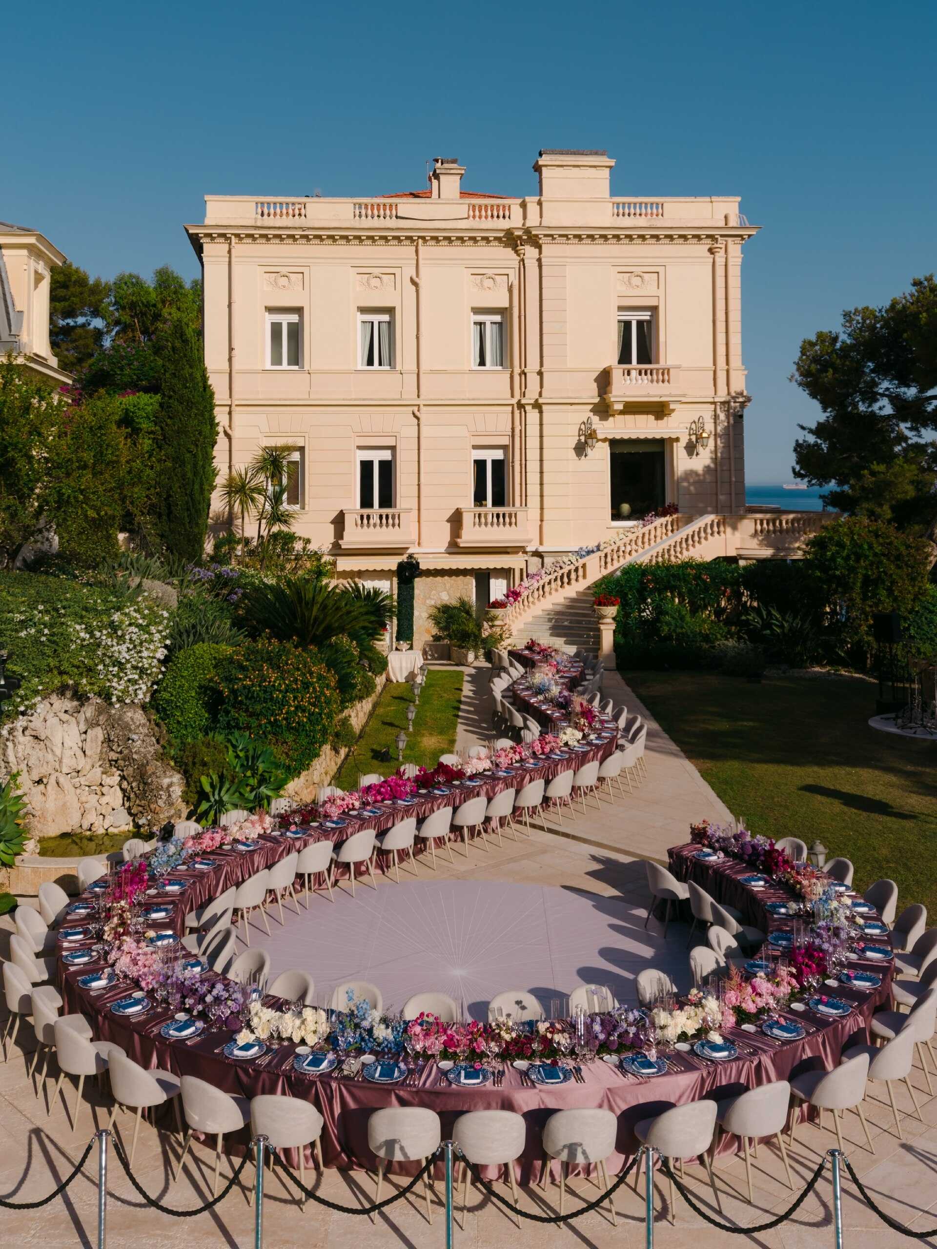
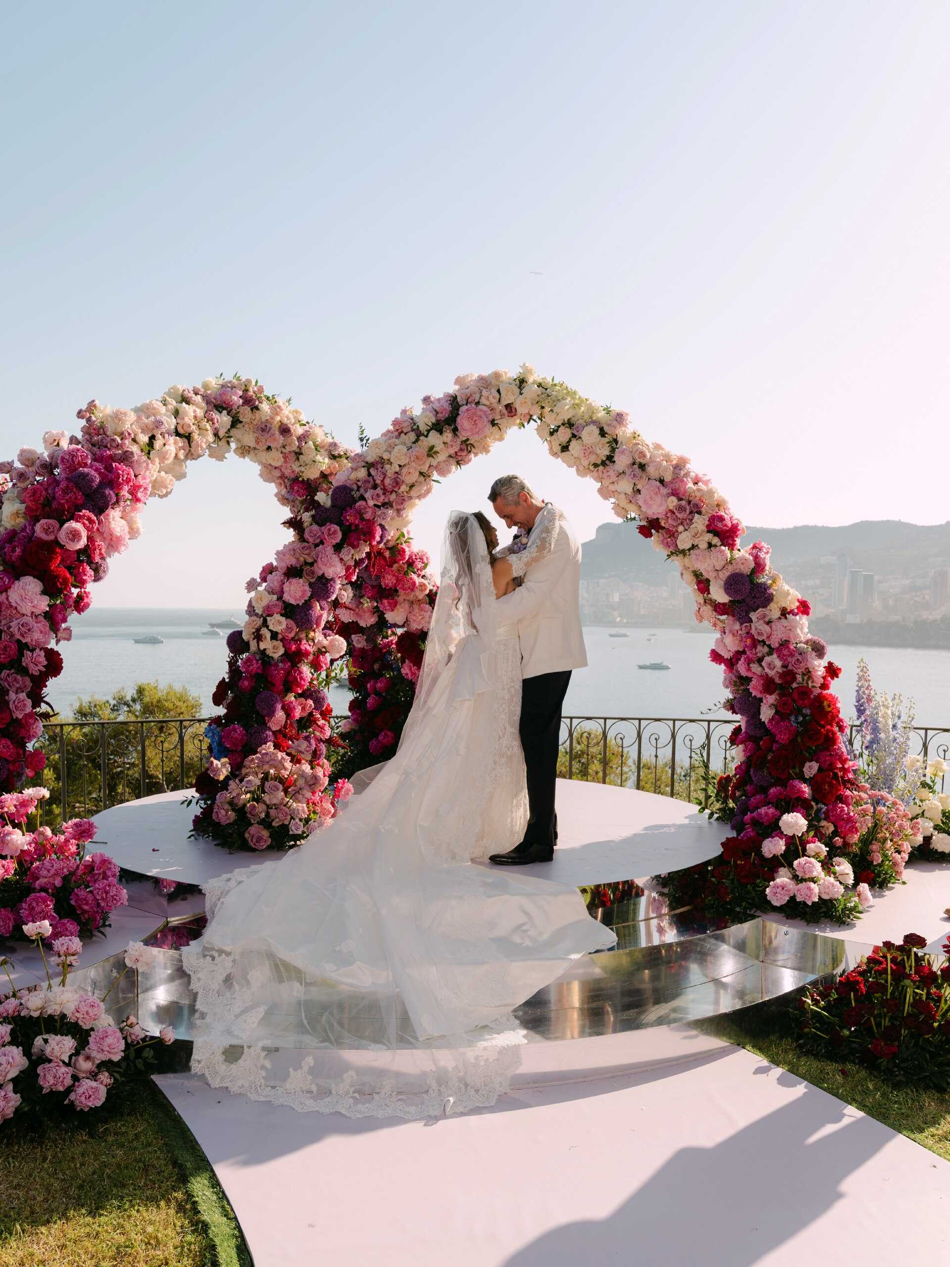
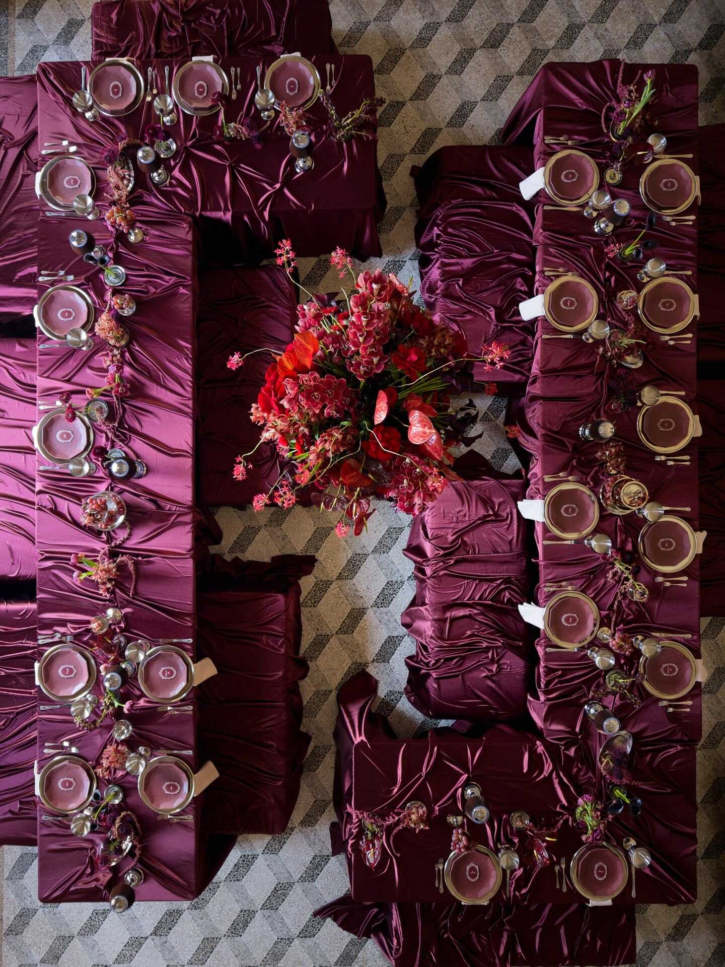
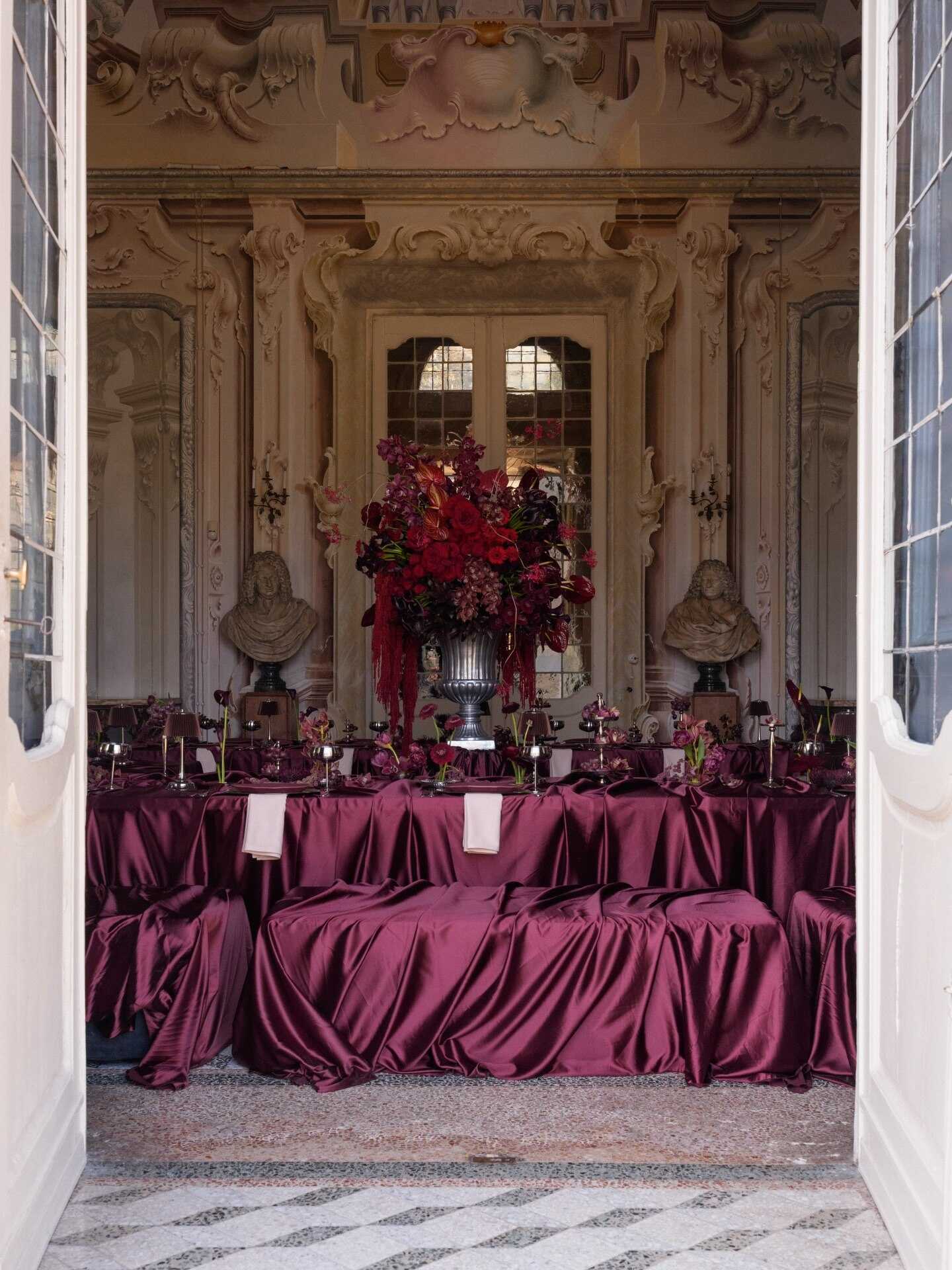
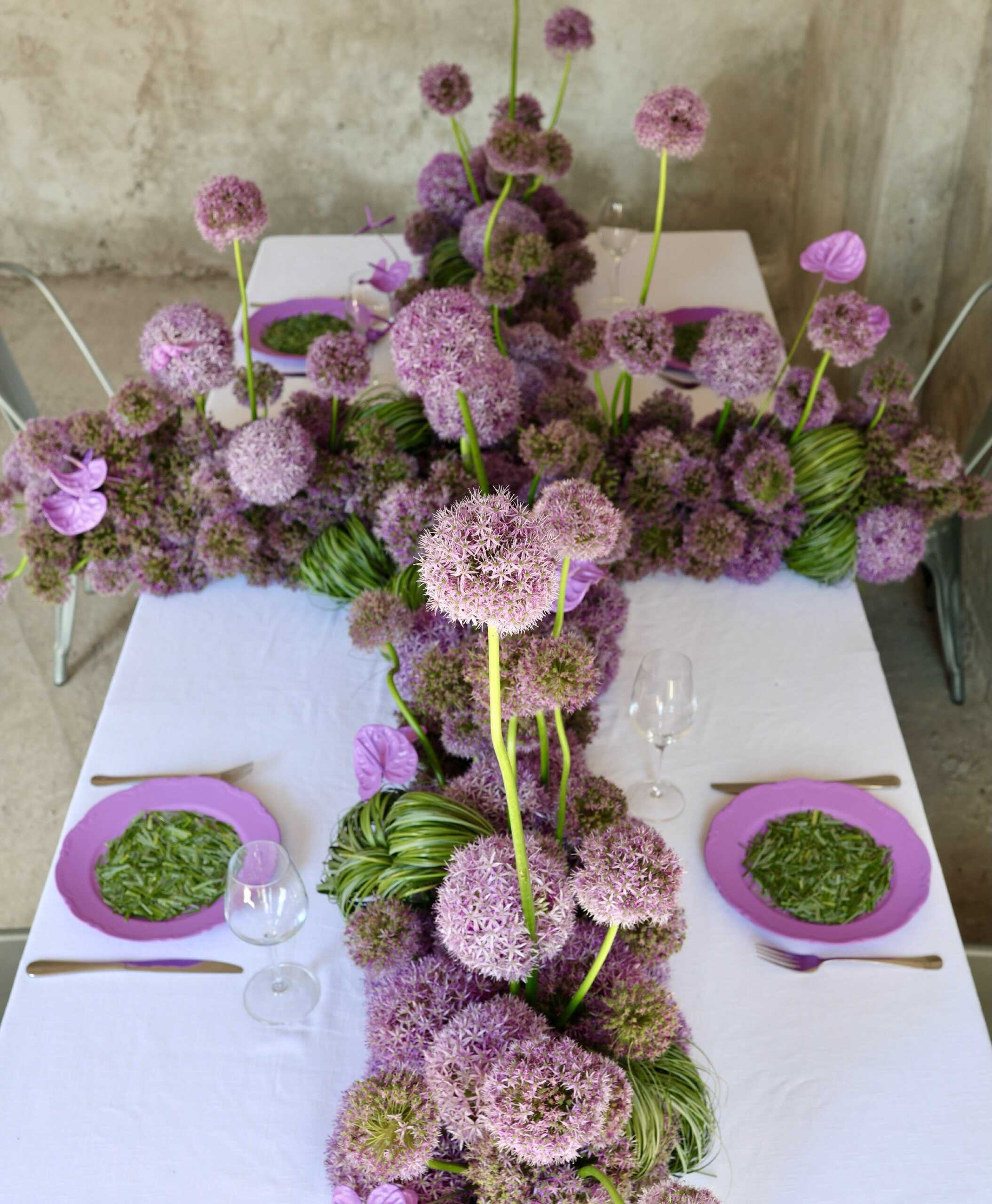
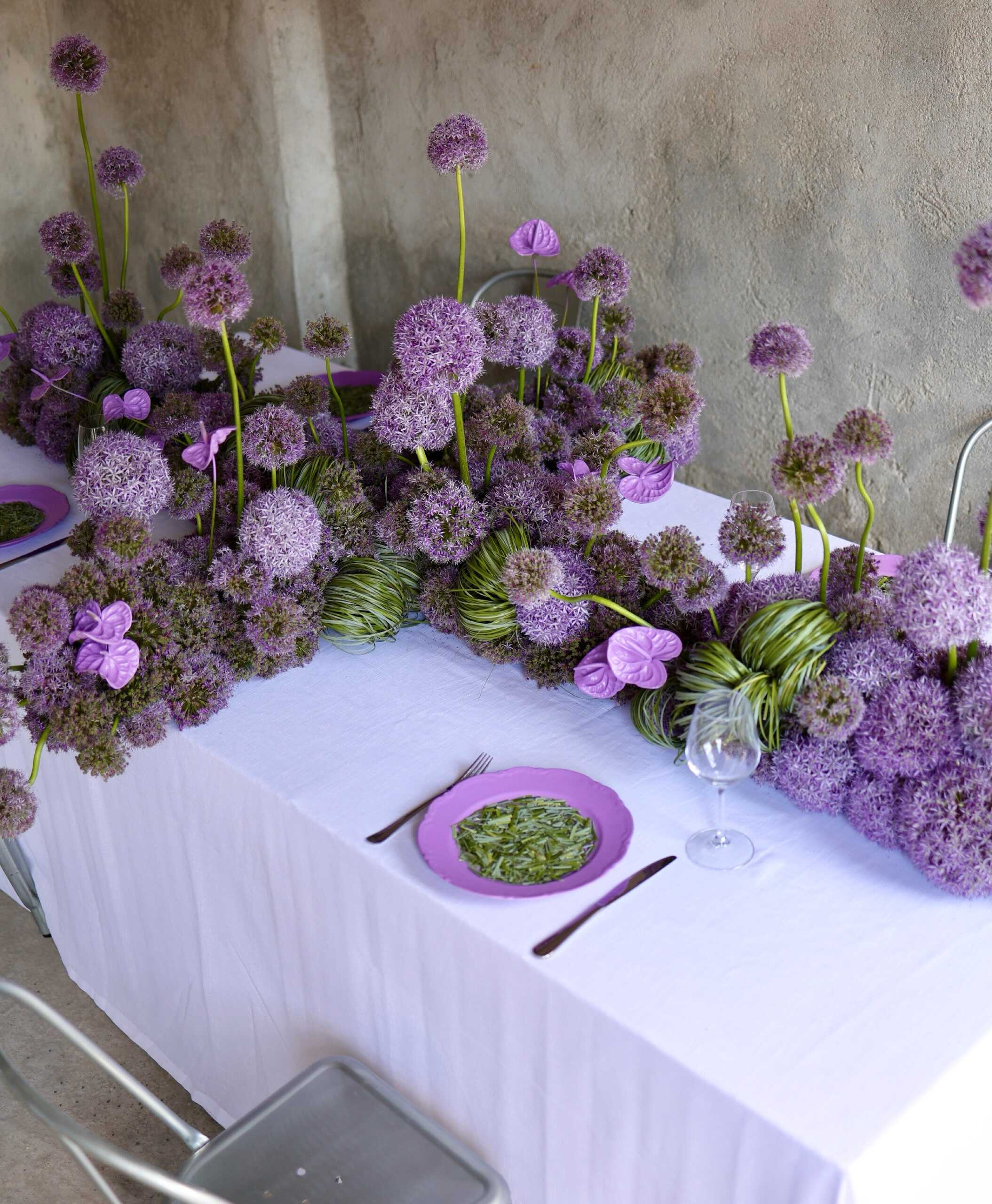
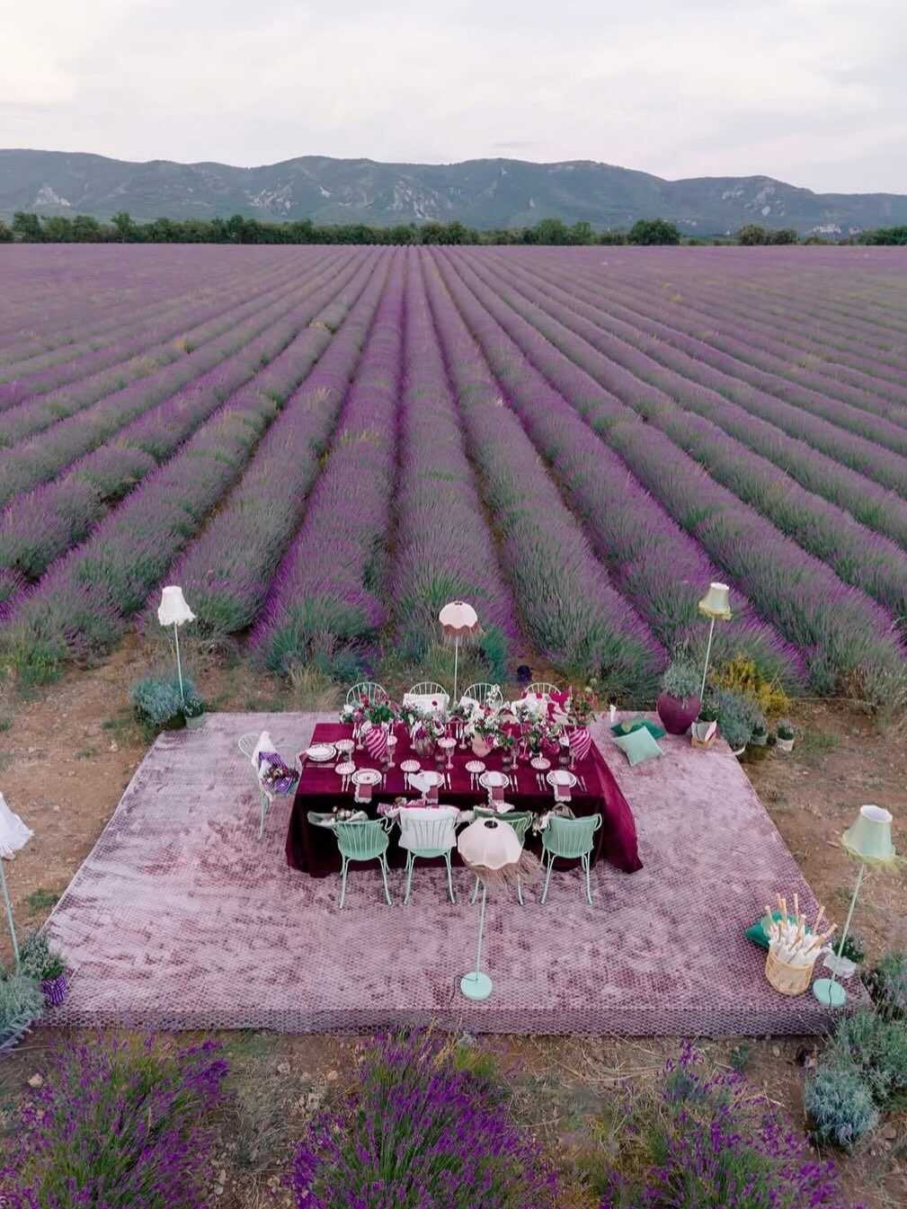
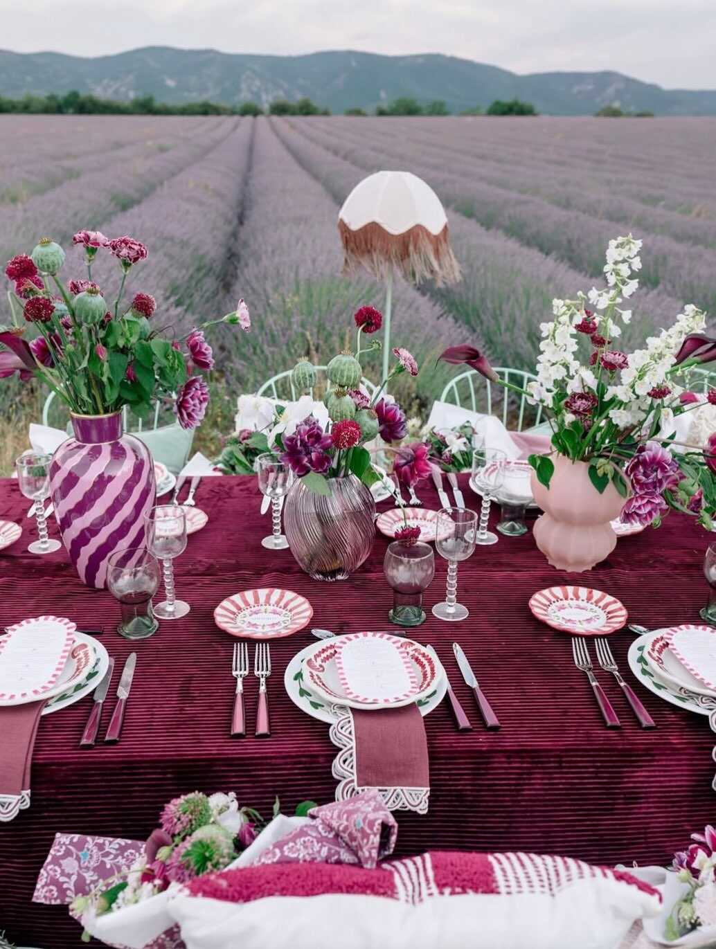
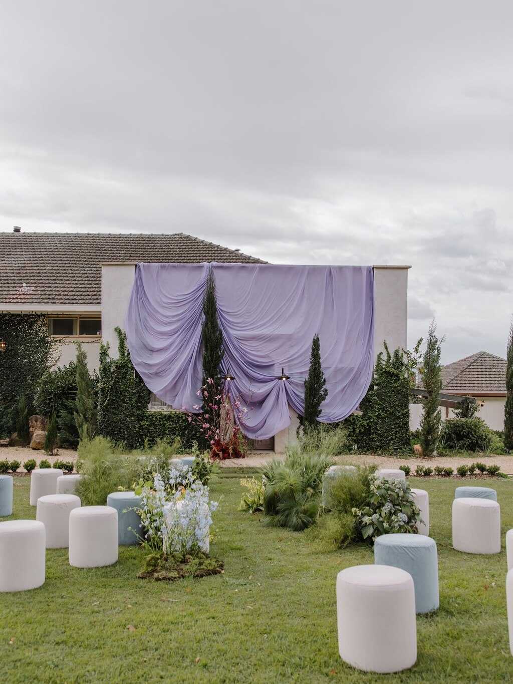
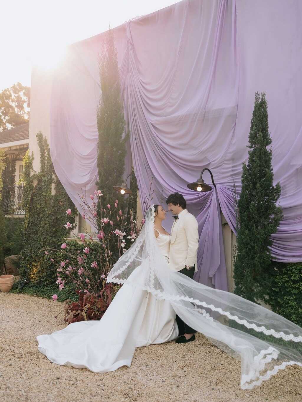
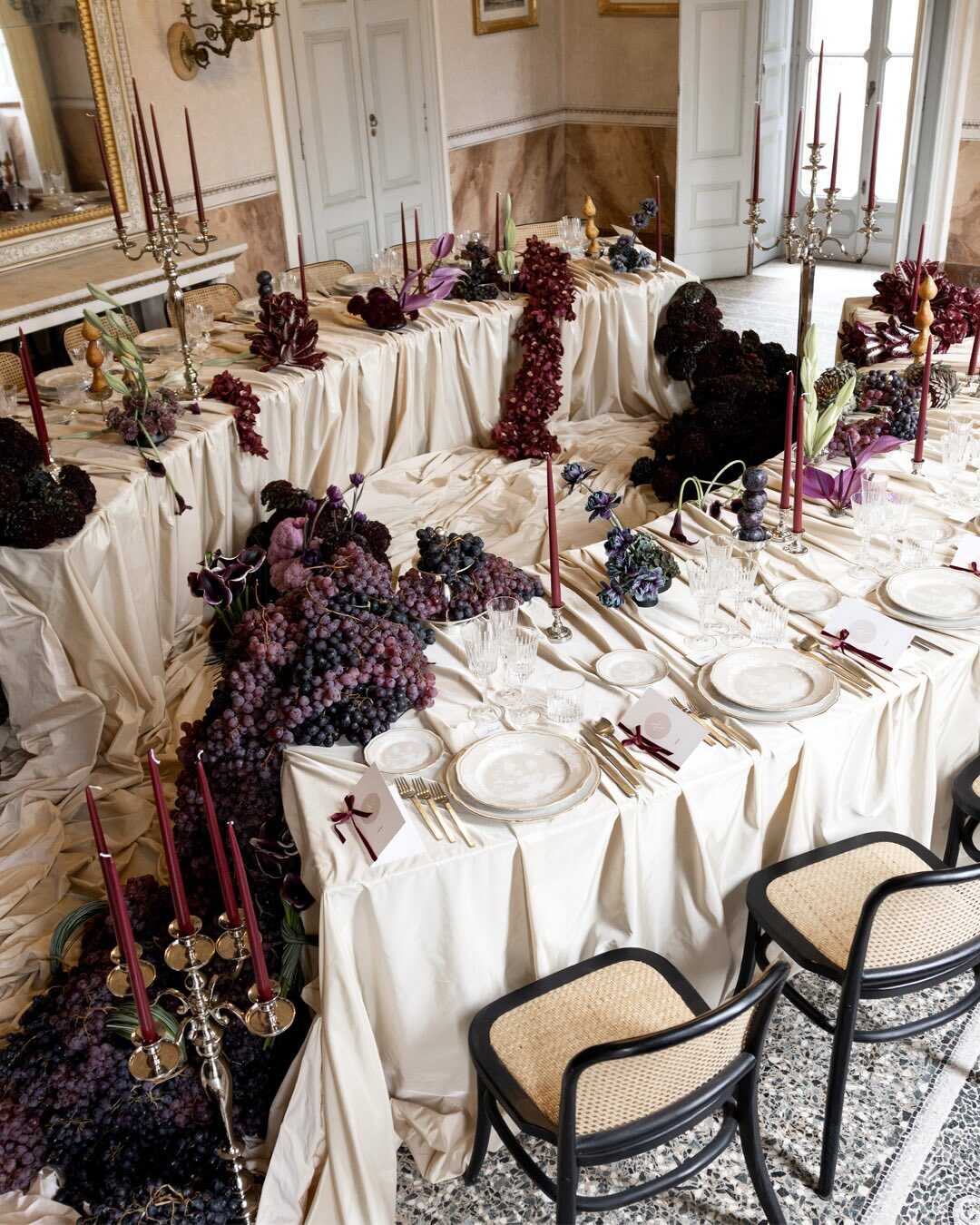
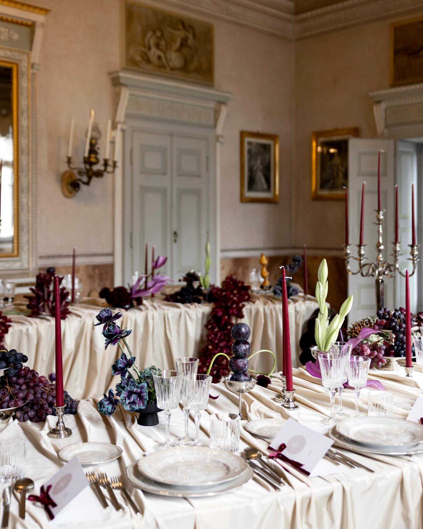
Berry tones are now taking the place of the softer pinks which had been popular in recent seasons, plum being right at the heart of this change - deep, romantic, and much more complex than any simple blush shade ever was. Paired with lavender, the combination feels more refined and less sugary, resembling a Regency drawing room rather than a garden party, especially when the lavender is dusty rather than bright.
What makes this combination work in 2027 is control on one side of the equation. Nowadays, most florists and designers keep one element light - for example, with a bare wood table, a soft ivory linen, or a single fresh green accent - so the plum and lavender feel rich without becoming too heavy. Deep plum is most noticeable in the bridesmaid gowns and floral centerpieces, while lavender takes on a more subtle role in the bouquets and softer decorative details nearby.
This particular approach works especially well with weddings held in the fall and winter months, since the low, warm light at that time makes the berry shades appear even more striking. People who choose romantic lavender color combinations for their wedding seldom limit themselves to lavender alone these days - the color is more often seen as one part of a deeper, more thought-out pair than the sole focus.
Shades of Terracotta
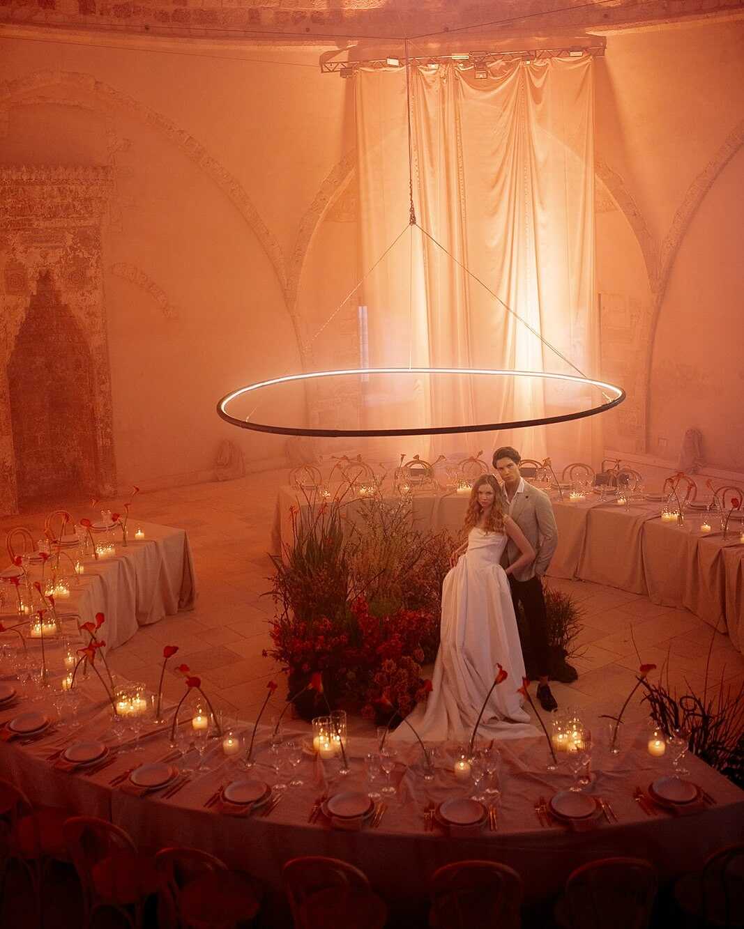
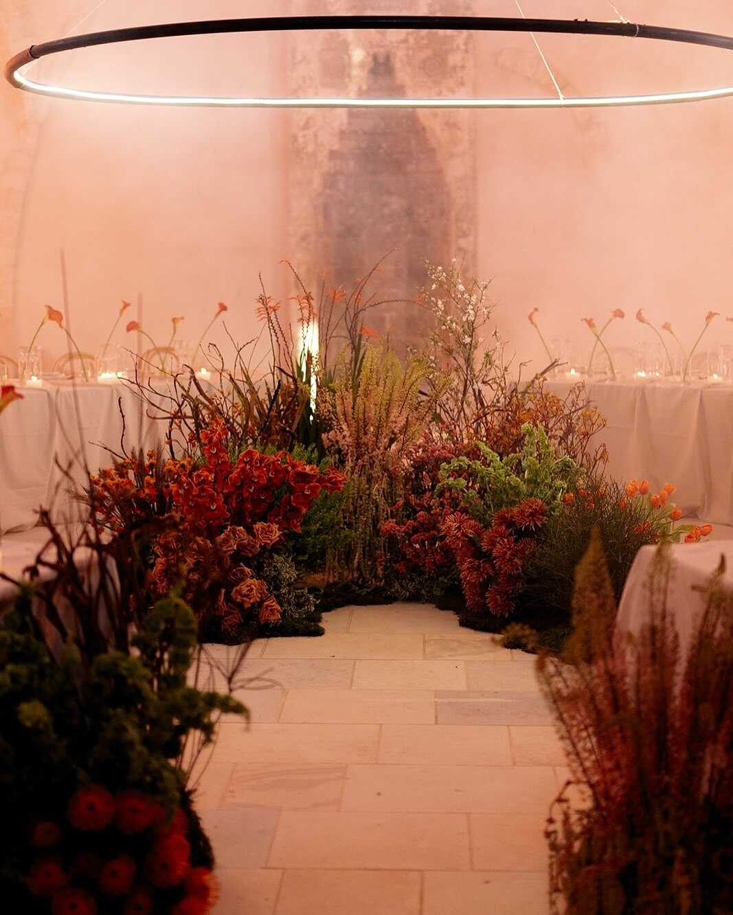
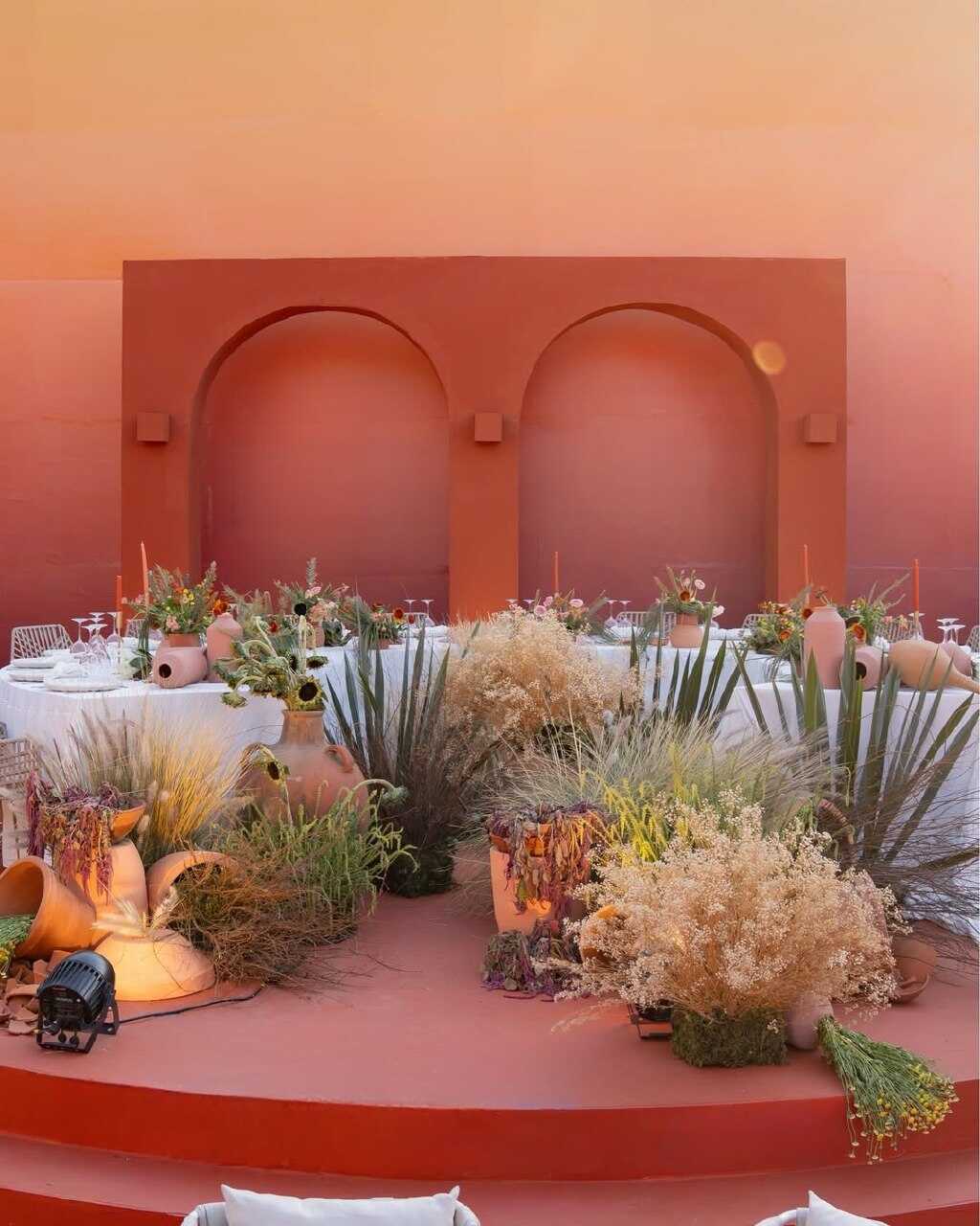
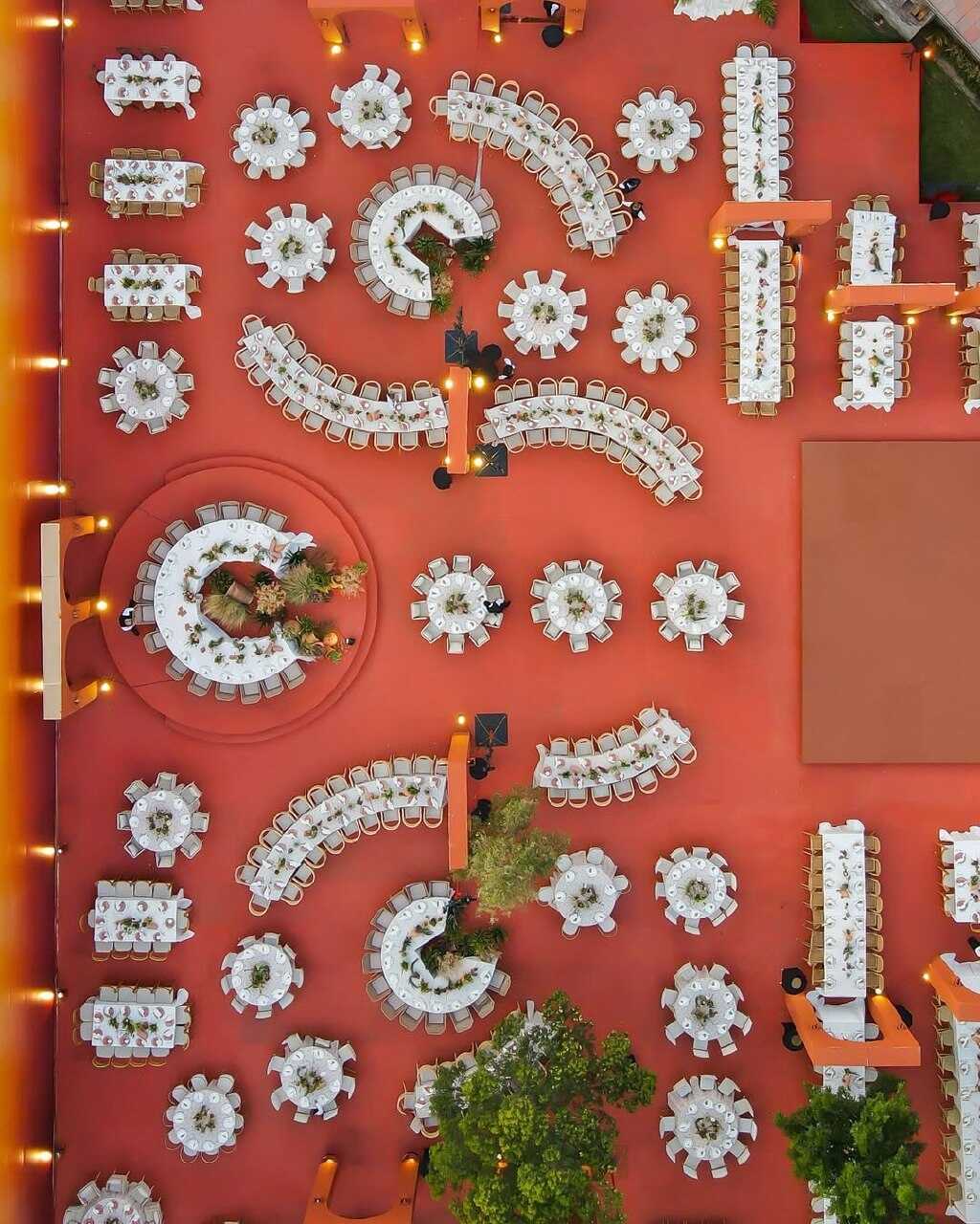
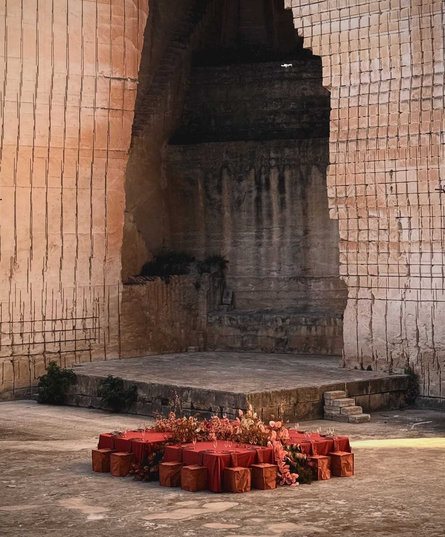
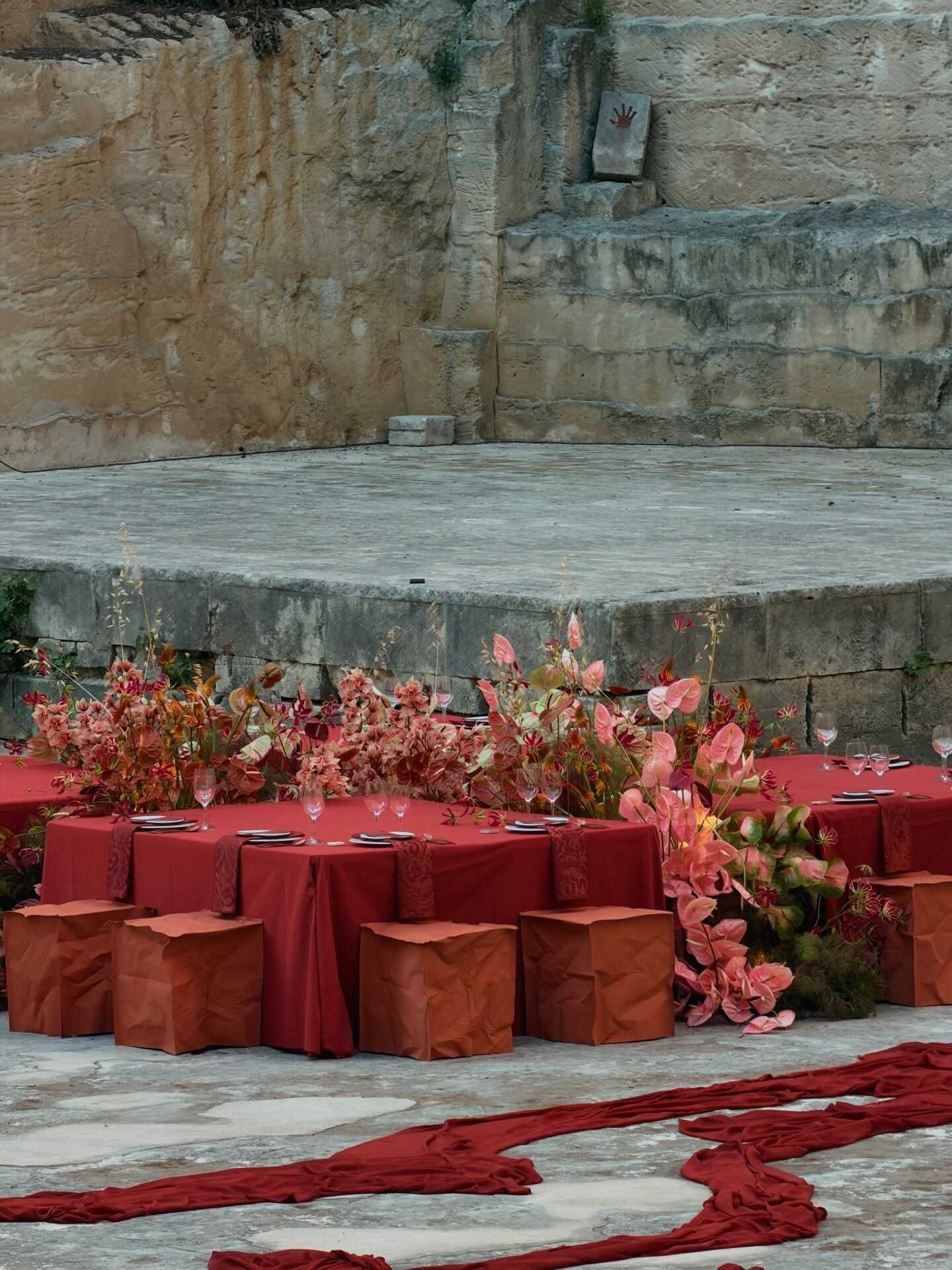
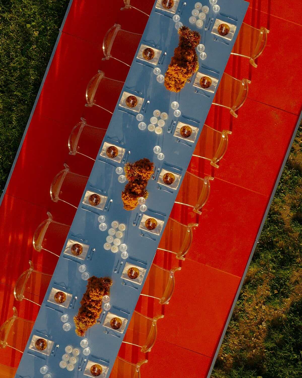
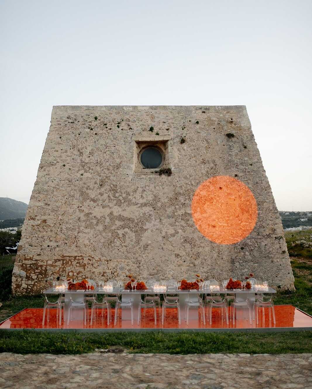
Terracotta has remained a popular choice for weddings for several seasons running, and this trend continues in 2027 rather than slowing down; in fact, it's moving in a richer, more layered direction. Warm clay tones, burnt orange accents, and sun-baked reds now regularly anchor entire palettes instead of showing up as a single accent color tucked into a bouquet.
- Terracotta, beige, and sage green - a warm, earthy trio suited to rustic or Mediterranean-style weddings
- Terracotta with peach and olive greenery - a softer, more romantic direction that photographs especially well in golden-hour light
- Terracotta paired with warm neutrals - the go-to autumn combination, leaning into candle-lit dinners and low, warm lighting
- Clay-toned candles with textured linen runners - a way to bring the color into tabletop styling without touching florals at all
Sunset-light outdoor weddings match this color scheme better than almost any of the others on the list, since the warm light of late afternoon naturally enhances all the terracotta and clay tones in the room. Those couples who are looking for burnt orange color combinations for wedding styling usually end up at this option - terracotta provides a more solid and less intense setting for that same warmth.
Olive Green
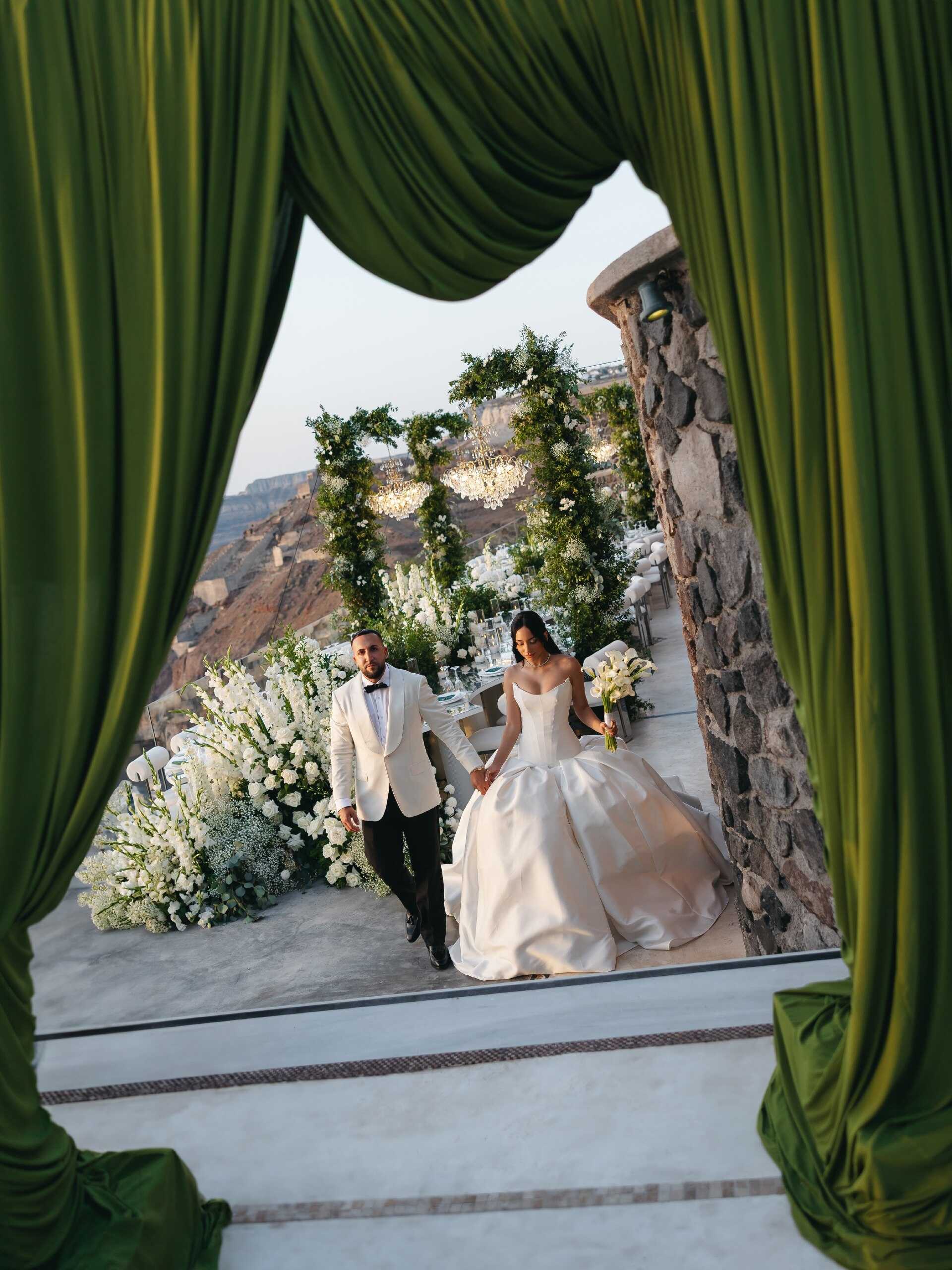
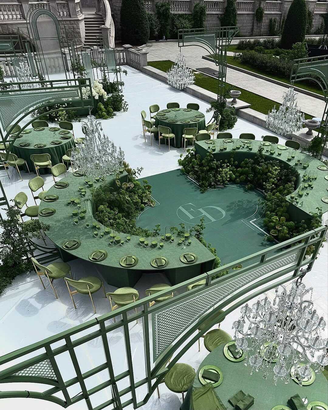
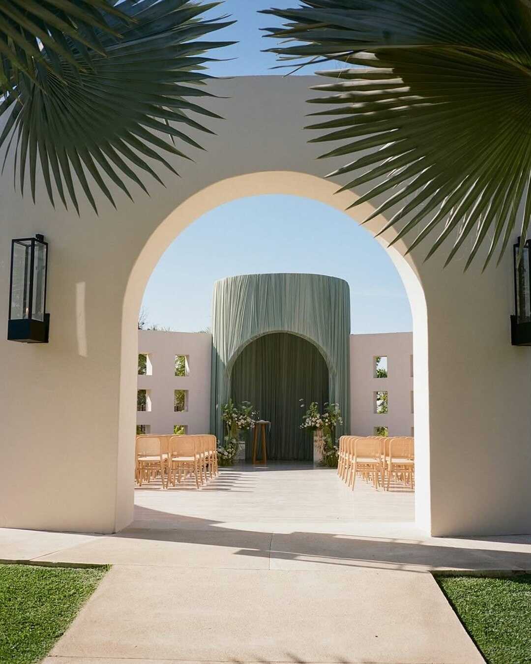
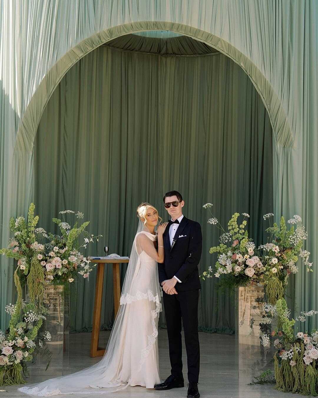
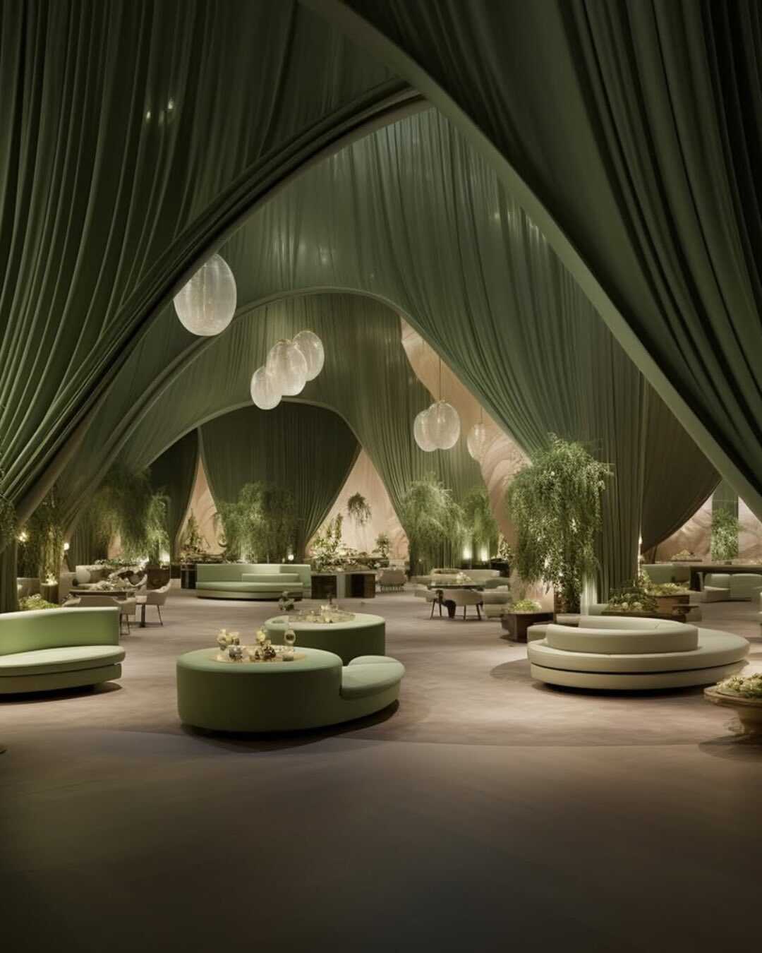
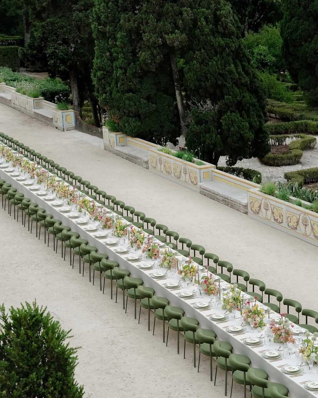
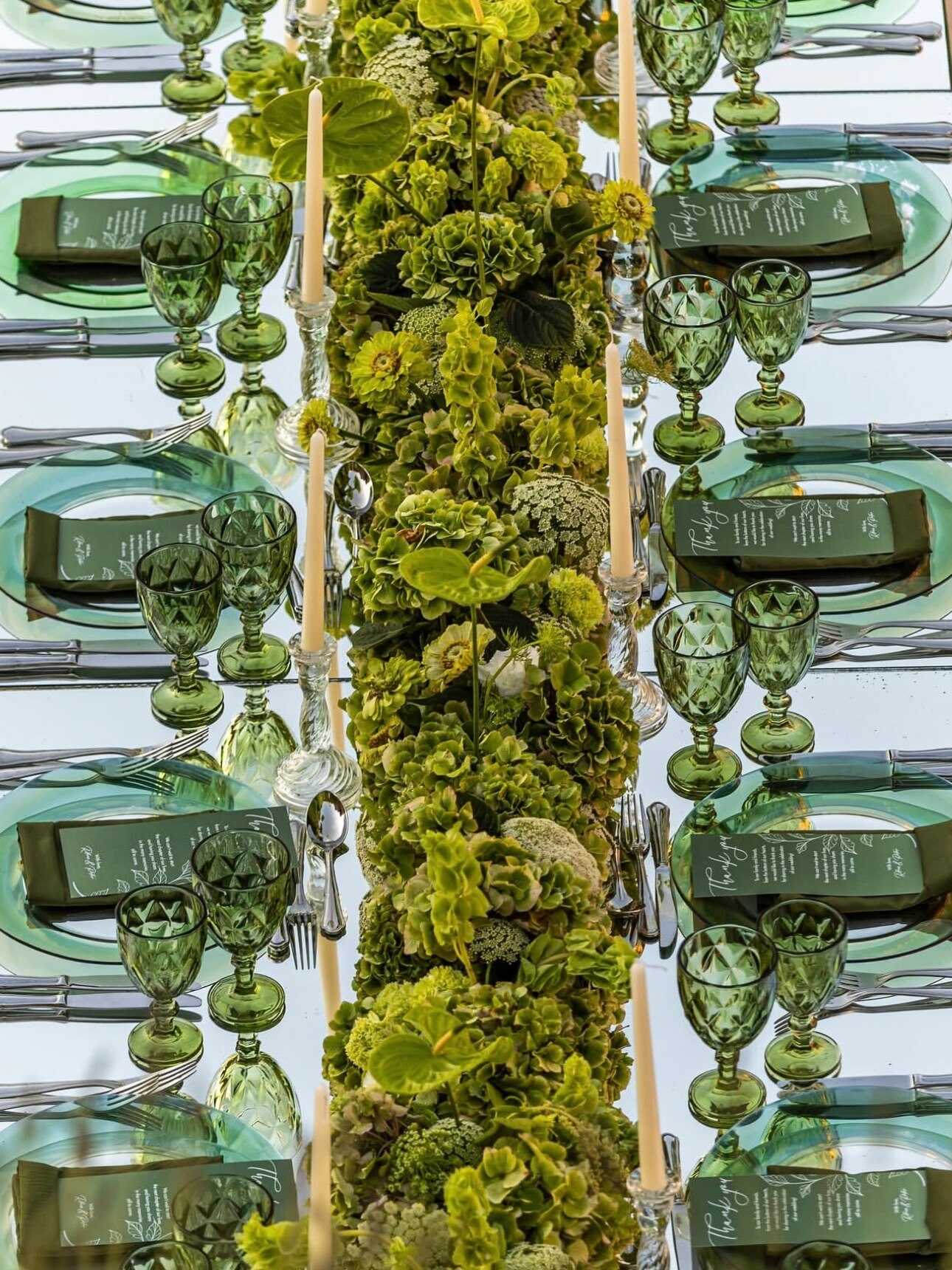
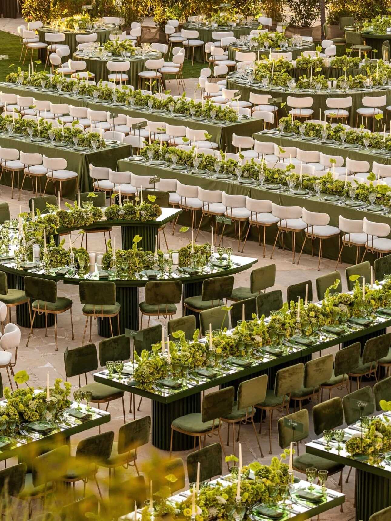
Green has become the most consistently featured color in the palettes named for 2027, appearing in almost every direction designers are considering this year, and olive is carrying most of that role. It seems natural and calming rather than fashionable, which is the reason why so many couples are using it as a safe and reliable base rather than as a bold choice.
Olive is mainly used for foliage and as a decorative element rather than as a primary, standalone color. It pairs well with lavender to create a softer, more romantic atmosphere, goes nicely with terracotta and clay shades for a warmer effect, and matches naturally with deep gold or matte metallics for a more refined evening look. This versatility is what makes it special - olive seldom conflicts with the other colors a couple has already chosen, which is why it is one of the least risky ways to introduce green into a wedding color scheme without going for a full garden theme.
For those looking into sage green wedding color combinations, sage and olive are often used interchangeably in current color schemes, both contributing to the same calm, natural atmosphere rather than appearing as two completely different colors. This is one reason so many designers choose it first, since either shade serves as a good link between a warmer and a cooler palette.
Silver Metallic
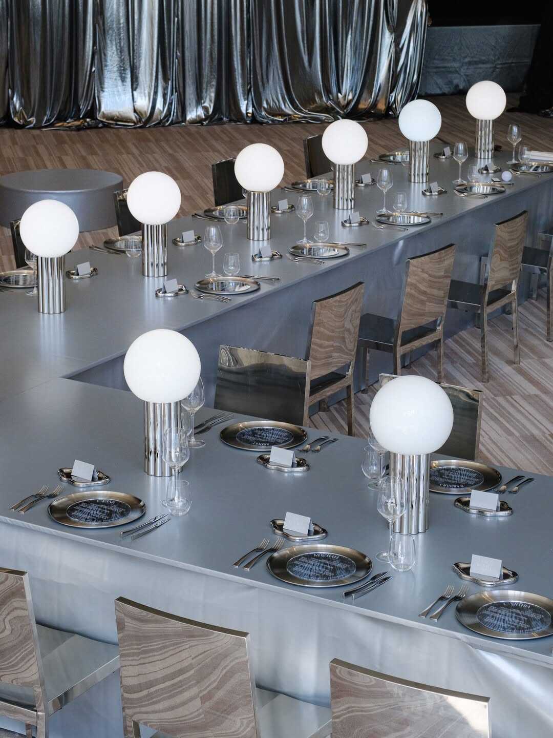
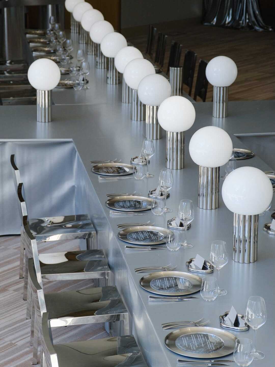
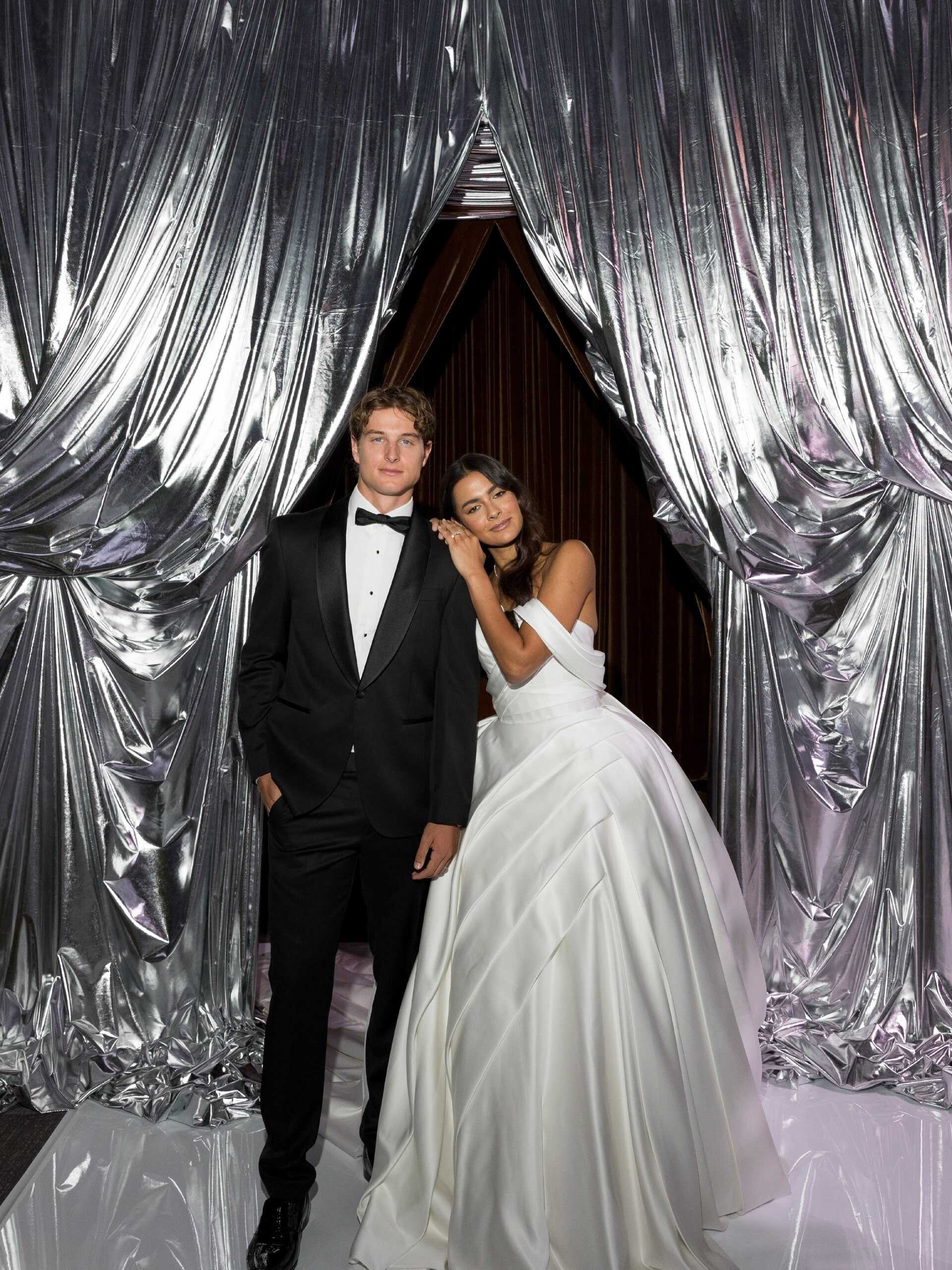
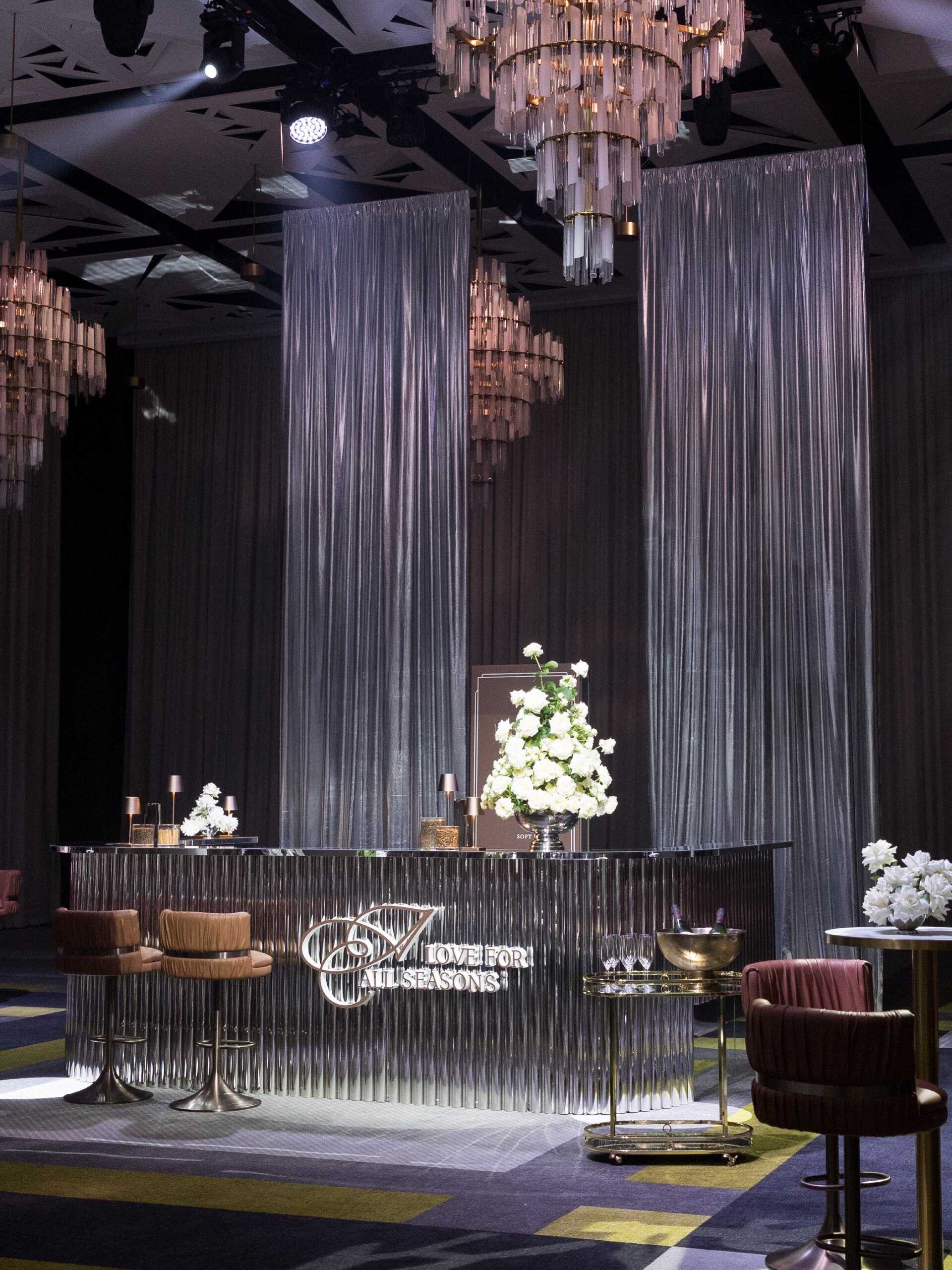
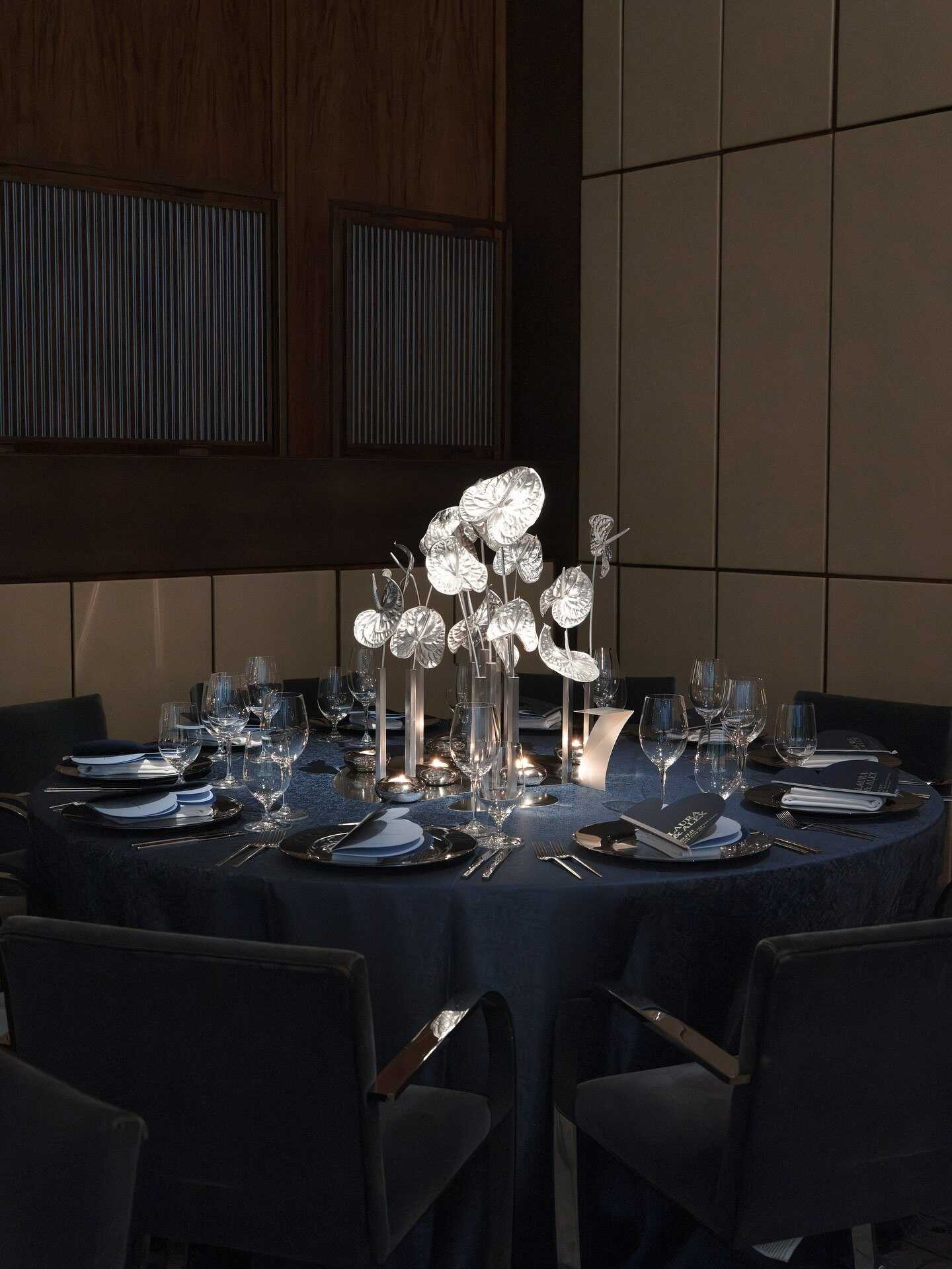
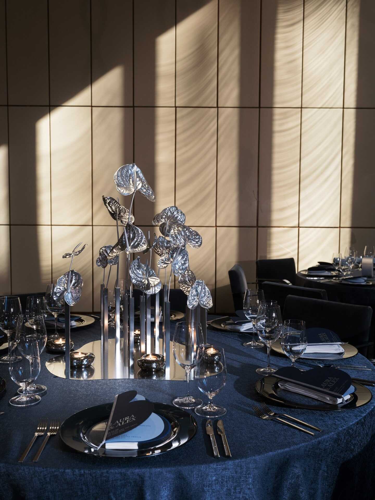
For many years, gold has been the metal of choice for weddings, but in 2027 this is finally changing. Silver is now fully coming into the open, with the industry describing it as the cooler alternative to gold for settings that want to feel more modern while still retaining a romantic atmosphere. Across all aspects of the arrangements, including table settings, stationery, and bridal accessories, chrome-inspired details, brushed silver flatware, and mirrored decorative elements are becoming more common.
Silver’s real strength is versatility; it looks sleek and modern in an urban loft, but becomes truly romantic when paired with candlelight and soft flowers at a more traditional venue. It also matches very well with the more somber color schemes that are becoming popular this year - midnight blue, charcoal, dark burgundy, and deep emerald all look comfortable next to a silver accent without either of the two elements dominating the other. At present, many couples are combining metals by adding silver details such as crystal, glass, and pearl rather than sticking to a single finish throughout the day.
Among current wedding color combination choices built around metallics, silver has a certain advantage over gold: it looks cool in almost any lighting situation, whether the event is a bright daytime ceremony or a candlelit evening reception, without ever looking flat or dull, as underlit gold accents sometimes do.
Powder Pink
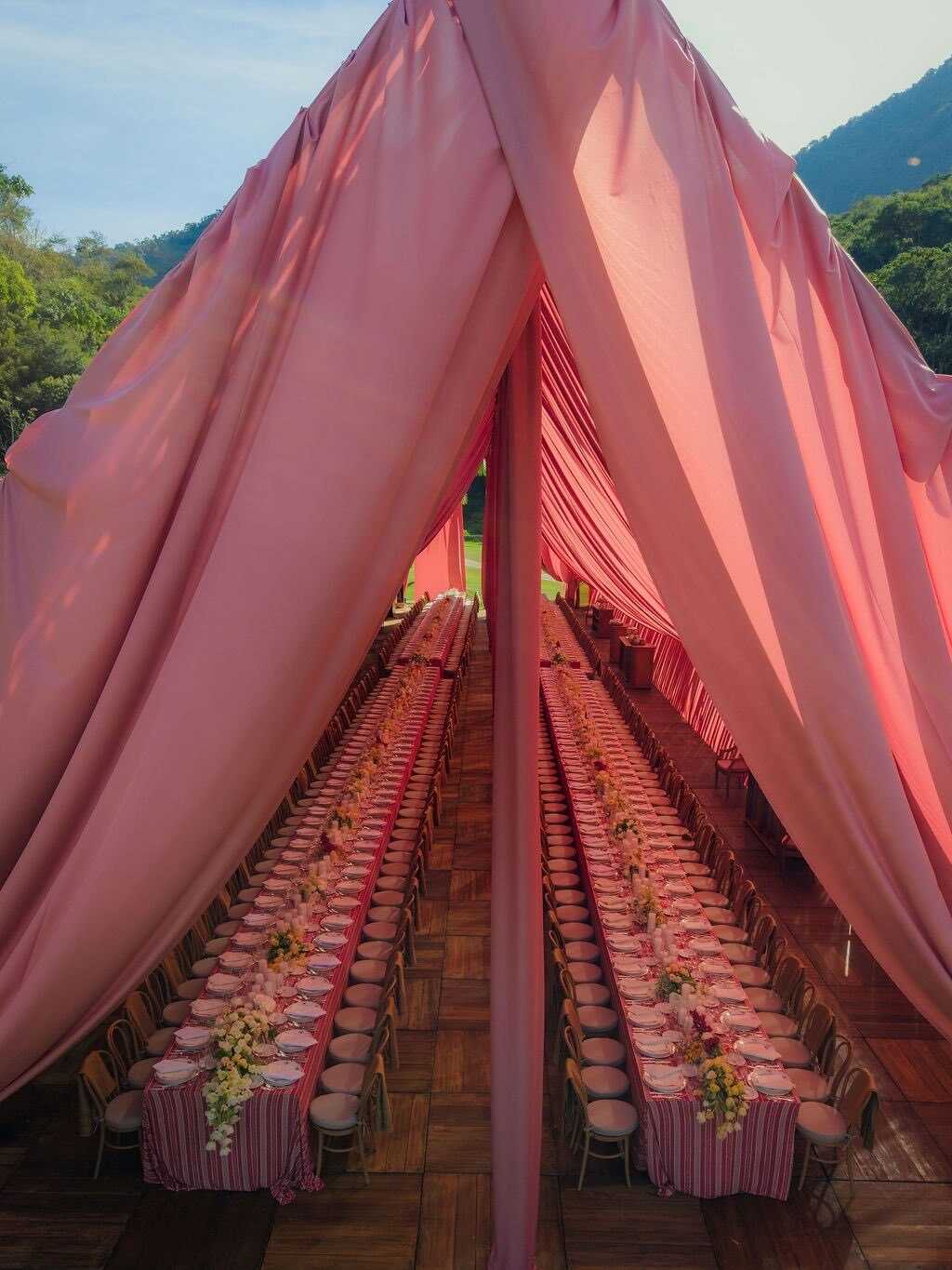
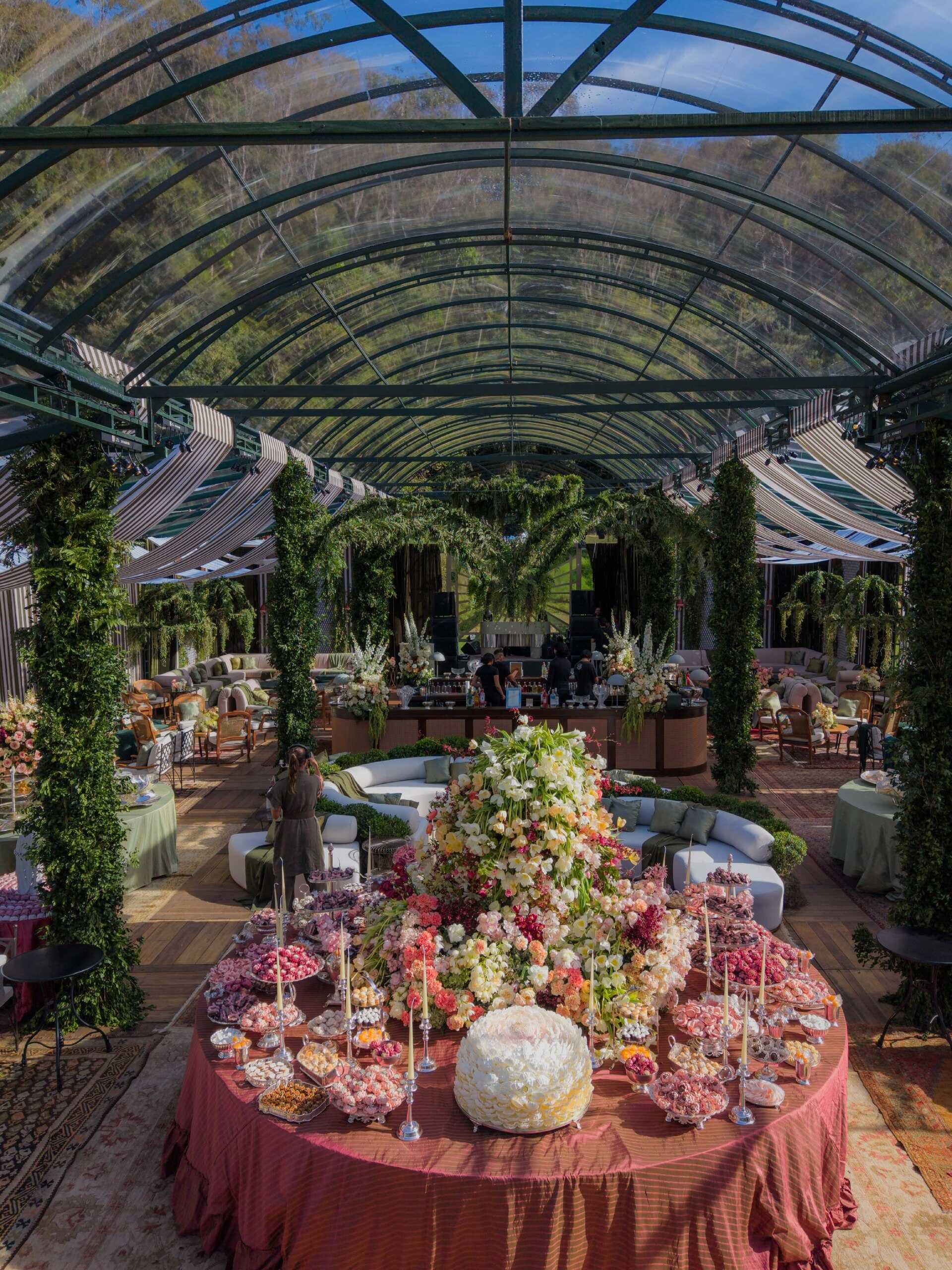
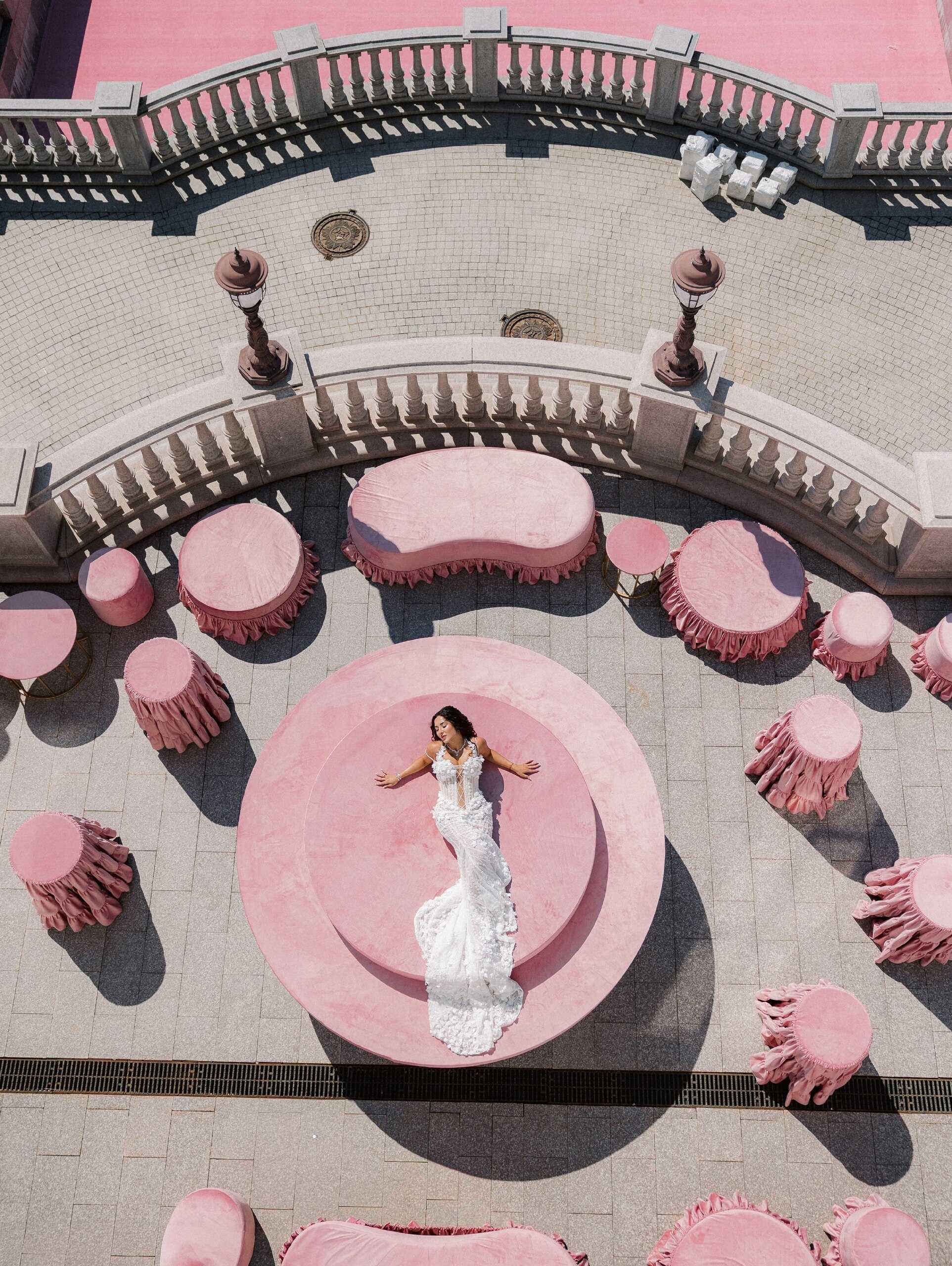
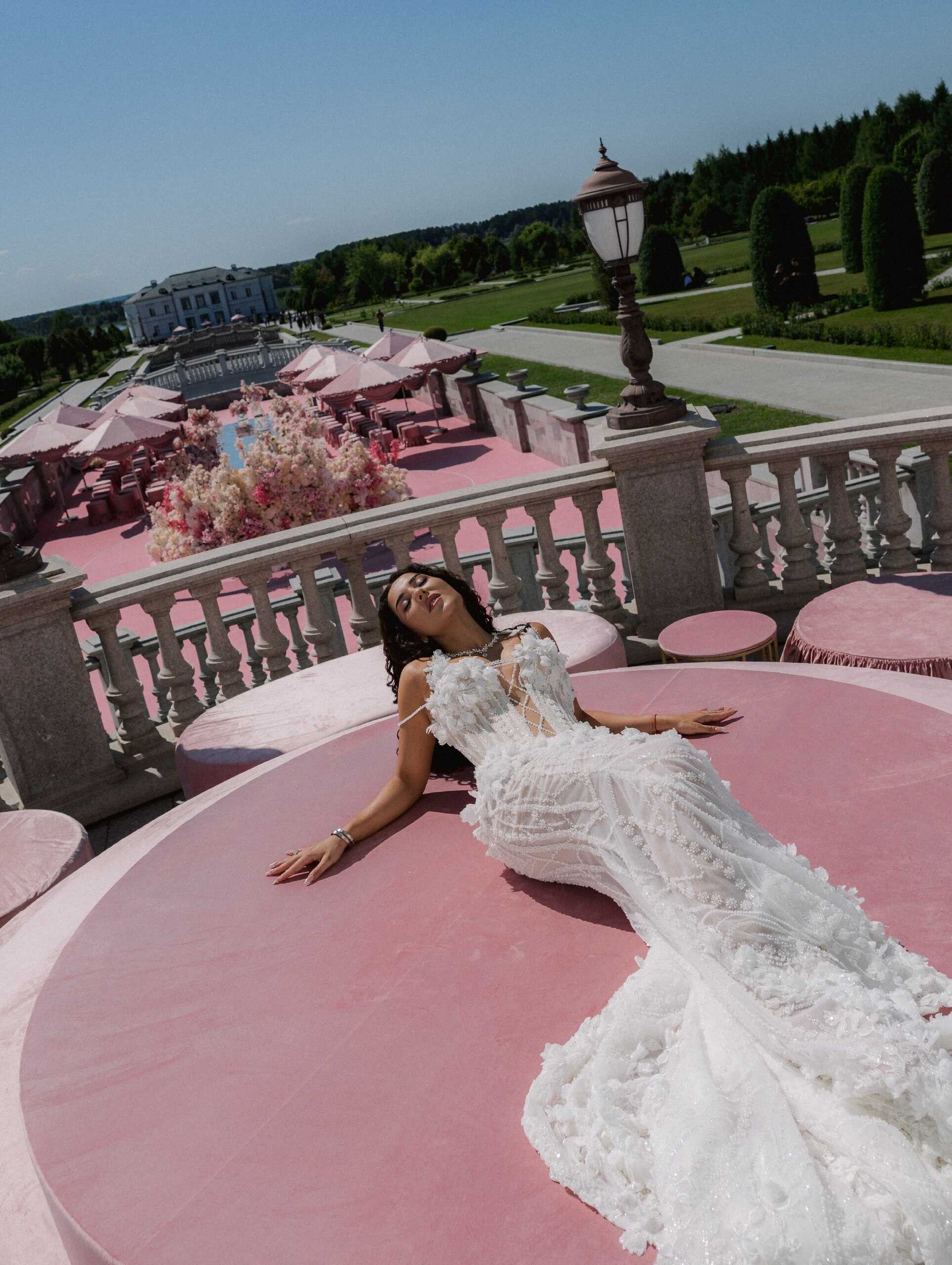
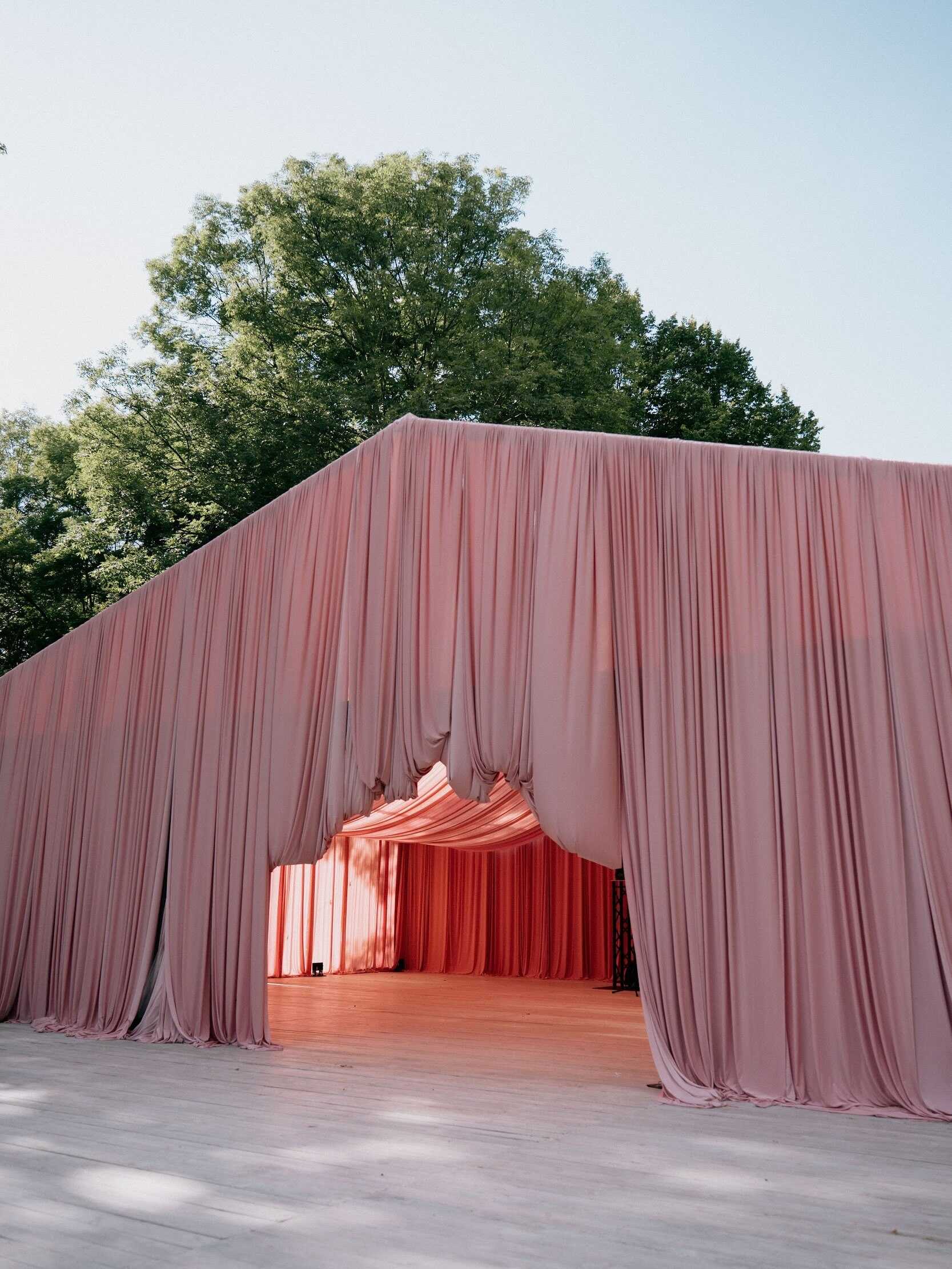
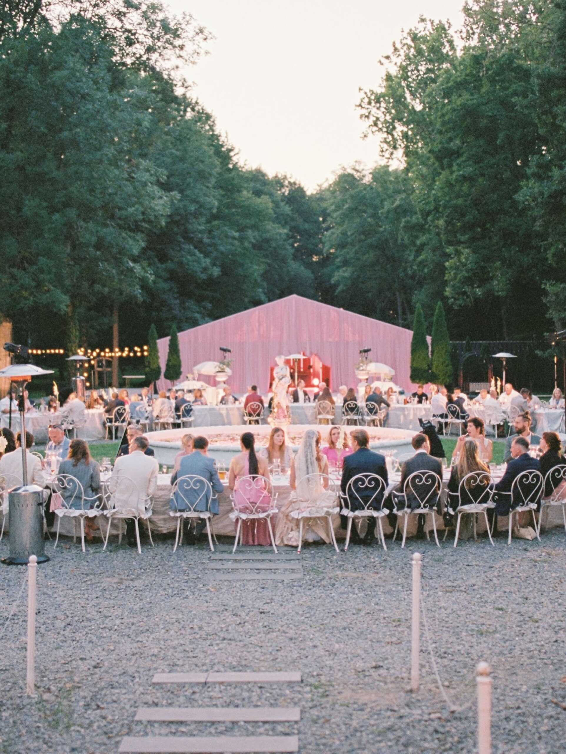
In 2027, pastel pinks are experiencing a genuine comeback, but not the sweet, single-toned shade that many couples recalled from a decade before. The latest interpretation of the color is more sophisticated and complex - a blush warmed by a mocha tone, powder pink balanced by a deeper shade nearby, and softness with real depth beneath it rather than relying entirely on itself.
This layering makes this year's style different from previous pastel fashions; powder pink with grassy green and white feels fresh and garden-inspired, while powder pink paired with warm mocha or deep plum looks more romantic and mature. Couples drawn to blush pink color combinations are now more likely to pair that shade with one neutral tone or one deeper accent color, rather than surround it with other pastels, which would flatten the entire color scheme into a single soft tone.
Deep Red and Burgundy
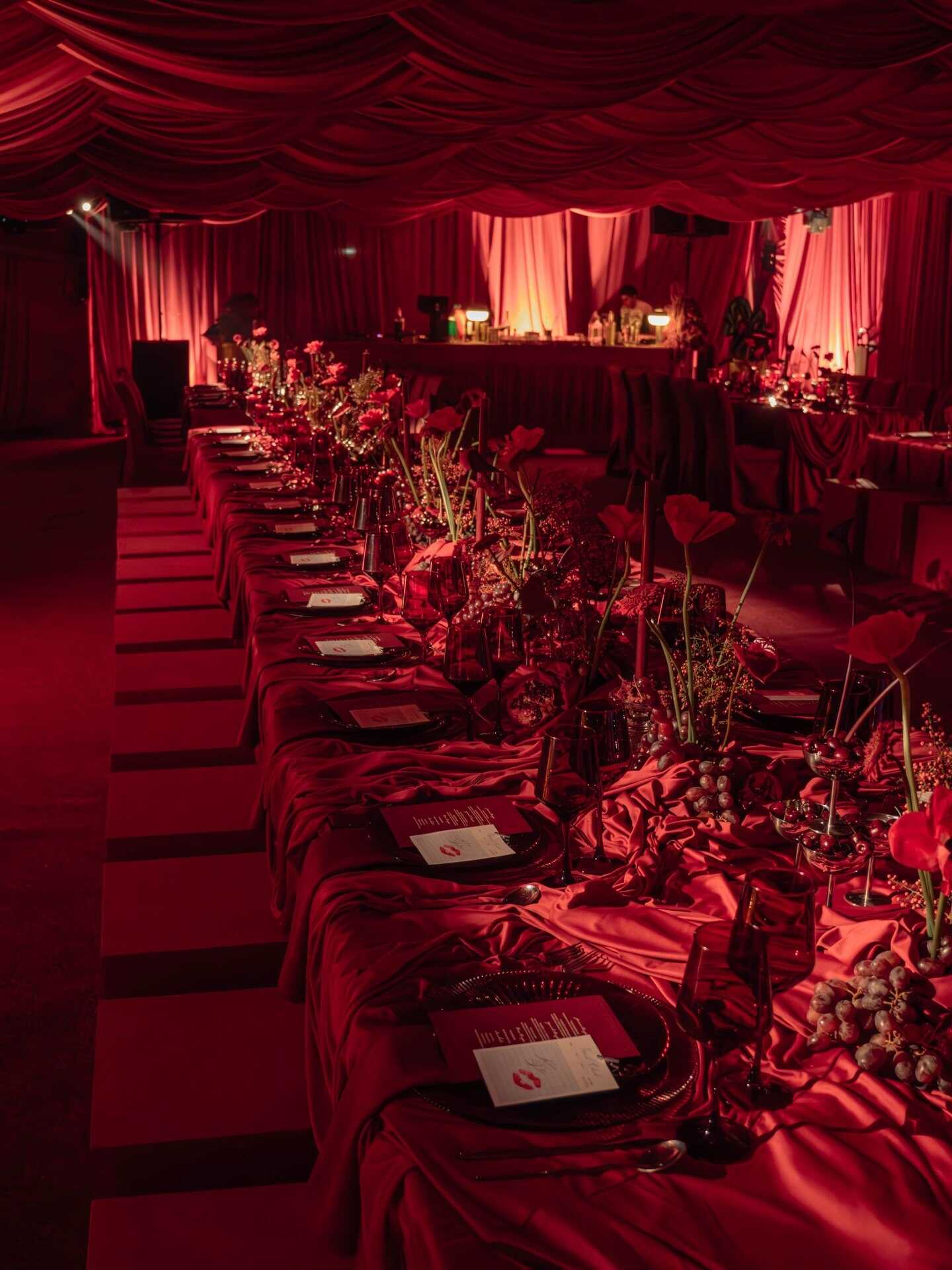
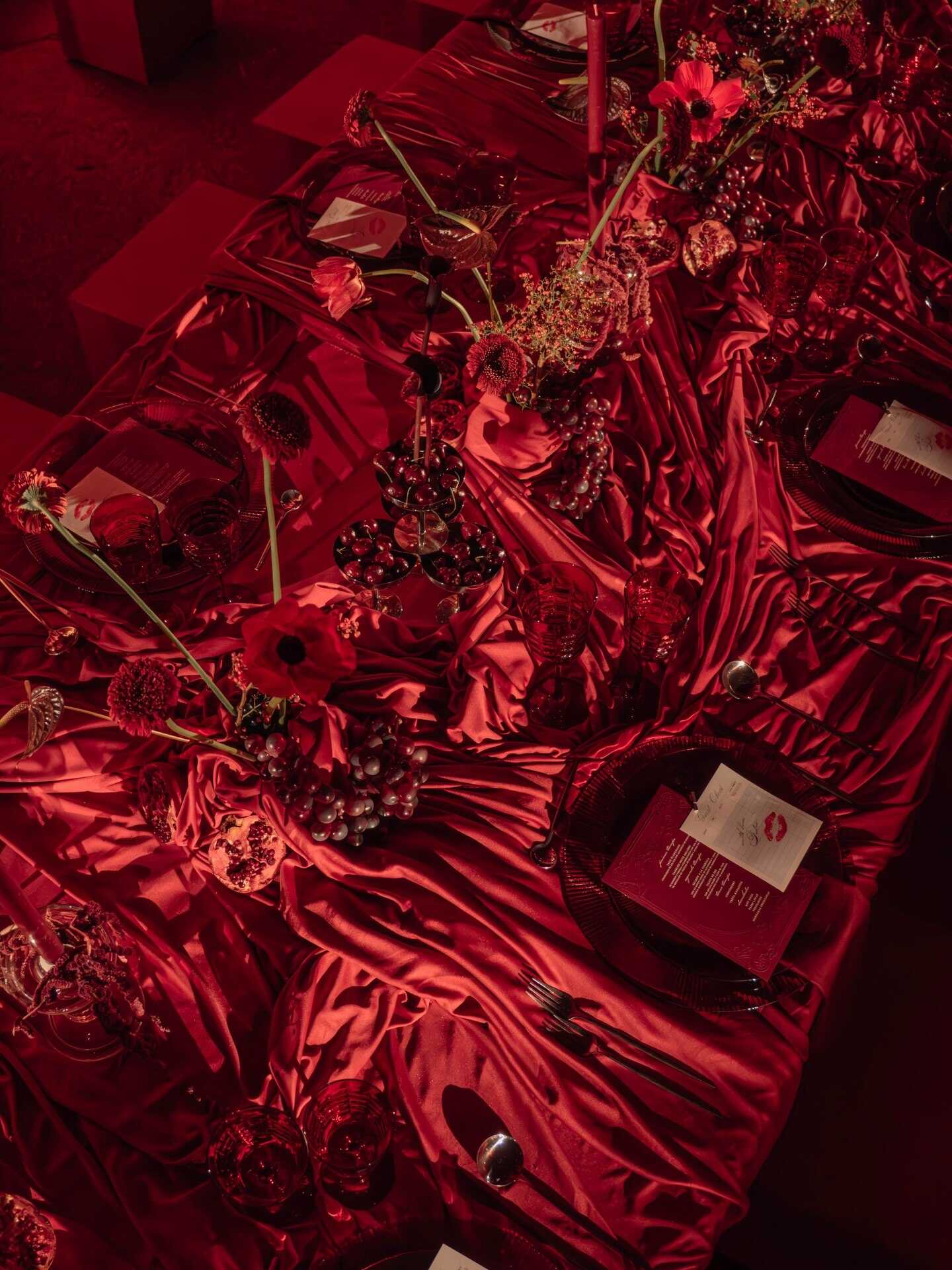
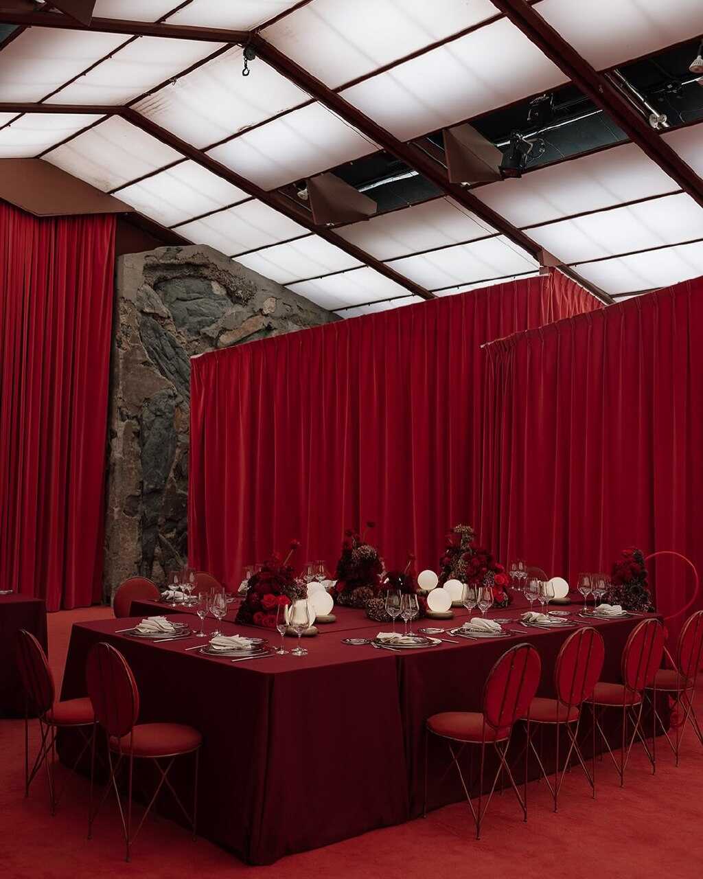
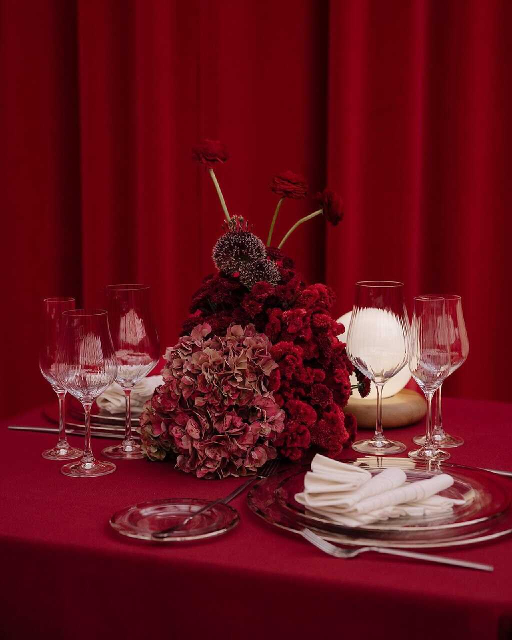
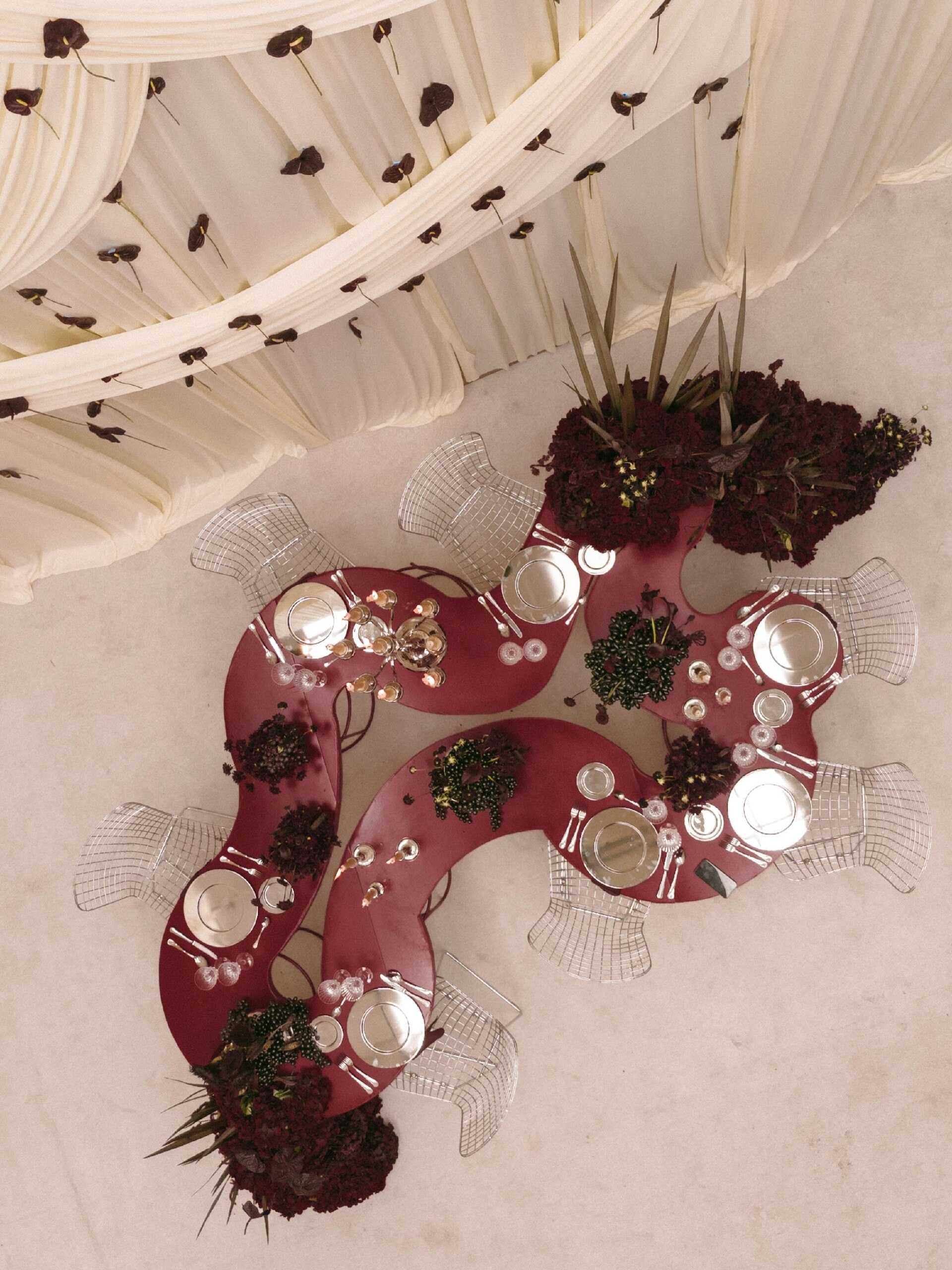
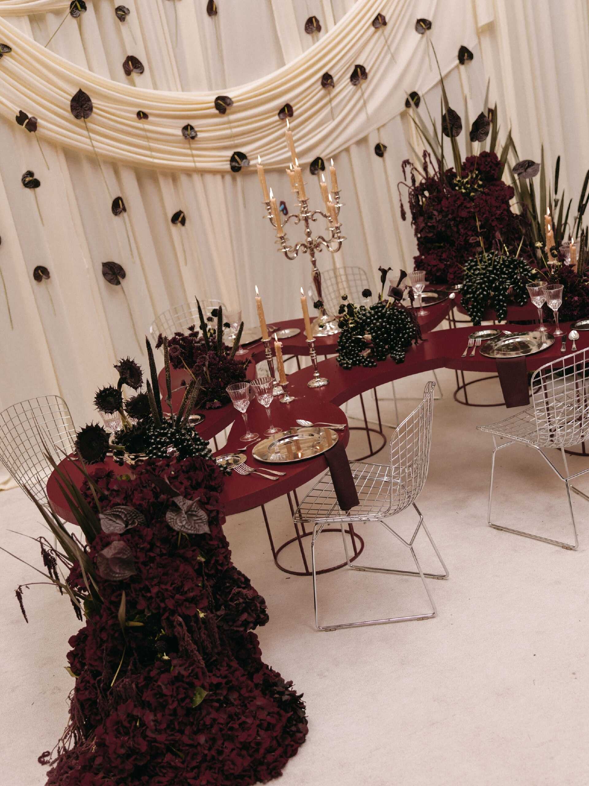
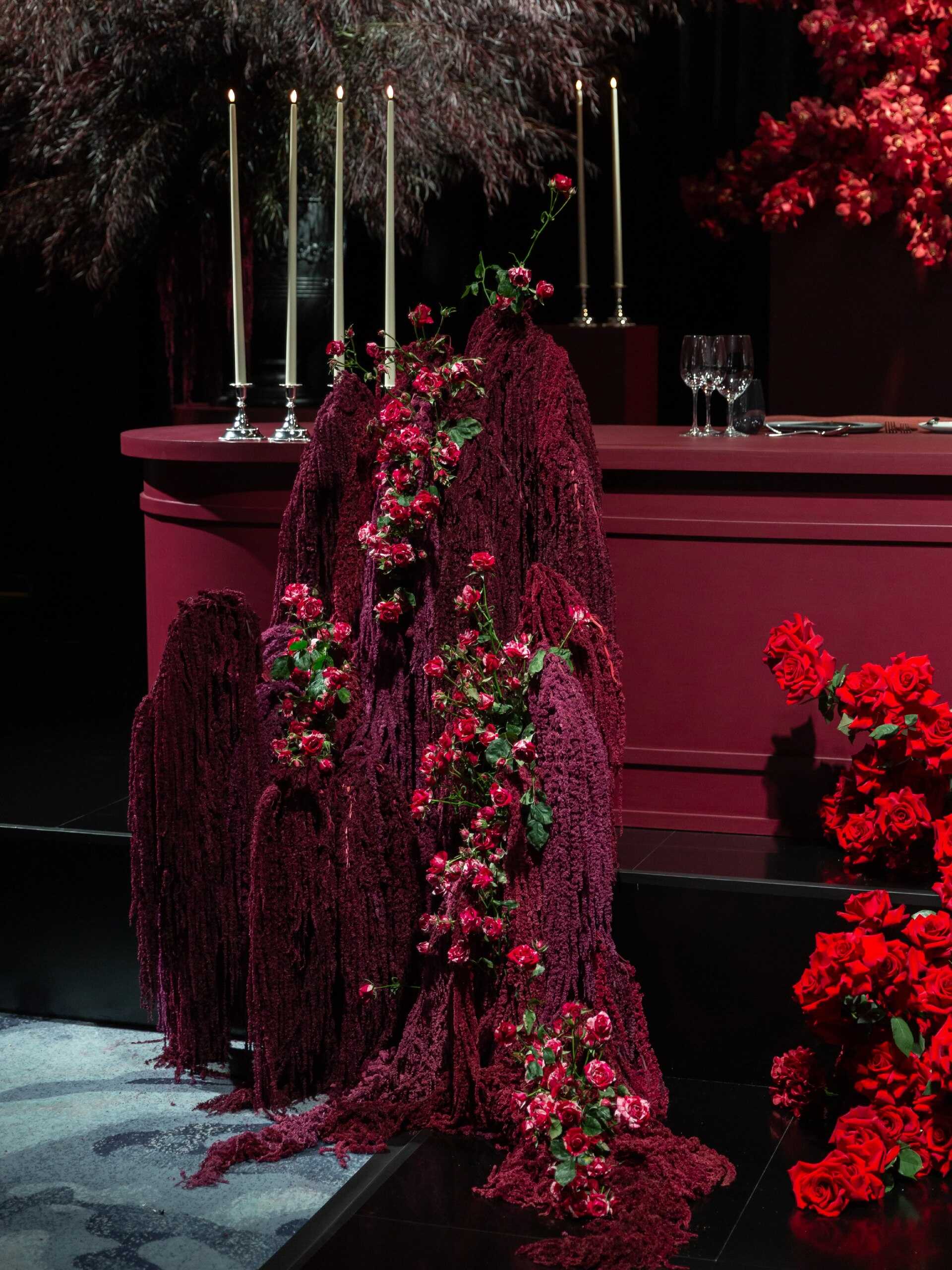
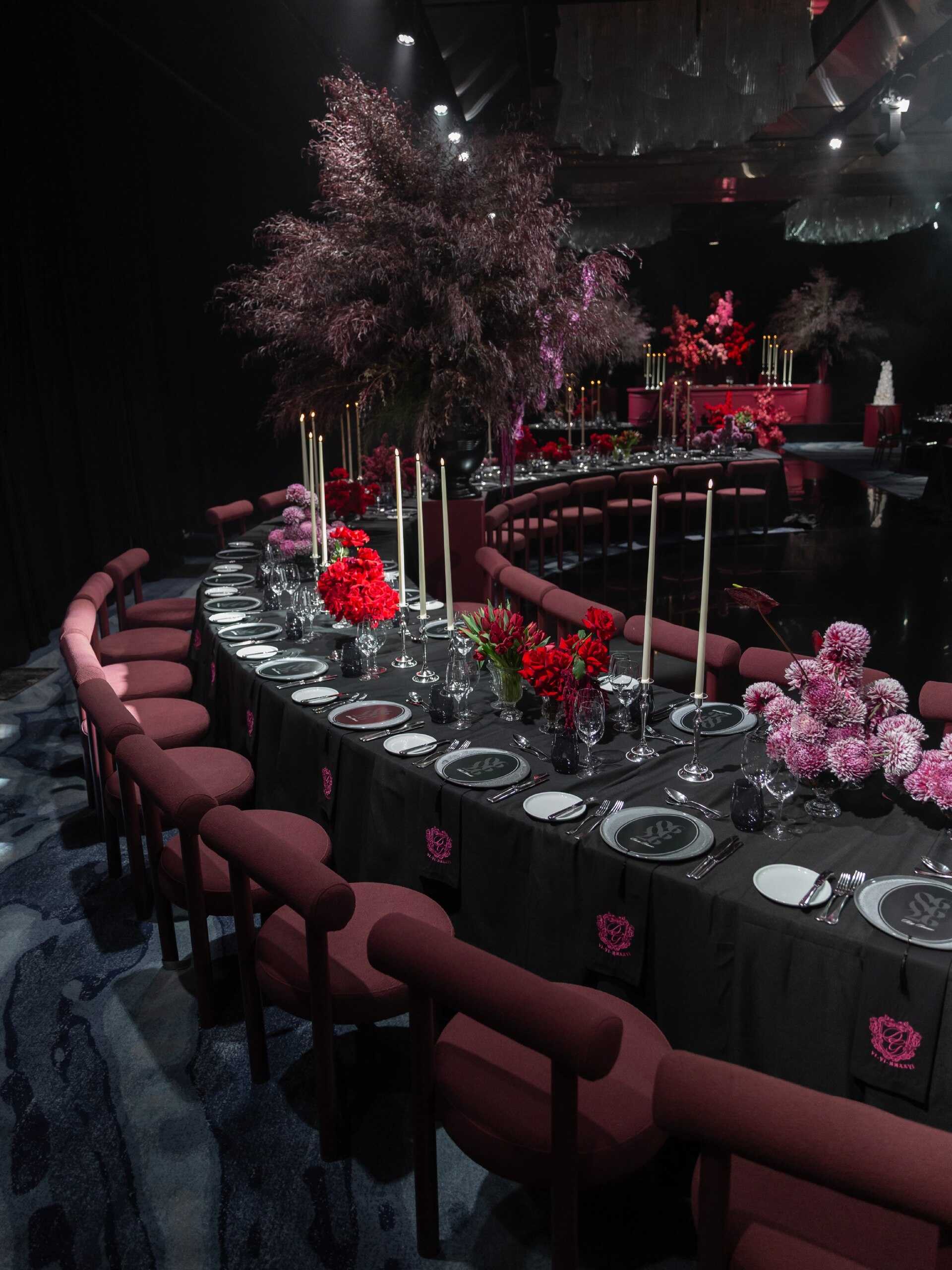
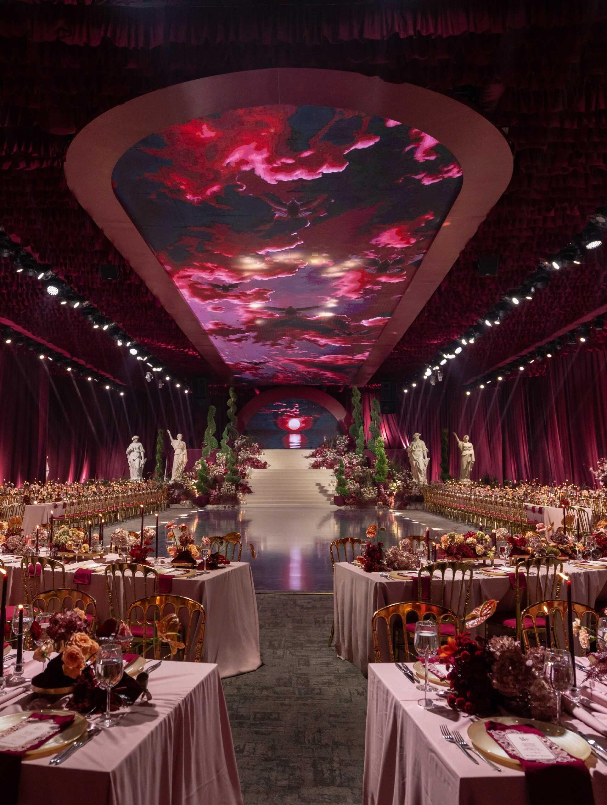
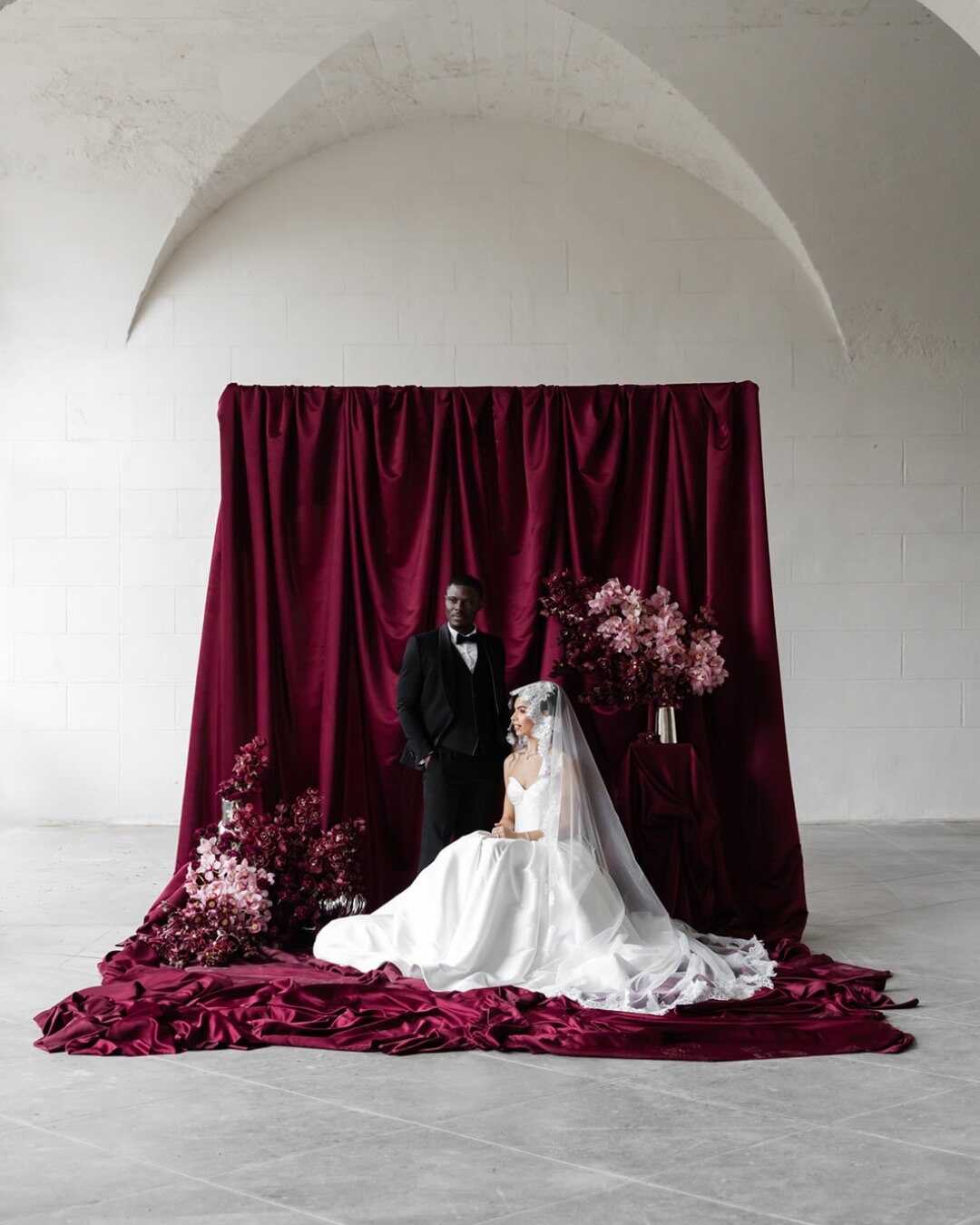
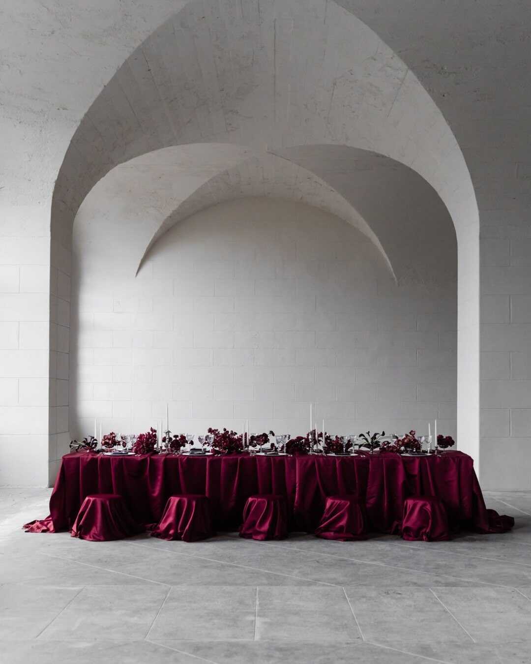
Few colors feel as dramatically romantic as deep burgundy, and 2027 leans hard into that drama instead of softening it. Rich, berry-toned linens, deep red blooms, and candlelight together create an atmosphere built specifically for intimate, unforgettable evenings - the kind of palette that photographs best in exactly the dim, warm light most receptions already have.
Burgundy’s real strength this year comes from what it’s paired with, not the color alone. Set against warm cream or ivory, it feels rich without tipping into heavy. Alongside silver, it becomes one of the season's strongest moody combinations - cool metal cutting cleanly through a deep, warm shade. A touch of soft blush or cream as an accent keeps the palette from feeling too dark, letting the contrast do the work instead of the burgundy carrying the room alone. Couples specifically searching out burgundy wedding color combinations tend to find the color works hardest in autumn and winter settings, where low natural light already matches its mood.
Chocolate
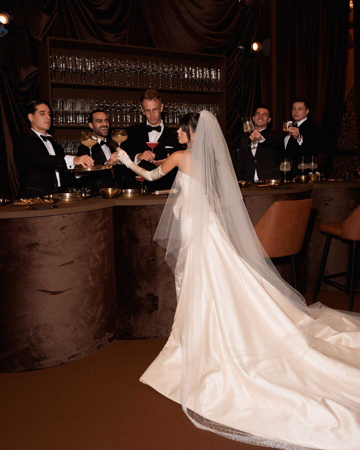
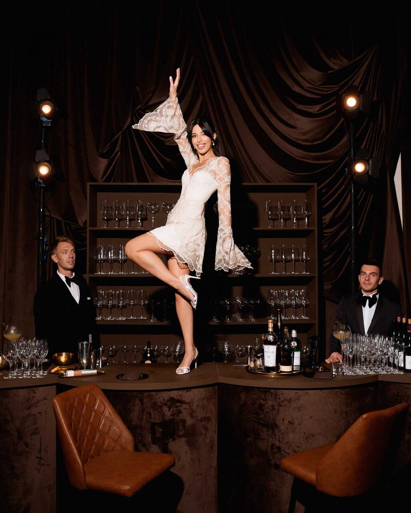
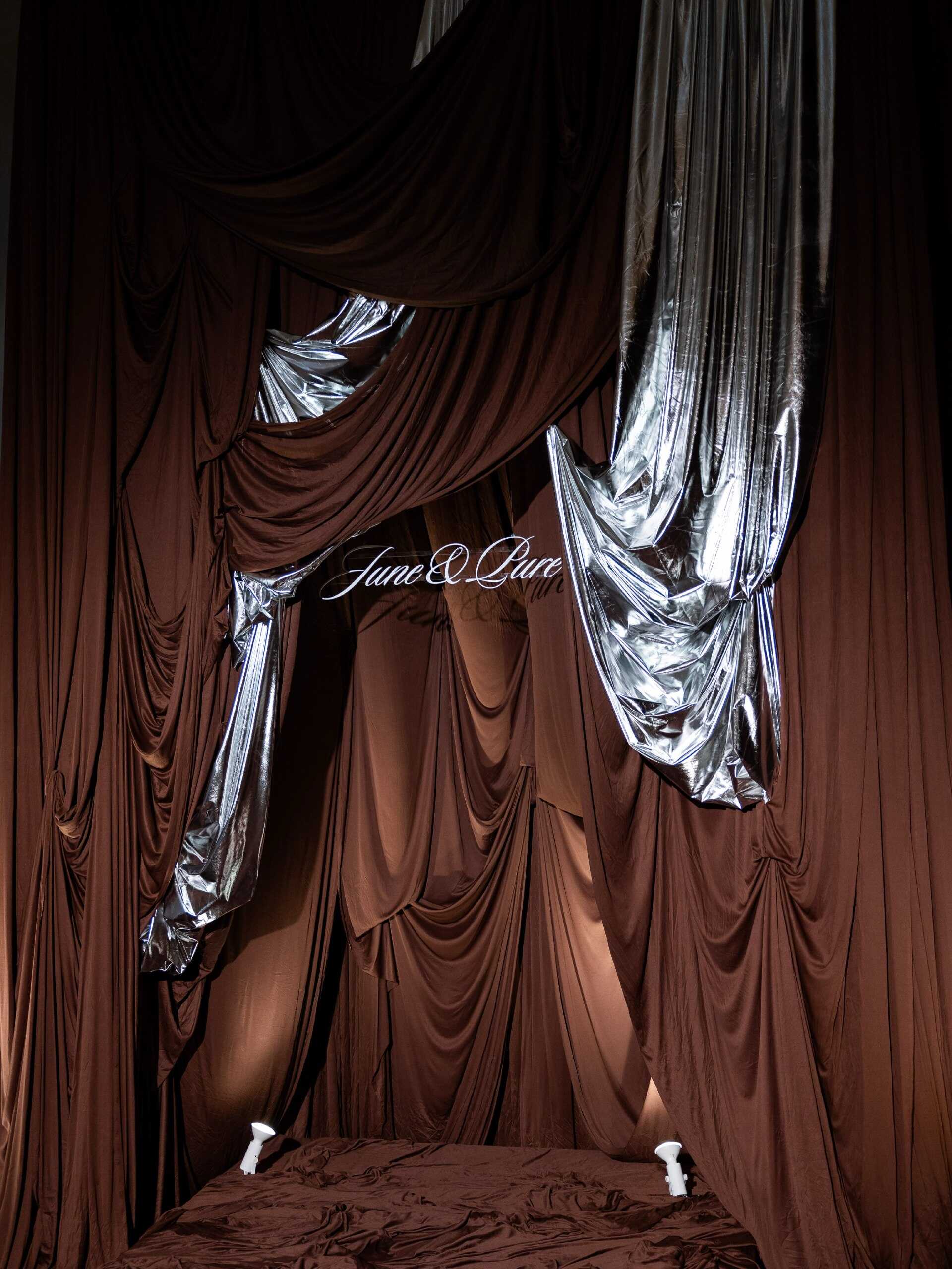
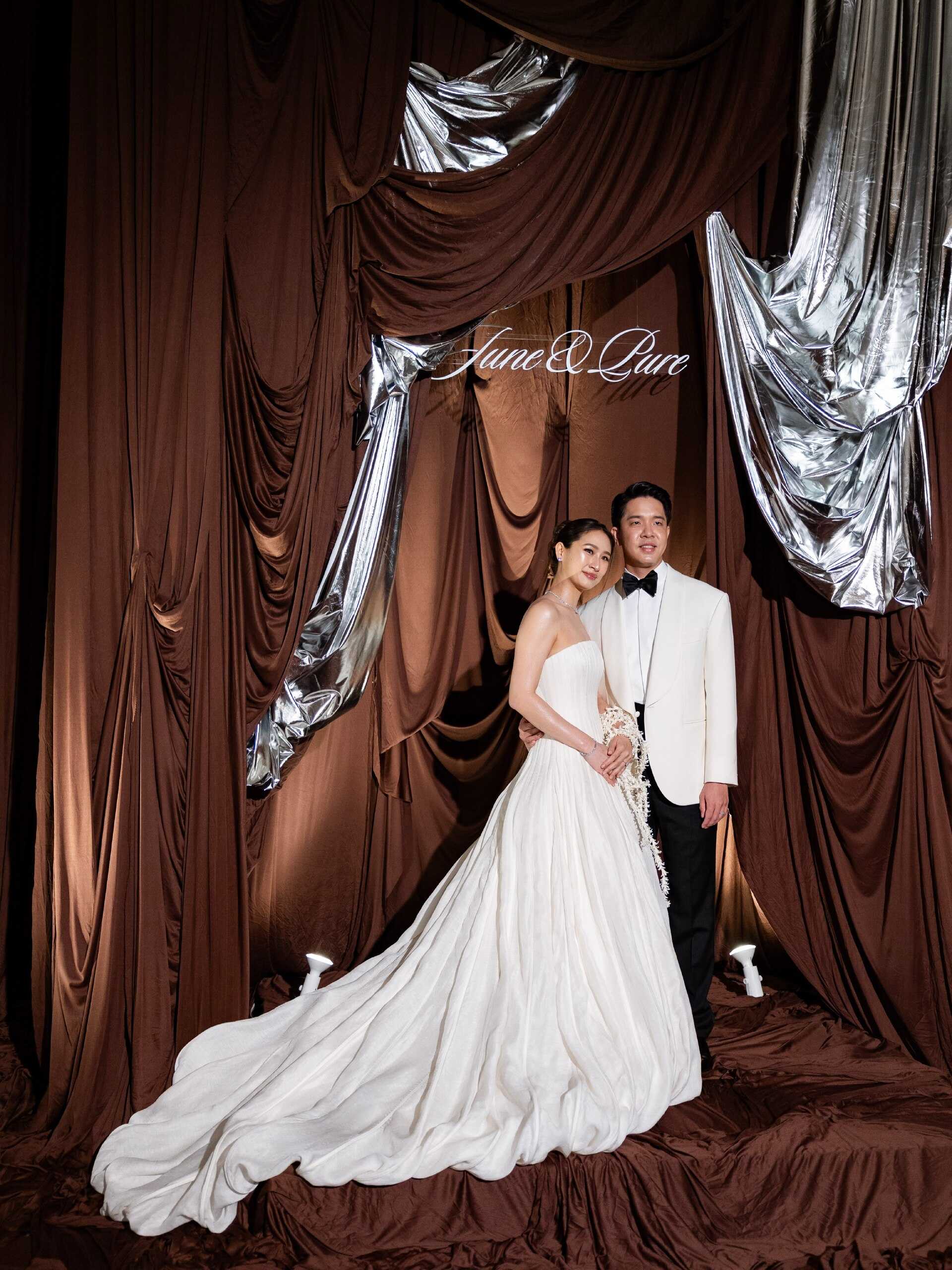
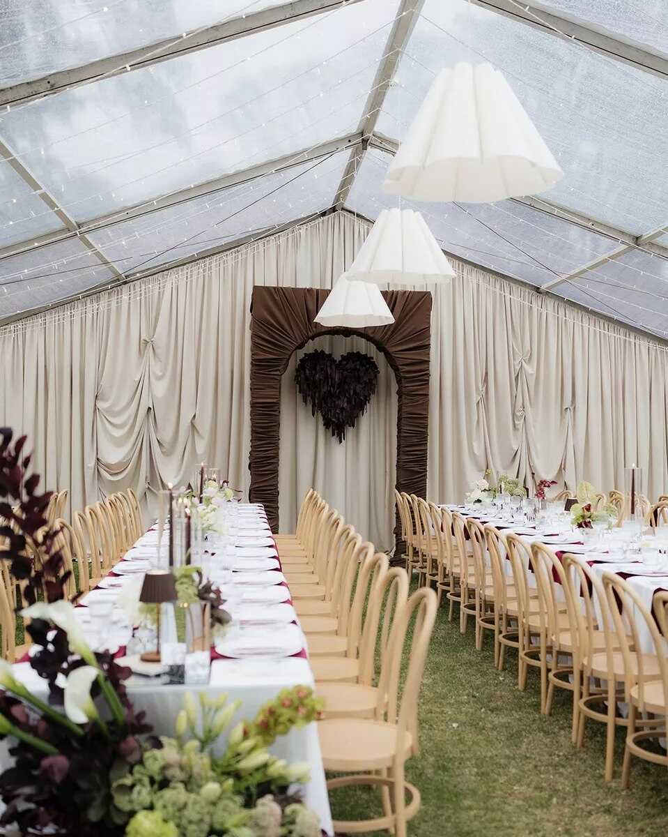
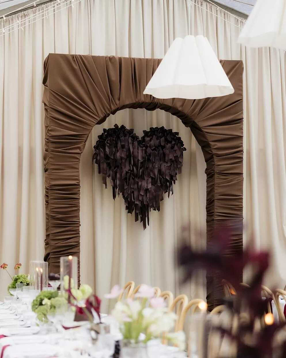
A few years ago, few couples would have called brown a wedding color at all. In 2027, chocolate brown has become one of the more genuinely interesting shifts in the entire palette conversation - showing up in bridesmaid attire, table linens, full stationery suites, and even floral choices, far from the flat, dated brown of past decades.
What makes chocolate work now is exactly what makes it feel unexpected: warmth without sweetness. Paired with ivory, champagne, caramel, dusty rose, or muted gold, it comes across as understated luxury rather than a departure from elegance. Tonal browns more broadly - chocolate, latte beige, portobello mushroom - are increasingly treated as a genuine alternative to classic white and cream, offering the same neutral base with considerably more richness and depth underneath.
The color suits autumn and winter weddings especially well, where its warmth matches the season instead of fighting against it. Couples weighing wedding color combination options that skip white entirely often land on chocolate specifically because it still photographs as neutral and versatile - it just brings a depth to portraits and tablescapes that pure white or cream can’t offer on its own.

How to Mix Wedding Colors: The Best Pairings for 2027
The most frequently asked question from couples isn't which single color to choose - it's how to combine two or three, so the color scheme doesn't feel flat or chaotic. This year, perfectly coordinated color schemes are gradually losing popularity; the aim nowadays is for colors to feel right together, not to match exactly.
| Base Color | Strongest Pairing | Best For |
|---|---|---|
| Plum | Lavender + a light neutral | Fall and winter, romantic settings |
| Terracotta | Sage green + beige | Rustic, Mediterranean, outdoor |
| Olive | Gold or lavender | Garden weddings, layered neutrals |
| Silver | Midnight blue or burgundy | Modern venues, evening receptions |
| Powder Pink | Mocha or deep plum | Spring dates, romantic-modern mix |
| Burgundy | Cream + silver accents | Autumn/winter, candlelit receptions |
| Chocolate | Ivory + caramel or dusty rose | Autumn/winter, understated luxury |
A few general rules can tell the difference between the best wedding color combination and one that seems haphazard. If you keep one aspect of the color pairing lighter, for example, a bare table, pale linen, or an ivory dress, the more intense tones appear elevated rather than heavy. A scheme based on one main color, one neutral as a supporting color, and a single accent color is more likely to work than having four or five shades all competing for attention. And by using metallics as a finishing touch rather than as a third color - such as with silver flatware or gold candlesticks - the entire color scheme is usually brought together without the need to add anything new.
Which Wedding Color Fits Which Season
The selection of color is not just a matter of taste - the time of year does, in fact, influence which of these seven schemes will work in the room, given that natural light affects the way each shade on the list appears. A color scheme that looks excellent in photographs at golden hour in September can look entirely flat under the more intense, brighter light of a midday June ceremony.
Spring and summer dates tend to be on the lighter side of the scale. A combination of powder pink with either fresh green or ivory has an obvious seasonal appeal, and lavender mixed with cream seems romantic without making a warm-weather occasion feel too heavy. Olive green also works well in these cases, particularly in garden or outdoor settings, since its natural, calming color matches the surroundings rather than clashing with them.
In autumn and winter, colors tend to move towards the more intense and somber part of the color range. Burgundy, chocolate, and deep plum adapt to low, warm light rather than opposing it, while terracotta acts as a link between the two seasons - taking on a lighter, peachy tone in late summer and becoming deeper, paired with warm neutral tones when autumn arrives. Silver metallic also works well in both halves of the year since its cool appearance photographs equally well against a bright spring palette as it does against a dark winter one.
Seven palettes are really just seven starting points. Wezoree's Inspiration section is where the rest of the color story lives - trends, expert tips, and ideas straight from the vendors building these palettes for a living - for anyone still chasing the exact shade their wedding should feel like.

FAQ
What are the biggest wedding color trends for 2027?
This year's most popular colors are plum and lavender, terracotta, olive green, silver metallics, powder pink, deep burgundy, and chocolate brown, and it is now more common for couples to combine two or three of these rather than choosing just one color. In the current 2027 wedding color palette trends, silver replacing gold as the preferred metallic is probably the most significant change compared to previous seasons.
Is gold or silver more popular for weddings in 2027?
Silver has truly become the metal of preference this year as it seems cooler, more modern, and a bit more romantic when set beside candlelight. Nevertheless, gold has by no means vanished altogether - a great many couples are now using both metals rather than picking just one.
What’s the best wedding color combination for a fall wedding?
Burgundy paired with warm cream, chocolate brown with ivory, and terracotta with deep neutrals all look especially well in the low, warm light typical of an autumn reception. These richer, layered color schemes photograph best when natural daylight enhances them.
Can I mix more than two colors in my wedding palette?
Yes, though most successful wedding color palettes stick to one main color, one supporting neutral, and a single accent rather than distributing the focus among four or five different shades. Adding a metallic, such as silver or gold, as a finishing touch instead of a full additional color tends to bring the overall palette together more neatly.
Do wedding colors need to match exactly across florals, linens, and attire?
That's no longer the case - one of the most noticeable changes in 2027 is a shift from perfectly coordinated color schemes to ones that look good together. For example, a bridesmaid's dress in deep plum paired with a lighter lavender bouquet seems deliberate rather than mismatched, as long as the overall tone stays consistent.
Which wedding colors work best for a spring or summer wedding?
Powder pink, lavender and olive green all look especially good in the warmer months, particularly when combined with a lighter neutral such as ivory or cream so that the overall colour scheme remains fresh rather than heavy. Lighter combinations of this kind also tend to photograph well in the bright, more direct light which is typical of spring and summer ceremonies.
Is chocolate brown really considered a wedding color now?
Chocolate has gone from an unusual option to one of the most discussed wedding color trends over the past two years, now used in stationery, linens, and even bridal party attire. When combined with ivory, caramel, or dusty rose, it looks warm and sophisticated rather than outdated.