2027 Wedding Stationery Trends
- Author: Natali Grace Levine
- Reading time: 16 min 57 sec
- Publication date: 08/12/2026
- Updated: 08/13/2026


- Why Wedding Stationery Is Becoming a Genuine Art Form in 2027
- Nautical Theme
- Flower-Shaped Invitations
- Laser-Cut Storytelling
- Plum-Colored Invitations
- Tactile Heirloom Stationery
- Crochet & Pinprick Lettering
- Envelope-Style Menu Cards
- Illustrated Bird-Shaped Cards
- Playful Maximalist Stationery
- Playing Card Invitations
- Whimsical Line-Art Illustration
- What’s Quietly Falling Out of Style
- Which Trend Fits Your Wedding Style
- How to Combine These Trends Without Overdoing It
- FAQ
A week after guests would throw their wedding invitations away, but in 2027, they are starting to frame them. What was once just a practical piece of paper—containing the date, the time, the address, and the request to RSVP by this date—has gradually become one of the most personal and widely photographed items of the entire engagement season. The 2027 wedding stationery trends are no longer aiming for 'elegant'. Instead, they are focusing on being memorable, tactile, sometimes odd, and almost always something a guest would like to keep.
Find Your Perfect Wedding Vendors

Why Wedding Stationery Is Becoming a Genuine Art Form in 2027
For the majority of the previous decade, wedding stationery adhered to a standard pattern—features such as a simple font, a subdued color scheme, and perhaps a wax seal if the couple chose to be bold. Although that period has not ended, it is now sharing prominence with a much more expressive approach, including invitations in the shape of flowers, laser-cut stories, hand-embroidered text, and menu cards that open out like small envelopes. The wedding stationery trends that are shaping 2027 regard the invitation set as a true forecast of the wedding itself, rather than an afterthought inserted between the venue and the dress.
This change also reflects a wider cultural trend: in an age when most communication takes place on a screen, a truly tactile, well-designed piece of paper has become remarkably special. It conveys a sense of effort in a way that a text message never can, and stationery designers have observed that couples respond to this rarity - the rarer a physical object becomes in everyday life, the more significant it is when it finally arrives in a mailbox. That is precisely why so many of the biggest wedding stationery trends in 2027focus on texture, dimension, and craftsmanship rather than on simple printed elegance, making the invitation something worth keeping rather than merely worth discarding after the RSVP deadline has passed.
Nautical Theme
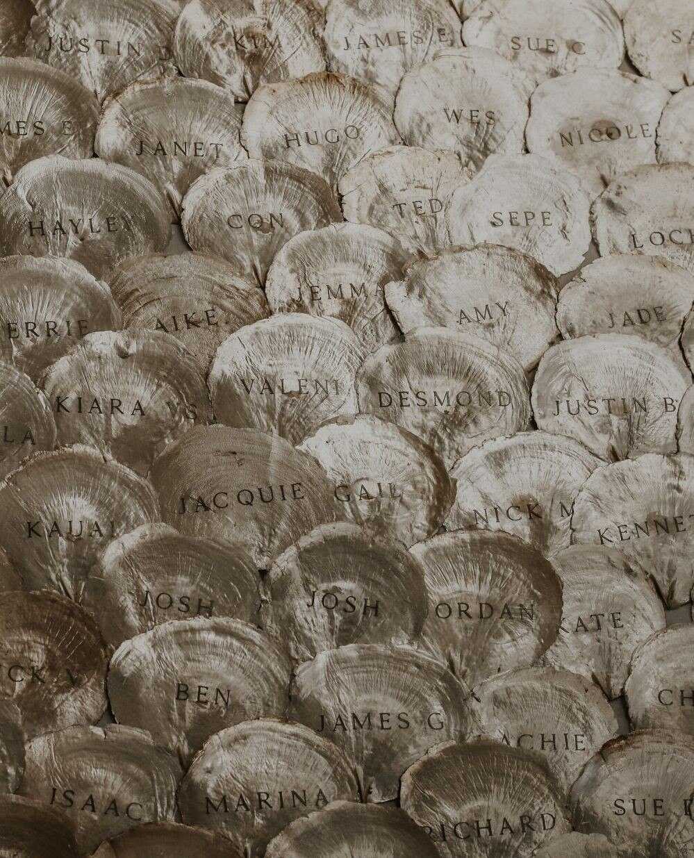
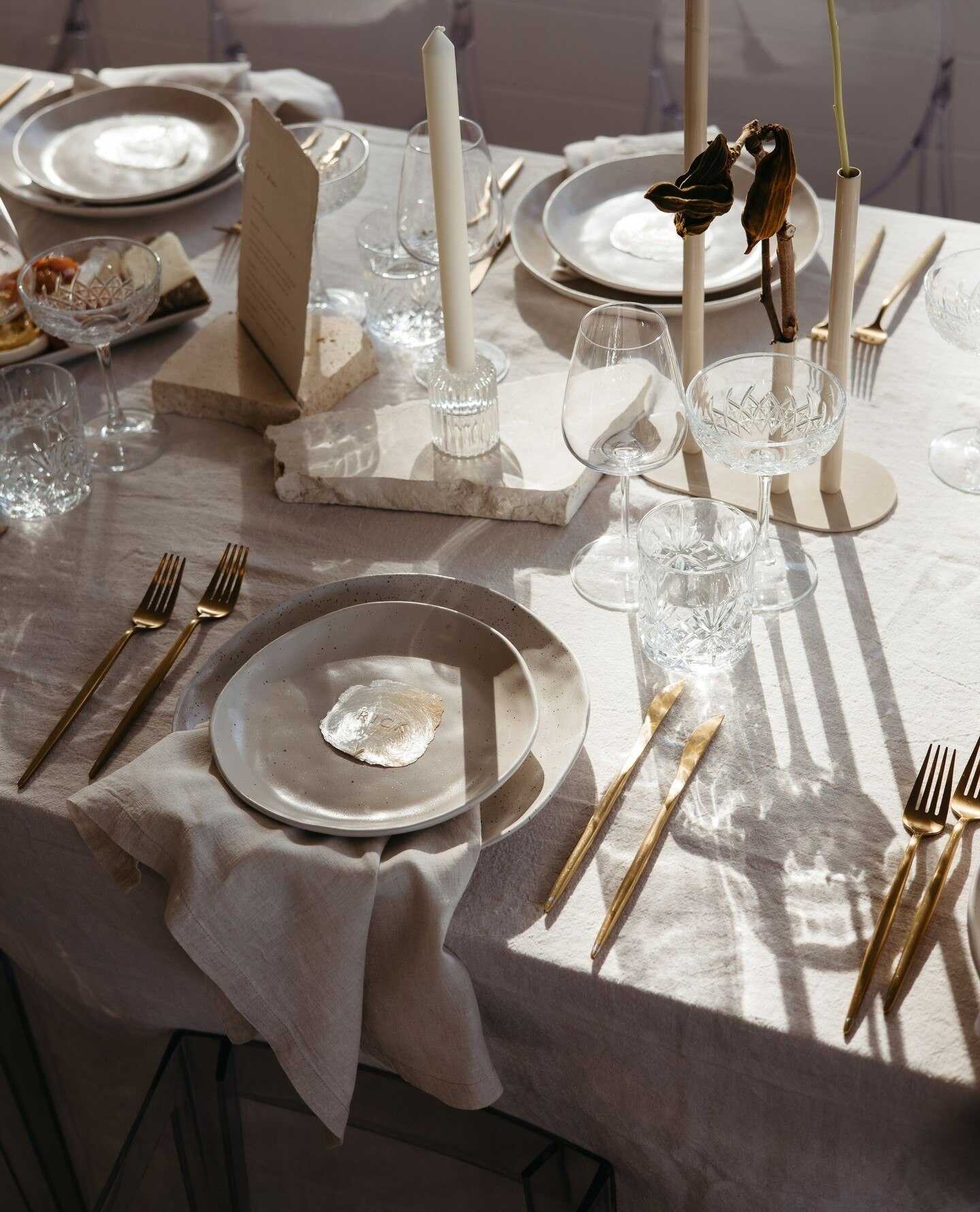
Coastal and destination weddings have been trending for years, but the nautical style of stationery in 2027 goes much beyond just using a simple anchor design or sticking to a navy and white color scheme. It includes rope-textured borders, wax seals in the shape of ship's wheels, envelope liners printed with old maritime maps, and invitation cards die-cut to match the outline of a sailboat or a lighthouse. This style suits couples who are marrying by the sea – whether it's on a coastline, at a lake, or on a riverside location – although many other couples, even if they are not marrying in such a place, are still adopting the look because they are attracted to the idea of 'setting sail' into married life.
The difference between a truly well-executed nautical suite and one that is merely kitsch generally lies in the color scheme - the use of deep navy, a beige similar to that of weathered rope, together with a single touch of coral or brass, gives a sophisticated appearance, whereas including too many literal nautical motifs at the same time makes the entire effect seem like that of a theme park. This year's designers have also begun to draw directly on vintage travel souvenirs - such as old steamship ticket stubs, hand-drawn coastal maps, and weathered brass compass illustrations - rather than on the more general beach-wedding clip art which was characteristic of earlier versions of this style, thus giving the suite a much more mature look.
Flower-Shaped Invitations
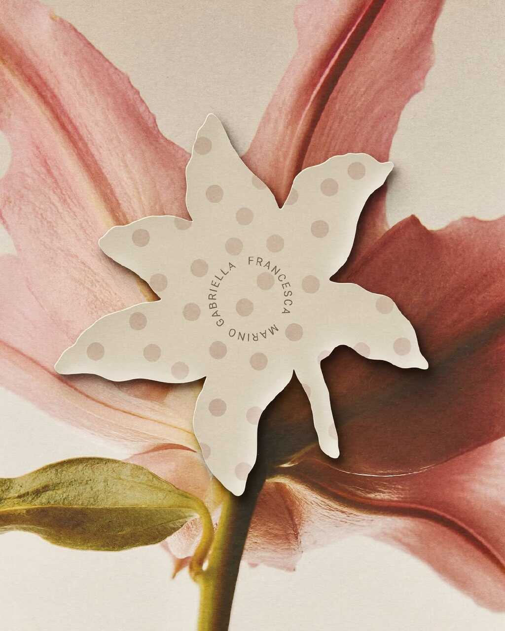
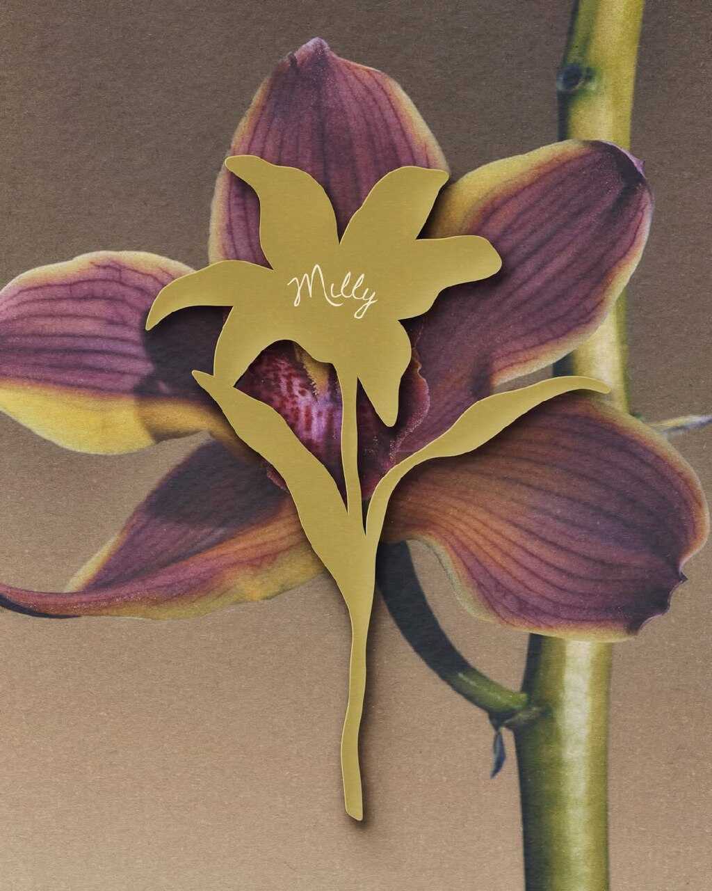
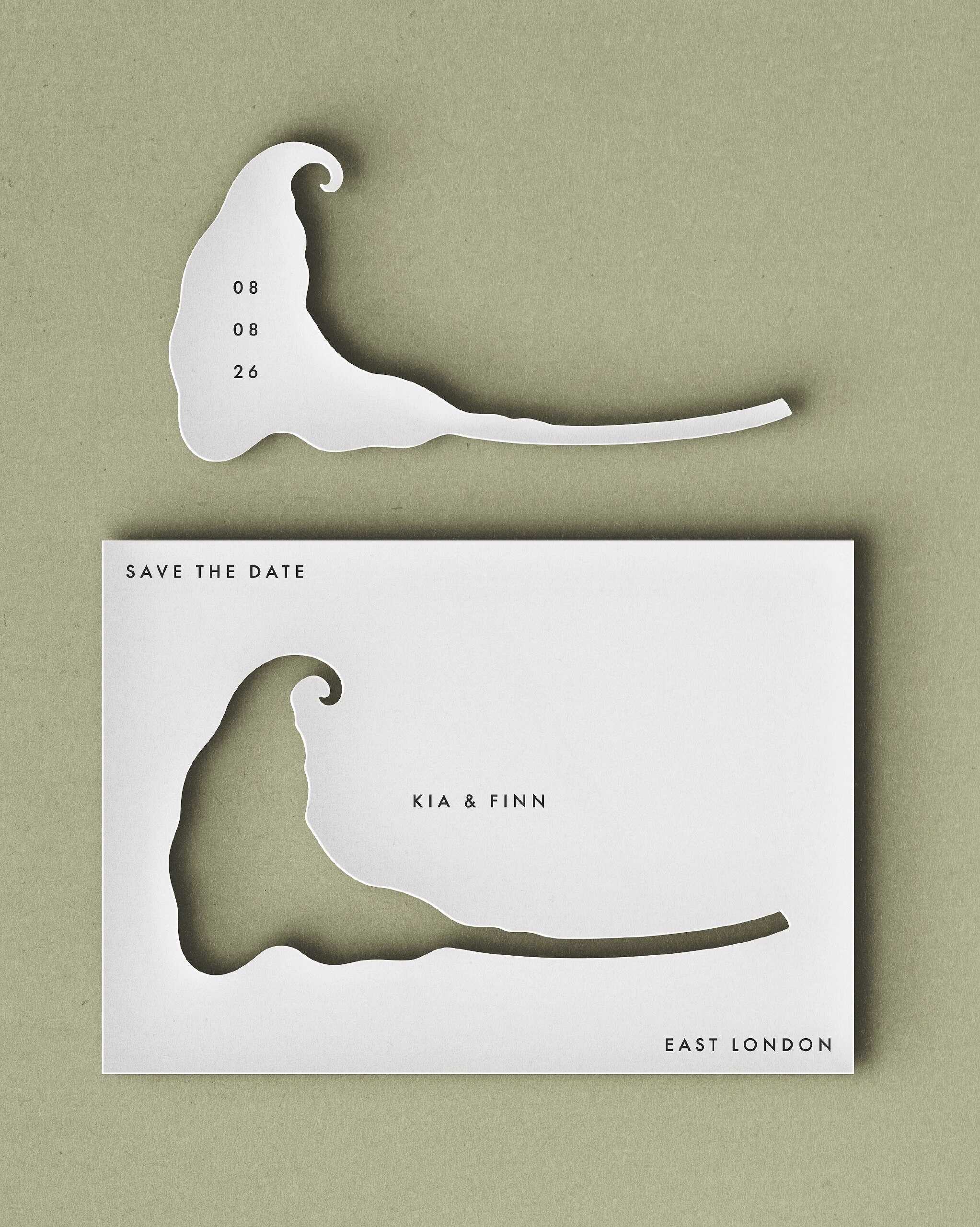
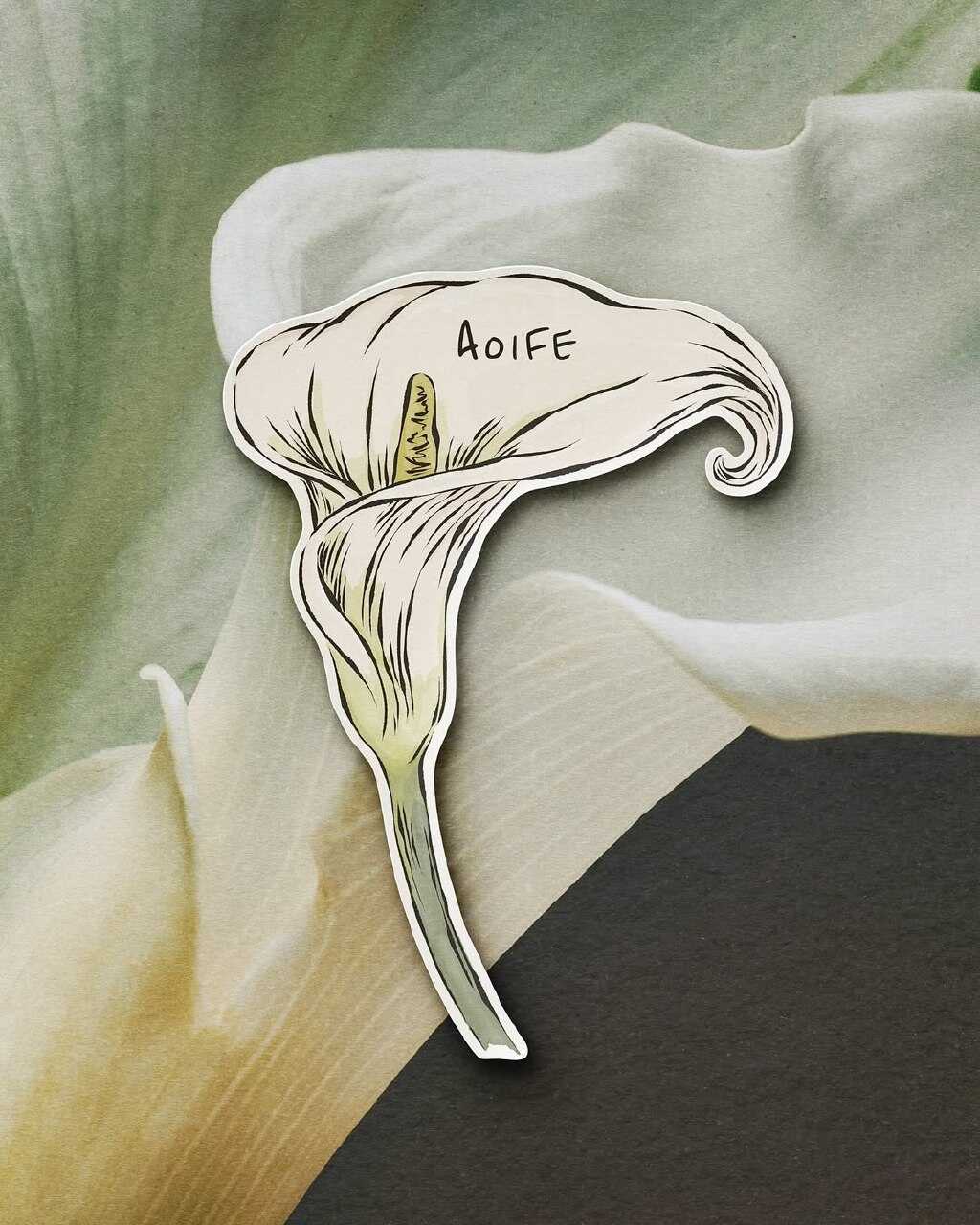
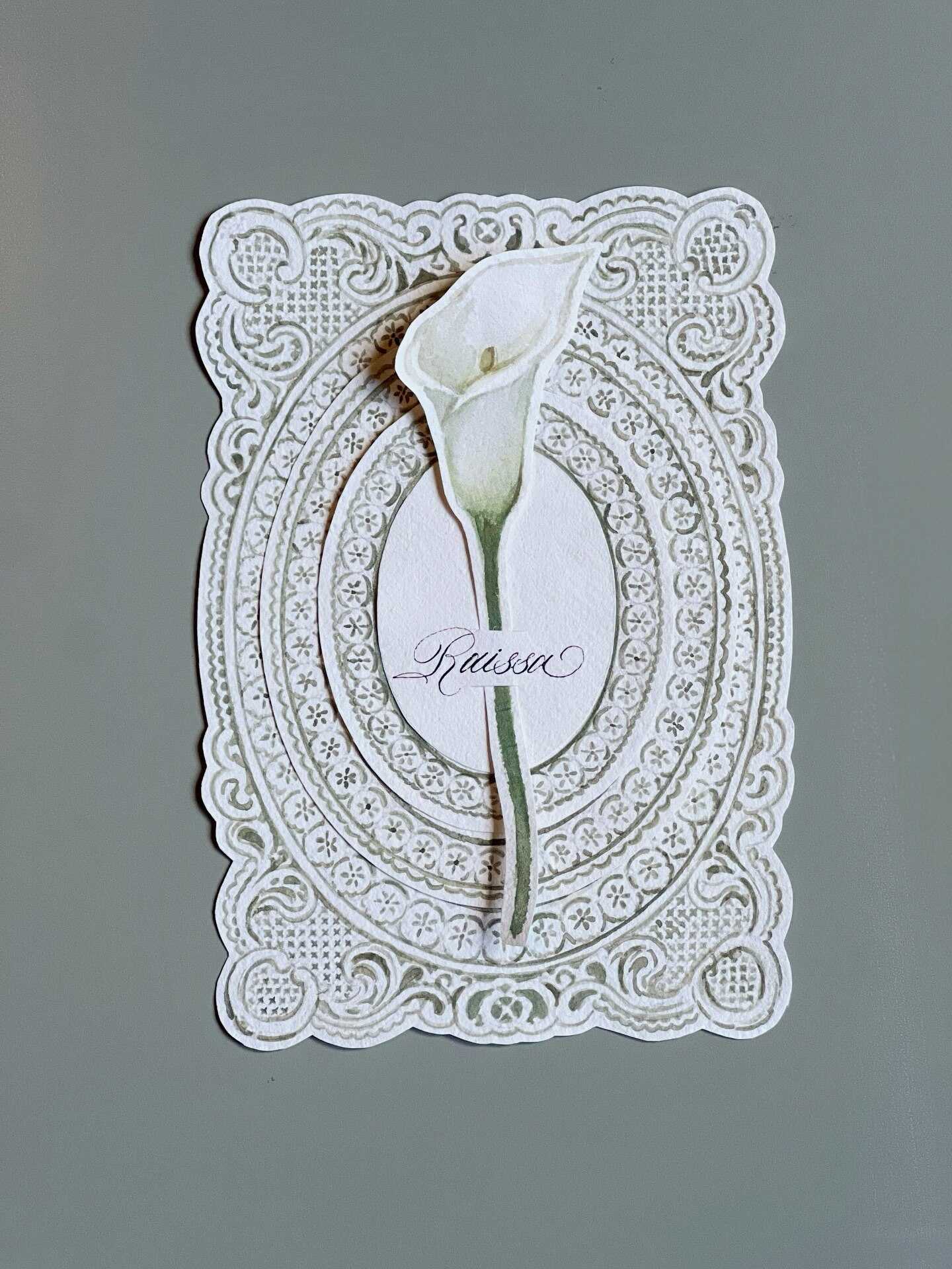

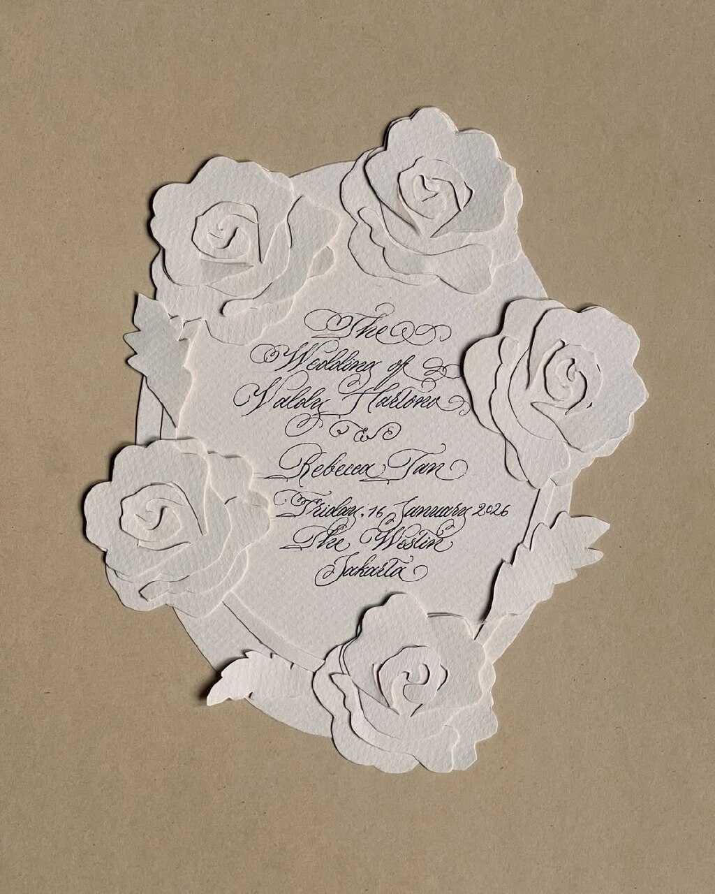
Die-cut invitations shaped like real blooms - peonies, roses, and even the silhouettes of wildflowers - have gone from being a specialty on Etsy for a small circle of people to becoming a common request this year. Unlike a printed floral illustration, when a flower-shaped card is removed from the envelope, it immediately announces its form; this shape becomes the first design feature guests notice before they have even read a word.
This style is particularly suitable for garden, botanical, or spring weddings, since the invitation can in effect give guests a preview of the full floral theme of the day before they arrive. Those couples who are developing an invitation suite based on this trend usually combine it with:
- A coordinating envelope liner printed with a subtler, complementary botanical pattern
- Vellum or translucent overlay cards layered on top for added dimension
- Hand-lettered or botanical-inspired typography rather than a stark, modern sans-serif, which tends to clash with the softness of the shape
- Pressed or illustrated foliage details along the card’s edges, echoing the exact greenery used in the day’s actual florals
- Matching save-the-dates in a smaller, simplified version of the same die-cut shape, so the theme feels consistent from the very first mailing
The true strength of the format is evident when seen in person not when it appears on a feed. A card in the shape of a flower actually stands out when placed against a mirror or when pinned to a corkboard, something that a simple rectangular invitation seldom succeeds in doing, which is precisely the reason why so many guests end up keeping it long after the wedding has actually taken place.
Laser-Cut Storytelling
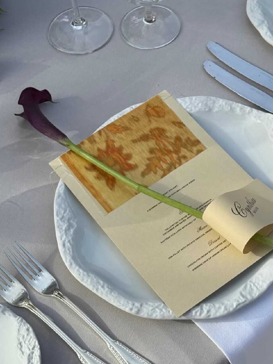
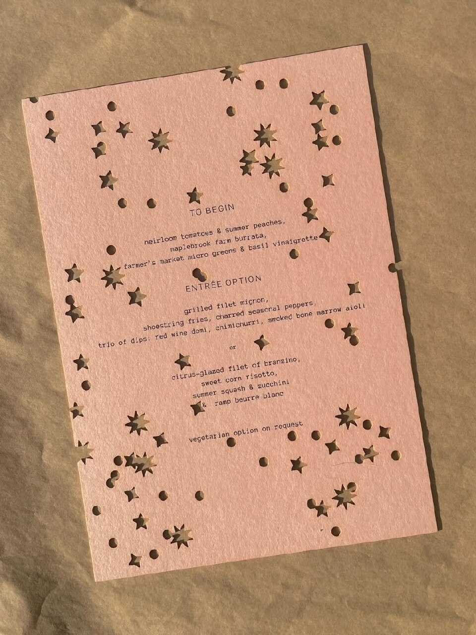
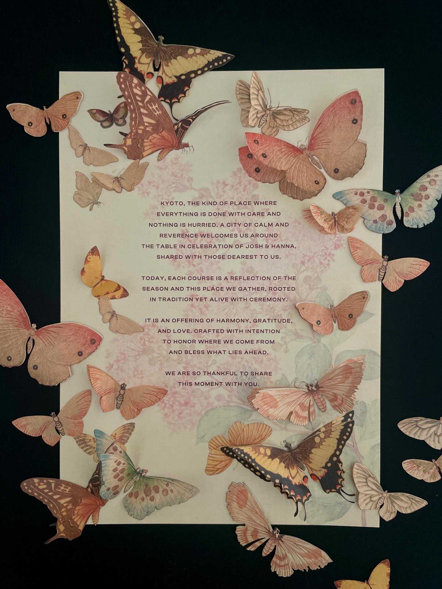
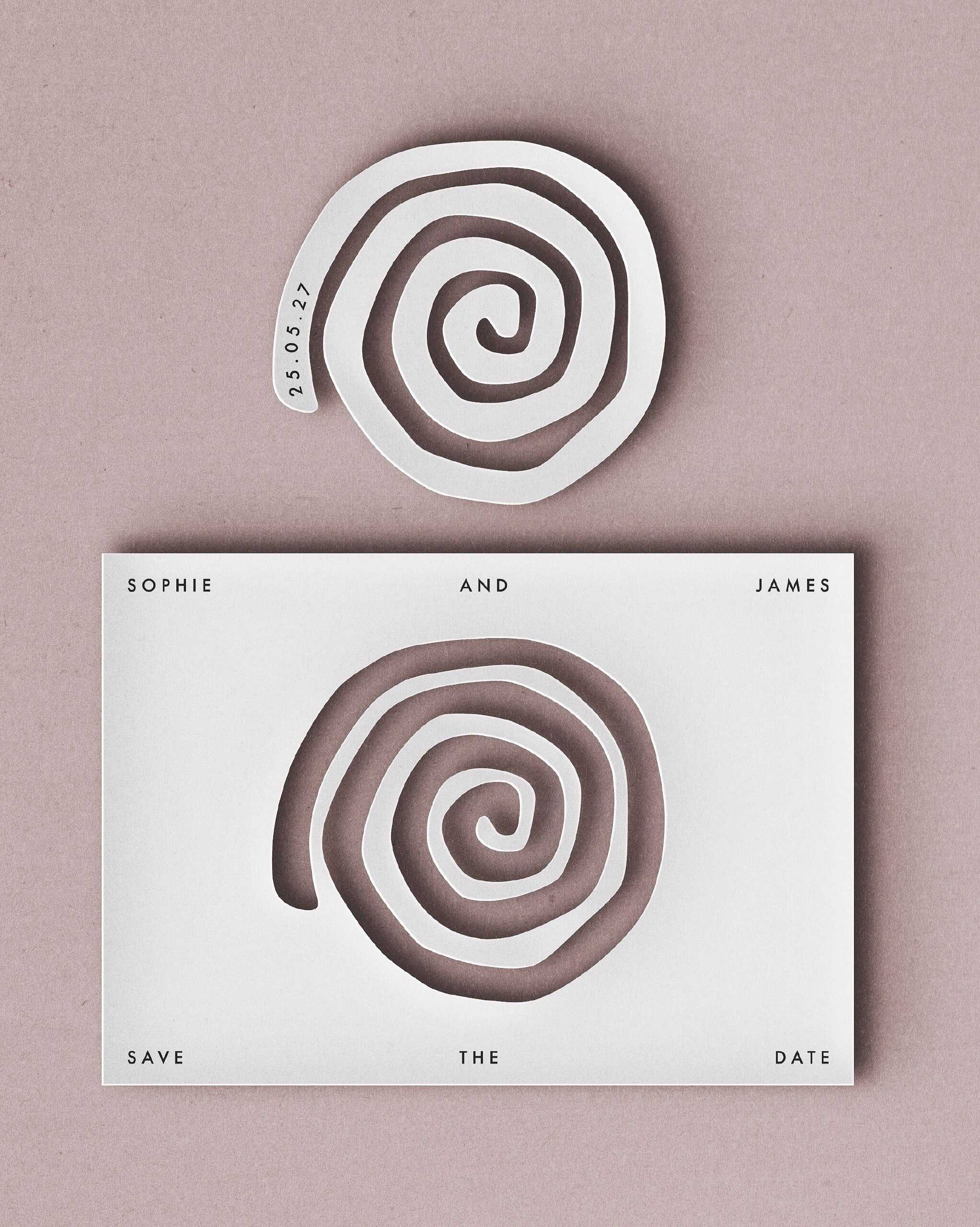
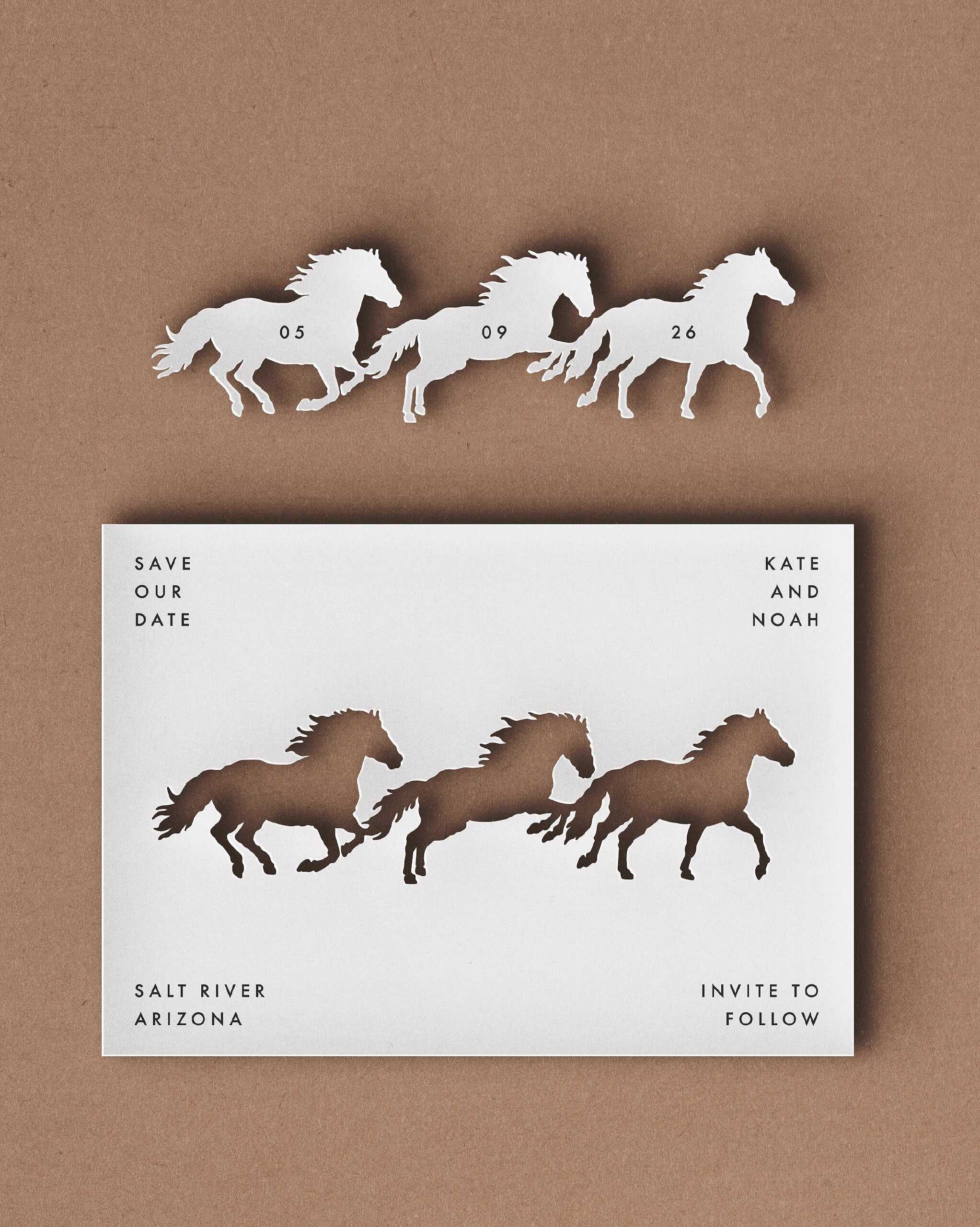
The idea of using laser-cut invitations is nothing new, but the ones from 2027 regard the technique as a real narrative device rather than just a decorative border. Instead of repeating the lace pattern, the designers are now cutting out complete scenes - such as the couple's outline under a particular tree, the skyline of the city where they first met, and an outline of the exact venue where they will get married. When held up to the light, the result looks rather like a small stained-glass window than a typical printed card.
What surprises most couples is the rather unexpected source of the technology involved in this trend. Laser cutting was first developed in the 1960s for cutting titanium and diamond dies in the aerospace and manufacturing sectors - a field completely unrelated to wedding stationery — and it wasn't until the 1990s that the technique made its way into paper crafting. In a rather odd way, every laser-cut invitation sent this year is a small descendant of industrial engineering from the Cold War period, having been put to use for something a great deal more romantic than cutting titanium.
This trend suits couples who have a very particular story to share, for example, a significant event, a common hobby, or an inside joke, since it allows them to put that narrative directly into the paper rather than hiding it in a footnote on a wedding website, which no one reads carefully.
Plum-Colored Invitations
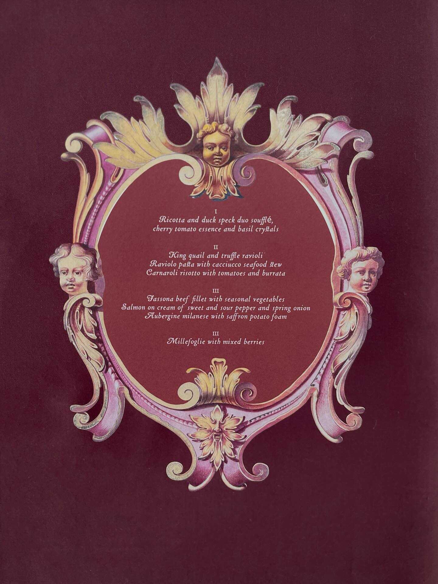
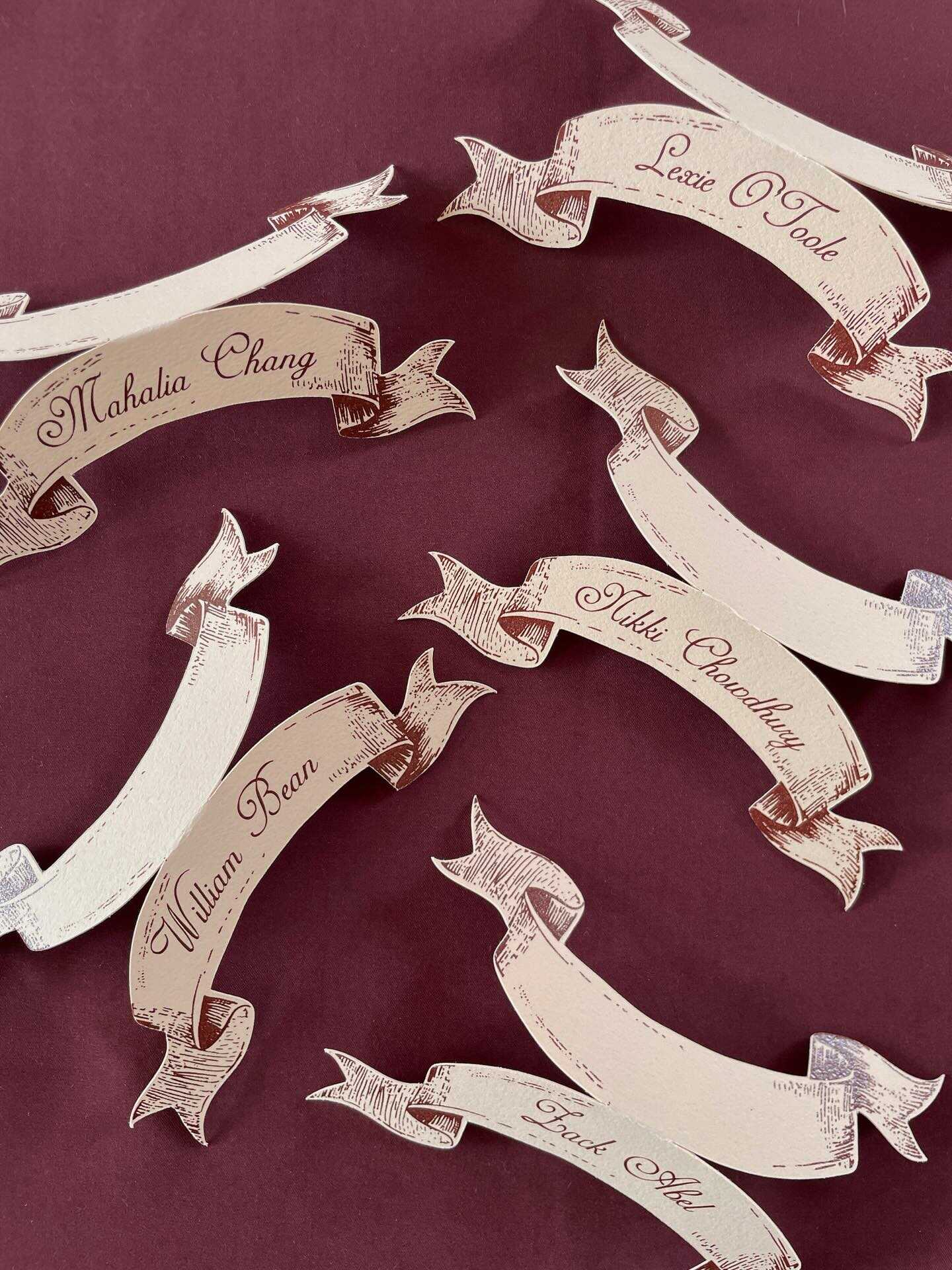
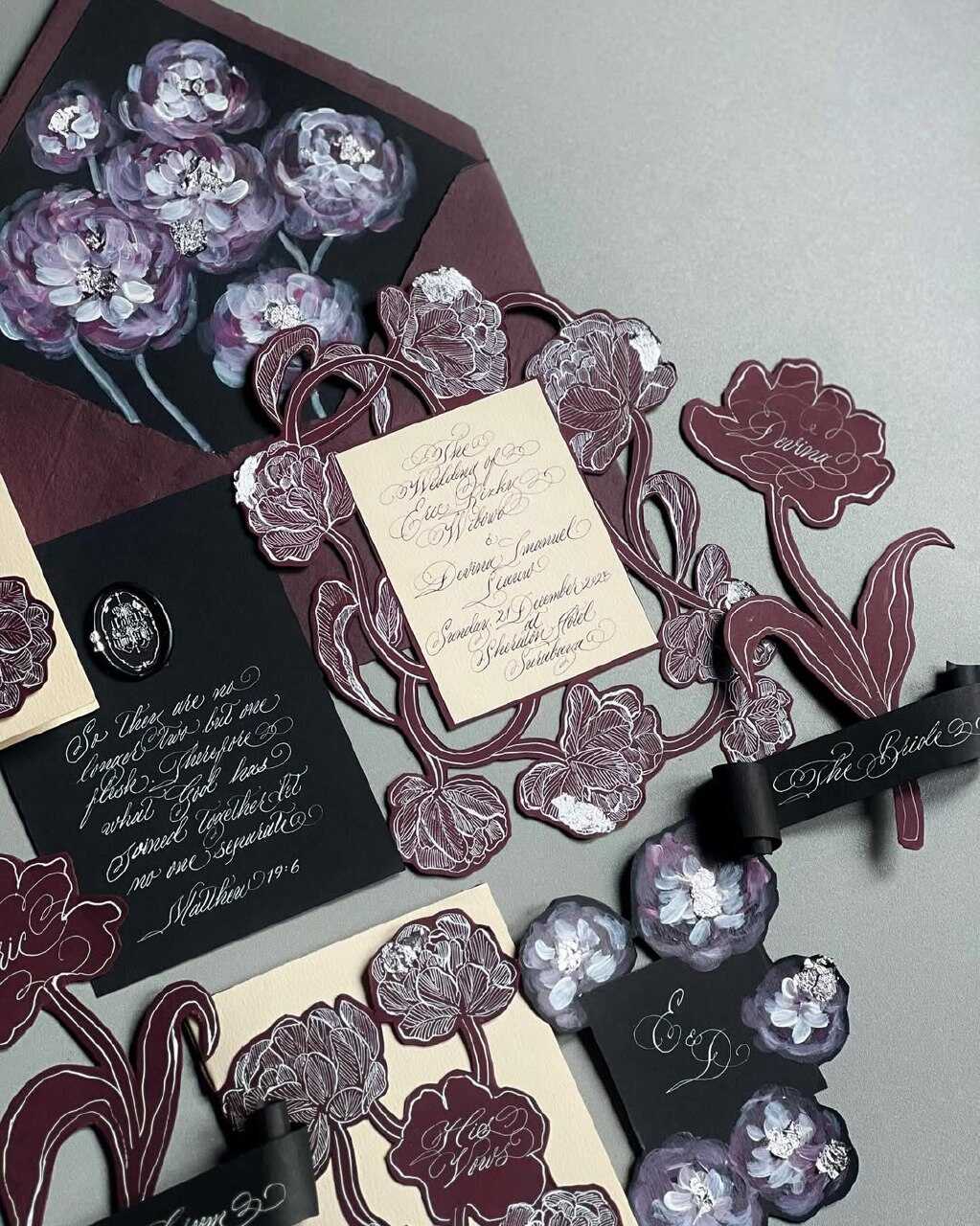
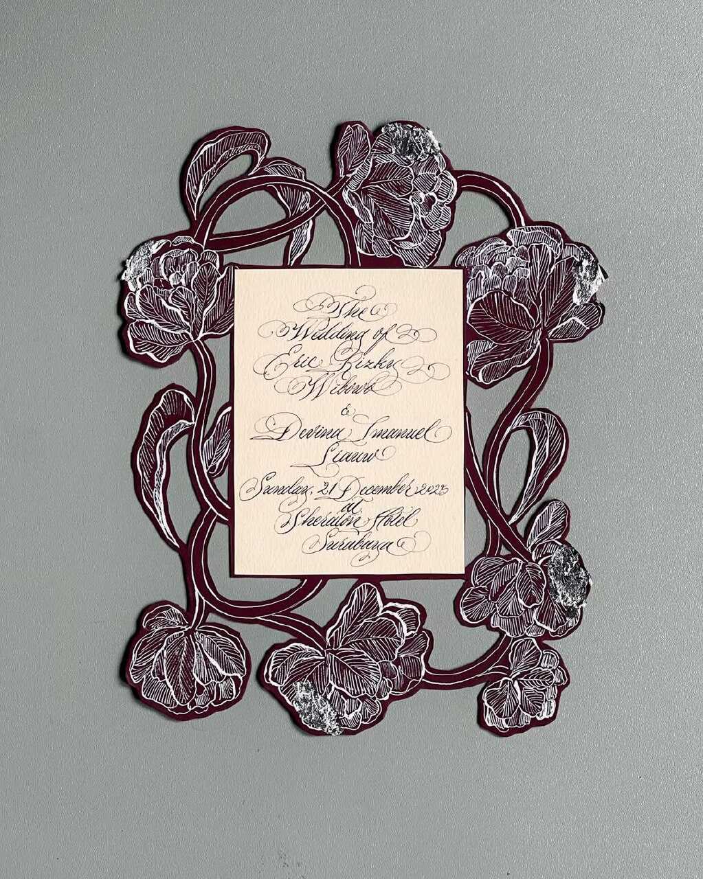
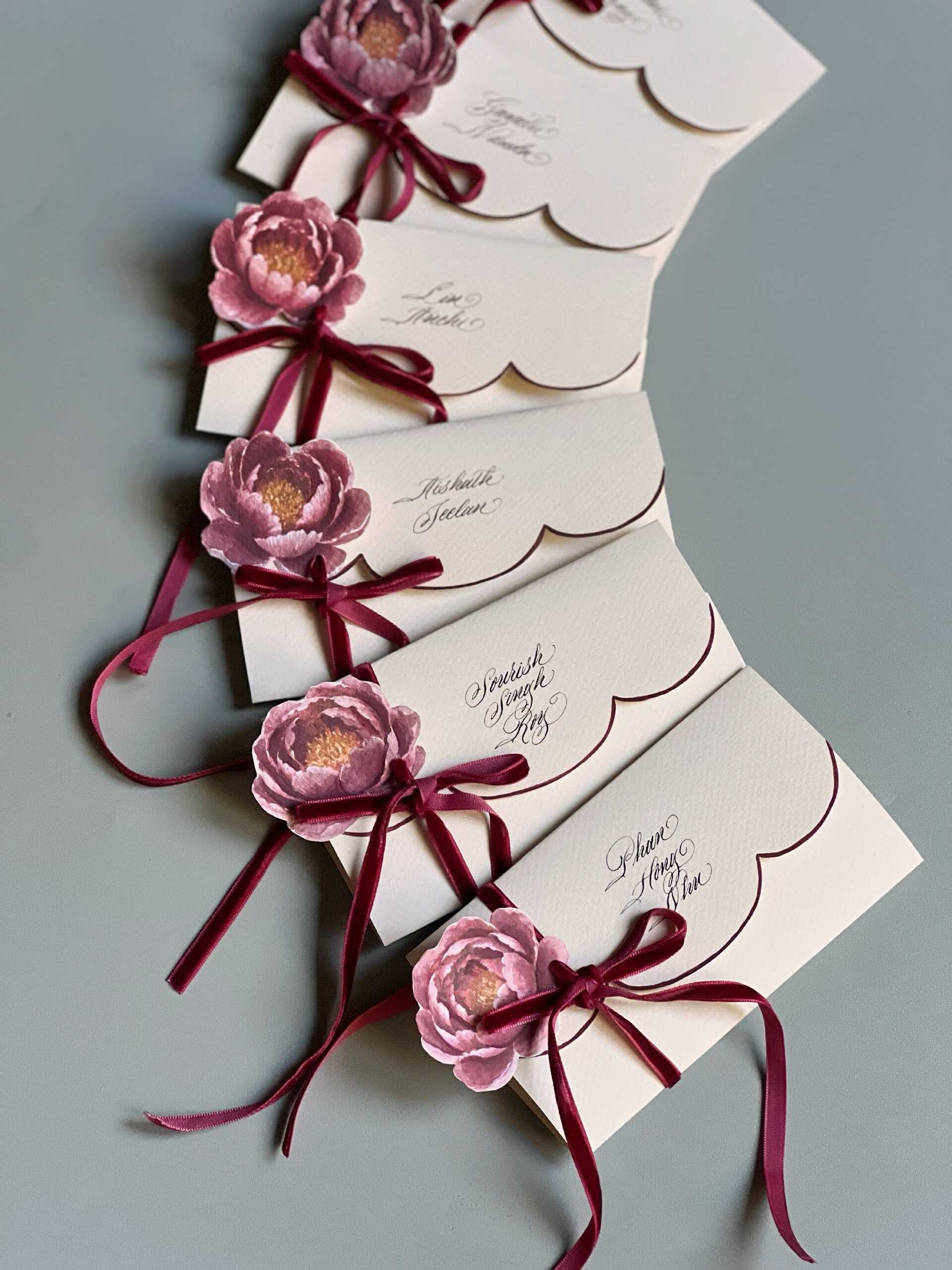
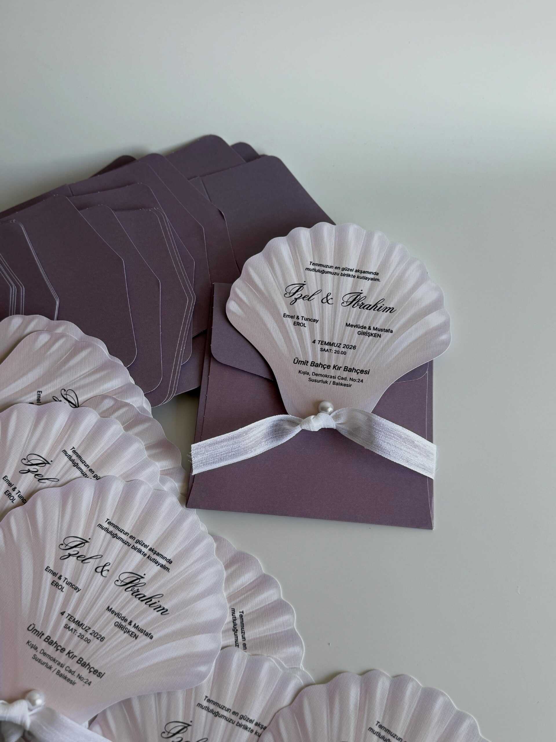
In 2027, deep plum, aubergine, and purples that are similar to wine are experiencing a genuine peak, taking over from the softer blush and sage shades that had been in vogue for the previous few years. This color has a dual character that is both romantic and truly luxurious, particularly when combined with gold or copper foil lettering, and it captures a richness that pastel palettes are unable to achieve under evening light.
Some interesting history concerning color: the idea that purple stands for luxury isn't something that was invented for marketing purposes; it is one of the oldest associations with color in human history. The Tyrian purple dye, which was obtained from a rare Mediterranean sea snail, needed thousands of mollusks to make just one gram and was in fact worth more than the weight of an equivalent amount of gold, so much so that Roman law limited the use of the colour to the emperors alone. The plum-coloured stationery in 2027 is, quite literally, drawing on thousands of years of 'this colour means power' without having to state it directly.
Plum is especially suitable for weddings in the fall and winter seasons, although in 2027 designers are more and more combining it with unexpected lighter touches - such as a soft cream cardstock, a pale blush ribbon, and a hint of sage green in the envelope liner - in order to prevent the color scheme from appearing too heavy. Those organizing an evening event with candlelight and jewel-toned flowers generally prefer this style most, since the plum stationery in effect gives a preview of that same richness before any of the guests reach the venue.
Tactile Heirloom Stationery
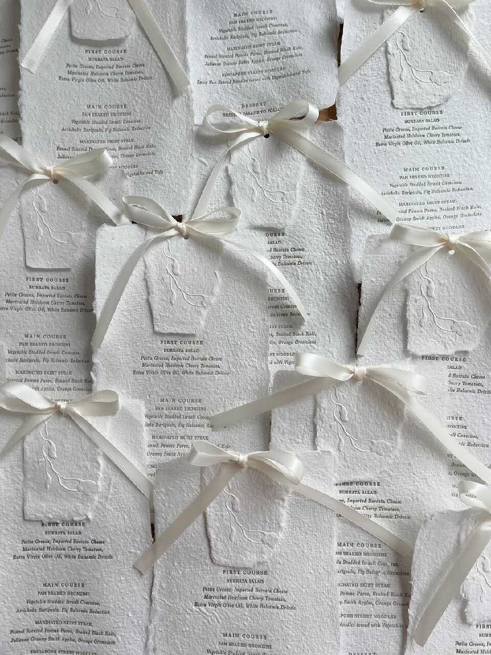
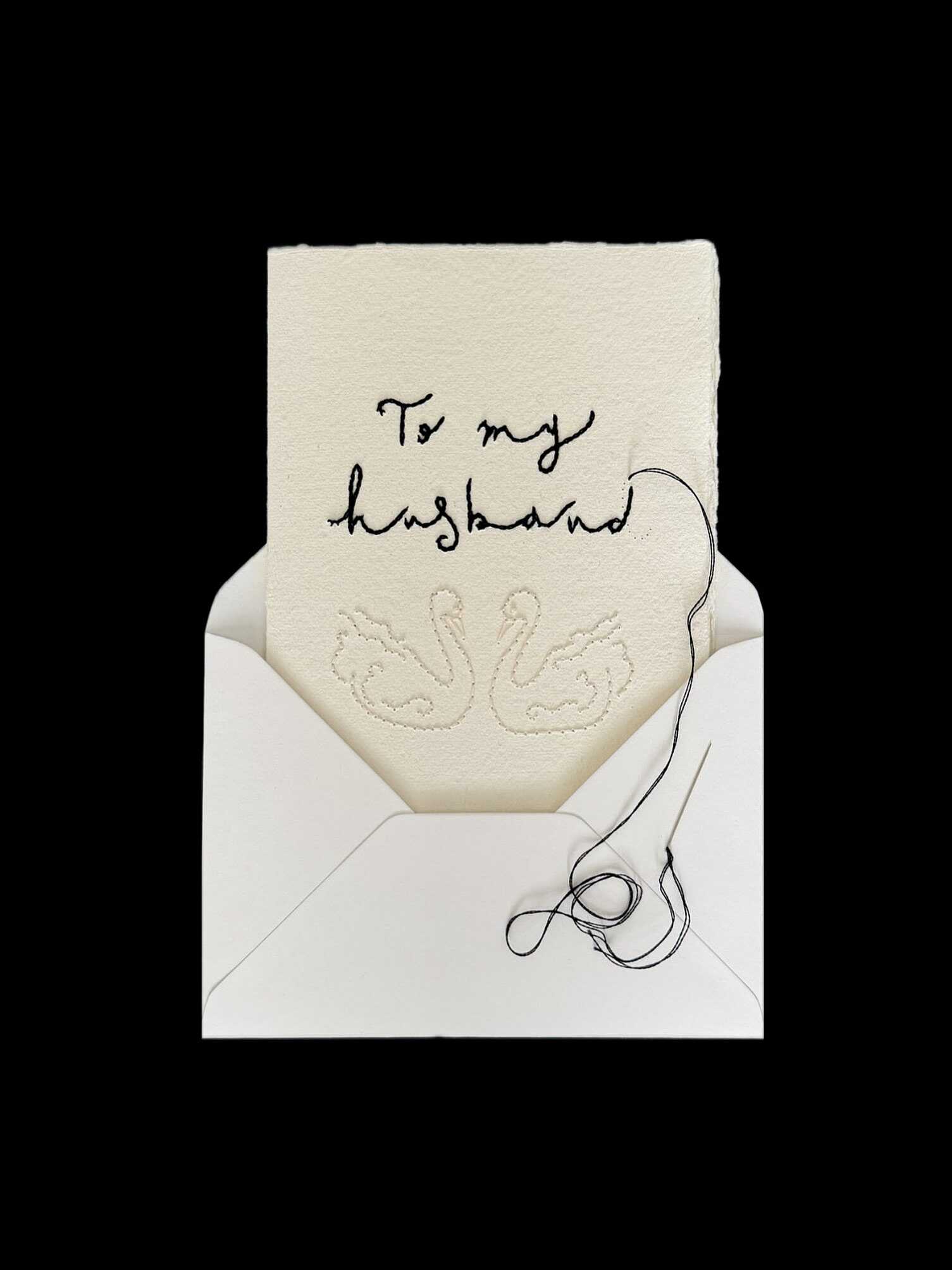
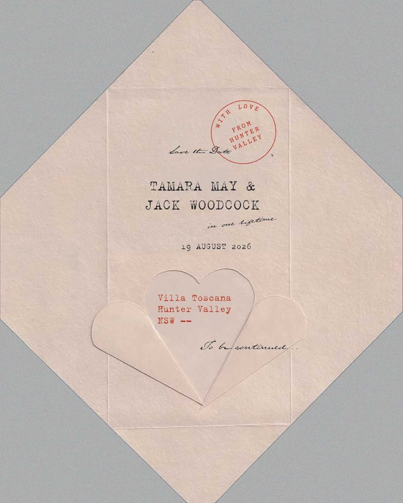
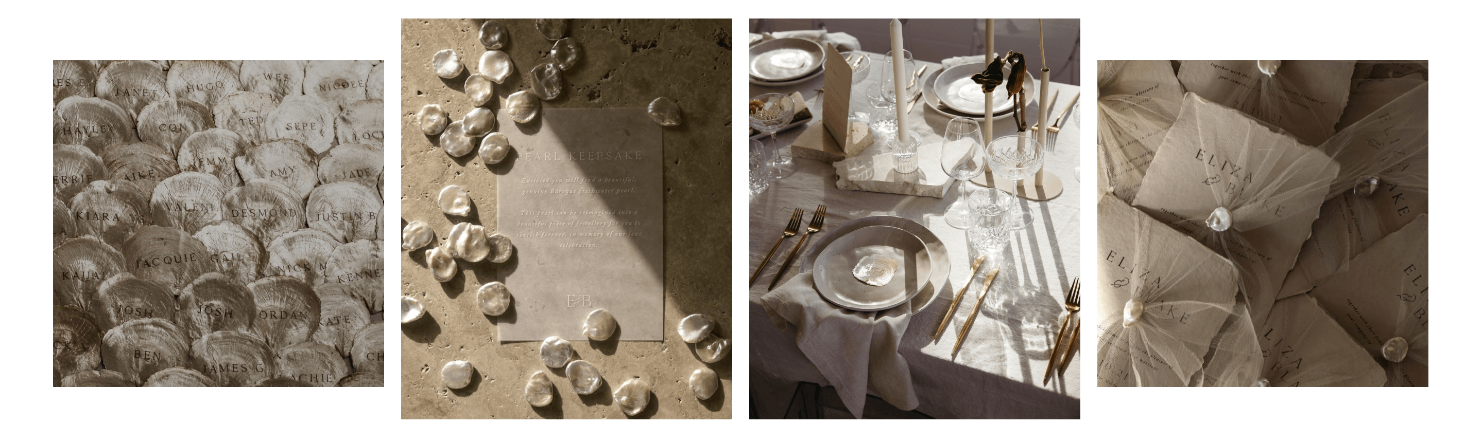
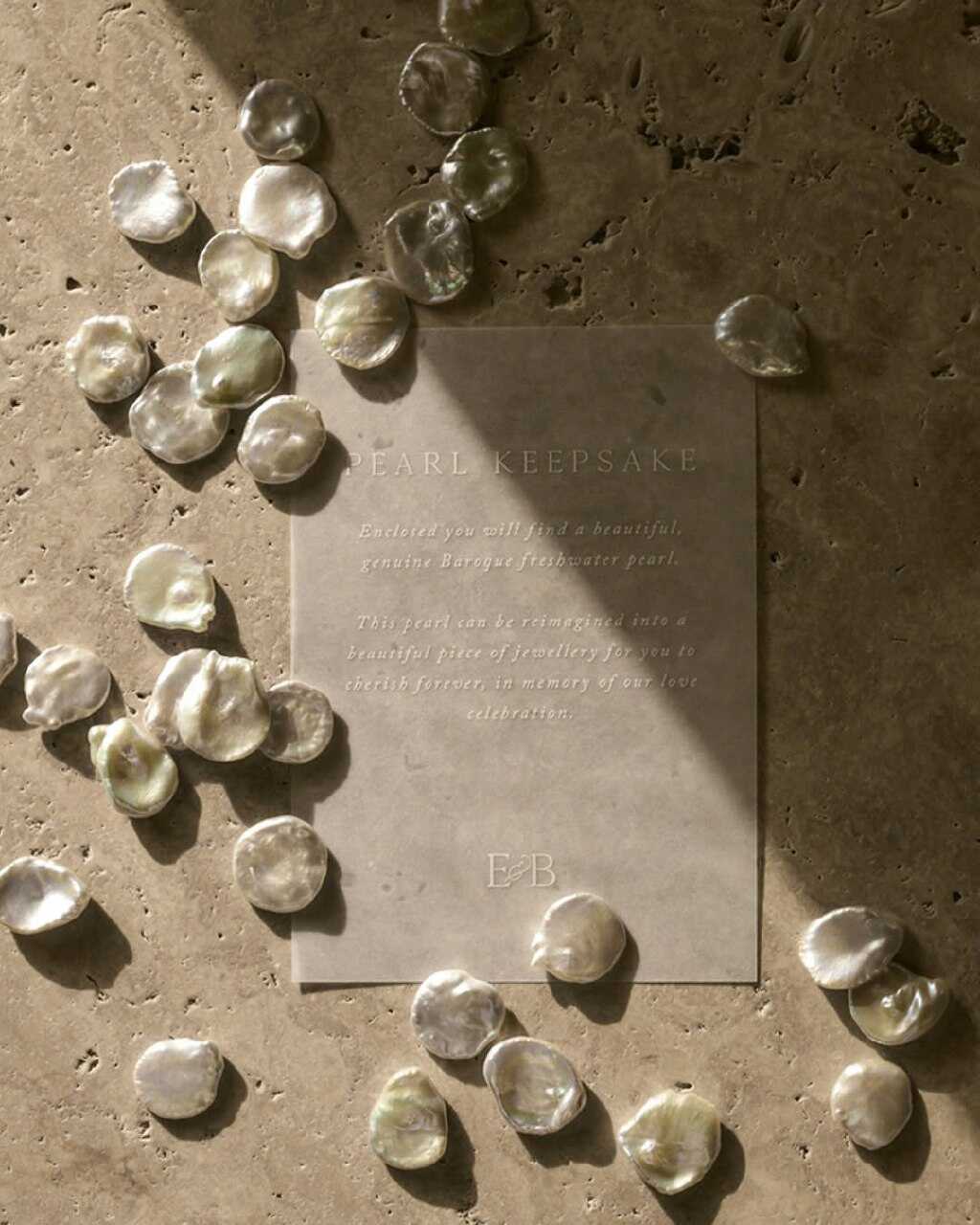
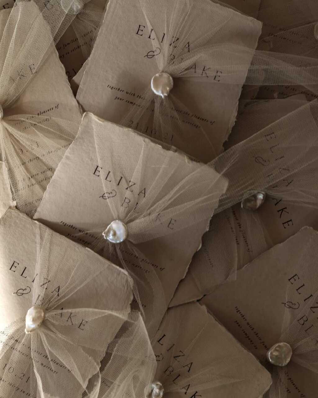
Where laser-cut and flower-shaped invitations lean visually, this trend leans almost entirely into touch. Think hand-pressed cotton paper with a genuinely rough, deckled edge, wax seals in colors that intentionally look aged rather than glossy, and typography set with a real letterpress machine, leaving a faint, tactile impression in the paper itself that you can feel with a fingertip even with your eyes closed.
The invitation's style is intentionally traditional - even though it was printed last month, it appears to have been passed down from one generation to the next. It suits people who prioritize how an invitation feels when held in someone's hands rather than how it looks on a phone screen, and also those bringing together two families with long, complex histories who would like the stationery to carry some of that history. A number of designers using this style also use genuinely vintage materials - such as antique postage stamps, ribbon reclaimed from old sources, and paper that has been aged with stains from tea or coffee - in order to strengthen the illusion so much that the invitation might actually be mistaken for something that had been inherited rather than purchased.
Crochet & Pinprick Lettering
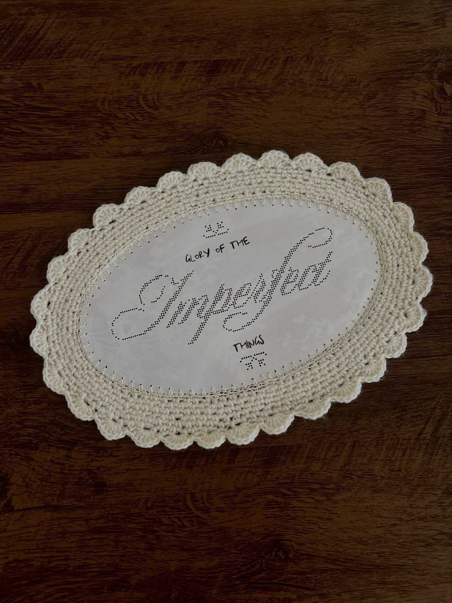
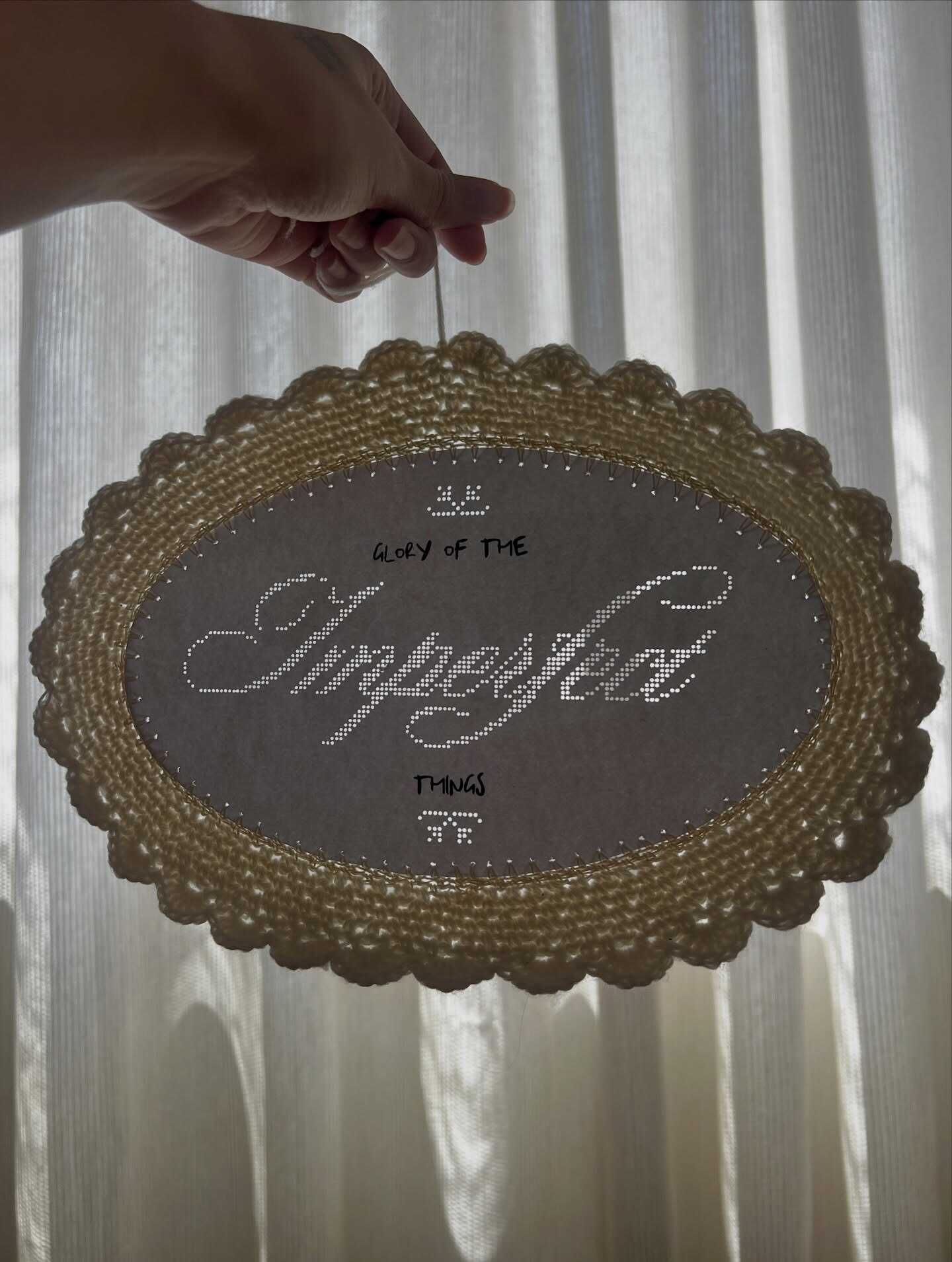
One of the most surprising comebacks this year has been hand-stitched or pinpricked lettering, in which names and dates are created not using ink but instead with thread or a series of small punctured holes that catch the light. When the lettering is held at an angle, it appears to flicker in and out of visibility according to its position in relation to a lamp or a window, and it is this effect that gives it such a distinct character compared to anything that has been printed.
It's worth noting, before taking this to be a brand-new concept, that pinprick stationery dates back to the late 1700s, when it was used to decorate cards and enhance hand-drawn watercolor illustrations. A well-known figure from history was Marie Antoinette, who is said to have used pinpricking on the stationery she sent while in prison before her execution, thus turning a simple technique into a subtle form of creative rebellion. The fashion for it moved through the parlors of the Victorian era as a polite kind of needlework pastime before almost vanishing by the early 1900s, and it is now making a reappearance on wedding invitations more than a hundred years later.
For couples who would like their stationery to have a truly handmade feel—not just a handmade appearance, but something that has actually been made by hand, thread by thread, even if this results in a longer production time than a typical printed set—crochet lettering takes this concept even further by using real yarn or embroidery floss to stitch directly onto cardstock to form names, dates, or a brief phrase, thus giving the entire set a soft, textile-like quality that is not quite matched by any of the other trends on this list.
Envelope-Style Menu Cards
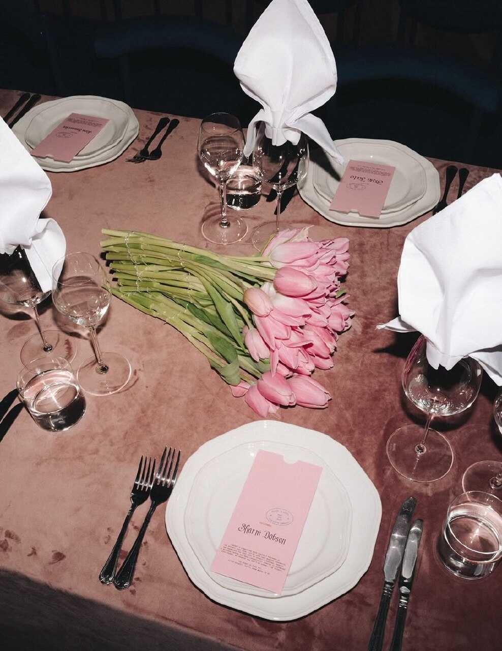
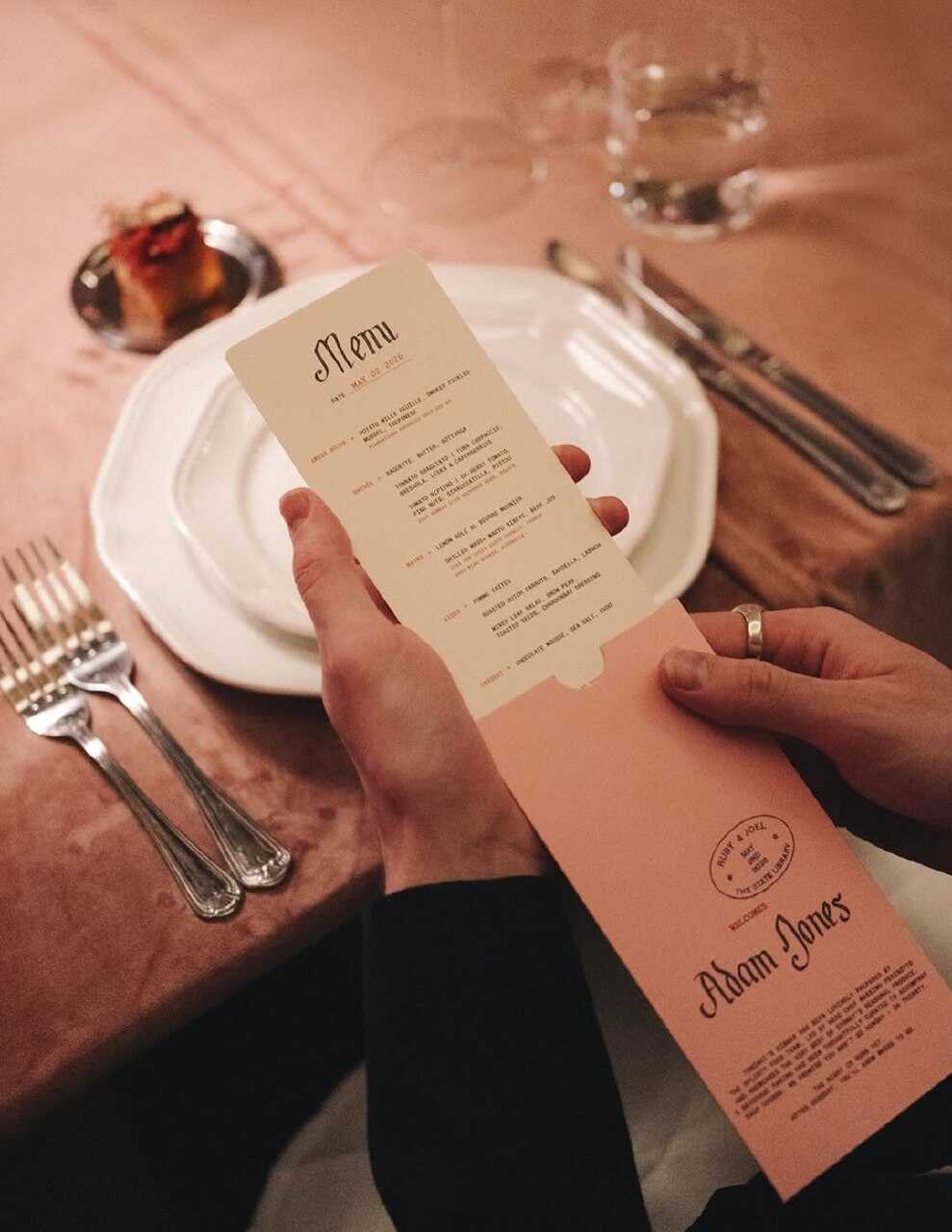
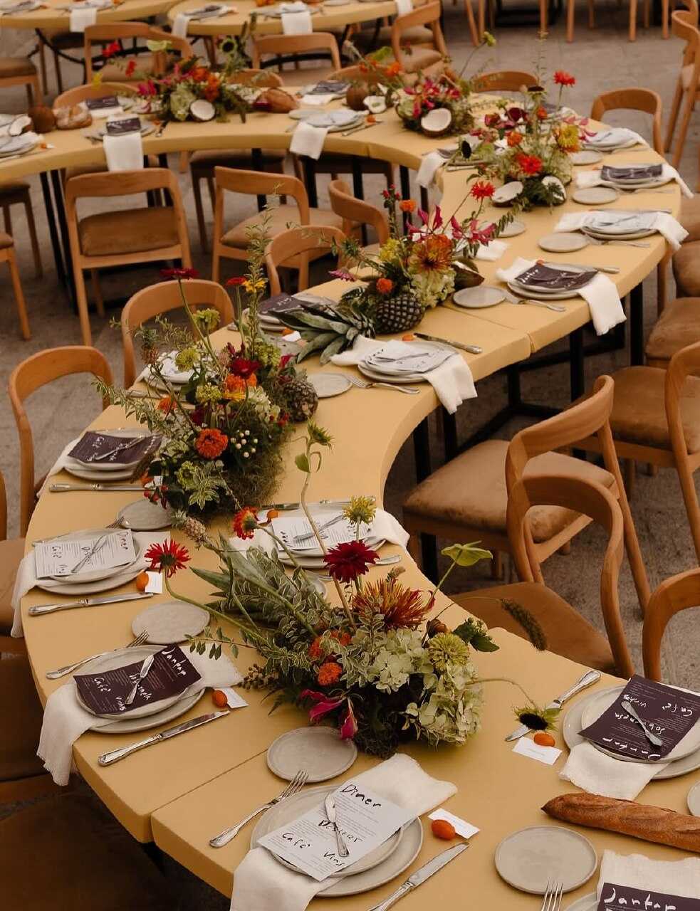
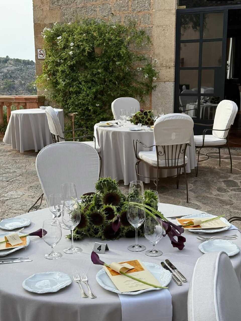
This year reception stationery is receiving just as much creative attention as the invitation itself, and menu cards are the most obvious example. Instead of being a simple printed card, the 2027 version folds out like a small envelope, usually "sealed" with a little wax stamp or ribbon, so that the real menu is only revealed when a guest opens it at their place setting.
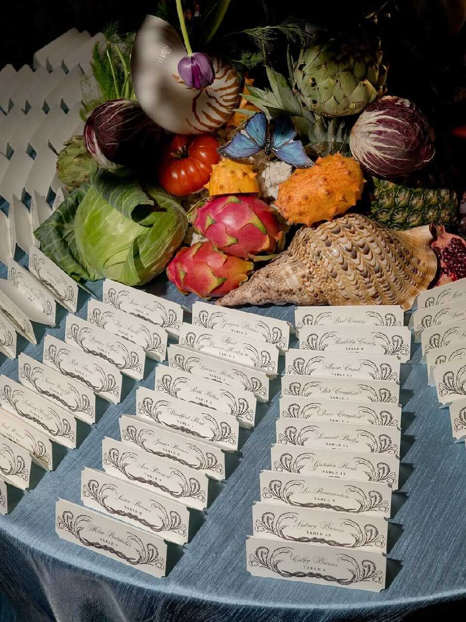
The format serves a dual purpose by incorporating a small interactive element at each table- guests actually enjoy the little ritual of opening something, no matter how small it is—and in this way it quietly but memorably slows down the first few minutes of the meal. Moreover, it provides the designers with a second surface, the outer 'envelope' side, on which they can include a monogram, a brief quote, or a small illustration that complements the invitation suite rather than viewing the menu as an afterthought, which is exactly the reason why so many of the 2027 suites are applying the same folded approach to also place cards and table numbers.
Illustrated Bird-Shaped Cards
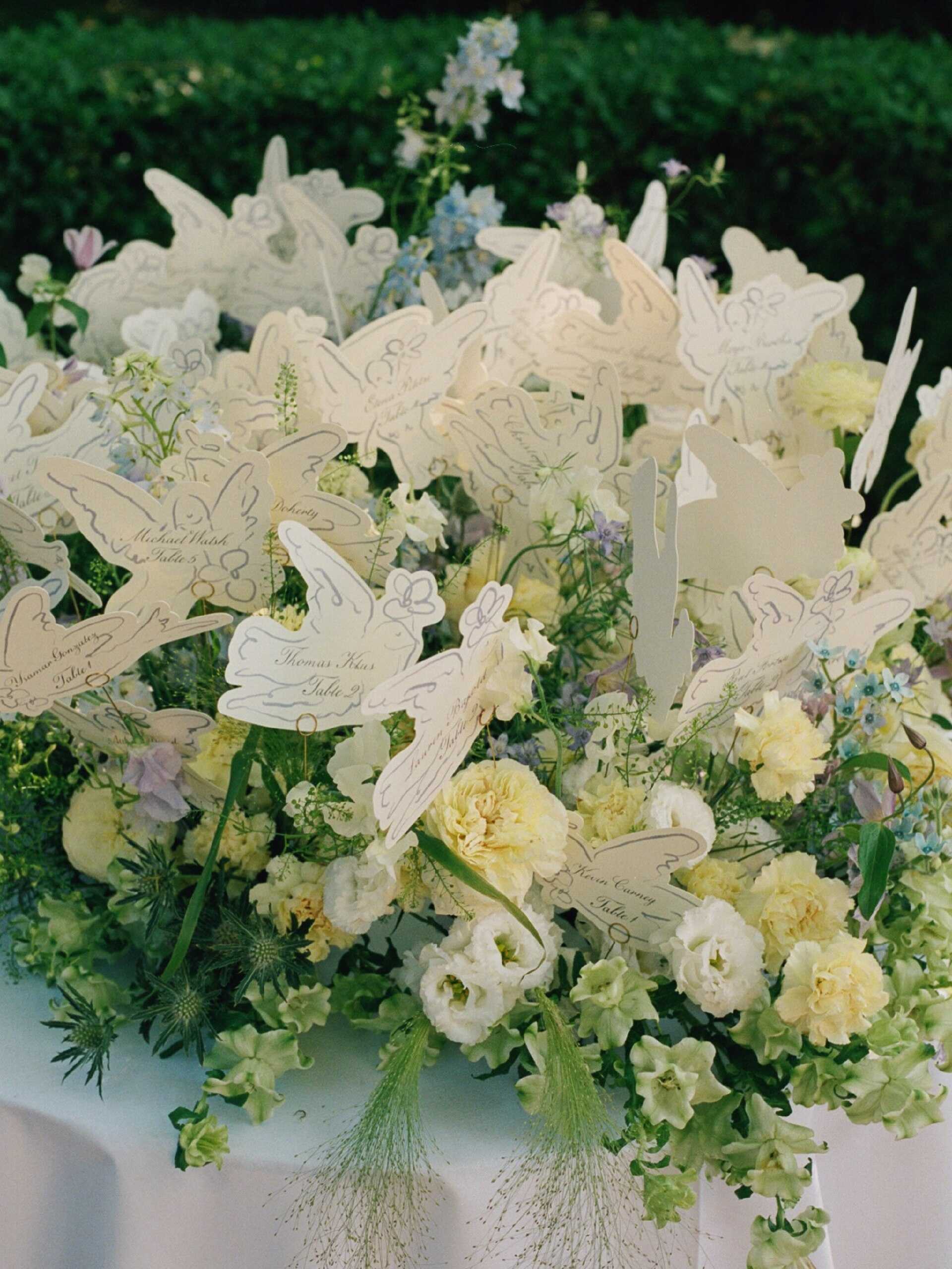
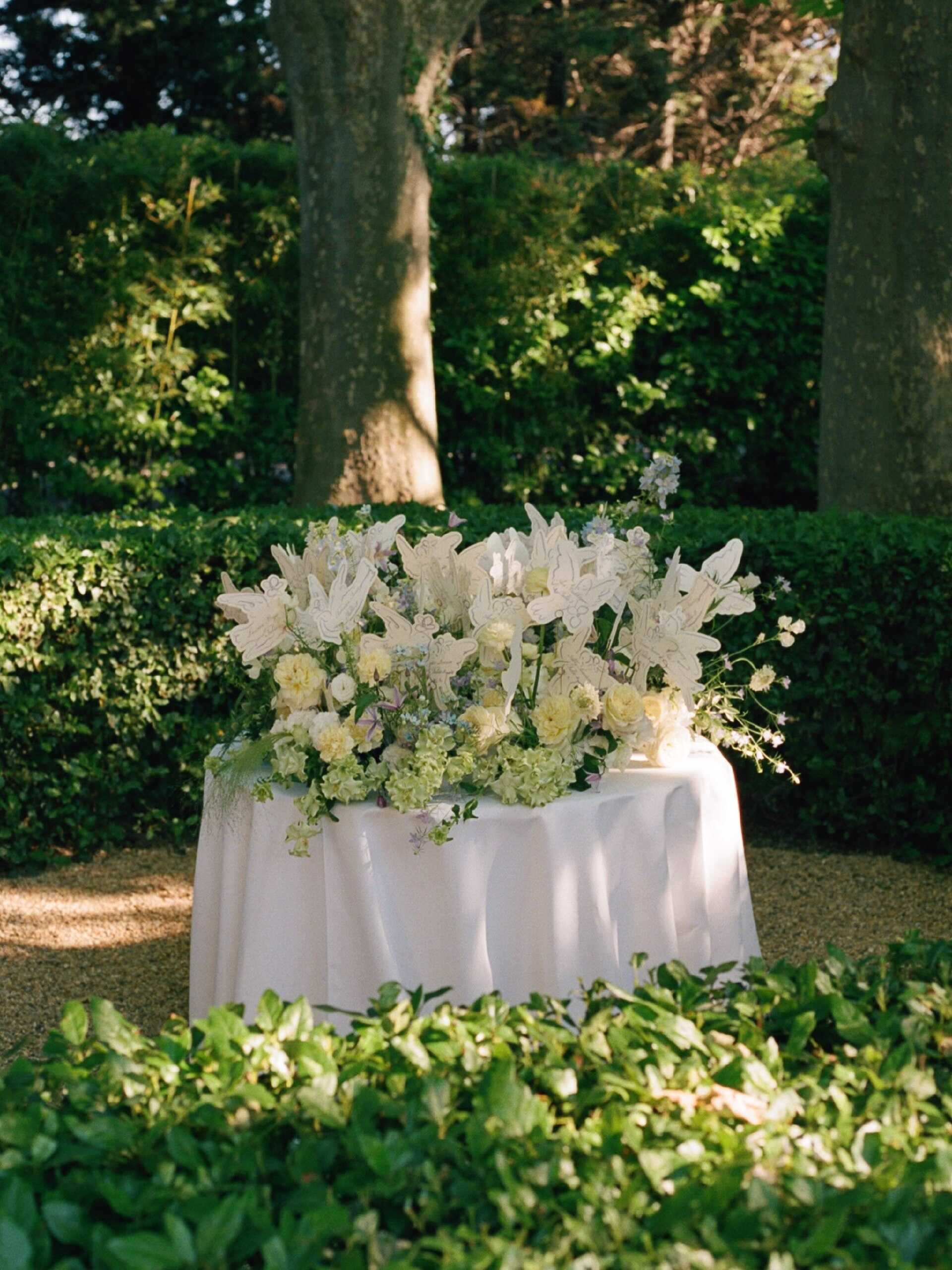
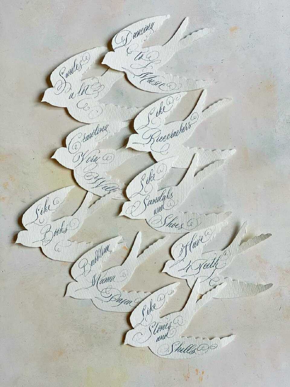
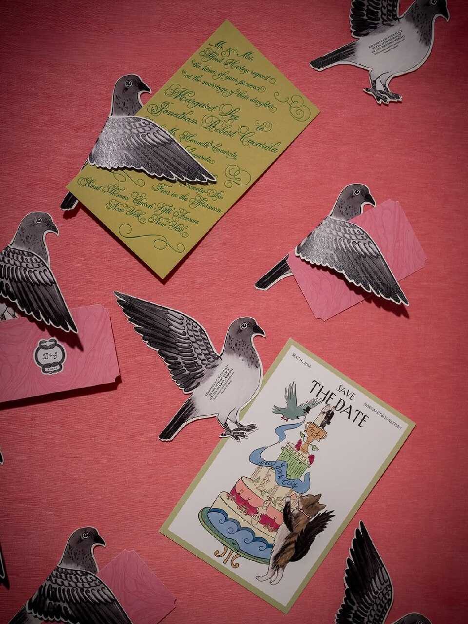
The same instinct which is behind the flower-shaped invitations has also led to a real increase in bird-shaped stationery in 2027 - this involving die-cut cards shaped like doves, swallows, or the couple's particular favourite bird, usually with delicate line-art decoration on the wings and a soft, hand-drawn appearance all over.
Birds have a clear symbolic significance at weddings - such as representing partnership and migration, with the idea of two individuals uniting to form one flock - which is one of the reasons this format has been so quickly adopted by couples seeking a style that carries meaning beyond merely serving as decoration. Designers have likewise begun to choose the particular type of bird to reflect important details, for example by selecting a cardinal for couples who had lost a close family member before the wedding, by picking a migratory bird associated with the place where the couple grew up, or simply going with the species that happens to nest near the ceremony site.
This one is especially suited to couples who are already attracted to the whimsical line-art illustration trend discussed below, since both styles have a light, hand-drawn character rather than the sharper geometric appearance associated with laser-cut pieces. This year, a number of designers have begun combining the two by using a bird silhouette as the die-cut shape and, at the same time, filling the interior with the same loose, single-line illustration style.
Playful Maximalist Stationery
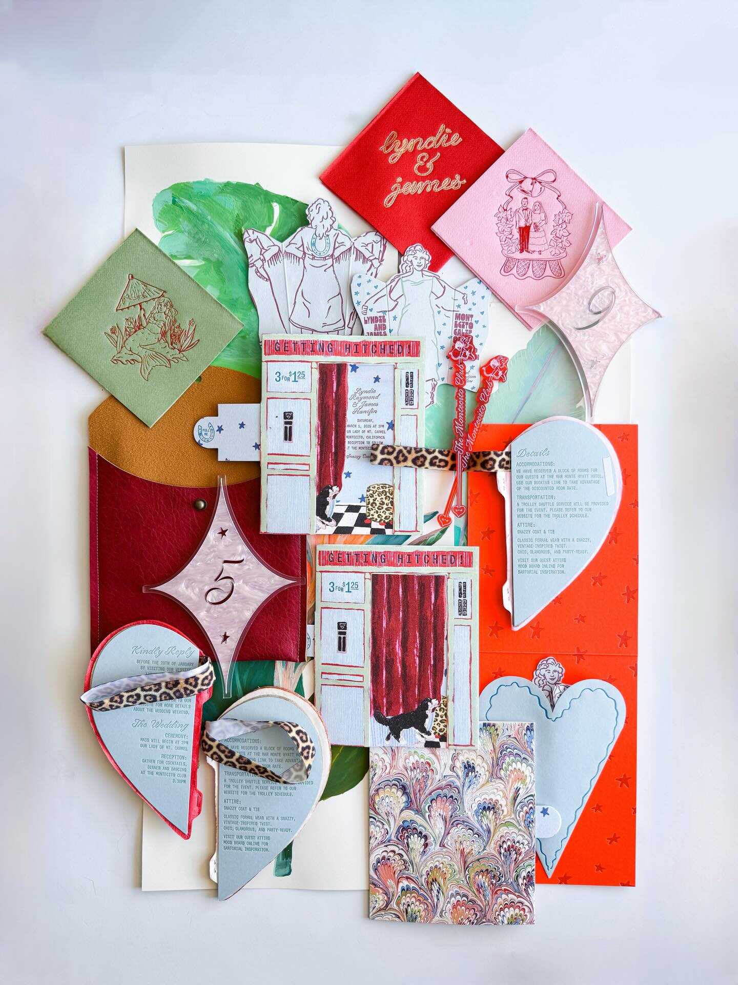
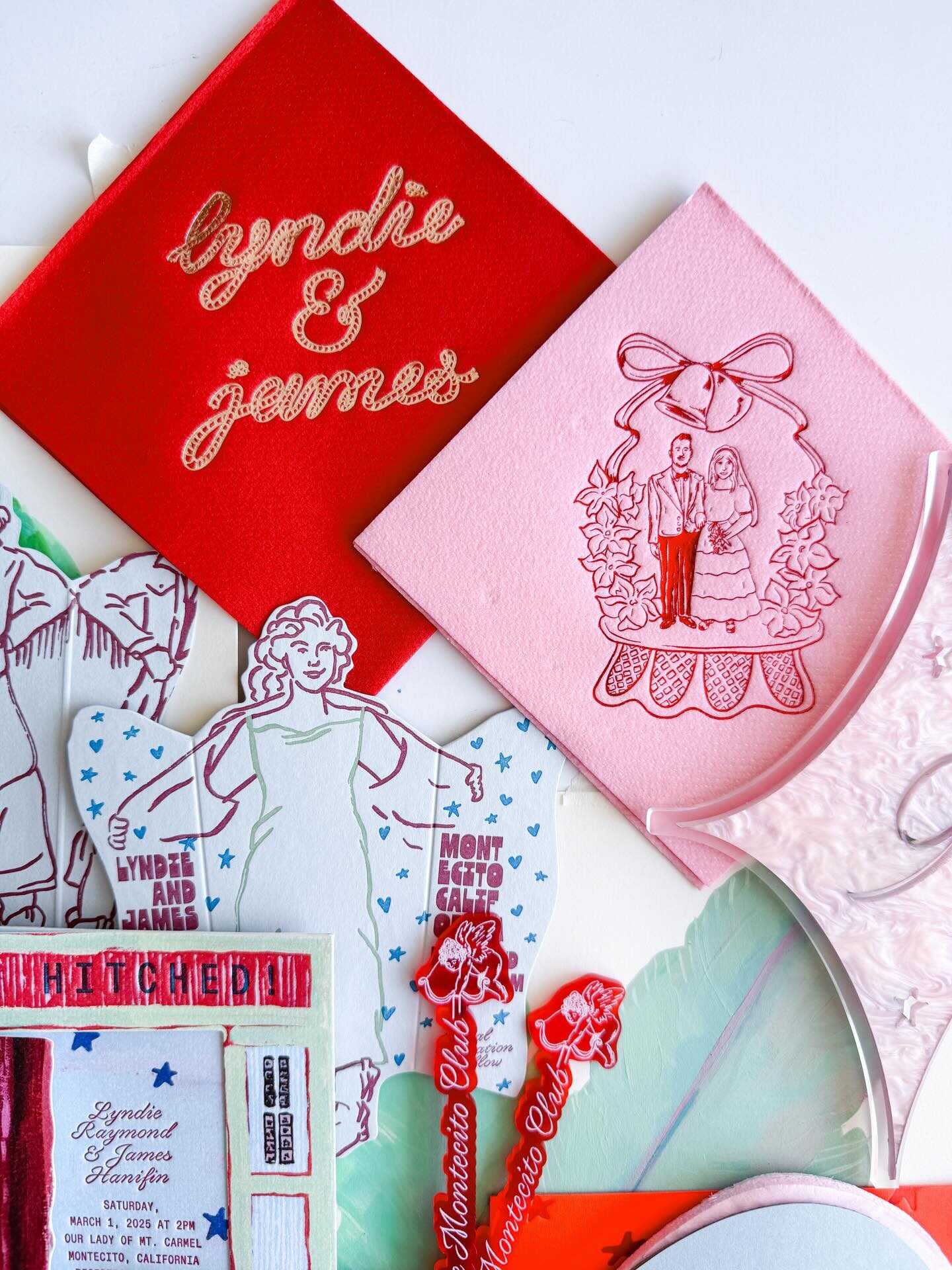
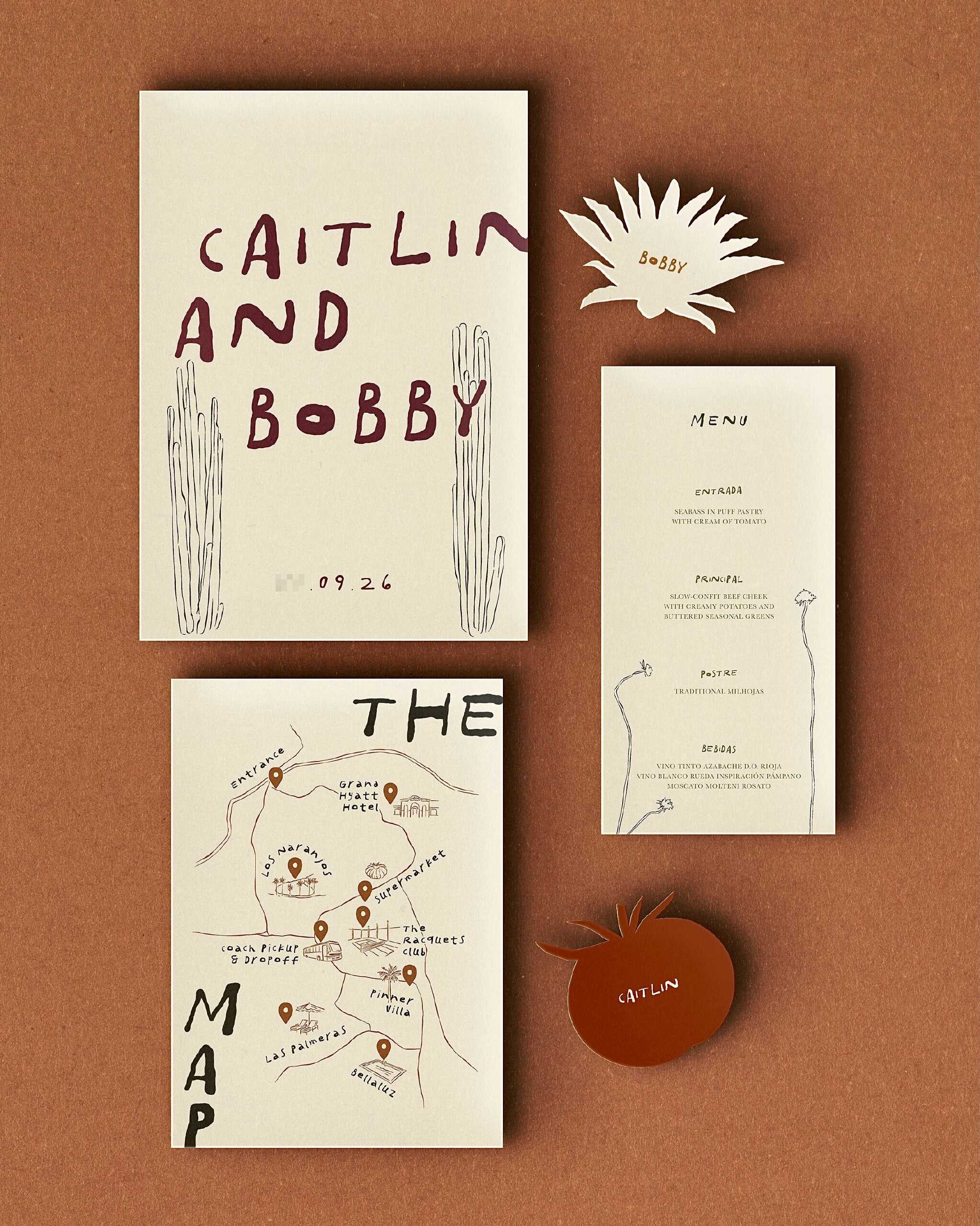
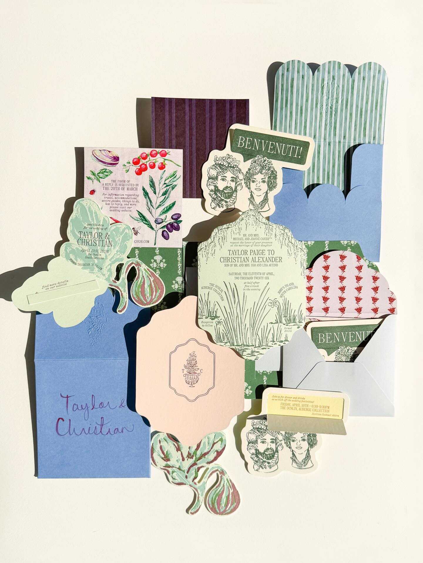
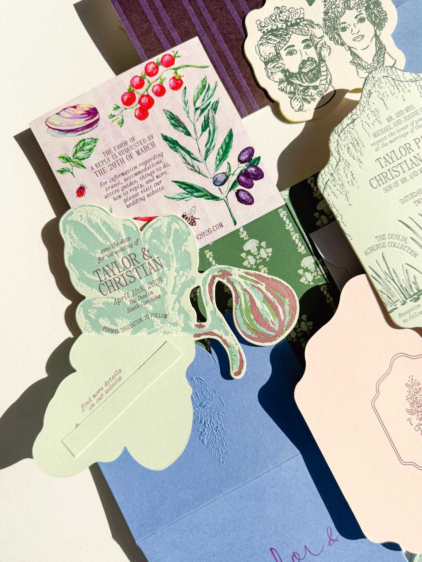
Of course not every couple in 2027 wants restraint, and this style has been designed specifically for those who don’t. It involves deliberately combining contrasting patterns, hand-drawn illustrations filling up every available area, unexpected bright combinations of colour, and a general unwillingness to make any white space disappear. It is appropriate for couples whose wedding decoration already tends to favour bold colours and sculptural centrepieces rather than quiet minimalism, since this type of stationery is simply the natural extension of that same preference to paper.
It works especially well for:
- Couples hosting a genuinely festive, high-energy celebration rather than a hushed, formal one
- Weddings with a strong personal theme - a shared love of travel, a specific decade, a favorite film - that benefits from visual density rather than restraint
- Save-the-dates and invitations meant to build real anticipation through sheer visual energy before guests even arrive
- Couples who want their stationery to double as genuine keepsake art, something worth pinning up rather than filing away
- Multi-day destination weddings, where a maximalist visual identity can carry consistently across welcome bags, itineraries, and signage, as well as the invitation itself
The risk, obviously, is legibility - the best maximalist stationery designers this year are careful to keep essential information - the date, the time, the RSVP details - in a clear, uncluttered zone, even as everything around it gets genuinely loud. Done well, the effect reads as confident and joyful rather than cluttered, which is really the entire point of choosing this direction over a quieter one.
Playing Card Invitations
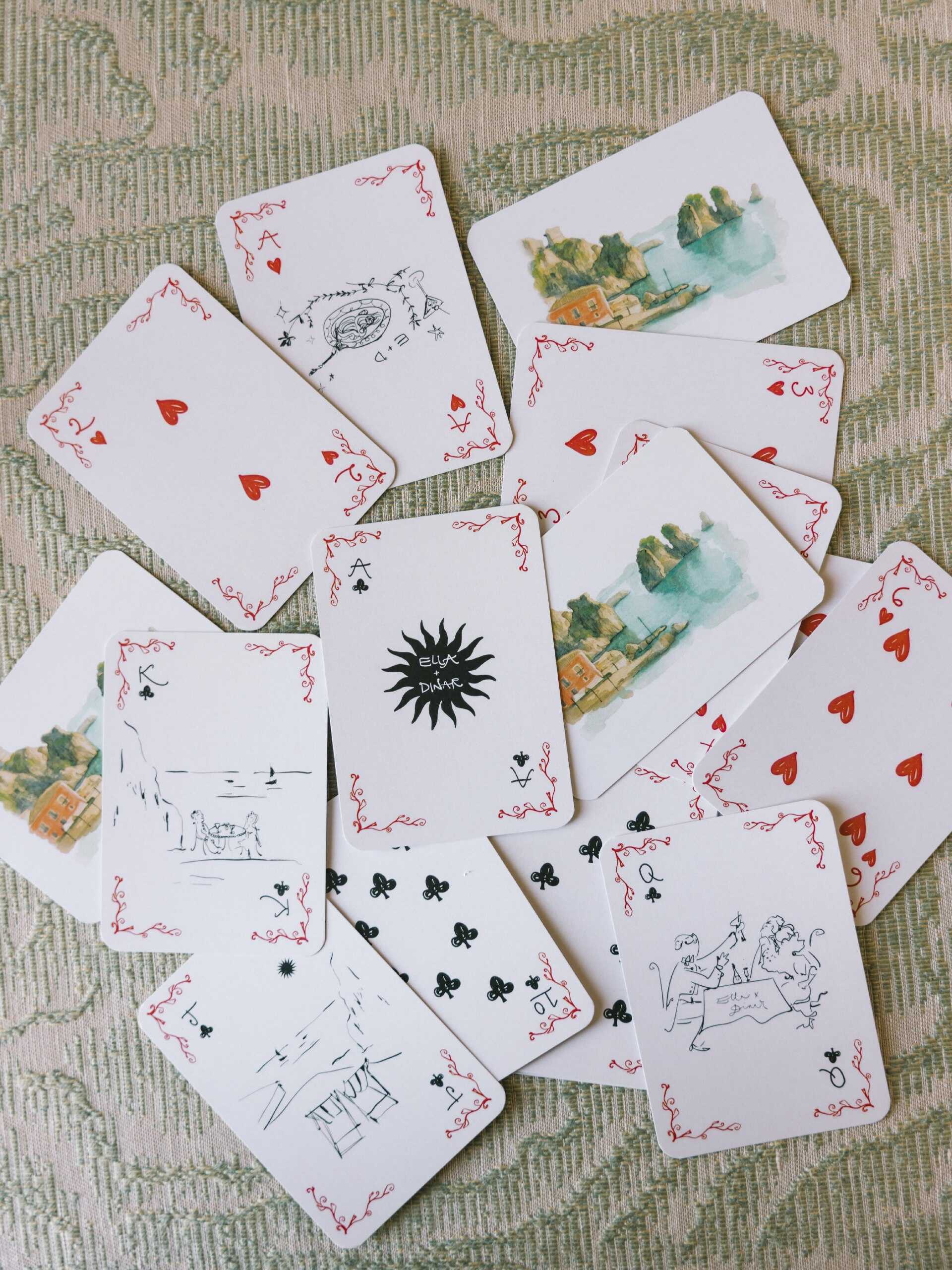
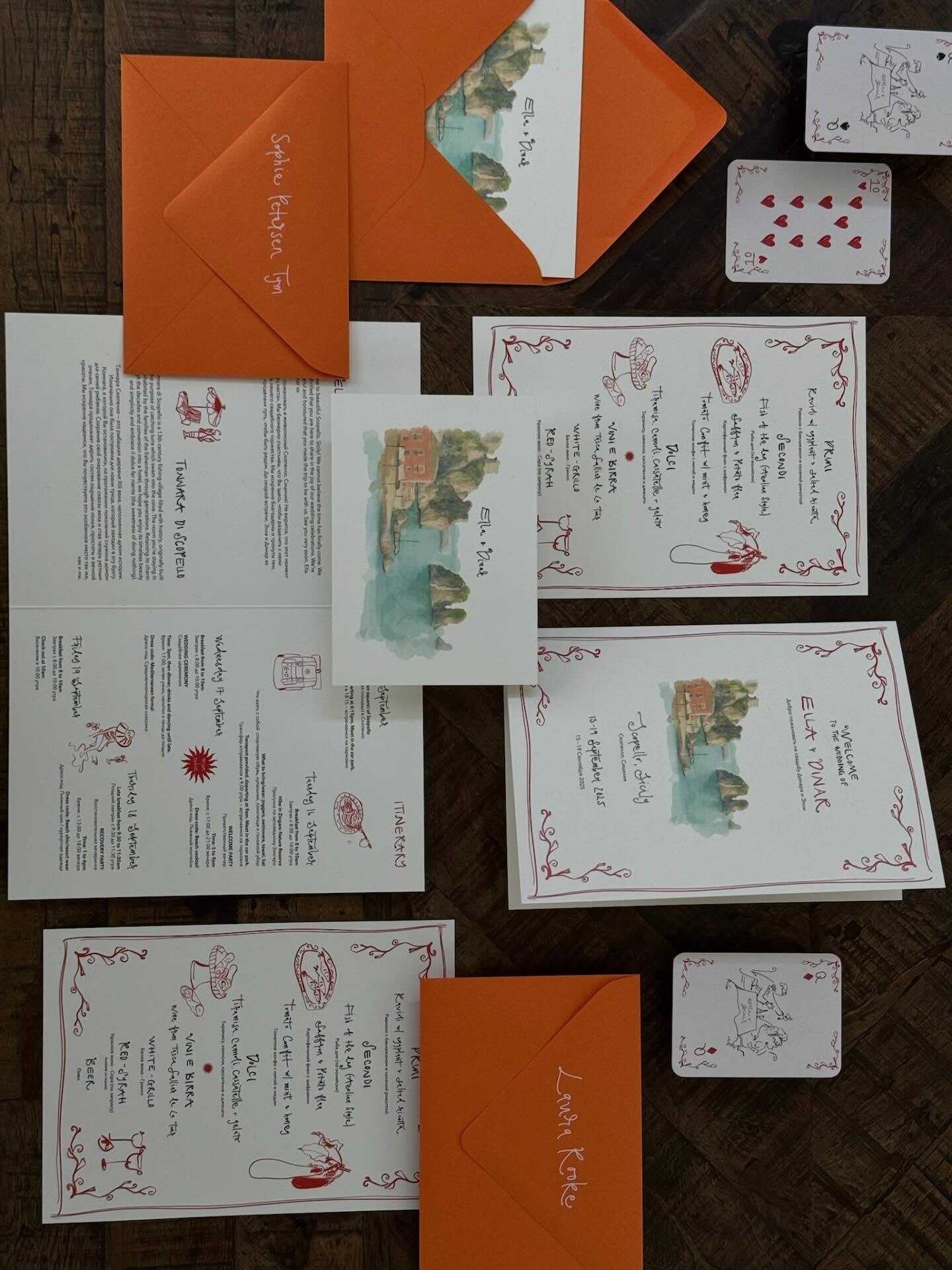
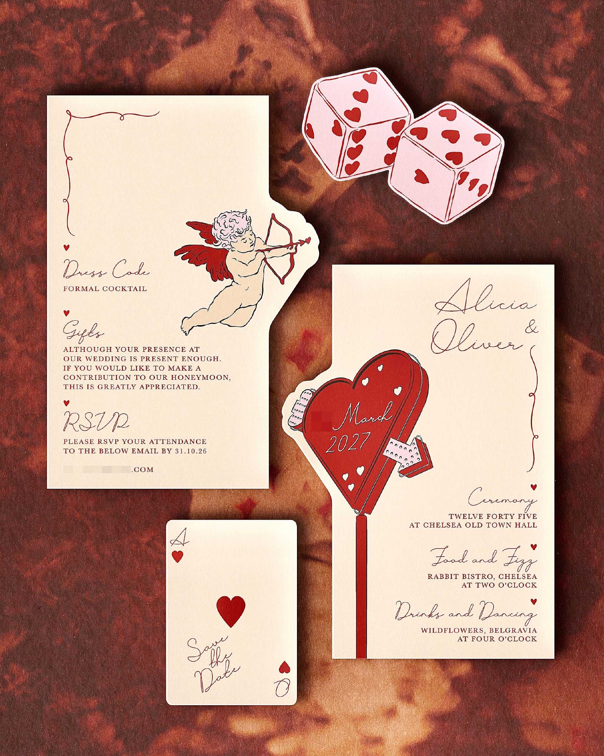
A clear example of a fun, a bit retro style involves invitations printed on cardstock similar to playing cards, including the suits, the numbers, or custom-illustrated face cards showing the couple. In some cases, the couple goes a step further by sending with the main invitation details a small set of cards, thereby turning the entire envelope into a kind of gift rather than just a formal notice.
This format is especially suitable for couples who got close during game nights, went on a trip to Vegas, or simply want their wedding to avoid appearing too traditionally formal right from the first letter that a guest gets. This year designers have also begun to make use of the format's inherent symbolism - for example, a King and Queen card with the couple's pictures, a complete suit representing the wedding party, or a joker card being used instead as the RSVP instructions for a more light-hearted and humorous effect.
It is also one of the more naturally 'keepable' formats on this list, since a playing card fits much more easily into a wallet or a drawer than a conventional invitation does, and as a result it usually lasts well beyond the wedding day, at times even ending up being mixed into a real deck of cards that a guest already has.
Whimsical Line-Art Illustration
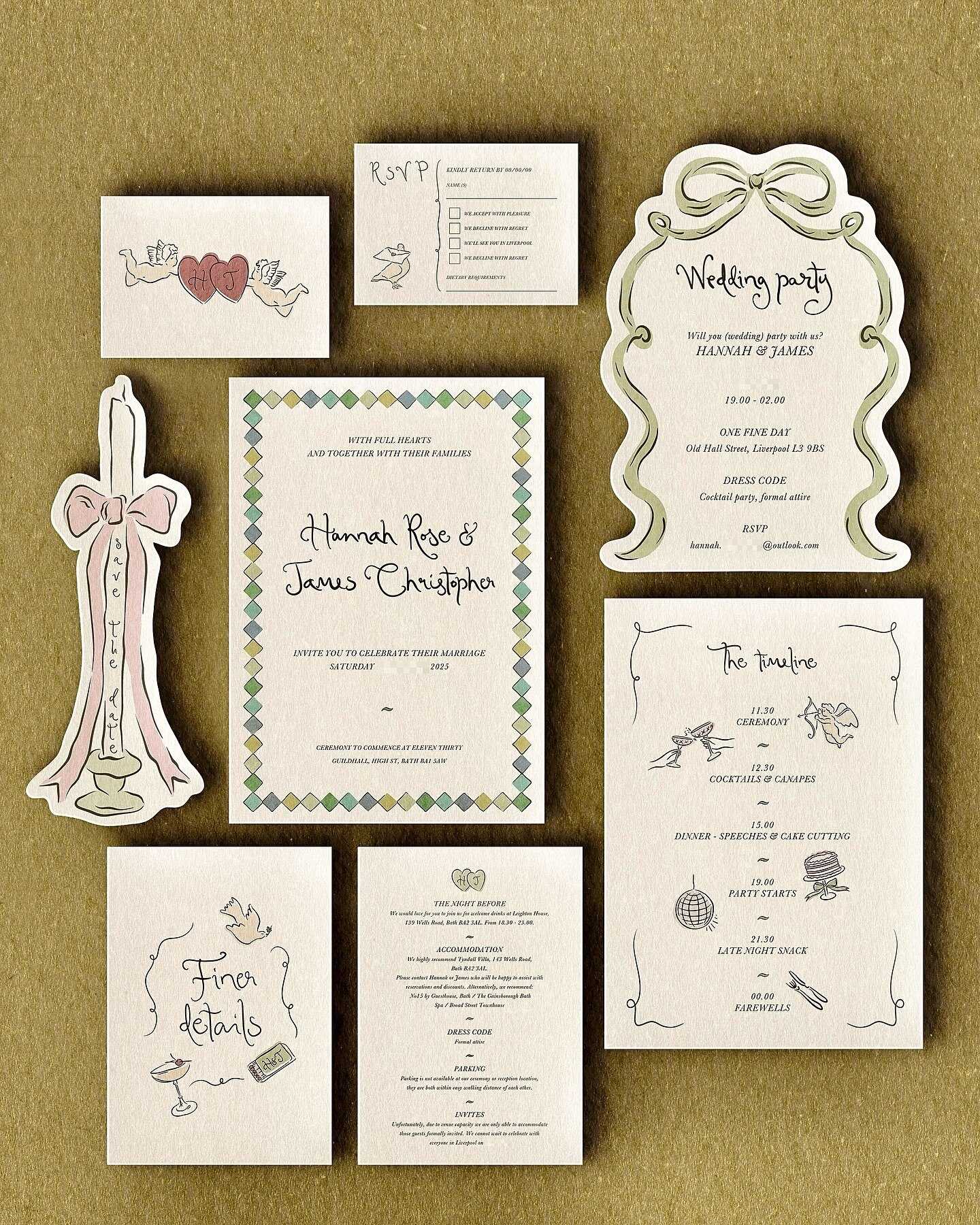
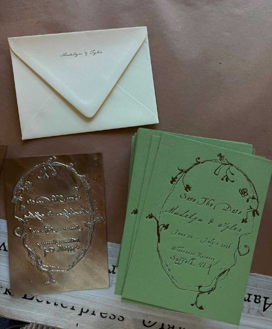
Closing out the list is perhaps the most versatile trend of the eleven: loose, hand-drawn line-art illustrations - a couple’s likeness, their pet, a sketch of the venue - rendered in a single continuous, slightly imperfect line rather than a polished, fully rendered portrait. The style reads as effortless precisely because it isn’t trying to be photorealistic, and that imperfection is the entire point.
A flawed line has a personal touch whereas a perfectly executed digital illustration almost never does, and that is precisely the reason why this trend fits so well with a number of the other ones mentioned here - such as bird-shaped cards, flower-shaped invitations, and the tactile heirloom category - as a consistent illustrative element that runs through the whole set rather than existing as a separate category. This year more and more couples are hiring a single custom illustration at an early stage in the planning process and then using it repeatedly on save-the-dates, invitations, the wedding website, and even on the day's signage, turning one small, imperfect drawing into the closest thing the wedding has to a real visual identity.

What’s Quietly Falling Out of Style
Every time there is a list of current wedding stationery trends there is also a less prominent one showing which trends are disappearing, and this is true of the stationery world in 2027 as well. A few types of invitations that had dominated wedding invitation sets for most of the previous decade are now losing popularity - not since they had ever looked bad, but simply because they have been so widely used for so long that they no longer appear to be intentionally chosen.
Strict minimalism featuring a single typeface and lacking any textural elements is nowadays becoming less common, being replaced by tactile and illustrated methods as shown in this list. Rather than the previously uniform and perfectly symmetrical floral border patterns, there is now a shift towards more asymmetrical, hand-drawn designs. The once-popular elegance achieved with foil alone and no other texture - such as smooth cardstock and shiny gold lettering with nothing else—is now beginning to seem more like an incomplete design rather than a final product, given that so many couples these days are looking for something a guest can actually feel in their hands. Similarly, the long-standing combination of blush and sage colours, which has already been declining in reception decoration, is also following the same trend in stationery, yielding to plum, deep gem colours, and bolder colour schemes.
This does not mean that the traditional method is incorrect - many couples will still opt for simple and minimalist stationery in 2027, and that continues to be a fully valid option. The only thing that has changed is that 'safe' is no longer the only style being praised, and it is now the couples who are willing to take a small creative risk with their stationery that tend to have their invitations genuinely remembered.
Which Trend Fits Your Wedding Style
The fact that there are eleven different directions listed means that it's more important to match a style to your real wedding vision than to go for whatever is currently most photographed. It's simple to be attracted by a single impressive photo of laser-cut invitations or by a maximalist save-the-date without first considering whether that same level of energy actually suits the rest of your wedding - for example, the venue, the season, and the overall atmosphere you'd like to create. The table below has been created precisely to overcome that natural tendency by starting with your actual wedding rather than looking forward to the trend that is currently most popular in wedding stationery trends news this month.
| If Your Wedding Is… | Consider This Trend |
|---|---|
| Coastal or destination | Nautical Theme |
| Garden or botanical | Flower-Shaped Invitations |
| Built around a specific love story or landmark | Laser-Cut Storytelling |
| Fall, winter, or formal evening | Plum-Colored Invitations |
| Vintage, generational, or family-focused | Tactile Heirloom Stationery |
| Handmade and personal above all else | Crochet & Pinprick Lettering |
| Bold, colorful, and high-energy | Playful Maximalist Stationery |
| Playful, casual, or game-night themed | Playing Card Invitations |
Treat this table as a starting point, rather than a strict rulebook - many couples do end up combining two neighboring rows after they've noticed how smoothly certain trends overlap. When more than one row actually applies, this is generally something you should take notice of, and it's often an indication that you should choose one main trend to form the basis of the design and then take a smaller supplementary element from another rather than having a single category carry the whole design by itself.
How to Combine These Trends Without Overdoing It
The actual danger when looking at a list of such diverse wedding stationery trends isn't selecting a poor one, but instead trying to incorporate four or five of them into one suite and ending up with something that looks chaotic rather than thought out. This danger increases significantly with each additional trend added on top of the previous one, which is the reason why the best wedding stationery suites of 2027 usually centre on a single main idea rather than taking multiple trends from the list at the same time.
For example, a couple adopting the laser-cut storytelling approach could apply the same cut-paper technique to t, avoiding the need to use flowcharts that compete for attention. A plum-and-gold color scheme pairs well with tactile heirloom textures because both contribute to that sense of old-world richness rather than going in conflicting directions. In all cases, the aim should be for the smaller items - such as menu cards, place cards, and thank-you notes - to reflect the main idea of the invitation in a more subdued way, rather than introducing a completely new visual style at each stage of the wedding.
A Wezoree note: should you decide to allocate all your real money to a single item of stationery this year, then it should be the invitation itself not the smaller reception items. It is the first physical item that a guest comes into contact with at your wedding, it establishes expectations for all that follows, and, unlike a menu card, it is the only item that most guests actually keep.
Still torn between two trends on this list? Start with whichever one you’d want framed on your own wall a decade from now - that’s usually the real answer. Wezoree’s Inspiration section has plenty more waiting to help you get there: the latest wedding stationery trends 2027 styling ideas straight from the designers building them, seasonal color stories, and vendors around the world who already know how to bring a suite this considered to life.
Still torn between two trends on this list? Start with the one you'd prefer to have framed on your own wall in ten years' time—that approach generally gives the correct answer. In Wezoree's Inspiration section, you will find many more items available to assist you in reaching your goal: the most recent wedding stationery trends for 2027, styling ideas directly from the designers who are creating them, seasonal color stories, and vendors from around the world who already know how to make such a thoughtful suite come to life.

FAQ
What are the biggest wedding stationery trends for 2027?
Laser-cut storytelling, plum-colored palettes, and tactile heirloom-style paper lead the list this year, alongside playful, shape-driven formats like flower- and bird-shaped invitations. The broader shift across nearly every wedding stationery trend 2027 category points toward texture and personal narrative over simple printed elegance.
Is nautical-themed stationery only for beach or destination weddings?
Not necessarily - while it works especially well for coastal and destination celebrations, the deep navy palette and rope-inspired textures at the heart of this trend can suit any couple drawn to a more classic, maritime aesthetic, regardless of venue.
How far in advance should we order laser-cut or tactile heirloom invitations?
Both formats typically require longer production timelines than standard printed stationery, due to the hand-finishing or specialized cutting required. Ordering at least 4 to 6 months before your mailing date provides a buffer for proofing, production, and any necessary revisions.
Can we mix multiple 2027 wedding stationery trends in one suite?
Yes, but restraint matters - the strongest suites tend to build around one dominant trend and let smaller pieces, like menu cards or thank-you notes, echo that same idea rather than introducing several unrelated visual languages at once.
Is plum a good stationery color choice for a spring or summer wedding?
It can be, particularly when paired with lighter accents like cream cardstock or soft blush ribbon to keep the palette from reading as too heavy for a warmer season. Plum tends to feel most natural for fall and winter celebrations, but a thoughtful pairing makes it workable year-round.
Where can we find real examples of these wedding stationery trends in action?
Wezoree’s Inspiration section features real wedding stationery from working designers, alongside broader coverage of wedding stationery trends, news, and seasonal styling ideas, making it a genuinely useful starting point beyond generic search results.