Rules for the Perfect Wedding Color Schemes


- How to Choose the Perfect Wedding Color Scheme
- Citrus Wedding Color Palette
- Yellow, Purple and White Wedding Color Scheme
- Pistachio and Pink Wedding Color Palette
- Coffee-Inspired Wedding Color Palette
- Plum, Burgundy, and Soft Purple/Pink Wedding Colors
- Green Shades and White Wedding Color Scheme
- Burgundy and Green Wedding Color Palette
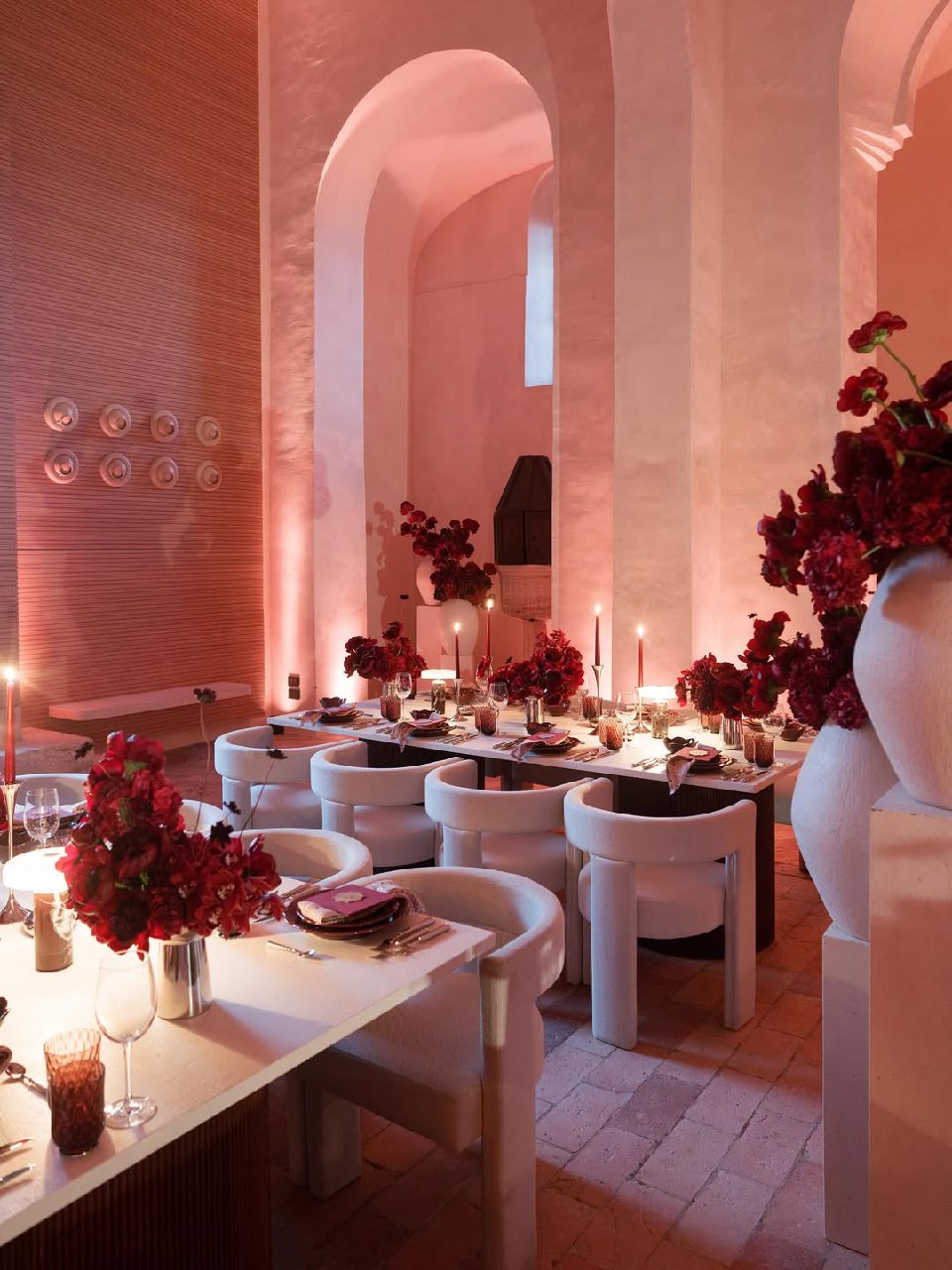
- Red and White Wedding Color Scheme
- How to Apply Your Wedding Color Scheme Across the Day
- Common Mistakes When Choosing a Wedding Color Palette
- FAQ About Wedding Color Schemes
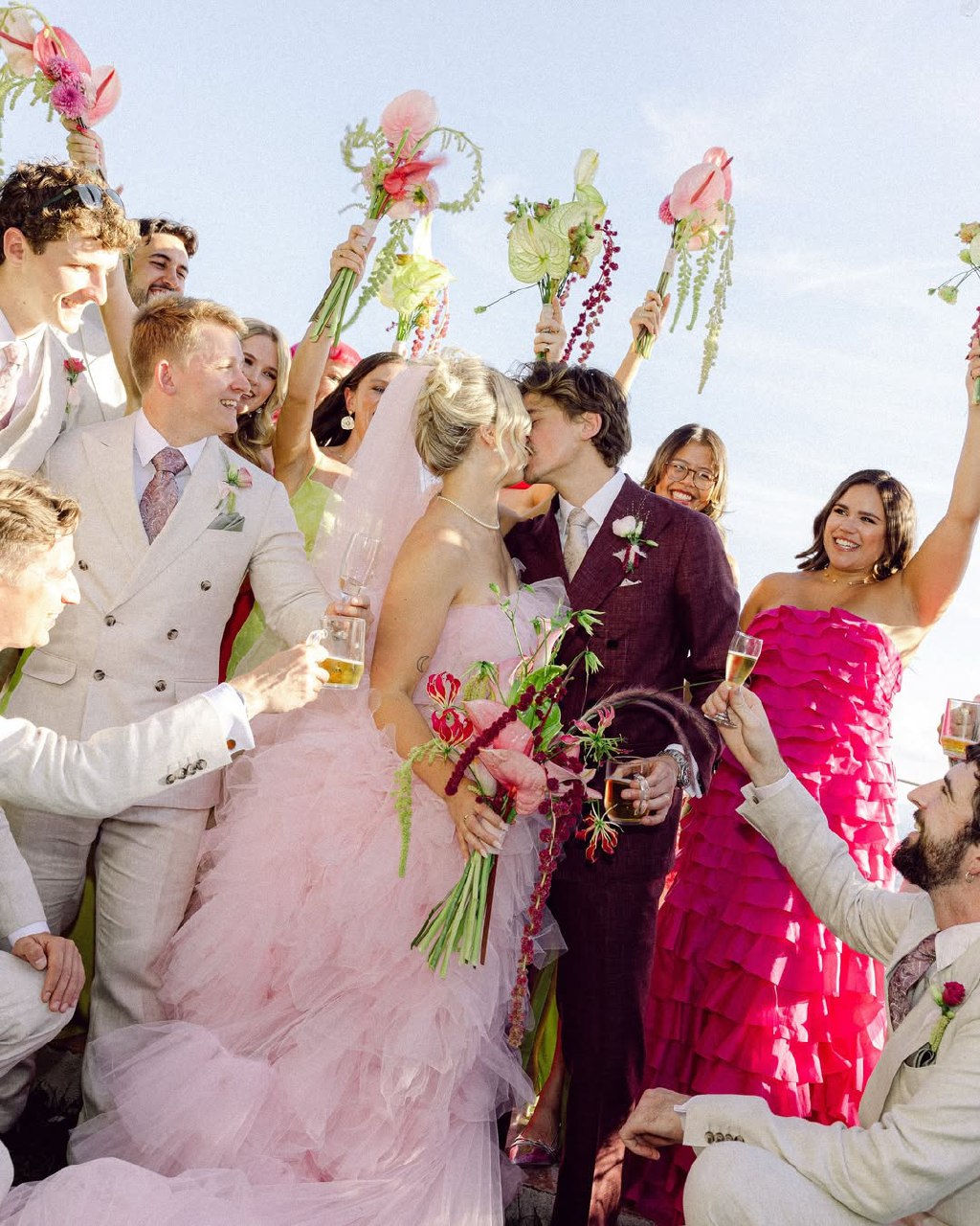
Your wedding color schemeis the thread that connects every part of your celebration, from flowers and tablecloths to bridesmaids' dresses and invitations. Choosing your colors thoughtfully helps everything feel connected and creates a welcoming atmosphere. The goal isn’t to use every shade, but to build a palette that guides your choices and still leaves room for natural, beautiful variations.
Find Your Perfect Wedding Vendors


How to Choose the Perfect Wedding Color Scheme
When choosing a wedding color scheme, consider the season, your venue, your personal style, and how the colors will look in photos. The goal is to make planning easier, not more complicated. A good color scheme narrows down your choices and helps you make other decisions with confidence.
Consider the Season and Location
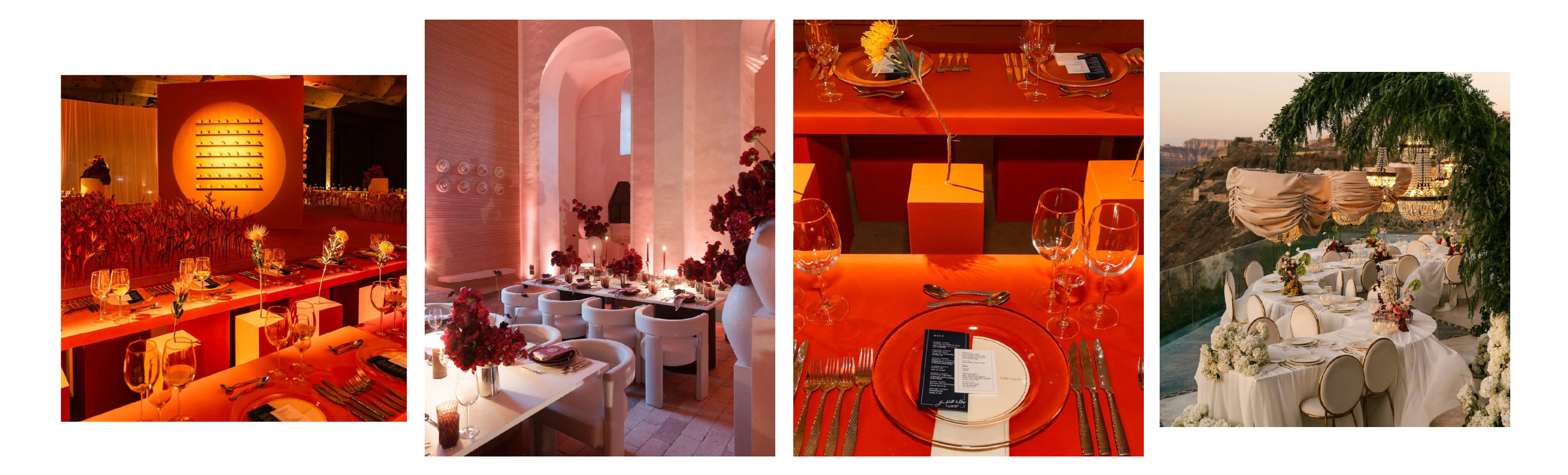
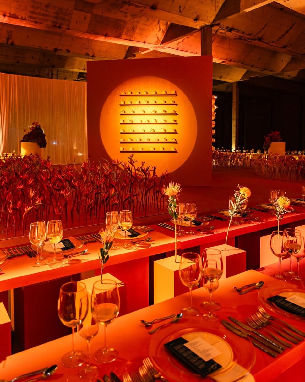
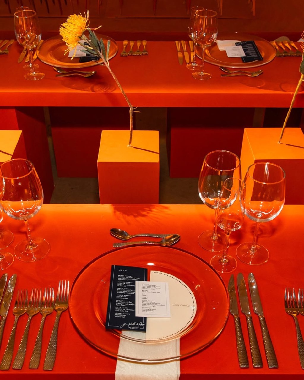
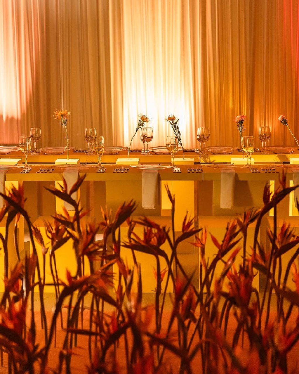
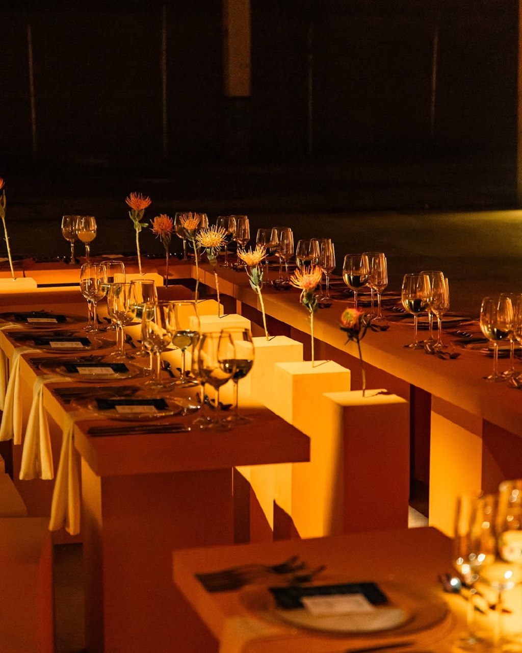
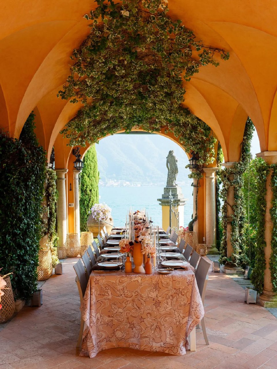
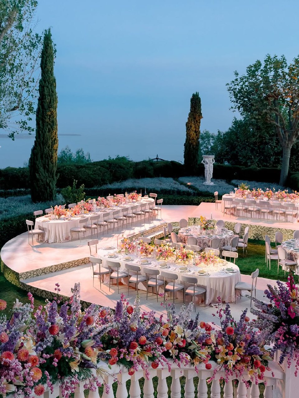
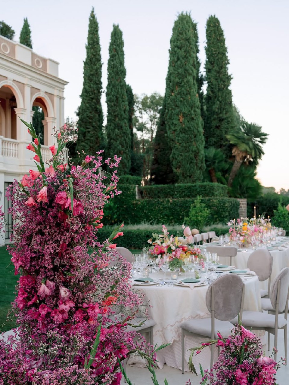
Fall wedding color schemes tend to be warm and rich, like burgundy, burnt orange, terracotta, and deep plum, to match the autumn leaves and the golden hour light. For winter, jewel tones, metallics, and bold contrasts work well, especially in low-light or desert settings. Spring weddings look great with pastels, soft greens, and crisp whites that reflect new growth and bright light. In summer, choose bright, vibrant shades like coral, bold pink, and blue that stand out in strong sunlight.
The colors and style of your venue also play a big role in your color scheme. A wooden barn works well with terracotta or champagne tones, while a modern white space lets you use bold colors like emerald green or burgundy. It’s best to work with your venue’s features instead of against them for the best results.
Balance Bright and Neutral Shades
A balanced wedding color scheme mixes bright and neutral shades. Neutrals like cream, ivory, taupe, soft grey, and natural linen create a calm look and keep things from getting too colorful. Use bold accent colors in small amounts to avoid overwhelming the space. A common approach is 60% neutrals, 30% main color, and 10% accent. For example, with a sage green scheme, use cream and wood as neutrals, sage green for flowers and fabrics, and dusty pink as an accent. This keeps everything harmonious and interesting.
Choose a Dominant Color and Accents
A strong wedding color scheme starts with one main color, supported by one or two accent colors. Using too many colors can make things look cluttered. Pick a main color that feels right for you and fits your venue, then add a couple of supporting shades. For example, in a burgundy scheme, use burgundy for flowers and key fabrics, cream or ivory as the neutral base, and gold as an accent.
Match the Color Scheme with the Wedding Style
Your wedding colors should fit the style you want. For a romantic look, soft shades like pink, champagne, ivory, and lavender work well. Vintage weddings often use dusty rose, sage, cream, and antique gold. Modern, minimalist weddings usually stick to one color or bold contrasts. Rustic styles use earthy tones like terracotta, olive green, cream, and wood.
Think About Photography and Lighting
Colors can look different in photos than they do in person, and lighting changes how they appear. For example, blue looks great in photos but can seem cold in some lighting, so pair it with warm neutrals. Light colors may fade in bright sunlight, while dark colors can look almost black in dim rooms. Always consider lighting when picking your wedding colors.
| Season | Best Color Temperature | Ideal Saturation | Lighting Considerations |
|---|---|---|---|
| Spring | Cool to neutral | Medium, soft pastels | Abundant natural light, fresh and airy |
| Summer | Warm, vibrant | High saturation possible | Intense sun requires deeper tones to register |
| Fall | Warm, golden | Rich, deep tones | Golden hour light enhances warm palettes |
| Winter | Cool, jewel-toned | High contrast acceptable | Lower light suits dramatic, saturated colors |
Citrus Wedding Color Palette
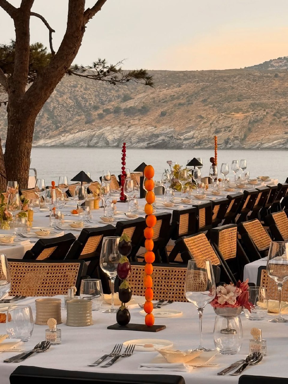
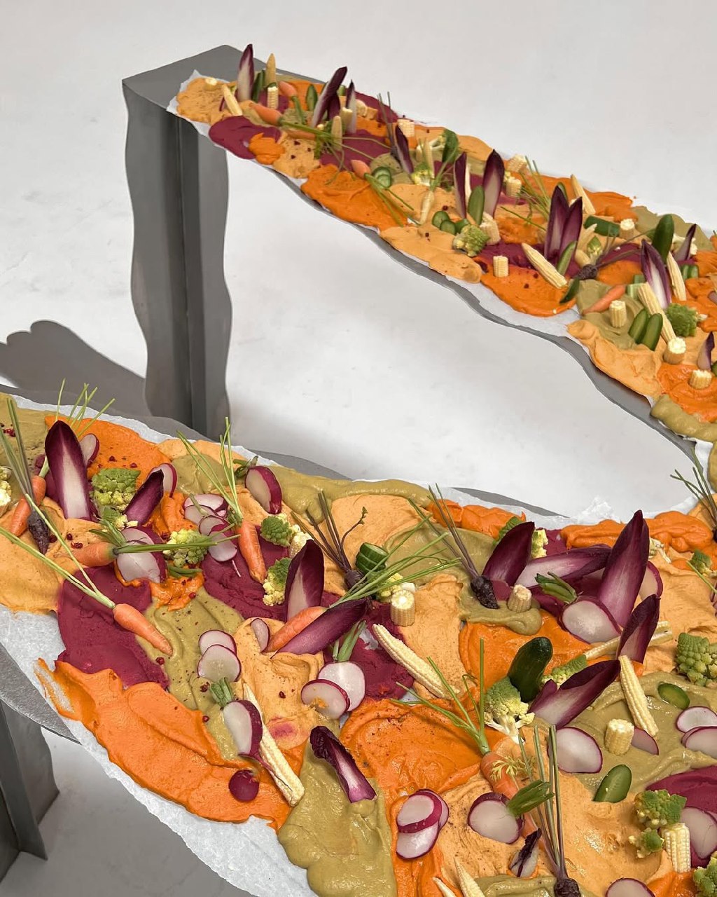
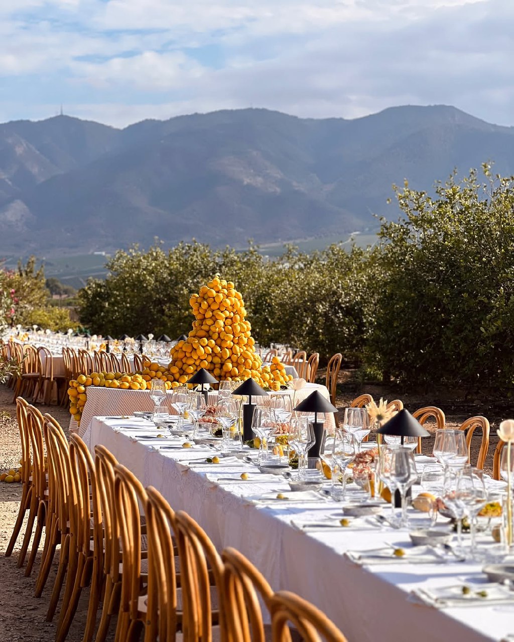
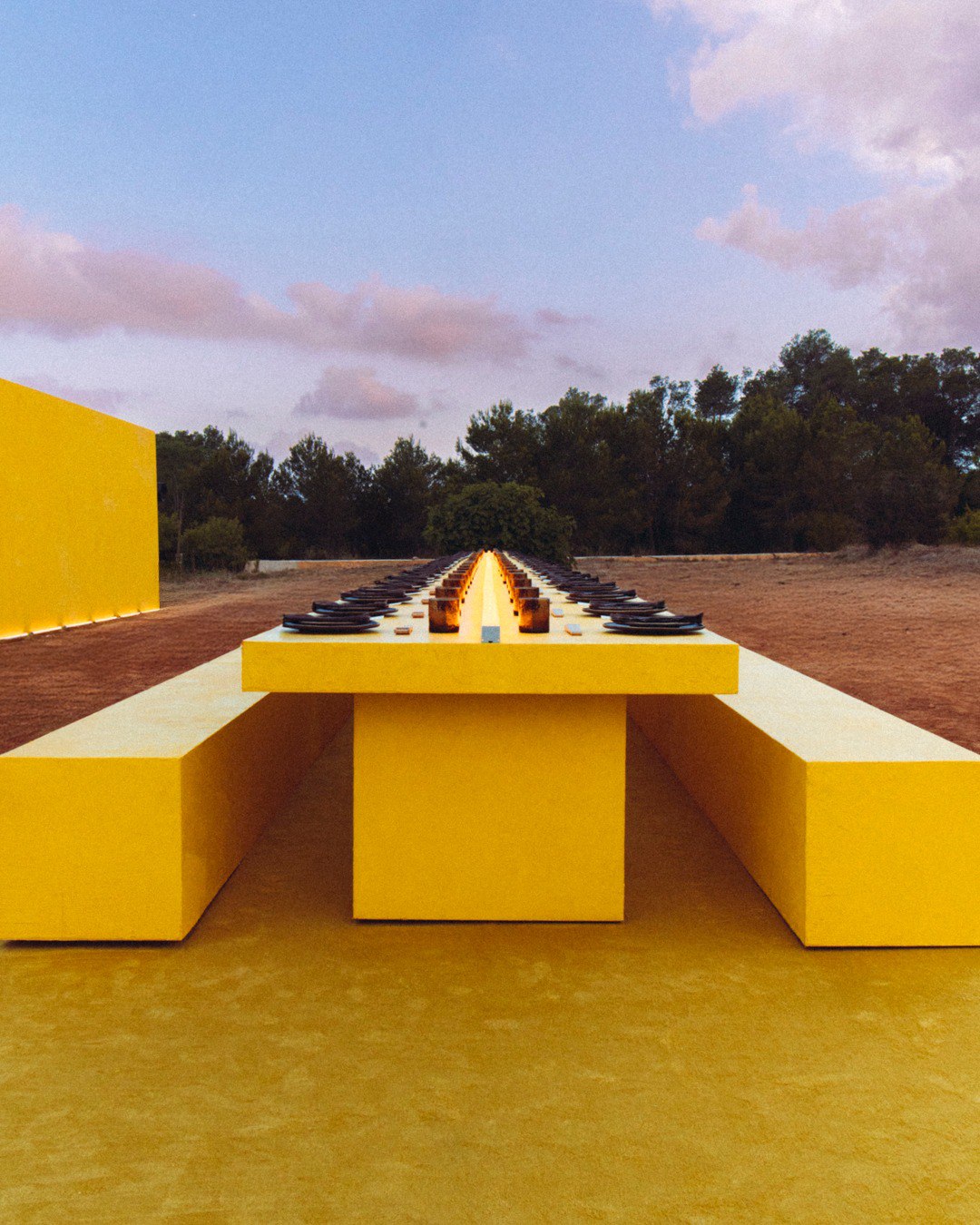
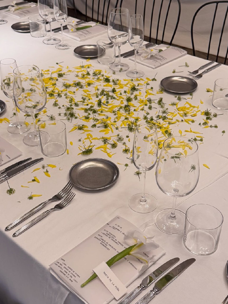
A citrus-inspired color palette with lemon yellow, orange, lime green, and grapefruit pink feels lively, cheerful, and modern. This summer wedding color scheme is great for a bright, upbeat celebration instead of a formal one. To keep it from feeling too intense, balance the bold colors with plenty of neutrals, such as white, cream, wood, and clear glass. Without enough neutrals, citrus colors can be too much.
Use citrus colors thoughtfully—add them to floral arrangements with ranunculus, tulips, and roses, or as accents in table settings, napkins, ribbons, and even cocktail garnishes. These shades work especially well for outdoor daytime events, garden parties, or beach weddings, where their brightness feels natural. In photos, citrus colors look great in natural light, but be careful with exposure so they don’t look washed out.
Yellow, Purple and White Wedding Color Scheme
Combining yellow, purple, and white creates a bold contrast and an elegant look. This color scheme works in any season. Use soft lavender and buttery yellow in spring, richer shades in summer, and deep plum and gold in autumn. White helps balance the strong colors so they don’t compete for attention.
Spread these colors throughout your wedding. Use purple as the main flower color—think delphinium, lisianthus, or anemones. Add yellow as an accent in bouquets, table details, or invitations, and use white for tablecloths, candles, and chairs. Lavender shades add a romantic touch. Remember, balance is key: too many bright colors can look messy, but thoughtfully placed ones create a sophisticated look.
Pistachio and Pink Wedding Color Palette
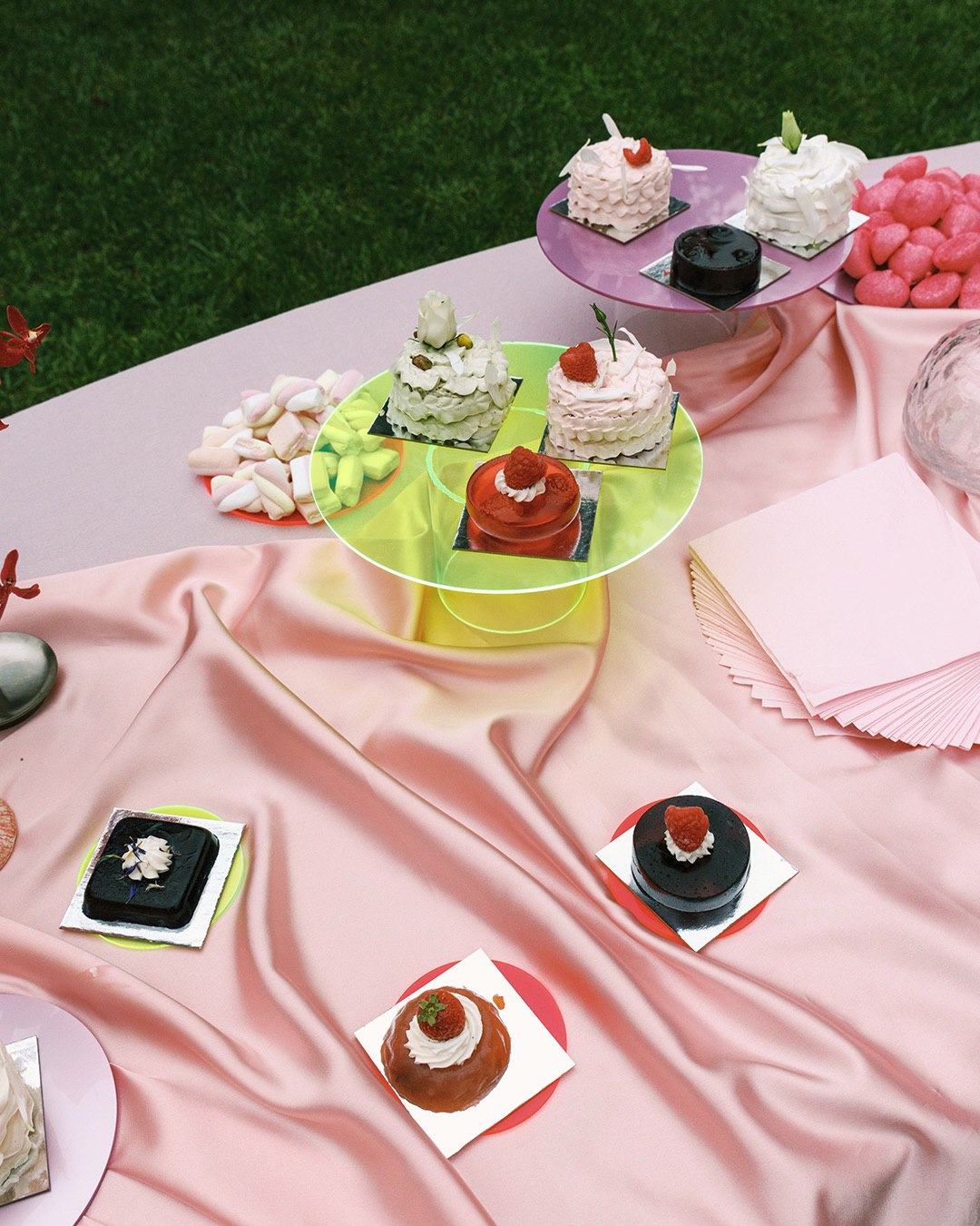
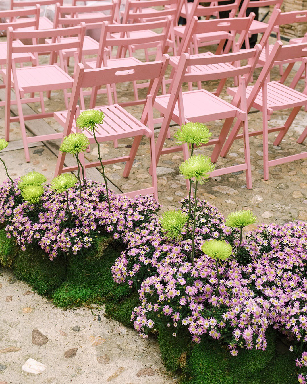
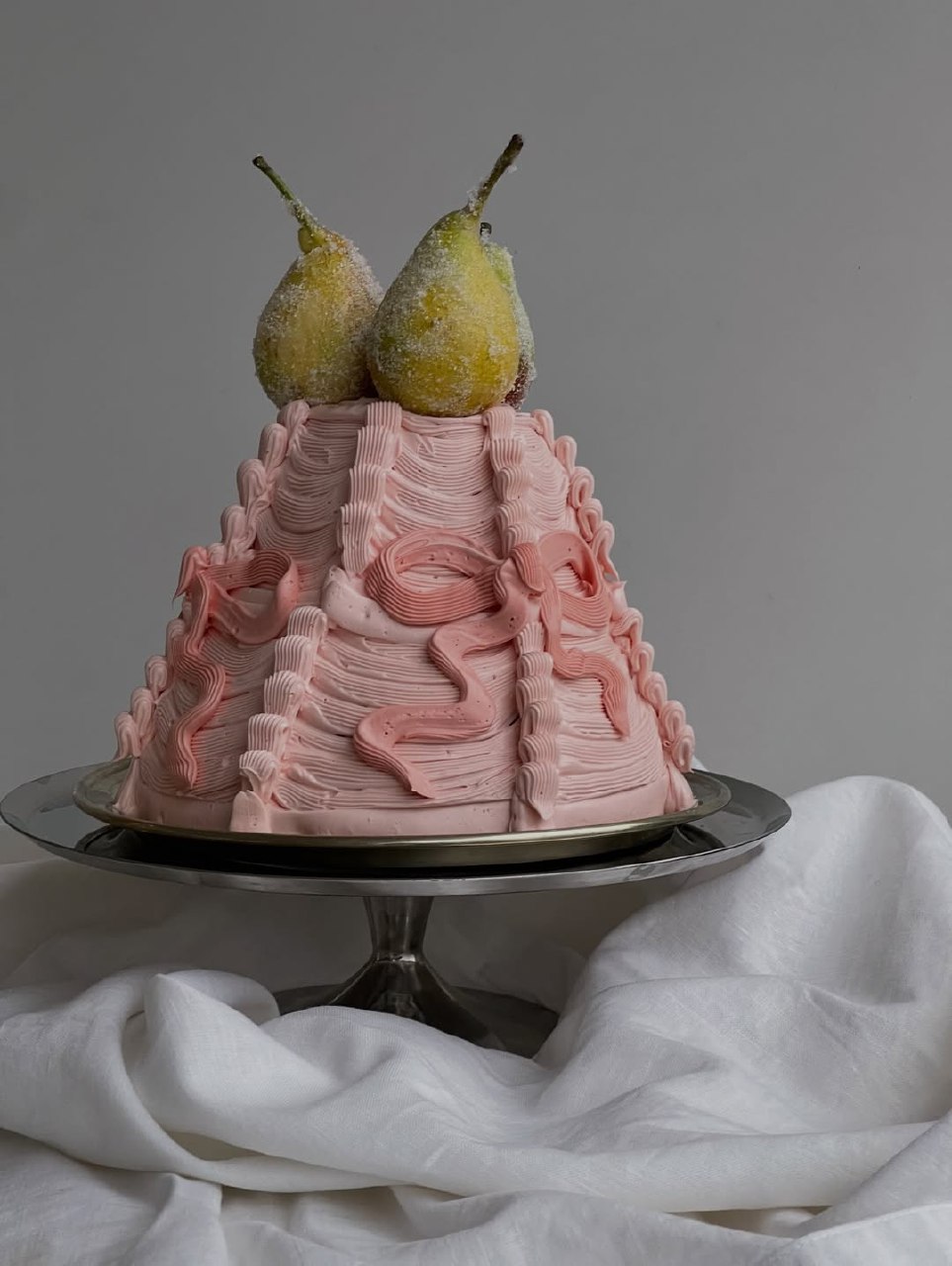
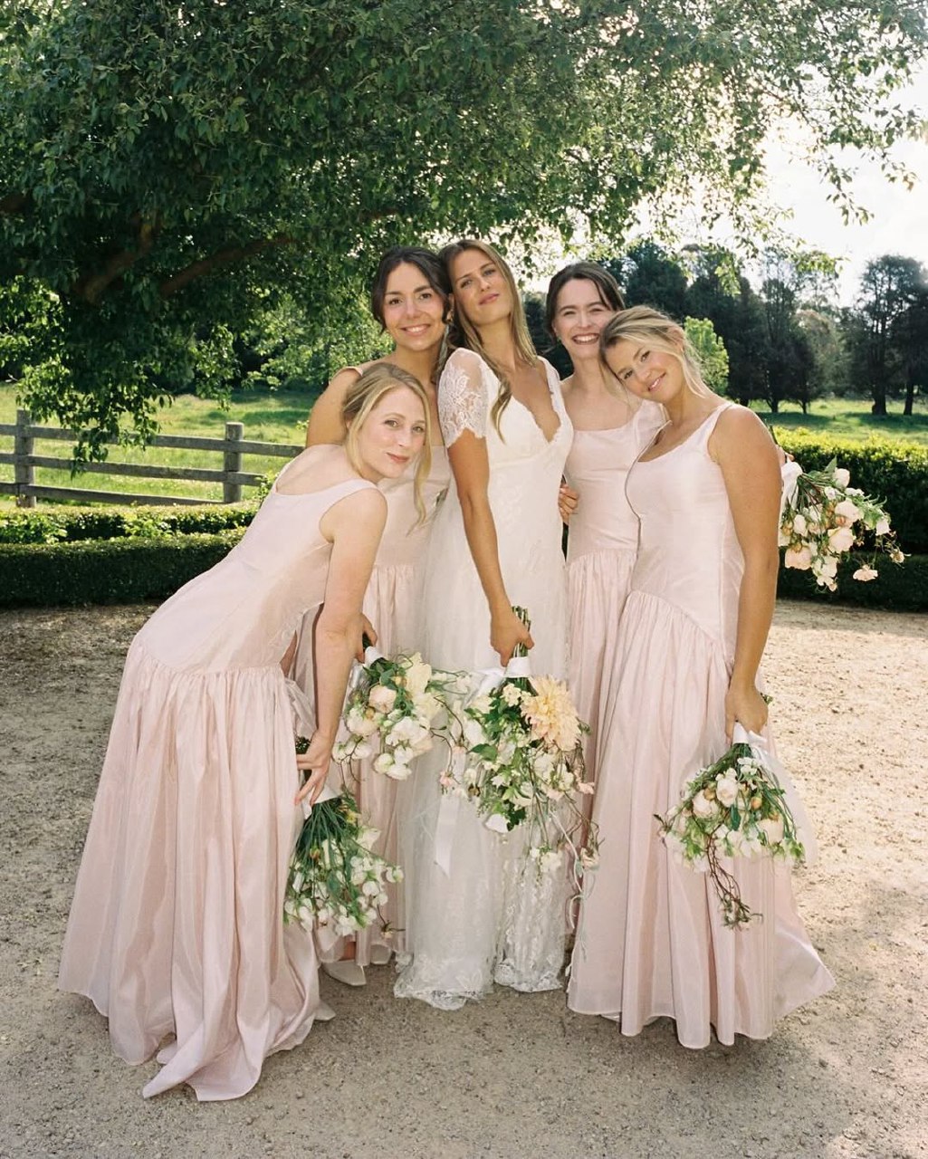
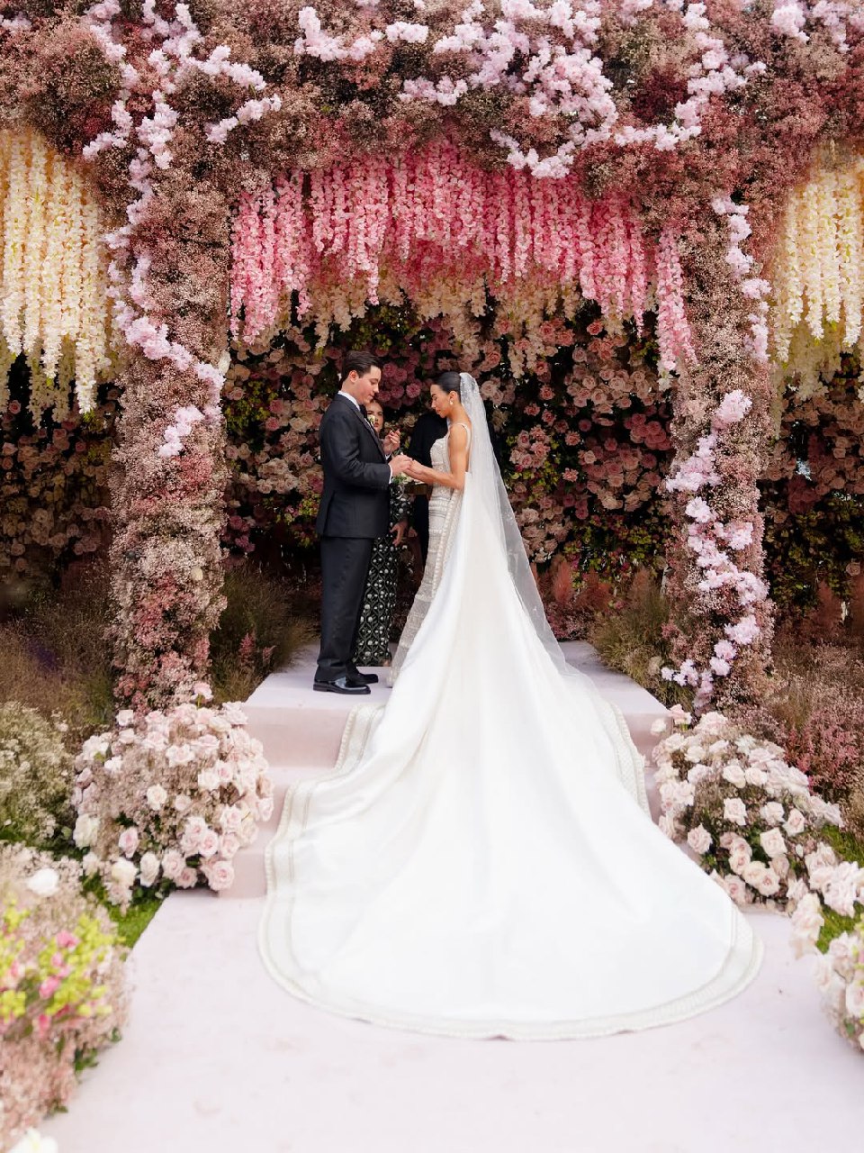
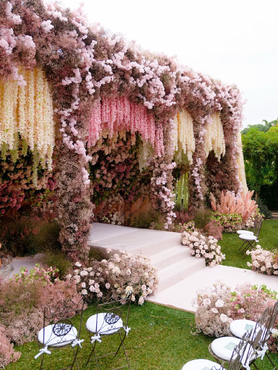
Pistachio and pink together create a soft, modern, and romantic look. Pairing pink wedding color schemes with cool pistachio green keeps it from feeling too bright or childish and adds interest. This combination is ideal for spring or summer weddings, especially garden or European-style celebrations. It’s also a good choice if you want color without going too bold.
This palette uses subtle greens, with pistachio showing up in eucalyptus, olive branches, and soft foliage. You can also use it in tablecloths, bridesmaid dresses, or invitations. Pink can range from pale to deep and works well in flowers like roses, ranunculus, or peonies, as well as in textiles and small details. Cream or ivory adds a third color, keeping the look from being too plain. This combination photographs beautifully, creating soft, romantic, and bright images.
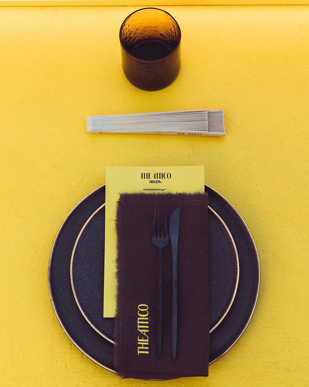
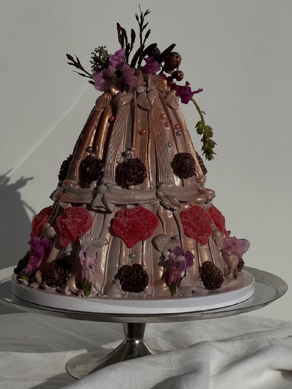
Coffee-Inspired Wedding Color Palette
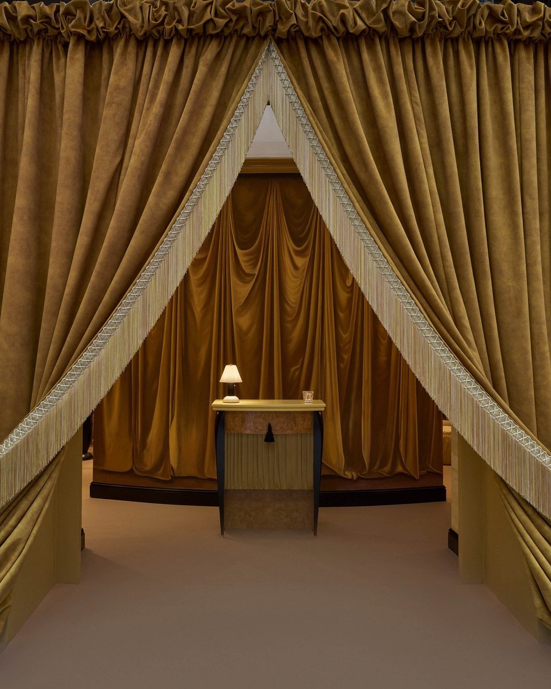
A coffee-inspired wedding palette is rich, warm, and cozy, using brown tones to create an intimate feel—perfect for fall and winter weddings. Champagne tones add elegance, and textures like distressed wood, linen, leather, matte ceramics, and candles complete the look.
- Deep espresso brown: wooden furniture, dark florals (chocolate cosmos, deep burgundy dahlias)
- Caramel and toffee tones: table linens, bridesmaid dresses, invitation paper
- Cream and milk white: candles, dishes, neutral florals, bride's dress undertones
- Golden accents: brass candlesticks, gold flatware, amber glassware
This color scheme works best with high-quality materials. Avoid cheap fabrics and plastic, as they clash with the elegant neutrals. Choose real wood, candles, and quality linen. The warm, timeless feel of this palette is perfect for vintage weddings and looks rich and cozy in photos.
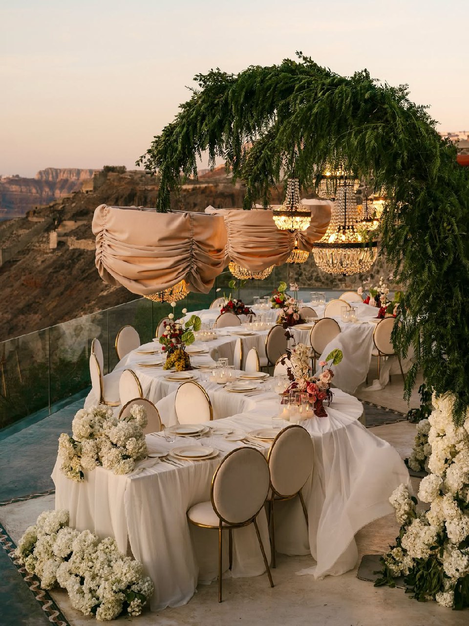
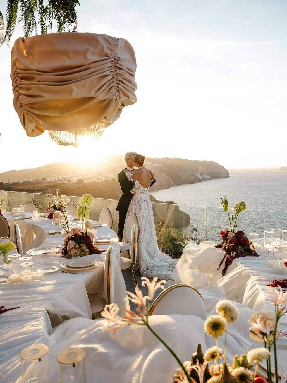
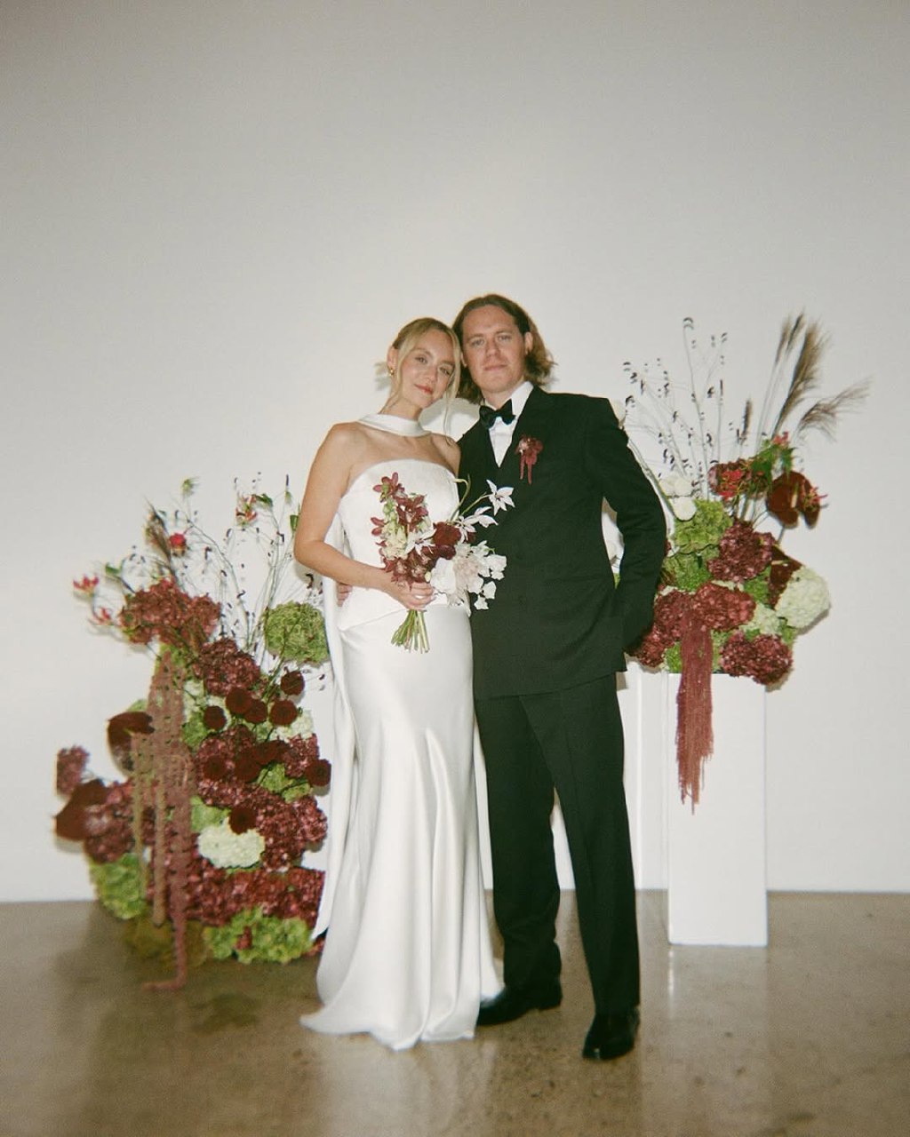
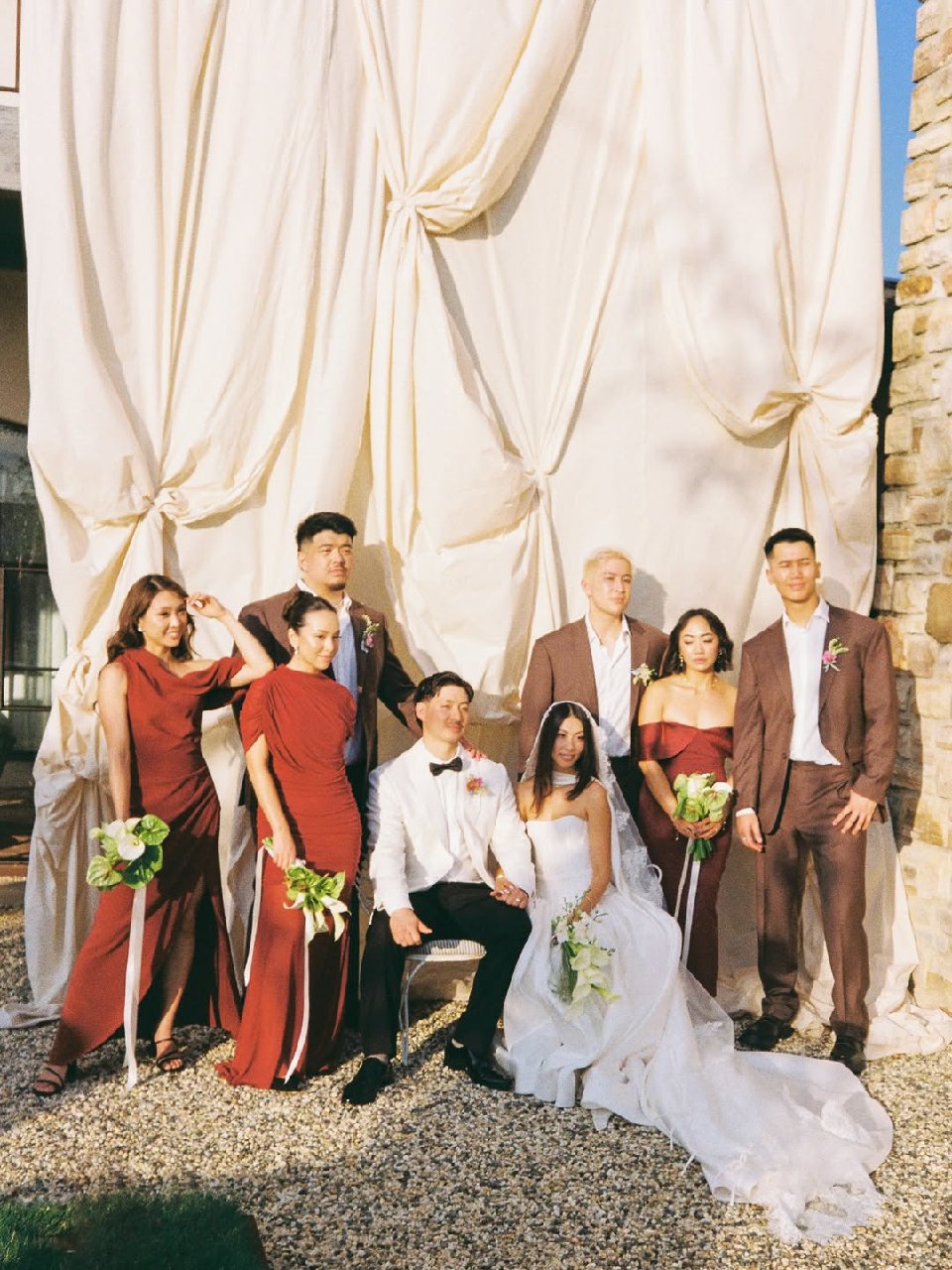
Plum, Burgundy, and Soft Purple/Pink Wedding Colors
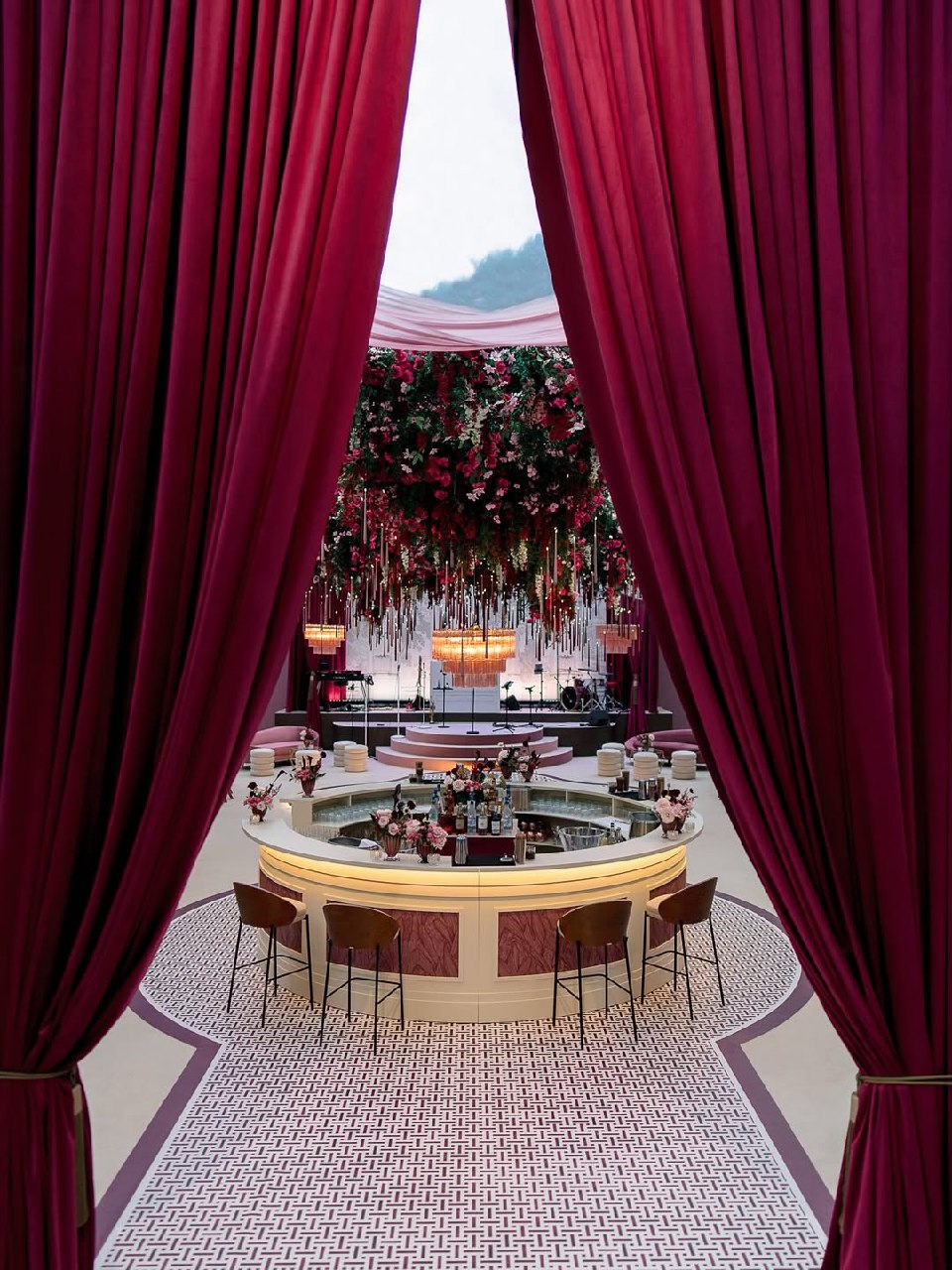
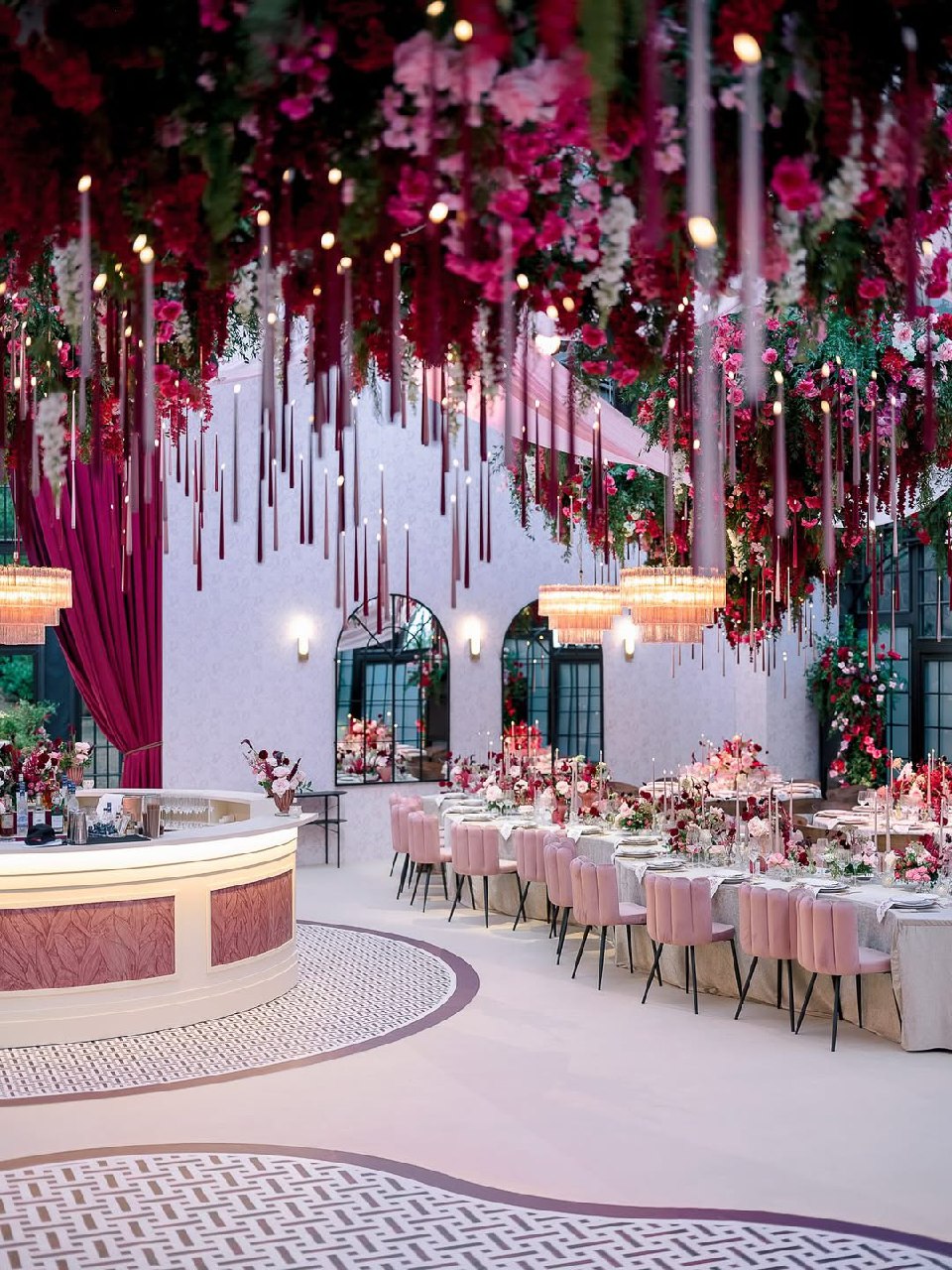
A burgundy color scheme with purple and pink accents sets a romantic mood, ideal for evening receptions and fall weddings. Deep shades like plum, burgundy, and wine add richness, while softer purple and pink tones keep the look from feeling too dark or heavy.
To make a burgundy wedding color scheme work, use plenty of neutrals, such as cream, ivory, champagne, and soft gray. These balance the bold colors and keep the space from feeling crowded. Use burgundy and plum for big elements like flowers, velvet, and dresses, and add softer purple-pink shades in smaller details like napkins and ribbons. If you want lilac but not too much, choose a lighter version for a subtle touch.
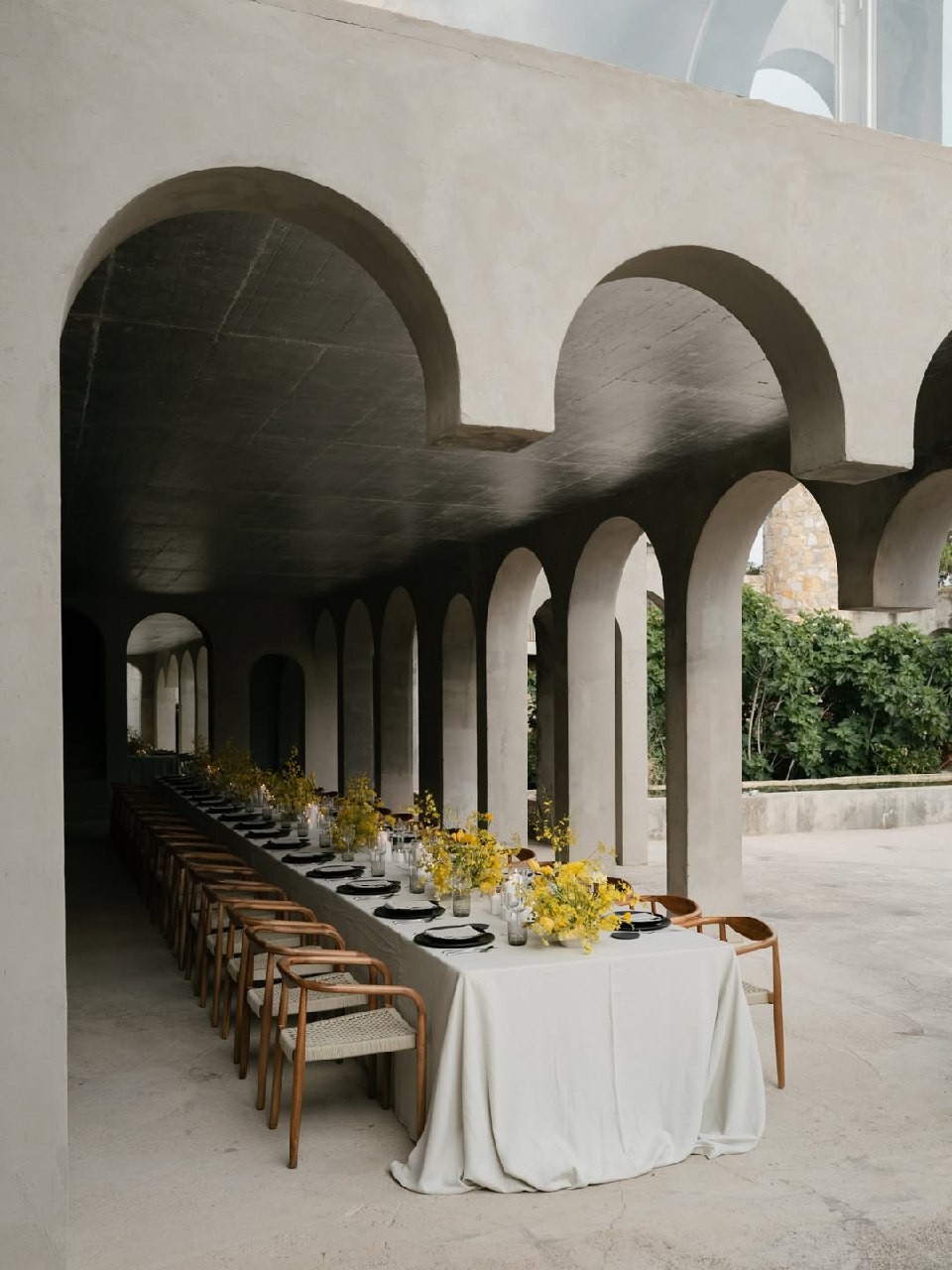
Green Shades and White Wedding Color Scheme
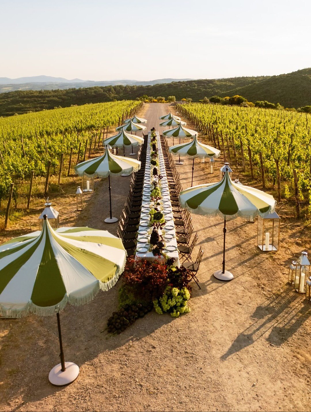
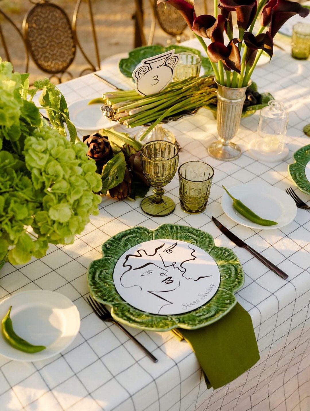
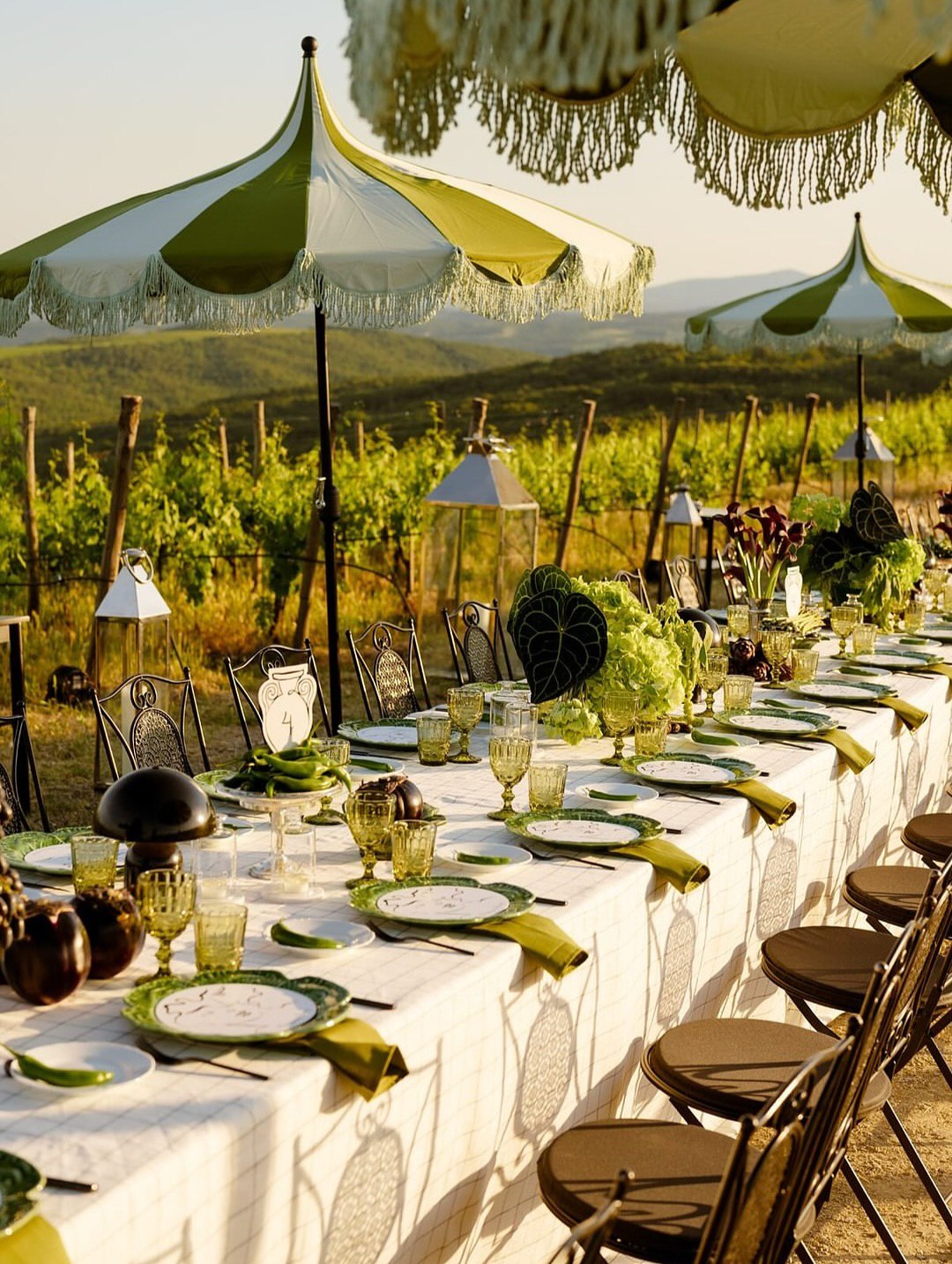
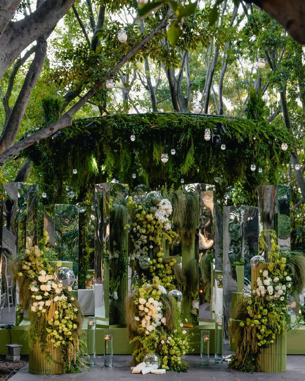
Green is one of the most versatile wedding colors, working well in any season, style, or venue. Green and white together look natural and elegant without being too busy. Since green is common in nature, it feels relaxed and unforced. Mix different greens—sage in linens, forest green in velvet, vibrant green in flowers, and eucalyptus for texture. White helps everything stand out and keeps the look fresh. This scheme is great for spring, garden, or outdoor weddings, but fits any event.
Burgundy and Green Wedding Color Palette
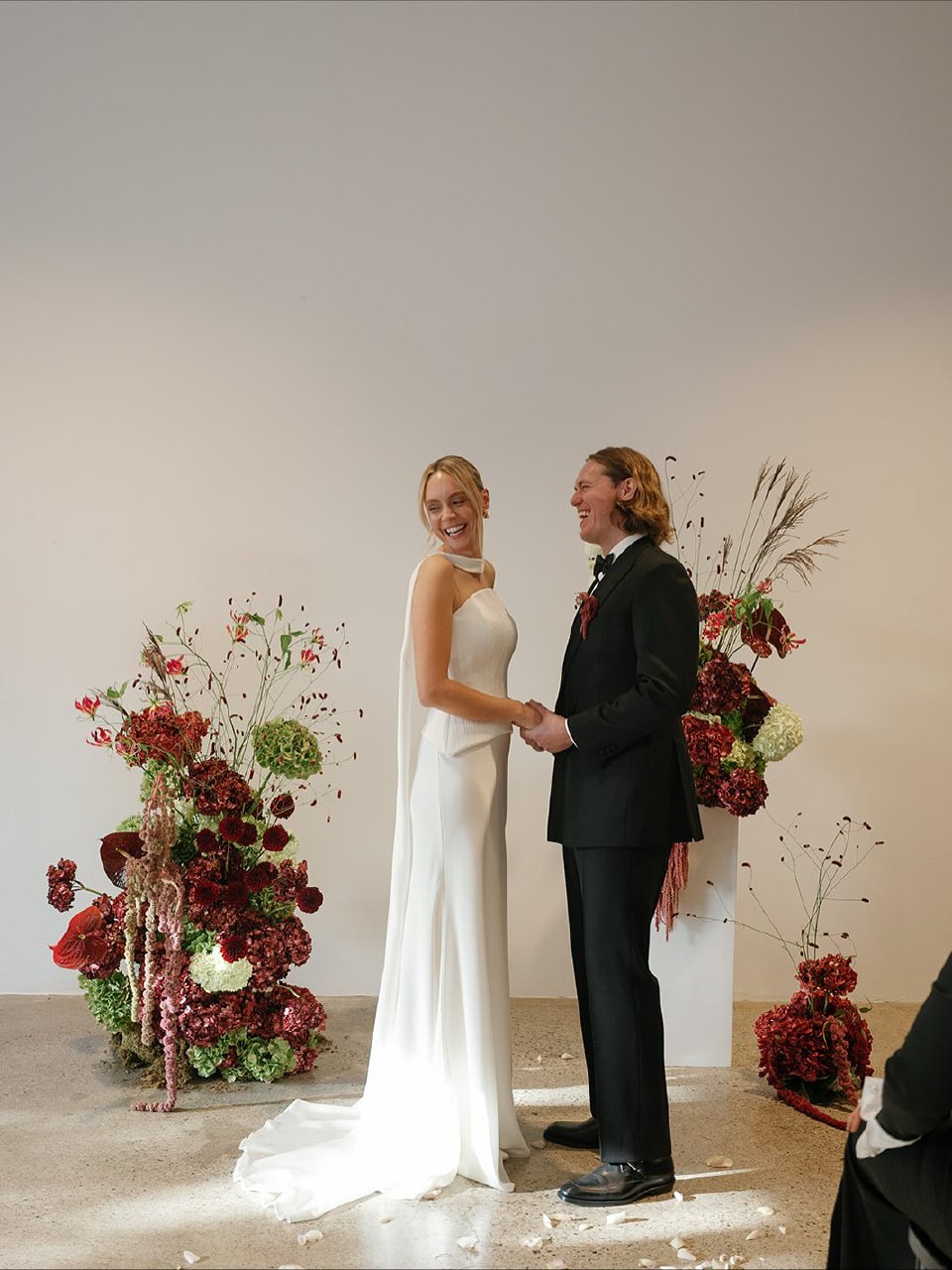
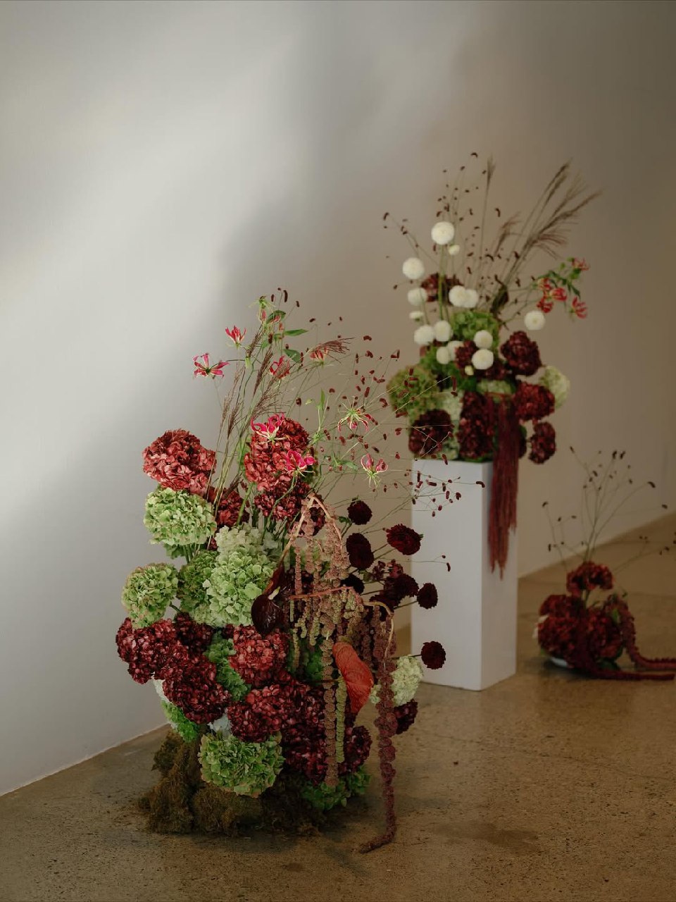
Burgundy and green together create a look that’s both elegant and rich, making this palette popular for autumn weddings and formal events. Burgundy adds drama, while greens like sage or forest balance the colors and keep the palette from feeling too heavy or wine-focused.
To balance a burgundy and green scheme, use about 40% green (in foliage, arrangements, linens, or dresses), 30% burgundy (flowers, fabrics, groomsmen details), and 30% neutrals like cream, ivory, or wood. This mix works for both rustic and elegant styles. Pair with wood and candles for warmth, or gold and velvet for a more luxurious feel.
Red and White Wedding Color Scheme
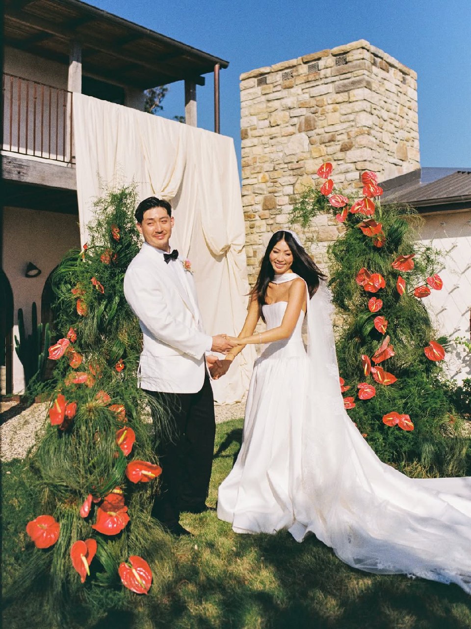
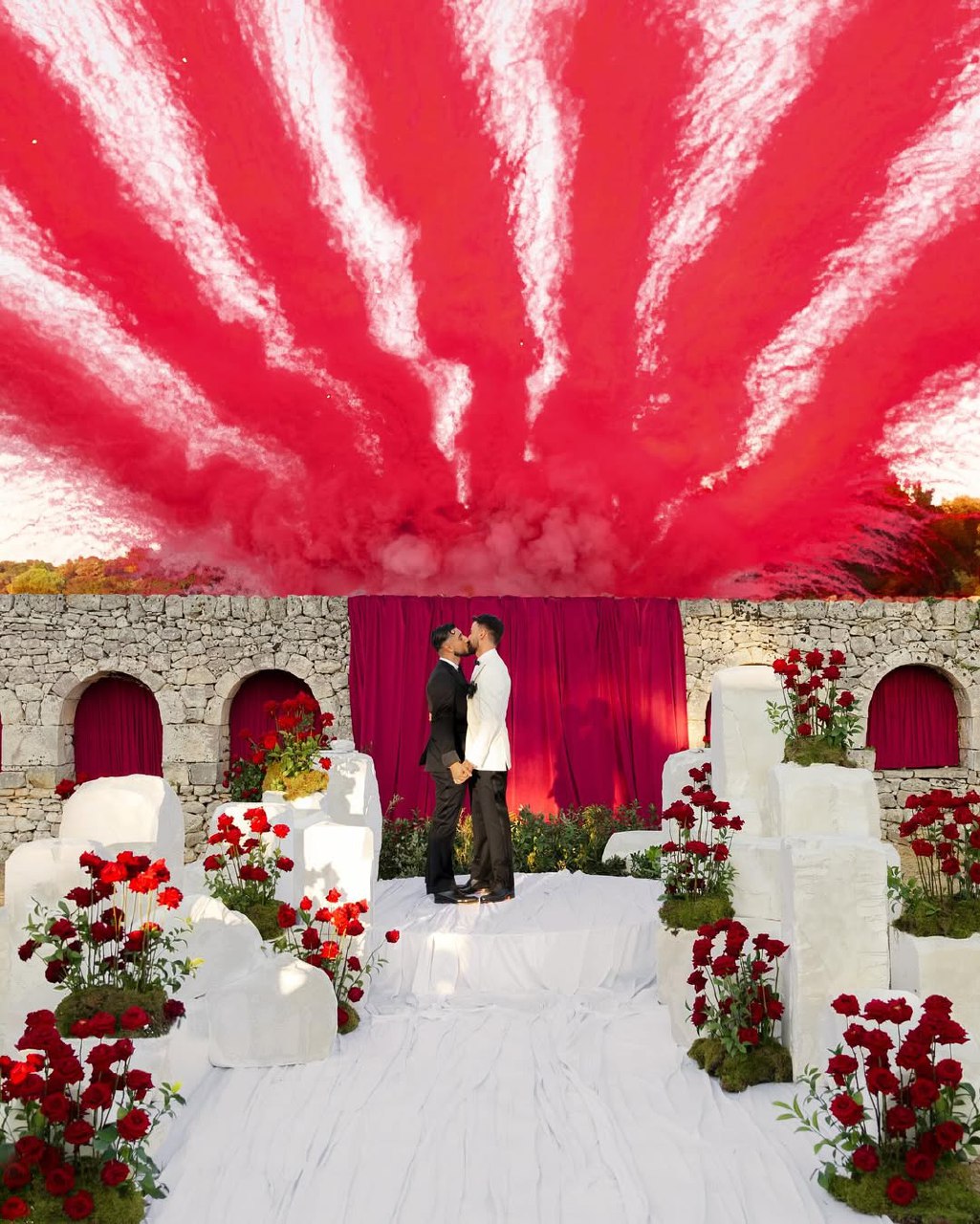
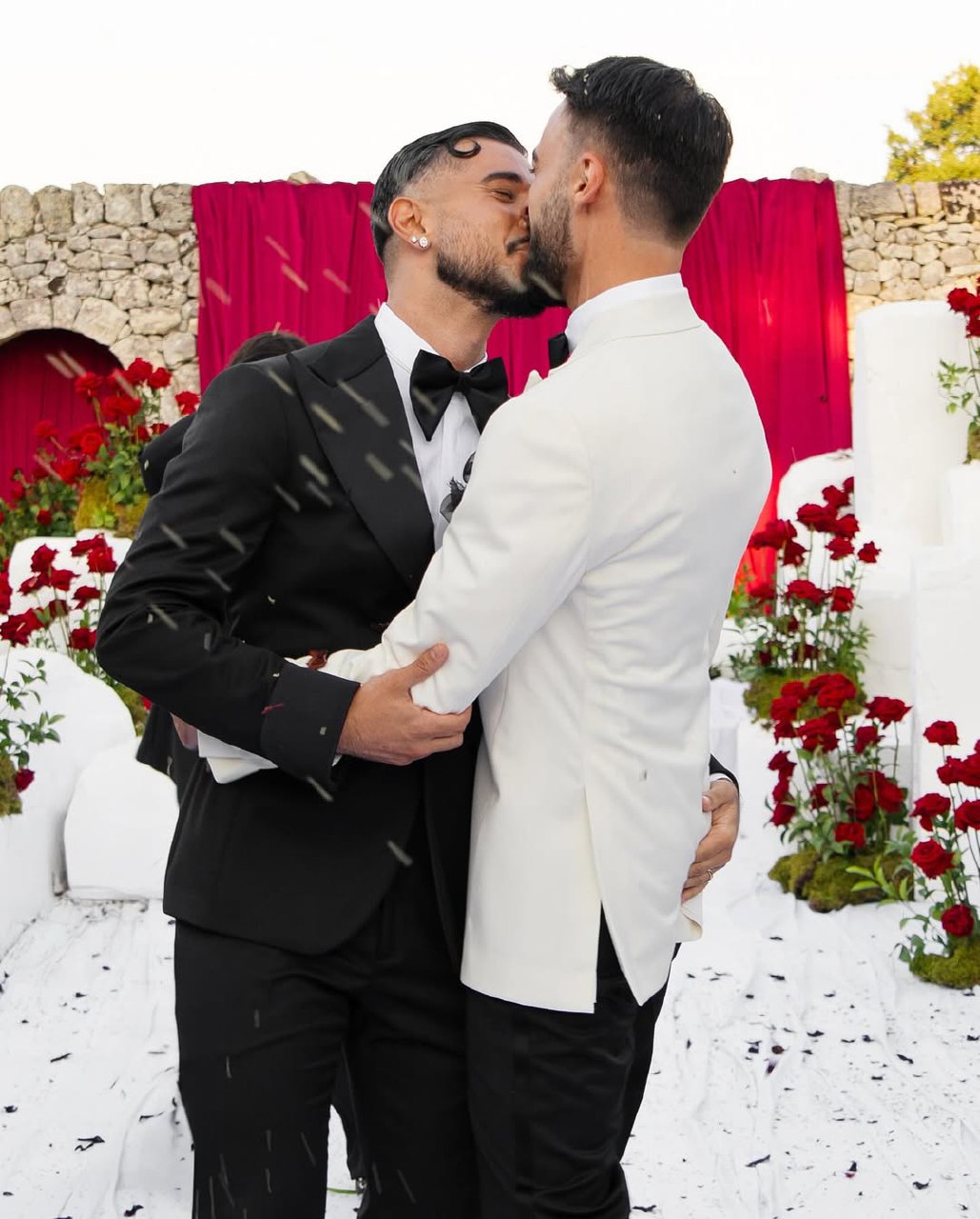
Red and white wedding color schemes are bold and meaningful, but need careful planning. Too much red can be overwhelming, while too little may not have the desired effect. The key is to use red as a strong accent on a white background, creating drama without making things look chaotic.
Use red in small amounts in these ways:
- In flower arrangements (e.g., red roses, ranunculus, amaryllis)
- As a bright colour in the bouquets of bridesmaids or groomsmen
- As highlights on wedding invitations
- As small details on tablecloths White is the most common colour in tablecloths, candles, tableware, and neutral elements
For a rustic wedding, use barnwood and cream as your main colors, with red in the flowers and some fabrics. Modern styles often go minimalist, with lots of white and sharp red accents for a clean, graphic look. This color combo is also common at Christmas weddings, and how you use it can make the event feel festive or timeless.
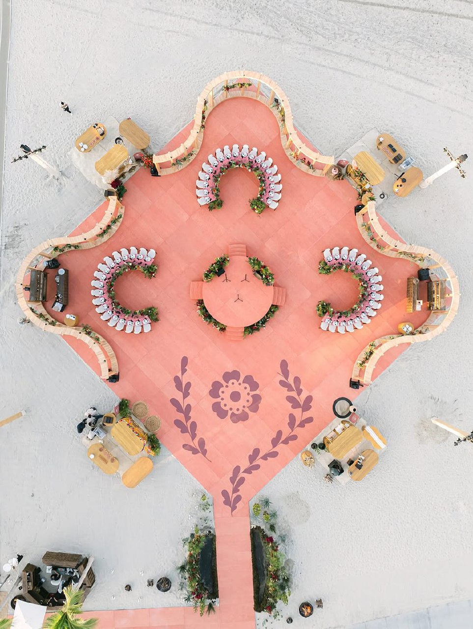
How to Apply Your Wedding Color Scheme Across the Day
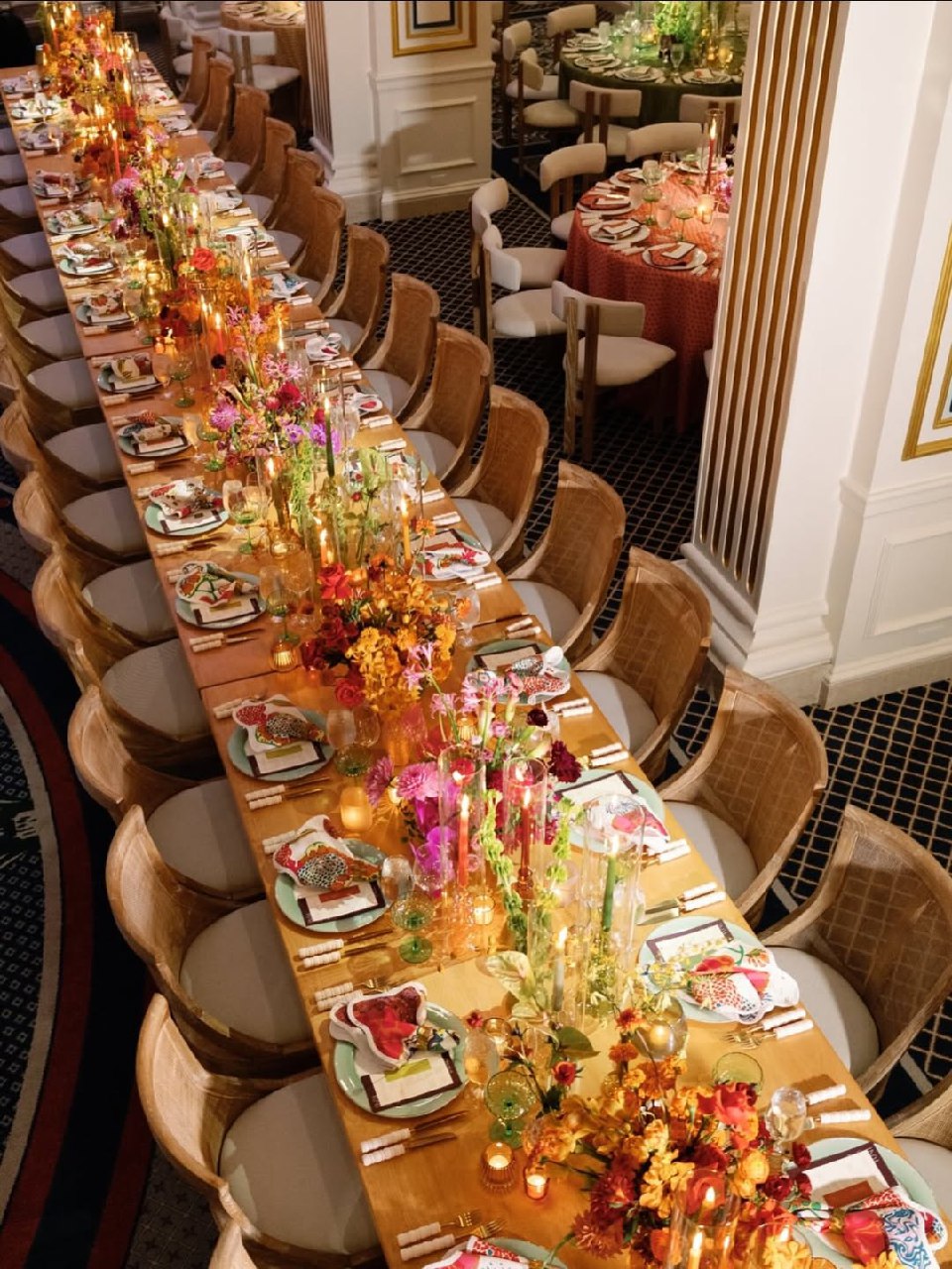
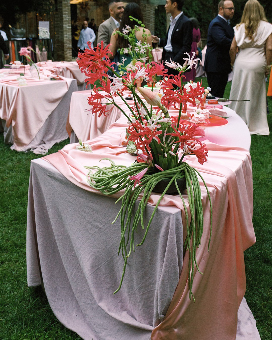
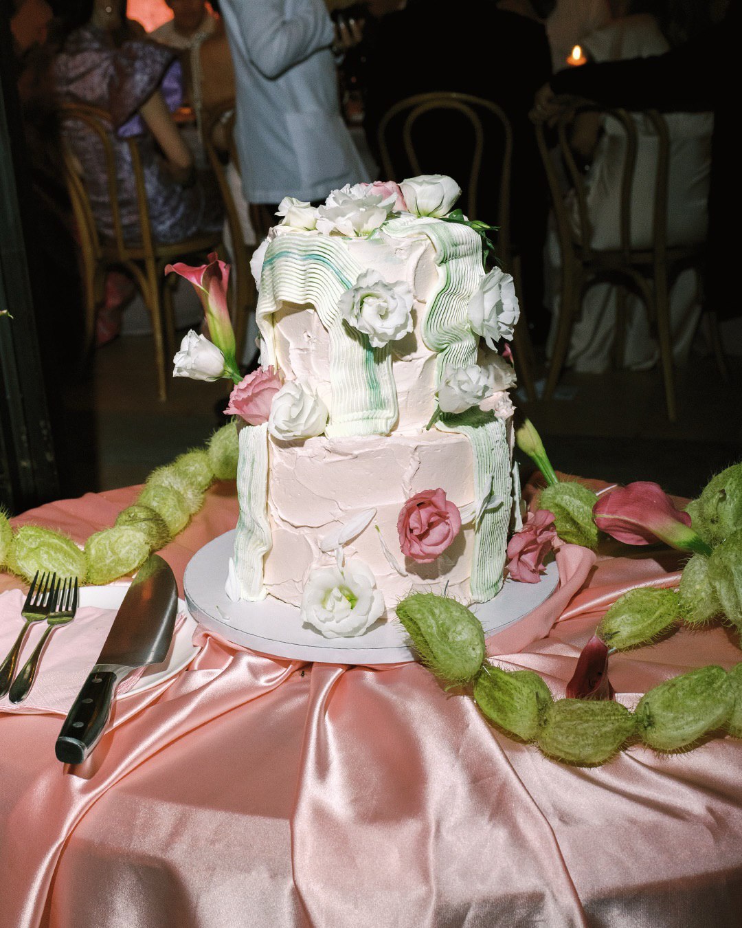
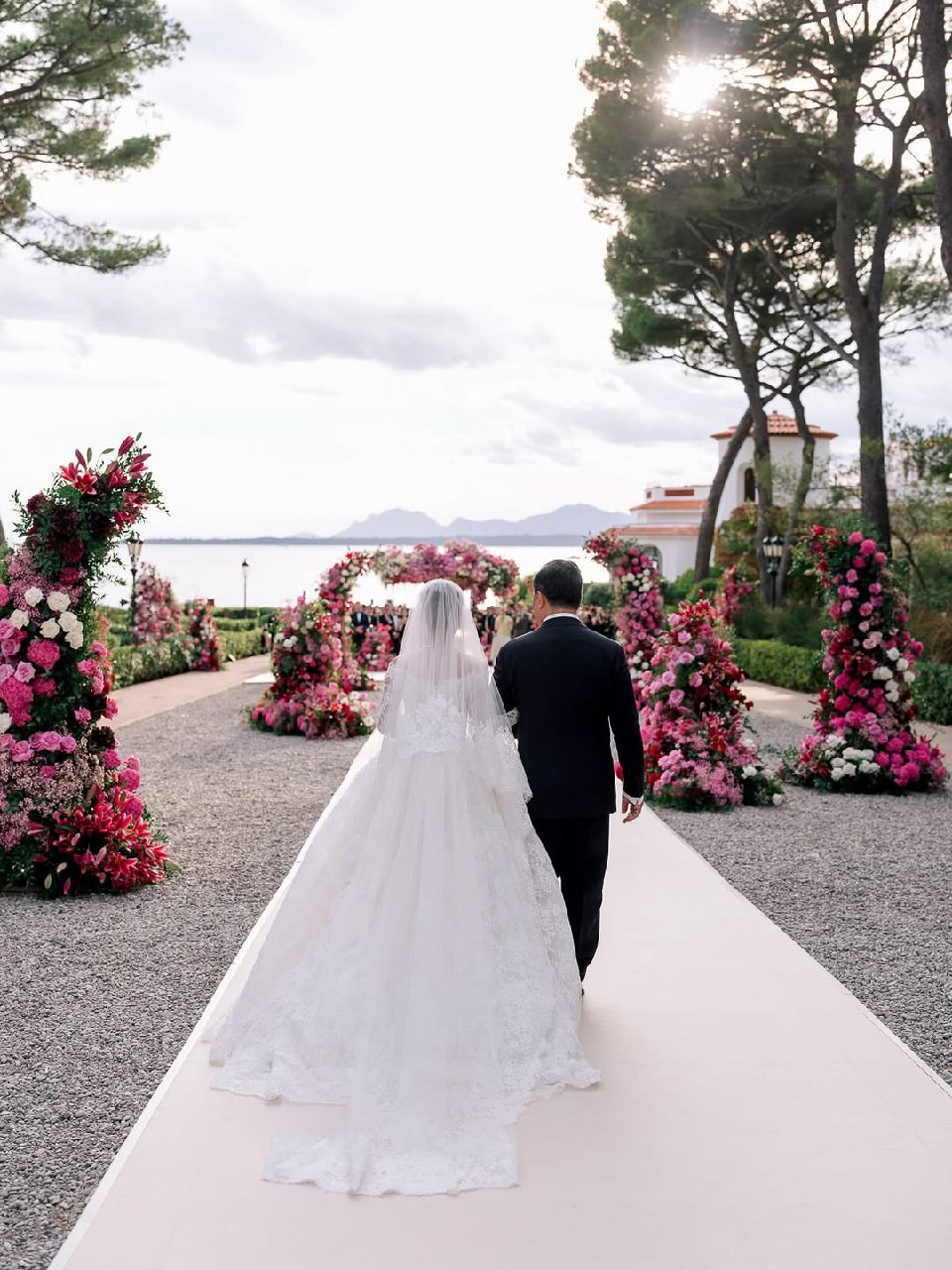
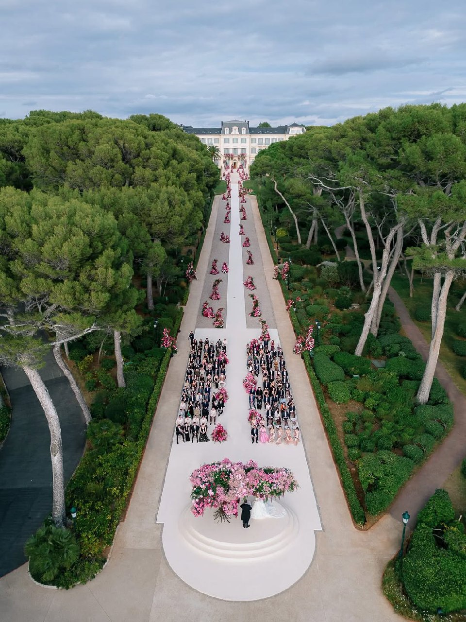
Let your wedding colors flow from the ceremony to the reception, so each part of the day feels connected but unique. Ceremonies often use lighter, neutral colors for aisle signs and altar decorations, with lots of white and greenery for a fresh feel. The couple’s outfits usually match the wedding colors, and bridesmaids, groomsmen, and flowers tie in as well. The reception is a great place to show off your colors with tablecloths, napkins, flowers, and candles. Lighting matters too—warm candlelight flatters warm colors, while cool lighting works for cooler shades. Add your colors to stationery and decorations, such as menus, place cards, and gift wrap. Aim for a look that reflects your style without feeling too plain or too formal.
Common Mistakes When Choosing a Wedding Color Palette
- Using too many colors can make things look confusing. Stick to two or three main colors plus some neutrals. Online color tools often suggest five or six colors, but that rarely works well. Fewer colors, used thoughtfully, create a better look.
- Without a neutral base, accent colors can compete, making the space feel overwhelming. Every color scheme needs plenty of neutrals like cream, ivory, white, and natural tones to make the room look and feel more open.
- If you don’t consider your venue and lighting, your color palette might not work in the space or look good in photos. Visit your venue at the same time of day as your wedding to see how the colors and lighting will look.
FAQ About Wedding Color Schemes
How many colors should a wedding color scheme have?
The best approach is to use two or three colors, plus neutrals. Pick one main color, one accent, and maybe a second accent, all set against a base of white, cream, or natural tones. Too many colors can look confusing instead of elegant. A simple, repeating color pattern works best.
Can you mix warm and cool tones?
Yes, you can mix warm and cool tones, but do it carefully. Soft blues and sage greens work well together because they have similar brightness and intensity. It’s better to mix muted shades of both rather than pairing a bright, warm color with a pale cool one. Choose colors that blend well so the palette feels balanced.
How to adapt a color palette for different seasons?
Keep your main colors the same, but adjust their shades and how much you use them for each season. For spring, use lighter greens and lots of white. For autumn, choose deeper greens with cream and burgundy accents. Fall weddings usually have richer colors, while spring ones are lighter and more pastel. The base palette stays the same, but the seasonal tweaks make it fit the time of year.
Your chosen wedding color schemes establish the visual language of your entire celebration, creating harmony that guests feel even when they can't articulate what makes everything "work." From fall wedding color schemes embracing rich burgundy and forest tones to summer wedding color schemes celebrating vibrant citrus and coastal blues, the right palette clarifies every subsequent decision while allowing flexibility and personal expression. The goal isn't perfect matching but thoughtful cohesion—colors that enhance rather than compete, that photograph beautifully, and that create the specific atmosphere you envision for your day.